


When preparing your home for resale, bathroom updates can make a real difference, and bathroom tile color is one of the first things buyers notice. The right tones can help a space feel cleaner, brighter, and more inviting, while the wrong ones may unintentionally turn buyers away.
Whether you’re updating a small powder room or a spacious primary bath, choosing a resale-friendly tile color is a smart move. In this blog, we’ll explore which shades tend to increase buyer appeal, which ones to avoid, and how to make the most of your bathroom’s size and lighting when selecting a palette.

Why Tile Color Matters When Selling a Home
When a potential buyer steps into a bathroom, the color scheme is one of the first things they notice. Tile color plays a subtle but powerful role in shaping their emotional response, whether it feels inviting, clean, modern, or dated. Below, we’ll look at how certain tones influence perception and help create a positive, lasting impression.
The Psychology of Color in Bathrooms
Color has a direct effect on how people feel in a space, especially in a bathroom where comfort and relaxation are key. Soft, muted tones like pale beige or cool grays often evoke calmness and neutrality, helping buyers envision the space as a blank slate. Warmer neutrals, on the other hand, can create a sense of coziness that makes the room feel more personal without being overwhelming. Blues and greens, when used subtly, can even lend a spa-like quality that taps into feelings of cleanliness and tranquility.
Buyers aren’t just evaluating a bathroom’s functionality; they’re imagining how it feels to use it daily. If the tile color promotes a positive emotional response, it increases the chance they’ll remember the bathroom for the right reasons. A space that feels balanced and peaceful through color is more likely to leave a mark, especially in competitive real estate markets.
A great example is our Juliet 2.5x10 Matte Porcelain Tile in Olive above; its subtle greens can bring a calm, spa-like tone that supports both visual serenity and emotional appeal. This muted olive hue offers just enough character without overwhelming the space, making it ideal for buyers who value a balanced, nature-inspired atmosphere
Cleanliness and Brightness as Selling Points
Light-colored tiles like white, cream, or soft gray can make a bathroom feel brighter, cleaner, and more open. These tones reflect natural and artificial light more easily, helping smaller bathrooms appear larger and more hygienic. Buyers often associate lighter colors with easy maintenance, even if that’s not always the case, simply because the space looks fresher and newer. The perception of cleanliness goes a long way in making the home feel “move-in ready.”
Overly dark or bold colors, in contrast, can unintentionally highlight dust, water spots, or grime, especially in places with hard water or limited light. This can create subconscious doubts about upkeep, even if the bathroom is spotless. Choosing colors that maintain that clean and open look helps reassure buyers and reduces objections during walkthroughs.
Timeless Appeal vs. Trendy Tones
While trending colors can make a bathroom feel stylish now, they may not age well as design preferences evolve. For resale purposes, it’s safer to lean on timeless hues like whites, soft grays, and warm taupes. These shades tend to work across a variety of design styles, from traditional to modern, without clashing with future buyers’ plans or personal taste. They also make it easier for buyers to mentally layer their own decor onto the space.
Trendy colors like bright teal, bold black, or coral can work beautifully in personal renovations, but they risk feeling out of place just a few years later. If buyers see the space as one they’ll need to immediately update, it can become a bargaining point—or a reason to walk away. Neutral and classic tile colors provide long-term flexibility, which adds subtle value to the overall bathroom presentation.

Top Tile Colors That Increase Resale Value
Some tile colors have consistently stood out in home sales, staging consultations, and buyer feedback. These tones tend to photograph well, appeal to a wide range of tastes, and make bathrooms feel more inviting.
Soft White and Off-White Shades
White tile has long been a staple in real estate because it conveys freshness, brightness, and a sense of cleanliness. Soft variations like ivory, pearl, and off-white add a bit of warmth while maintaining the same open, clean feel buyers look for. These shades help reflect light, making bathrooms feel larger and more welcoming, especially important in smaller spaces or homes with limited windows. They also act as a versatile backdrop that lets potential buyers imagine their own décor and style in the room.
What makes off-white tones particularly effective is their neutrality—they don’t lean too cold or too warm, which broadens their appeal. Whether paired with chrome fixtures or wood accents, soft whites adapt easily and rarely go out of fashion. This balance between brightness and subtle warmth is part of what makes them a go-to for boosting resale value.
Light Gray and Greige Neutrals
Light gray and greige (a blend of gray and beige) offer a more modern but still buyer-safe alternative to white. These tones introduce depth without being overwhelming and complement a wide variety of finishes, from black matte hardware to brushed gold accents. They work well in both contemporary and transitional bathrooms, which adds to their appeal for a diverse buyer pool. Plus, they’re less likely to show dirt or water marks than pure white, adding practical appeal alongside their style.
Greige in particular has gained popularity because of its balance—warm enough to feel inviting, but cool enough to look updated and sleek. Buyers tend to respond positively to spaces that feel move-in ready but also current, and light gray or greige tiles hit that sweet spot. They project a refined, neutral look that supports a high-end feel without becoming the focal point.
Earth Tones Like Taupe or Warm Beige
Earth-toned tiles like taupe, warm beige, and light tan bring a grounded, calming quality that appeals to buyers seeking comfort and familiarity. These shades are especially effective in bathrooms where natural light plays a key role; they soften harsh shadows and add a gentle warmth that feels welcoming. Unlike stark neutrals, earth tones have a cozy undertone that helps the bathroom feel more lived-in without looking outdated.
These colors also work well with wood cabinetry, natural stone countertops, and brushed metal fixtures, creating a cohesive look that feels intentionally designed. Buyers are drawn to rooms that feel complete, and earth tones offer that without needing additional décor. Their broad versatility and natural aesthetic make them a valuable choice when selling.
Muted Blue or Green Accents (Used Sparingly)
Soft shades of blue and green can be very effective when used thoughtfully, particularly in homes aiming for a spa-like or coastal feel. Muted tones like powder blue, seafoam, or sage green create a sense of calm that buyers often associate with relaxation and cleanliness. These hues should be used as accent colors, either on a feature wall or shower niche, rather than across the entire space to maintain broad appeal.
Because blue and green are tied to natural elements like water and foliage, they can help a bathroom feel fresher and more inviting. However, their strength lies in restraint; for example, when paired with neutrals, they offer just enough personality without overwhelming potential buyers. Used correctly, they can add value by giving the bathroom a gentle style lift that still feels timeless.
A great example is our Maisie 2.5x16 Glossy Ceramic Tile in Pistachio, which offers a soft green tone with a clean, polished finish. Its muted hue brings in a fresh, nature-inspired accent without overwhelming the space, making it ideal for buyers who appreciate a subtle touch of color. The glossy surface catches light beautifully, adding depth and brightness to shower walls or backsplashes. Paired with neutral floor tiles and warm fixtures, Pistachio creates a spa-like feel that supports both style and versatility. It's a thoughtful way to introduce personality while keeping long-term appeal in mind.

How Bathroom Size Affects Tile Color Choices for Resale
In smaller bathrooms, tile color has a noticeable impact on how open or cramped the space feels to buyers. Lighter tones like white, cream, or soft gray can reflect more light, making tight areas feel airier and more expansive. These colors reduce visual clutter and help draw attention to clean lines, which adds a sense of calm and simplicity. For buyers walking through a home, a light and open-looking bathroom can instantly feel more inviting and less like a renovation project. It’s often these subtle impressions that tip the scale during a showing.
Medium-sized bathrooms offer slightly more freedom, but sticking to lighter neutrals still adds a resale advantage. Soft beiges, warm taupes, and even greige tiles can bring warmth without closing in the space. These tones often work better in natural lighting and help the bathroom feel grounded while still fresh. Buyers also appreciate how these mid-tones balance comfort with modern appeal, which can help the bathroom stand out in listing photos. The goal is to create a space that feels lived-in but not limiting—something many buyers look for in homes that are move-in ready.
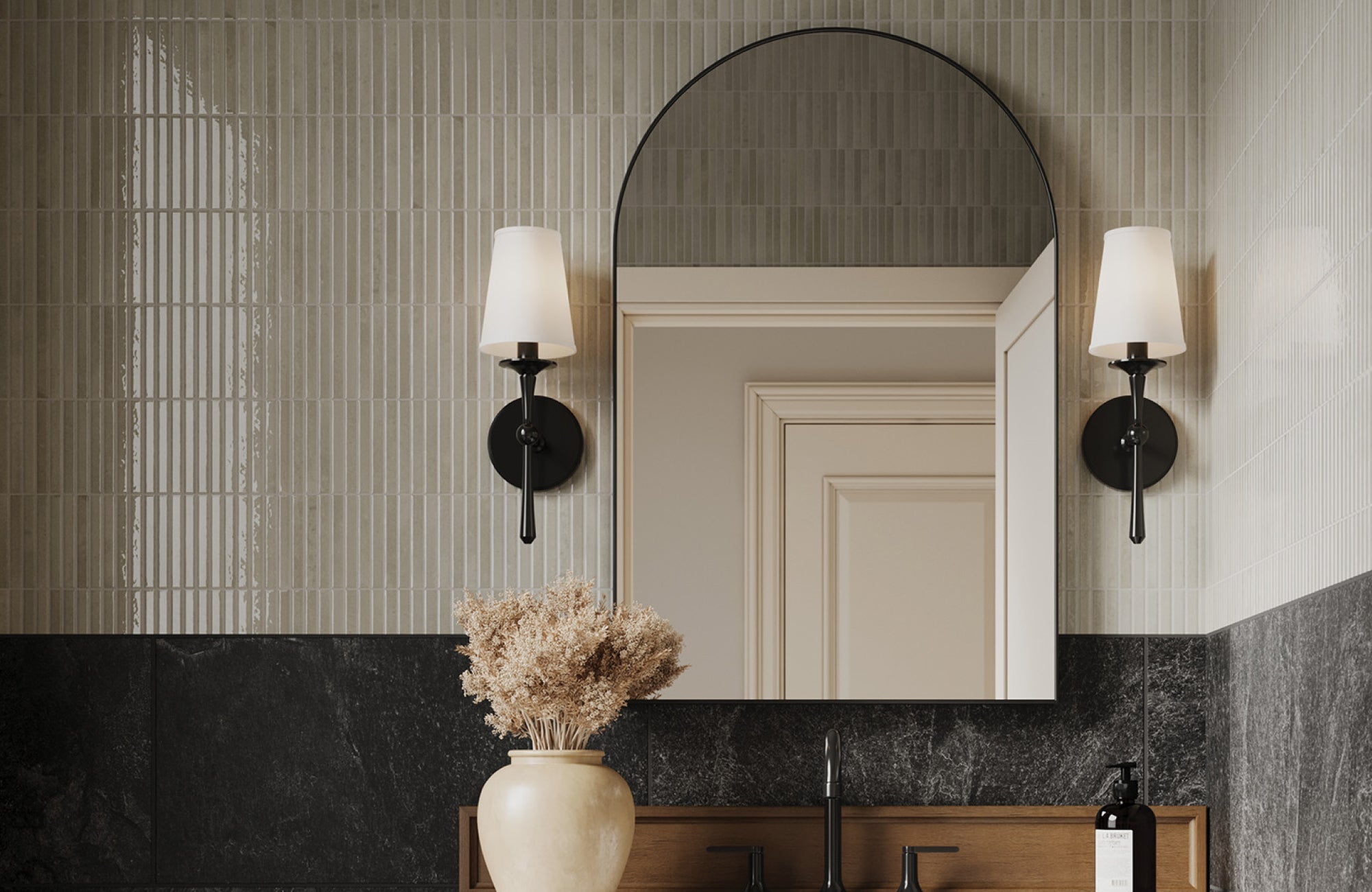
In larger bathrooms, homeowners can get away with slightly bolder tile colors without affecting the sense of space. Deeper grays, warm charcoals, or earthy browns, such as our Catalina 2x16 Matte Porcelain Tile in Mushroom above, can bring character and depth when there’s room to breathe. Even so, it’s smart to keep the overall tone cohesive and not too dark, especially if the space lacks strong natural light. Buyers still gravitate toward spaces that feel open and adaptable, so anchoring one wall with a darker tile while keeping the rest light can strike the right balance. Ultimately, color should support the size, not fight it, so buyers feel comfortable, not overwhelmed.

Common Color Mistakes That Can Hurt Resale Value
While bold bathroom tile colors can look stunning in the right setting, not every choice translates well during a home sale. Certain tones or combinations can shrink the space visually, clash with fixtures, or simply distract buyers from seeing the room’s full potential. Below, we’ll walk through common missteps that could unintentionally reduce a bathroom’s resale appeal.
Overly Dark or Moody Tones in Small Spaces
Dark tile colors can create a cozy or dramatic atmosphere, but in a small bathroom, they often make the space feel tighter and less inviting. Without ample lighting or contrast, these tones absorb light instead of reflecting it, which can exaggerate shadows and corners. Buyers may feel the room is harder to clean or less functional, even if it’s perfectly maintained. A heavy, moody palette can also distract from selling points like new fixtures or smart layouts. If the bathroom doesn’t offer much natural light, it’s usually best to avoid these darker choices.
Loud or Highly Personalized Color Schemes
Bright, saturated colors like fire engine red, neon green, or deep purple might reflect personality, but they’re a gamble when it comes to selling. Most buyers prefer a neutral foundation they can picture themselves in, and bold color choices can feel too specific or overwhelming. Even when tastefully designed, an unconventional palette can make buyers hesitate, thinking they’ll need to renovate immediately. These strong impressions, whether positive or negative, can work against a quick, full-price sale. Neutral tones provide more breathing room for imagination and flexibility.
Clashing Fixtures and Tile Combinations
Even the right tile color can fall flat if it doesn’t coordinate with the bathroom’s other elements. When the tile clashes with the vanity, countertop, or hardware finishes, the space can feel disjointed or poorly planned. Buyers may assume the bathroom was updated in pieces or without a clear vision, which lowers the perceived quality of the renovation. Sticking to a cohesive palette helps the bathroom feel intentional and polished. During walkthroughs, harmony between materials can leave a stronger impression than flashy features alone.

Final Tips for Choosing Resale-Friendly Tile Colors
Choosing the right tile color isn’t just about what looks good today—it’s about what will still appeal to buyers a few years from now. Striking the right balance between style and marketability can help ensure your bathroom holds its value and appeals to a broader audience.
Test in Natural and Artificial Light
Tile colors can shift noticeably depending on the lighting in your bathroom, so it’s important to view samples throughout the day. A tone that looks soft and neutral in sunlight might appear yellow or dull under LED lighting. Testing under both conditions can help you avoid surprises after installation. This also helps ensure the tile maintains the clean, open look buyers often prefer. A color that performs well in all lighting gives your space consistency and reliability during showings.
Coordinate with Existing Bathroom Elements
Before committing to a tile color, consider how it will interact with your current vanity, countertop, fixtures, and even paint. A well-coordinated color scheme creates a sense of flow that feels professionally designed, something buyers instantly pick up on. If the tile feels disconnected or overly bold compared to other features, it can throw off the whole look. Aim for balance and cohesion so that nothing competes for attention. This approach gives your bathroom a more complete and inviting feel.
Think About Future Buyers, Not Just Personal Taste
It’s easy to fall in love with a tile color that fits your personal style, but resale value comes from broader appeal. Neutral and timeless tones are generally safer choices because they don’t lock the next owner into a specific look. Buyers want to imagine how they’ll use the space, not how someone else did. While you don’t have to play it too safe, it helps to think from the buyer’s perspective. When in doubt, lean toward versatility over bold statements.
Use Our AR Tool and Sample Service to Feel Confident
If you're unsure how a tile color will look in your space, our AR tool lets you visualize it in real time, right on your own bathroom walls. This gives you a clearer sense of how the color interacts with your lighting, fixtures, and overall design. For added peace of mind, you can also order a high-quality 4x4 sample to see the tile’s true finish and tone in person. Both tools help you avoid costly mistakes by making smarter, more informed choices from the start. With a clear picture of how it fits your space, you can choose a resale-friendly tile color with confidence.
Creating a Bathroom That Sells Itself
Choosing the right tile color for your bathroom isn’t just a design decision; it’s a smart investment in your home’s future value. Colors that feel clean, balanced, and timeless tend to create the strongest impressions during walkthroughs and listings. Whether you’re preparing to sell soon or just want to keep your options open down the line, a well-chosen tile color can give your space lasting appeal without feeling dated or overdone.
If you’re still unsure which direction to take, our team is here to help. Schedule a free design consultation and get personalized guidance based on your bathroom’s lighting, size, and existing finishes. We’ll help you make a confident choice that fits your style today and your goals for resale tomorrow.