


Decorative pillows may be small, but their color has the power to change how a room feels almost instantly. The right pillow case colors can brighten a sofa, soften a bedroom, sharpen a neutral palette, or bring together details from rugs, artwork, furniture, and finishes.
To choose well, it helps to look beyond personal preference and consider the room as a complete design composition. By understanding undertones, furniture colors, seasonal moods, and layered color combinations, decorative pillows can become more than accessories. Instead, they can act as thoughtful styling tools that make a space feel cohesive, expressive, and beautifully finished.

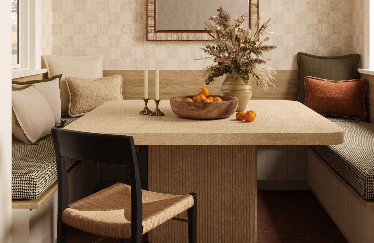
Merelle 22" x 22" Pillow Cover in Ivory and Merelle 13" x 21" Pillow Cover in Olive introduce soft contrast and layered texture, bringing warmth and a refined, inviting touch to the bench seating arrangement
Neutral Pillow Case Colors For Timeless Versatility
Neutral pillow case colors are highly adaptable because they can support different furniture styles, seasonal accents, and interior design schemes without overwhelming the room. When selected with attention to undertone, fabric texture, and contrast, whites, creams, taupes, grays, and browns can create a calm foundation that still feels layered and intentional.
White And Ivory
White and ivory pillow cases brighten sofas, beds, benches, and accent chairs by reflecting light and creating a crisp, refreshed appearance. They work especially well with darker upholstery, deep wood tones, or heavier architectural finishes because they add visual breathing room. To keep these light neutrals from feeling plain, use textured fabrics such as linen, boucle, woven cotton, or embroidery, which allow the materiality to provide depth while maintaining a clean and quiet palette.
Edward Martin’s Merelle 22" x 22" Pillow Cover in Ivory, seen above, is a strong example of how a light neutral can feel elevated through texture rather than color alone. Its ivory tone can brighten darker sofas or layered bedding, while its tactile surface adds enough dimension to keep the arrangement from looking flat. Used with deeper shades like camel, charcoal, olive, or brown, it can also act as a soft visual bridge that makes the overall pillow palette feel more refined and cohesive.
Beige And Taupe
Beige and taupe pillow cases add warmth and softness without creating strong contrast, making them ideal for living rooms and bedrooms designed around comfort and continuity. Beige feels lighter and more casual, while taupe offers a more complex neutral quality that can bridge warm and cool elements, such as gray upholstery with oak nightstands or cream seating with walnut flooring. These shades work particularly well with wood furniture, natural fiber rugs, leather seating, plaster-style walls, and warm metal finishes, especially when layered in varied textures such as flat weave, velvet, chenille, or ribbed cotton.
Gray
Gray pillow cases help ground a room without the intensity of black or the warmth of brown, making them useful in modern, transitional, and neutral interiors. Light gray can feel airy and tailored, while charcoal creates stronger definition against pale upholstery or cream bedding. Since gray can lean warm or cool, undertone matters: greige pairs well with beige, taupe, oak, and brass, while cooler gray works better with chrome, black metal, marble, slate, and blue-toned interiors. It can also act as a visual mediator, making stronger accent shades such as rust, olive, or navy feel more refined.
Brown And Camel
Brown, camel, and tobacco pillow cases bring warmth, depth, and an earth-based foundation to neutral interiors, especially rooms with leather, wood, woven fibers, stone, or organic textures. Camel can add definition to a cream sofa, while deeper brown or tobacco tones can make linen bedding or pale seating feel more layered and substantial. These shades pair well with ivory for softness, black for contrast, olive for an organic look, and rust for warmth, making them effective anchoring colors rather than simple filler tones.

Merelle 13" x 21" Pillow Cover in Navy introduces rich color and woven texture, adding depth, contrast, and a tailored accent through its distinctive stitched border
Accent Pillow Case Colors That Add Personality
Accent pillow case colors can shift the mood of a room more noticeably than neutrals because they introduce contrast, emphasis, and visual direction. When selected with intention, shades such as blue, green, terracotta, rust, and black can help decorative pillows become focal points that still feel connected to the wider interior scheme.
Blue
Blue pillow cases add color without overwhelming a room, making them a dependable choice for bedrooms, living rooms, reading corners, and family spaces. Navy brings depth and formality, slate blue feels refined, denim blue adds a relaxed quality, and soft blue creates a lighter, more restful effect. These shades work especially well in coastal, traditional, and transitional interiors, pairing naturally with white, ivory, beige, gray, and natural wood. For added dimension, combine different blue tones through linen, velvet, chambray, or woven cotton so the palette feels layered rather than flat.
Green
Green pillow cases bring a nature-inspired quality to interiors, especially in rooms with plants, wood furniture, stone surfaces, or botanical artwork. Sage feels soft and muted, olive adds warmth and depth, moss creates an earthy look, and emerald offers a richer accent when used selectively. Because green can bridge warm and cool palettes, it works well with light oak, cream upholstery, walnut, cognac leather, black metal, and woven textures. For a refined effect, use deeper greens as statement accents and softer greens for a calmer, more natural arrangement.
Terracotta And Rust
Terracotta, rust, clay, and paprika pillow cases add warmth, depth, and an earth-based richness to rooms that feel too pale, cool, or minimal. These tones pair especially well with cream upholstery, woven textures, walnut furniture, natural fiber rugs, plaster finishes, travertine, and warm stone surfaces. Terracotta also offers a softer sunbaked look, rust feels deeper and more dramatic, clay appears muted and natural, and paprika can add a livelier accent in small doses. To keep the palette polished, balance these colors with ivory, camel, olive, charcoal, or soft black.
Black
Black pillow cases create contrast, structure, and graphic definition, making them useful in rooms with pale upholstery, light walls, or mostly neutral textiles. Even a small amount of black can sharpen the overall palette and make surrounding colors feel more intentional. However, black works best in restrained doses, since too many solid black pillows can feel heavy on smaller sofas or beds. For a lighter effect, choose black accents in striped, embroidered, woven, or textured fabrics and pair them with cream, beige, camel, gray, olive, or natural linen.

Brielle 18'' x 18'' Pillow Cover in Natural / Brown adds a warm, tailored accent to the banquette seating, complementing the rich tones of the Sandro Outdoor Dining Table and enhancing the space with layered texture and inviting contrast
Matching Pillow Case Colors To Furniture And Fabrics
Pillow case colors should respond directly to the furniture they sit on, since upholstery color, fabric texture, and material finish strongly influence how each shade appears. By considering the sofa, bed, chair, or bench as the immediate backdrop, decorative pillows can enhance the furniture rather than compete with it.
White And Cream Sofas
White and cream sofas offer a flexible foundation because they can support soft neutrals, deep contrasts, and expressive accent colors. However, light upholstery often benefits from some level of color variation, so the pillow arrangement does not disappear into the seating. Ivory-on-cream can look refined when texture is the focus, but adding camel, sage, navy, rust, or charcoal introduces more dimension and helps define the furniture’s shape.
For a calm and tonal look, pair cream upholstery with ivory, oatmeal, beige, or pale taupe pillow cases in linen, boucle, or woven cotton. For a stronger designer-led palette, combine one warm shade such as camel or rust with one grounding shade such as charcoal or navy. This creates contrast without overwhelming the sofa’s clean, airy character.
Gray Sofas
Gray sofas require attention to undertone because the same pillow case color can look very different against warm gray, cool gray, or charcoal upholstery. A cool gray sofa often pairs well with blue, slate, mist, forest green, or crisp white, creating a calm and contemporary palette. A warmer gray or greige sofa can support cream, mustard, rust, camel, olive, or warm beige, which softens the seating and prevents the room from feeling too cool.
For lighter gray sofas, deeper pillow case colors such as navy, charcoal, moss, or terracotta can add structure and visual weight. Dark gray sofas, on the other hand, often benefit from lighter pillows in ivory, pale gray, warm beige, or muted blue to break up the density of the upholstery. In both cases, mixing matte, nubby, or velvet textures helps keep the arrangement from feeling flat.
Leather Furniture
Leather furniture has a strong material presence, so pillow case colors should complement both its color and its natural sheen. Brown and cognac leather pair especially well with earthy and textural shades such as cream, camel, olive, tobacco, burgundy, black, and patterned neutrals. These colors reinforce the warmth of the leather while adding softness to a surface that can otherwise feel visually firm or structured.
Texture is particularly important when styling pillows on leather seating because smooth fabrics can slide or look too polished. Linen, wool blends, heavy cotton, boucle, suede-like fabrics, embroidery, and woven patterns provide grip, contrast, and tactile depth. For a balanced arrangement, use cream or beige to brighten the leather, olive or burgundy for richness, and black or patterned neutrals for definition.
Patterned Upholstery
Patterned upholstery already carries visual movement, so pillow case colors should be chosen with restraint. Instead of introducing unrelated hues, select solid pillow cases that repeat one or two colors already present in the fabric pattern. This allows the pillows to feel connected to the furniture while giving the eye a calmer place to rest.
For example, a floral chair with soft blue and sage details may work best with solid sage or muted blue pillows, while a striped sofa with beige, charcoal, and ivory can be paired with one of those tones in a textured solid. If additional pattern is desired, keep it smaller in scale or quieter in contrast than the upholstery pattern. This prevents visual competition and helps the furniture remain the primary design feature.

Merelle 22" x 22" Pillow Covers in Terracotta, Brielle 18'' x 18'' Pillow Cover in Natural / Mustard, Merelle 13" x 21" Pillow Cover in Terracotta, and Merelle 22" x 22" Down Pillow in Tan create a warm, layered arrangement that adds rich color, soft contrast, and inviting texture in this window seating
Using Color Combinations For Layered Pillow Styling
The most effective decorative pillow arrangements usually rely on more than one color, yet they still need a clear visual relationship to feel intentional. By using established color strategies, such as monochromatic, complementary, analogous, and pattern-led combinations, pillow styling can gain depth without becoming visually crowded.
Monochromatic Pillow Combinations
Monochromatic pillow combinations use several shades, tints, or tones from the same color family to create a cohesive and sophisticated arrangement. This approach works well when the goal is calmness, restraint, and subtle dimension, such as pairing cream, oatmeal, sand, and taupe for a soft neutral story or navy, denim, slate, and pale blue for a classic layered palette. To keep the arrangement from looking flat, texture becomes essential, so mix linen, boucle, velvet, ribbed cotton, embroidery, or tonal woven patterns to create surface variation without introducing competing hues.
Complementary Color Pairings
Complementary color pairings use colors opposite each other on the color wheel to create contrast and visual energy. In pillow styling, this can be done in a refined way through restrained combinations such as blue and rust, green and blush, or mustard and violet-gray. The key is to control proportion, allowing one color to act as the dominant accent while the other appears in a smaller dose through a secondary pillow, trim, embroidery, or pattern detail. This keeps the palette lively and balanced rather than overly bold.
Analogous Color Schemes
Analogous color schemes use neighboring colors on the color wheel, creating a softer and more harmonious effect than high-contrast pairings. Combinations such as sage, olive, and moss or terracotta, camel, and warm beige work especially well in interiors with natural materials like wood, stone, linen, jute, rattan, and leather. To make the arrangement feel intentional, use one shade as the anchor, one as a supporting tone, and one as a subtle bridge, allowing the colors to feel layered without becoming repetitive.
For a warm, earth-toned arrangement like the setup above, the Merelle 22" x 22" Pillow Cover in Terracotta can serve as the main color anchor, while the Brielle 18'' x 18'' Pillow Cover in Natural / Mustard introduces a golden transitional note between terracotta and beige. To complete the grouping, the Merelle 13" x 21" Pillow Cover in Terracotta adds lumbar proportion and repeats the deeper clay tone, creating a cohesive pillow mix that feels rich, dimensional, and naturally connected.
Patterned Pillows With Solid Color Anchors
Patterned pillow cases work best when they are supported by solid color anchors that repeat one or two shades from the pattern. A bold floral, geometric, stripe, or block-print pillow can introduce movement and personality, but quieter solid pillows in linen, velvet, cotton, or boucle give the eye a place to rest. For example, a pattern with ivory, rust, and olive can be paired with solid ivory and olive cases, while a blue-and-white stripe can be grounded with denim, navy, or cream for a collected but controlled arrangement.

Merelle 13" x 21" Pillow Cover in Ivory, Brielle 18'' x 18'' Pillow Cover in Natural / Brown, and Merelle 22" x 22" Pillow Cover in Olive create a layered arrangement that adds soft contrast, earthy warmth, and inviting texture to the bedroom
Seasonal And Room Specific Pillow Case Color Ideas
Pillow case colors can be adjusted by season or by room function, allowing decorative pillows to support both mood and practical use. By selecting colors that respond to light, temperature, activity level, and atmosphere, pillows can make a space feel more comfortable, refreshed, or intimate without requiring major design changes.
Living Room
Living room pillow case colors need to balance visual presence with everyday durability because these spaces are often used for relaxing, entertaining, watching television, and gathering with family. Colors such as beige, charcoal, olive, navy, and rust are practical choices because they provide enough depth to disguise minor wear while still looking intentional and decorative. Beige and olive can soften the room, charcoal and navy can add structure, and rust can introduce warmth without feeling overly bright.
Since living rooms usually contain several large design elements, including sofas, coffee tables, rugs, media consoles, and window treatments, pillow case colors should help connect the room rather than compete with it. A neutral sofa can benefit from navy or olive for contrast, while a darker sectional may feel more inviting with beige, camel, or warm ivory. For busy spaces, mid-tone colors are especially useful because they feel polished while being more forgiving than very pale or highly saturated shades.
Bedroom
Bedroom pillow case colors should support a calmer atmosphere because the room is primarily used for rest, privacy, and restoration. Softer shades such as ivory, muted blue, sage, blush, taupe, and soft gray can help create a layered bed arrangement that feels serene rather than overstimulating. These colors work well because they have a quieter visual temperature and do not create the sharp contrast often associated with more active areas of the space.
To make the bed feel refined, combine two or three related shades instead of using too many separate colors. For example, ivory and taupe can create a warm neutral foundation, muted blue and soft gray can feel cool and tranquil, while sage and blush can add gentle color without overpowering the room. Fabric choice also matters, since linen, washed cotton, velvet, and quilted textures can make soft colors feel more dimensional and inviting.
Spring And Summer Pillow Colors
Spring and summer pillow case colors can lighten a room visually and make it feel more open, airy, and refreshed. Linen white, pale blue, soft green, butter yellow, and sandy beige are effective seasonal choices because they reflect more light and pair easily with natural materials such as rattan, light wood, seagrass, and cotton. These shades are especially useful in rooms that receive strong daylight, where deeper tones may feel too heavy during warmer months.
A seasonal update does not require replacing every pillow case. Instead, introduce one or two lighter colors into the existing arrangement to shift the mood without disrupting the entire palette. For instance, pale blue can refresh navy, soft green can brighten olive, and linen white can lift beige or camel. This approach allows the room to feel seasonally appropriate while still connected to the year-round design.
Fall And Winter Pillow Colors
Fall and winter pillow case colors can make interiors feel warmer, deeper, and more intimate as daylight becomes softer and temperatures drop. Chocolate brown, burgundy, forest green, charcoal, rust, and camel are strong choices because they add richness and visual weight to sofas, beds, and reading chairs. These tones work especially well with heavier fabrics, layered throws, warm lighting, and natural textures such as wood, wool, leather, and woven fibers.
To keep deeper seasonal colors from making the room feel too dark, balance them with lighter neutrals or reflective accents. A forest green pillow can be paired with ivory, a burgundy pillow can be softened with taupe, and chocolate brown can feel more dimensional beside camel or cream. This contrast helps preserve warmth and comfort while preventing the arrangement from feeling heavy or closed in.
The Best Pillow Case Colors Create Balance And Personality
The best pillow case colors are the ones that work with the room’s existing palette while adding the right amount of contrast, warmth, softness, or personality. Neutrals such as ivory, beige, gray, brown, and camel provide timeless flexibility, while accent shades like blue, green, terracotta, rust, and black can introduce mood and definition. At the same time, the most successful choices respond to the furniture beneath them, the undertones around them, and the level of visual energy the room needs. As a result, choosing pillow case colors becomes less about following one fixed rule and more about building a balanced palette that feels intentional, comfortable, and easy to refresh over time.
If you are ready to bring that palette to life, explore pillow case options that help refine your room through color, texture, and material detail. For personalized support, product questions, or guidance on choosing pieces that suit your space, contact us and find the right accents with confidence!