


Neutral decor depends on nuance. A room built around ivory, beige, taupe, gray, wood, stone, and soft metallic finishes can feel calm and beautifully composed, but it can also reveal every small mismatch. That is why a vase color matters more in a neutral interior than it might in a more colorful space. The vase is often one of the few decorative objects that can shift the mood of a surface without overwhelming the room.
For many people, the question is not simply whether a vase should be white, black, beige, or glass. The more useful question is what the room needs from that vase. It may need softness, warmth, contrast, height, texture, or a subtle accent that keeps the palette refined. When chosen with the surrounding materials in mind, a vase can complete a neutral room with quiet precision.

A brown floor vase adds warmth and height beside the tub, while the Gemma 55" Single Vanity in Satin Black Veneer with Carrara Marble Top and Juliet 7 x 8 Hexagon Matte Porcelain Tile in Rust create a grounded neutral palette with strong contrast.
Start With the Neutral Palette Already in the Room
A vase should not be chosen in isolation, because neutral rooms are built from many subtle color relationships. Cream walls, oak furniture, gray upholstery, marble surfaces, woven rugs, brass lighting, and black-framed mirrors can all shift how a vase color appears. Before deciding whether the vase should blend in or stand out, it helps to understand whether the room leans warm, cool, mixed, or high-contrast.
Warm Neutral Rooms: Cream, Beige, Tan, and Wood Tones
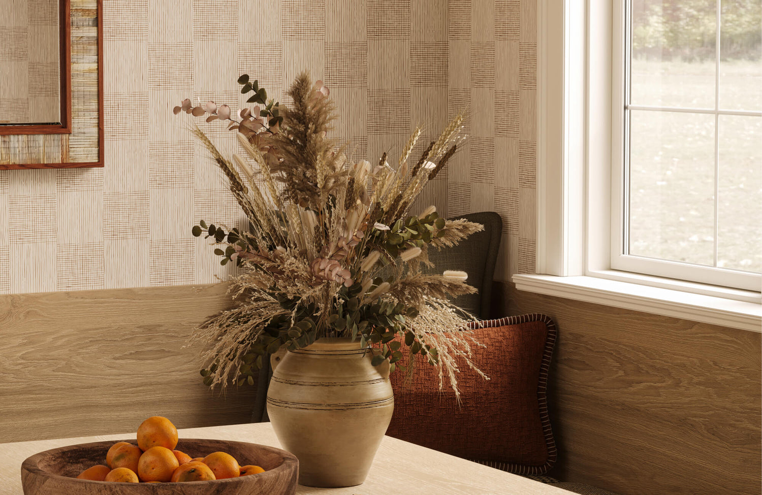
Warm neutral rooms usually feel grounded in cream, beige, sand, camel, warm white, natural wood, woven fibers, and soft brown. In these spaces, the most successful vase colors often echo the warmth already present rather than introducing a sharp or icy contrast. Ivory, cream, sand, taupe, clay, terracotta, amber, warm brown, aged brass, and bronze all feel naturally at home in this kind of palette.
For beige decor in particular, a vase with warmth and depth is usually more flattering than a stark white one. A warm ivory ceramic vase can look soft and layered, while a terracotta or clay vase can bring a more organic quality to the room. If the furniture includes oak, walnut, rattan, linen, or jute, those earthy vase colors can make the space feel more connected.
Texture is especially important in warm neutral interiors. A smooth beige vase on a beige console may feel too quiet, but a ribbed stoneware vase, speckled ceramic vessel, or matte clay form can add shadow and dimension. The color remains restrained, yet the surface gives the eye something to read.
Cool Neutral Rooms: White, Gray, Charcoal, and Silver Tones
Cool neutral rooms tend to rely on white, gray, charcoal, black, polished stone, chrome, silver, and cooler-toned fabrics. In these interiors, vase colors often work best when they either stay crisp and tonal or introduce deliberate contrast. Crisp white, soft gray, charcoal, black, smoked glass, clear glass, blue-gray, and silver-toned metal are natural choices.
A gray and white room can easily feel flat if every decorative object sits in the same pale range. A black or charcoal vase can provide definition, especially when the room already includes black window frames, dark lighting, cabinet hardware, mirror frames, or furniture legs. Smoked glass is another strong option because it adds depth while keeping the overall effect lighter than opaque black.
Cool palettes can be less forgiving with orange-heavy clay or warm terracotta unless those tones are repeated elsewhere. A single warm vase in an otherwise cool room may feel accidental. If warmth is desired, a softened bronze, muted taupe, or smoky amber often bridges the gap more gracefully.
Color accuracy also matters in cool interiors. White, gray, and metallic finishes can shift noticeably depending on daylight, bulb temperature, wall color, and nearby reflective surfaces. A vase that appears soft gray online may read blue, green, or lavender in the actual room.
Mixed Neutral Rooms: Greige, Taupe, Stone, and Layered Materials
Many refined interiors are not strictly warm or cool. They combine greige walls, taupe upholstery, oak or walnut furniture, stone countertops, brushed metal lighting, and textured rugs. These layered neutral rooms are often the most flexible, but they also require more attention to undertones.
Stone, mushroom, greige, taupe, soft brown, muted olive, matte black, and textured white vases can work particularly well in mixed palettes. These colors help bridge materials that might otherwise sit apart from one another. A taupe ceramic vase, for example, can connect gray upholstery with warmer wood furniture, while a muted olive vase can introduce color without disrupting the neutral mood.
In mixed neutral rooms, texture often becomes the deciding factor. A vase does not need to match every surface, but it should relate to at least one meaningful element nearby. That connection may come through color, finish, shape, or material. A stone-textured vase near a marble table, a matte black vase near dark metal lighting, or a warm ceramic vase beside a woven rug can all make the room feel intentionally layered.

The Cavero Decorative Vase and Rivena Vase show how texture, shape, and warm neutral color can give decorative vases visual presence without relying on bold color.
Choose a Vase Color Based on the Effect You Want
Once the room’s palette is clear, the next decision is what the vase needs to accomplish visually. In some neutral spaces, the best vase is quiet and tonal; in others, it needs to create contrast, add warmth, or introduce a restrained accent color. This is where color becomes less about matching and more about shaping the room’s mood.
For a Soft, Tonal Look: White, Ivory, Beige, Taupe, and Stone
A tonal vase is ideal when the room already has strong architecture, patterned rugs, expressive artwork, or enough contrast from furniture and lighting. White, ivory, beige, taupe, and stone-colored vases support a calm composition without pulling attention away from the rest of the room. They are especially effective in minimalist, organic modern, transitional, and serene interiors.
The important distinction is undertone. White is not always the same as ivory, and beige is not always the same as taupe. A crisp white vase can look clean and architectural in a cool white room, but it may appear too sharp against cream walls or warm oak. Ivory is softer and often more forgiving in warm interiors. Taupe and stone work well when a room combines beige, gray, and natural materials.
White vases can work beautifully in white rooms, but they need definition. A matte finish, sculptural silhouette, ribbed surface, or shadowed placement can prevent the vase from disappearing. Edward Martin's Cavero Decorative Vase demonstrates this well through its ivory tone, folded organic rim, and deeply textured surface, which give a soft neutral color more movement and dimension. The Rivena Vase offers a quieter interpretation, using a rounded beige form and carved horizontal detailing to show how a warm tonal vase can feel grounded without becoming visually heavy. Tonal styling should feel quiet, not invisible.
| Vase Color | Best For | Watch Out For |
| Matte white | Clean, simple neutral rooms | May disappear against white walls |
| Ivory | Warm, soft interiors | Can look yellow beside cool whites |
| Taupe | Layered beige or greige spaces | May feel dull without texture |
| Stone | Organic, quiet styling | Needs contrast nearby for definition |
The table shows why neutral vase colors are rarely interchangeable. A soft ivory vase and a matte white vase may both seem safe, but each one changes the temperature of the room in a different way.
For Contrast and Definition: Black, Charcoal, Dark Brown, and Bronze
A darker vase can bring structure to a neutral room that feels too pale or visually weightless. Black, charcoal, dark brown, and bronze vases create definition on coffee tables, consoles, mantels, and shelves. They give the eye a point of focus and help anchor lighter materials around them.
A black vase is not automatically too harsh for neutral decor. It becomes too harsh when it is isolated. If the room already includes black lighting, dark-framed mirrors, black furniture details, or charcoal accents in a rug, a black vase can feel purposeful. Without those connections, it may look like an unrelated object placed in the room.
Dark brown is a softer alternative when black feels too graphic. It adds depth while maintaining warmth, especially in rooms with wood, leather, woven textures, or antique brass. Bronze can achieve a similar effect with a little more reflection, making it useful in rooms where a purely matte dark object would feel too heavy.
For Warmth or Subtle Color: Clay, Amber, Olive, Sage, and Blue-Gray
Neutral decor does not require every object to be beige, white, or gray. Muted color can be one of the most sophisticated ways to make a neutral space feel personal. Clay, rust, amber, olive, sage, dusty blue, and blue-gray all introduce color while preserving a restrained palette.
Clay and terracotta are especially effective in warm neutral rooms because they add earthiness without feeling loud. Amber glass can bring a golden warmth to a room with brass lighting, oak furniture, or cream upholstery. Olive and sage work well with natural fibers, greenery, stone, and organic materials, while dusty blue or blue-gray is often better suited to cooler interiors.
The key is saturation. A muted green vase may feel calm and architectural, while a bright green vase may become the dominant accent in the room. For a neutral interior, color usually works best when it appears softened by gray, brown, clay, or smoke.

The Jaden 2.5 x 16 Glossy Ceramic Tile in Hunter adds depth behind the warm wood cabinetry, while the Savannah Counter Stool in Cream softens the kitchen’s contrast and keeps the palette balanced.
Let Material and Finish Influence the Color Choice
The same color can look completely different depending on whether it appears in matte ceramic, glossy glass, metal, stoneware, or textured clay. In neutral interiors, finish often carries as much visual weight as hue because the palette is intentionally restrained. A vase color that feels too plain in a smooth finish may feel rich and dimensional when expressed through glaze, texture, transparency, or natural variation.
Ceramic and Stoneware Vases Add Softness and Texture
Ceramic and stoneware vases are among the most versatile choices for neutral decor because they combine color with tactile presence. A matte white ceramic vase feels different from a glossy white glass vase. A speckled stoneware vessel reads differently than a flat beige one. These details matter in rooms where the palette is intentionally quiet.
Matte, ribbed, speckled, handmade, and reactive glaze finishes can prevent neutral colors from feeling flat. A taupe vase with a textured surface can create more interest than a brighter color in a plain finish. Similarly, a sculptural cream vase can work beautifully without flowers because the form and surface provide enough visual substance.
The same principle applies to natural stone and stone-like finishes. Edward Martin's Cavendry Travertine Vase Set shows how a pale beige vessel can feel architectural rather than plain when material texture carries the design. Its tall hourglass silhouettes, porous travertine surface, and side panel details create a sculptural quality that works especially well against richer surroundings, such as dark tile, warm wood, marble, and brass. The neutral color remains quiet, but the texture and vertical rhythm give the arrangement presence.
Handmade ceramics, stoneware, travertine, and reactive glazes may vary in tone, texture, and finish. That variation can be part of their appeal, but it also means the vase should be viewed in relation to nearby fabrics, tile, rugs, furniture, and lighting rather than judged by color name alone.
Glass Vases Keep Neutral Rooms Light and Flexible
Glass vases are useful when a room needs softness without additional visual weight. Clear glass, smoked glass, amber glass, frosted white, and soft gray glass can all work within neutral interiors, but each creates a different effect. Clear glass almost disappears, smoked glass adds depth, and amber glass introduces warmth through transparency.
Clear glass is especially effective on dining tables, kitchen islands, and smaller surfaces where a heavier ceramic or metal vase might feel too solid. It allows stems, water, and light to become part of the arrangement. In a neutral room, that transparency can keep the surface open and breathable.
Smoked glass is more dramatic without being as strong as black ceramic or metal. It works well in cool neutral rooms or spaces with black, charcoal, or gray accents. Amber glass feels warmer and pairs naturally with brass, oak, tan leather, and cream textiles.
| Glass Vase Color | Visual Effect | Best Use |
| Clear glass | Light, flexible, quiet | Dining tables and airy rooms |
| Smoked glass | Subtle depth and contrast | Cool neutral spaces |
| Amber glass | Warmth and reflection | Cream, wood, and brass palettes |
Glass is also more affected by what surrounds it. Wall color, table finish, water level, stems, and daylight can all influence how the vase appears.
Metal, Clay, and Natural Finishes Add Depth
Metal, clay, and natural finishes can make a neutral room feel more collected. Brass, bronze, blackened metal, terracotta, and raw clay tones bring depth through surface quality as much as color. They are particularly useful when a room feels polished but needs a more tactile or grounded element.
Metallic vases can behave like neutrals when their finish relates to lighting, mirrors, hardware, or furniture details. A bronze vase can warm up a cool palette without introducing a strong color, while a silver-toned vase can reinforce a clean, contemporary interior. The level of shine matters. A softly aged finish usually feels more relaxed than a highly polished one.
Terracotta and clay vases add warmth in a more organic way. They suit Mediterranean, rustic, organic modern, and transitional interiors, especially when paired with plaster-like walls, natural wood, woven textures, or stone surfaces. Their color is distinct, but still rooted in the natural world.

The Farrow Porcelain Vase, Large introduces pattern and scale against the Mika 2.5 x 10 Glossy Ceramic Reeded Tile in Midnight, creating a clear focal point within the neutral kitchen setting.
Match the Vase Color to Its Placement and Purpose
A vase on a coffee table does not need to behave the same way as a vase on a console, dining table, open shelf, or floor. Placement changes the amount of attention the vase receives, how much contrast it can handle, and whether it needs to function as a centerpiece or a quiet supporting object. The best color often depends on how close the vase is to other decor, furniture, lighting, and architectural finishes.
Coffee Tables, Consoles, and Entryways Need Clear Visual Anchors
A coffee table vase is usually seen in relation to other decorative objects, such as books, trays, bowls, candles, and small sculptures. Matte white, stone, black, smoked glass, and clay are strong choices because they can hold their own without feeling overly decorative. The right color depends on whether the table needs lightness, contrast, or warmth.
On a wood coffee table, stone, ivory, smoked glass, black, and terracotta can all work well. Lighter vases create a soft contrast against the wood grain, while darker vases provide a sharper anchor. Clay and warm ceramic tones can feel especially natural on oak, walnut, or reclaimed wood surfaces.
Consoles and entryways often benefit from more presence. A tall black vase, sculptural ceramic vessel, bronze finish, or earthy clay form can add height and definition near a mirror, lamp, or artwork. Since entryways are experienced quickly, the vase color should read clearly from a distance.
Dining Tables and Kitchen Islands Benefit From Flexibility
Dining tables and kitchen islands usually call for a vase color that can adapt to changing settings. Clear glass, soft white, ivory ceramic, stone, and amber glass are reliable choices because they allow flowers, branches, greenery, tableware, and seasonal decor to shift around them.
A dining table vase should not compete with place settings, lighting, or conversation. Color is only part of that decision. Height, width, and arrangement density matter as well. Tall vases can be striking on a sideboard or kitchen island, but on a dining table they should preserve sightlines across the table.
Kitchen islands can often support a more expressive vessel because they have broader surface area and are usually viewed from multiple angles. Edward Martin's Farrow Porcelain Vase, Large illustrates that balance through its rounded porcelain body, generous scale, and blue geometric linework. The pattern gives the vase definition against a light countertop, while cream flowers and surrounding neutral cabinetry keep the arrangement from feeling too forceful. It is a useful example of how a vase can introduce pattern and color while still functioning within a refined neutral setting.
Soft neutral vases are especially useful in dining areas because they remain flexible throughout the year. A clear glass vase can feel fresh with spring branches, quiet with greenery, and elegant with dried stems. A stone or ivory vase creates a more solid centerpiece without locking the room into a seasonal palette.
Shelves, Mantels, and Floor Vases Depend on Scale
Shelves require more restraint because a vase is usually one object among many. Tonal ceramic, stone, small black accents, muted green, or textured white often work well because they add depth without creating visual noise. A shelf vase should connect to nearby books, boxes, frames, bowls, or sculptures rather than stand apart from the entire arrangement.
Mantels can handle either symmetry or contrast. A pair of tonal vases can create quiet balance, while a single black, bronze, or sculptural ceramic vase can give the mantel a stronger focal point. The right color depends on the fireplace material, wall color, artwork, and lighting nearby.
Floor vases can support stronger color because they operate more like sculpture or furniture. Black, clay, stone, dark brown, and oversized ceramic finishes can ground an empty corner or soften a transition between furnishings. Since floor vases occupy more visual space, their color should relate clearly to the room’s larger palette.
| Placement | Best Vase Color Direction | Why It Works |
| Coffee table | White, stone, black, smoked glass | Creates a styling anchor |
| Console table | Tall ceramic, black, clay, bronze | Adds height and presence |
| Dining table | Clear, ivory, soft ceramic | Keeps the surface flexible |
| Open shelves | Tonal, textured, muted accents | Adds depth without clutter |
| Floor corner | Dark, clay, stone, oversized neutral | Grounds empty space |
The placement of a vase changes its visual responsibility. A small shelf vase may only need to support a composition, while a floor vase or entryway vessel may need enough color and scale to define a space.

The Celia 5 x 10 Matte Ceramic Tile in Sage and Somerset Wallpaper in Tan I, 52" x 132" frame the neutral vase arrangement with soft color, pattern, and layered texture.
Avoid Common Vase Color Mistakes in Neutral Decor
Even a beautiful vase can feel wrong when its color ignores undertones, nearby materials, or the room’s need for contrast. Neutral interiors leave less room for accidental mismatch because small differences in white, beige, gray, and brown become more noticeable. The most successful vase choices look intentional because they relate to something else in the room while still adding their own shape, texture, or visual weight.
Choosing a Vase That Disappears Completely
A tonal vase can be elegant, but it should not vanish. A white vase against a white wall, a beige vase on a beige console, or a stone vase on a similarly colored surface may lack definition if the shape and finish are too plain. In that case, the room may still feel unfinished even though the color technically matches.
The solution is not always a stronger color. Texture, scale, and silhouette can create enough distinction. A ribbed white ceramic vase may stand out more gracefully than a smooth beige one. A sculptural ivory vase with a wider body can feel more intentional than a small vessel that blends into the surface.
Edward Martin's Ingram Porcelain Vase Set offers a clear example of tonal color with enough variation to hold attention. Its rounded porcelain forms combine beige and white movement across the surface, which helps the vases separate from warm walls and wood furniture without introducing a strong accent color. The paired arrangement also adds visual mass, making the neutral vessels feel collected rather than incidental.
Greenery, branches, or dried stems can also help define a neutral vase. So can styling it on a darker tray, a stack of books, or a contrasting tabletop. Tonal styling works best when shadow, form, and material give the object presence.
Adding Contrast Without Repeating It Elsewhere
A dark vase can sharpen a neutral room, but contrast needs rhythm. If a black vase is the only dark accent in the space, it can feel abrupt. When that same tone appears in a lamp, mirror frame, cabinet hardware, rug detail, furniture leg, or artwork, the vase becomes part of a larger design language.
The same principle applies to architectural finishes. A charcoal vase can feel more resolved when it relates to a dark fireplace surround, a patterned rug, or a tile accent in an adjoining space. When planning fixed finishes, Edward Martin’s AR Visualization Tool can help preview how tile color, contrast, and finish might coordinate with furnishings and decorative objects before those choices become permanent.
Contrast should feel distributed rather than isolated. A dark vase does not need to match every element, but it should have at least one visual relationship elsewhere in the room.
Ignoring Undertones, Lighting, and Nearby Materials
Neutral colors often clash quietly. A cool white vase can make cream upholstery look yellow. A warm beige vase can look muddy beside crisp gray stone. A taupe vase may shift brown, purple, or gray depending on the surrounding materials and light.
Lighting changes these relationships throughout the day. Morning light, shaded rooms, warm bulbs, cool LEDs, glossy surfaces, and reflective glass can all affect how a vase color appears. Online images and screens may not represent exact color, finish, scale, or undertone, especially for handmade ceramics, glazed surfaces, glass, and metallic finishes.
When coordinating a vase with permanent materials, physical comparison is valuable. Tile Samples can help clarify undertone, glaze, and texture in the same lighting as nearby furniture, rugs, and decor. For rooms involving several finish decisions, such as tile, lighting, rugs, mirrors, furniture, and decorative objects, Edward Martin’s design services can support a more cohesive material and color direction. Readers who need help aligning decor choices with broader room finishes can also use the contact page for project-specific guidance.
The Best Vase Color Is the One That Completes the Room
A neutral room rarely needs a vase color chosen by rule alone. It needs a color that responds to the room’s undertone, strengthens the surface where it sits, and contributes the right amount of softness, warmth, contrast, or depth. Ivory, stone, taupe, black, terracotta, smoked glass, and muted green can all work beautifully with neutral decor when they are chosen with the surrounding materials in mind.
The strongest choice is the one that gives the room what it is missing. Tonal vases create calm when the space already has depth. Dark vases add definition when the palette feels too pale. Earthy vases bring warmth, while glass keeps a room feeling light and flexible. In a refined neutral interior, the vase does not need to dominate the design. It should make the room feel more resolved, more layered, and more intentional than it did before.