


White tiles are one of the most versatile choices in design, offering endless creative potential when paired with the right color. Whether you're working on a serene spa bathroom, a statement kitchen, or a retro-inspired floor, the color combinations you choose can significantly alter the mood and ambiance of your space. This guide explores unique angles, including the classic checkerboard layout, to help you create cohesive, balanced, and visually striking tile combinations.
Using Contrast to Build Character
Pairing white tiles with deep or vivid colors adds clarity, movement, and personality to your space. Strategic contrast helps white tiles feel deliberate and expressive, turning them from a neutral base into a defining feature of your design.
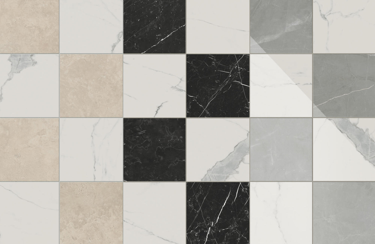
Black for Bold Clarity
Black and white is a combination that never loses its appeal. When paired with white tiles, black introduces timeless contrast and sharp definition, bringing crisp geometry to the forefront. It also works effortlessly in both modern bathrooms and vintage kitchens, adding visual clarity and depth without relying on excessive detailing. Especially if you’re leaning toward a checkerboard layout, this classic pairing delivers rhythm and confidence that anchors the entire space.
Dark Blue for Sophisticated Depth
Dark blue offers the same grounding effect as black but with a softer, more inviting feel. It brings calm and contrast without making the space feel too heavy, which also makes it especially well-suited for kitchens and powder rooms. When paired with glossy white tiles, dark blue creates a look that feels both polished and relaxed, one that stays stylish year after year.
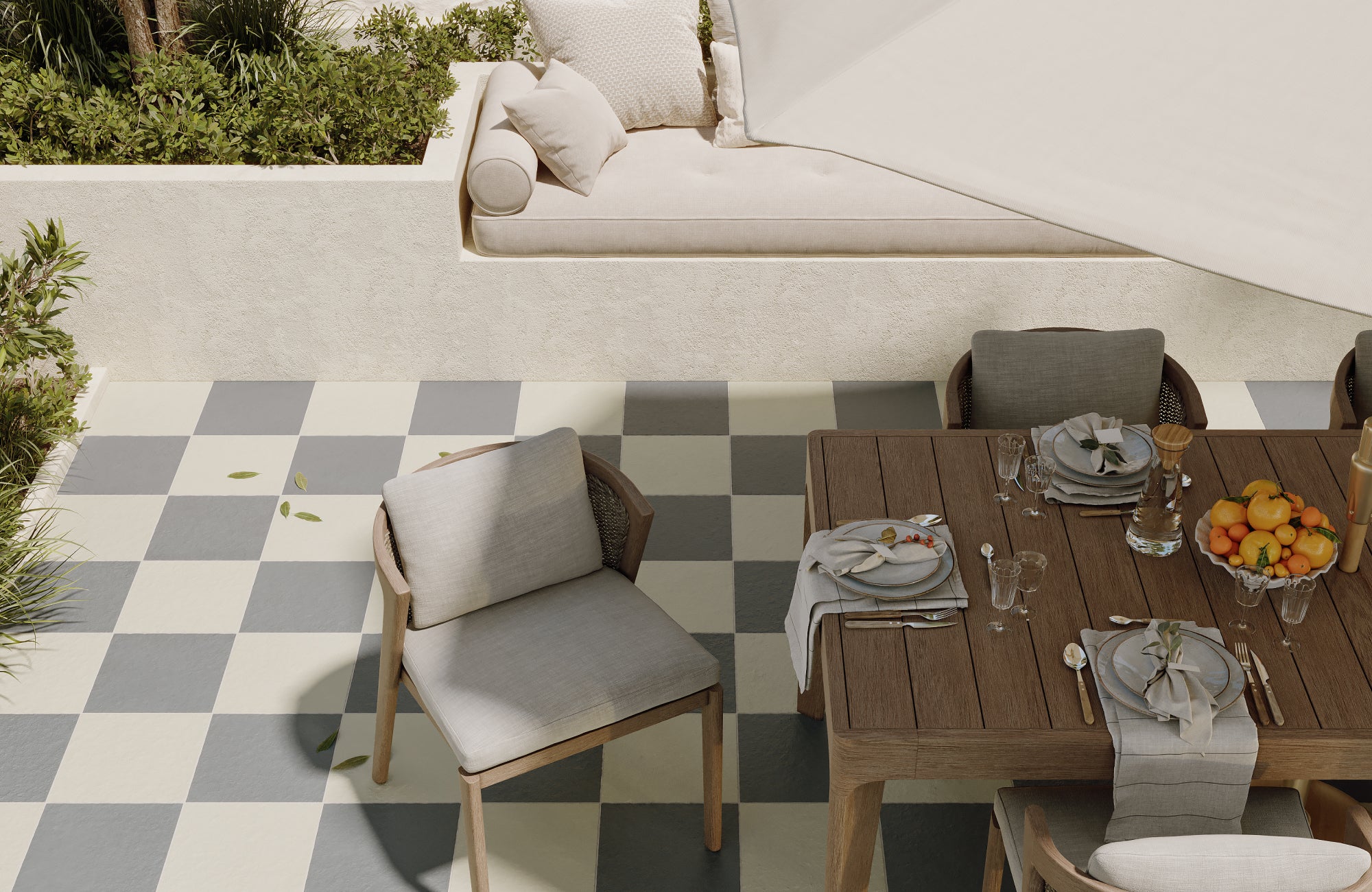
Soft Grey for Contemporary Calm
If you love a contemporary look but find black a bit too bold, grey offers a softer, more relaxed alternative. It brings just the right amount of contrast to highlight white tiles while maintaining a calm, balanced feel. In a checkerboard layout, this combination creates a clean, structured foundation that works beautifully with both indoor and outdoor settings. It also introduces texture and rhythm while still preserving an easygoing, modern atmosphere.
This aesthetic is beautifully captured in the photo above, featuring Edward Martin’s Palmer 12x12 Checkerboard Raw Porcelain Tile in White and Grey. Its raw finish adds a subtle, tactile quality that complements natural light and outdoor textures, while the color pairing keeps the space feeling fresh and refined. Whether you're styling an airy sunroom or an open-air dining area, this color combination delivers a look that’s both relaxed and thoughtfully styled.

Embracing Warm Neutrals for Subtle Contrast
White tiles don’t always need a bold companion to make an impact. Warm neutrals offer a softer approach, adding balance and a gentle sense of warmth to any tiled space.
Beige and Cream for Soft Balance
Beige and cream tones gently soften the crispness of white tile, creating a space that feels warm, airy, and inviting. This combination is especially suited to bathrooms, kitchens, or laundry rooms where you want brightness without the starkness of bold contrast. It also complements warm woods, brass fixtures, and natural textures, bringing harmony to relaxed, everyday spaces.
That balance is beautifully captured in the photo above, where Edward Martin’s Brody 24x24 Checkerboard Matte Porcelain Tile in Sand and Dune lays the foundation for a soft, tonal look. Its large format and muted palette work seamlessly with the wood cabinetry and rounded arch details, proving how a gentle checkerboard design can feel both modern and timeless.
Taupe for Versatile Sophistication
Taupe brings a soft, understated richness that enhances white tiles without overpowering them. Its balanced undertones allow it to work seamlessly with both cool and warm color palettes, making it a smart choice for transitional or mixed-style spaces. Whether used in paint, cabinetry, or stone accents, taupe paired with white tiles introduces a quiet sense of structure and style that feels both grounded and adaptable.
Terracotta for Earthy Warmth
If you're looking for a more grounded feel, terracotta tiles or accents can bring a rustic charm that pairs beautifully with white. This combination works especially well in bohemian, Mediterranean, or eclectic spaces where warmth and character are key. The rich, clay-inspired tones add depth and texture, helping soften rooms that might otherwise feel too stark or sterile.

Creating a Checkerboard Effect That Works
Checkerboard layouts bring bold, graphic structure to a space, but the color you pair with white tiles will shape the entire look and feel. From classic to playful, the right combination makes all the difference.
White and Brown
For a checkerboard pattern that feels both elegant and grounded, white and brown make a striking pair. The brown adds a warm, sophisticated contrast to the crispness of white, creating a rich look without being too bold. This combination also works well in dining rooms, entryways, or formal spaces where you want the floor to elevate the overall design without overwhelming it.
That balance is beautifully illustrated in the photo above, where the Leona 12x12 Checkerboard Polished Porcelain Tile in Calacatta and Amani Bronze sets the tone. Its polished finish reflects natural light, adding a sleek, luminous quality, while the soft veining in both tiles brings texture and depth. Paired with gold accents and sculptural furnishings, this checkerboard design delivers a look that feels timeless, layered, and intentionally refined.
White and Green
If you're aiming for a retro or mid-century vibe, pairing white tiles with forest or sage green is a stylish way to achieve it. Green brings just enough contrast to feel bold without being overpowering, adding a nostalgic charm that feels both playful and intentional. This combination also works well alongside vintage-inspired appliances, warm wood cabinetry, and brass or copper accents, helping you create a space that feels curated, inviting, and full of personality.
Muted Color Options
If you’re drawn to playful design but prefer a gentler approach, muted tones offer the perfect middle ground. Soft shades like dusty rose, pale mustard, powder blue, or even tan, such as Ellie 5x5 Matte Ceramic Tile in Tan, can bring warmth and personality without overwhelming the space. When paired with white in a checkerboard layout, these colors create a pattern that feels fresh, creative, and easy to live with.
This combination also works well in bathrooms, kids’ rooms, or any space where you want to add a touch of personality without going too bold. It brings just the right amount of color to draw the eye, while still keeping the overall atmosphere soft, balanced, and inviting.

Exploring Accent Colors for Walls and Fixtures
With checkerboard tile already establishing a bold foundation, the surrounding accents, like wall color, lighting, and hardware, play a crucial role in guiding the room’s overall tone. The right choices can either emphasize the pattern or provide visual balance, adding depth and cohesion without overwhelming the design.
Soft Pastels for Light-Filled Serenity
Soft shades like blush pink, mint green, and powder blue offer a calming contrast to the bold geometry of checkerboard tile. These gentle hues bring just enough color to soften the look without distracting from the pattern. In bathrooms or laundry rooms, pastel walls or cabinetry can also complement the tile beautifully, keeping the space feeling open, airy, and effortlessly serene.
Rich Colors for Visual Contrast
For a more dramatic approach, rich tones like emerald, burnt orange, or mustard can bring bold energy to a checkerboard layout. When used on cabinetry or accent walls, these colors can add depth and warmth that complement the tile’s clean geometry. This strategy also works well in well-lit rooms, where vibrant hues can enhance the flow of the pattern without overpowering the space.
In the photo displayed above, taupe cabinetry brings just the right amount of depth to complement Edward Martin’s Palmer 12x12 Checkerboard Matte Porcelain Tile in White and Grey. Checkerboard tile’s soft contrast pairs effortlessly with the warm, earthy tones of the cabinets, showing how even subtle, rich colors can also elevate a checkerboard floor while keeping the overall look balanced and inviting.
Metallic Accents
Finishes like brushed brass, matte black, or polished chrome offer crisp, refined detail that pairs beautifully with checkerboard tile. These metallic accents also help define the edges of a space, echoing the pattern’s geometry while bringing cohesion to elements like lighting, plumbing, and cabinetry. When thoughtfully chosen, they add just the right amount of contrast and sophistication without overwhelming the room’s overall design.

Coordinating Checkerboard Tiles With Room Layout and Decor
Checkerboard patterns naturally draw the eye, so the surrounding layout, furniture, and styling should support the look rather than compete with it. When thoughtfully balanced, the result is a space that feels cohesive and well-composed, allowing the checkerboard tile to stand out effortlessly.
Neutral Furniture for Balance
In rooms with checkerboard flooring, furnishings should provide gentle contrast to keep the pattern from feeling overwhelming. Natural wood, soft upholstery, and muted finishes can also help ground the space while allowing the tile to remain a focal point. This creates visual balance and keeps the overall design clean and inviting.
That effect comes through beautifully with Edward Martin’s Leona 24x24 Checkerboard Matte Porcelain Tile in Calacatta and Amani Grey, as shown in the photo above. Checkerboard tiles’ neutral tones pair effortlessly with warm brown chairs and a matte black dining table, showing how understated elements can complement a bold floor without overshadowing it.
Avoiding Pattern Clutter
Checkerboard tile already makes a bold visual statement, so it’s best to keep surrounding patterns to a minimum. Opt for solid-colored rugs, curtains, and upholstery, or stick with subtle textures that won’t compete for attention. This restraint allows the tile to take center stage while maintaining a calm, cohesive atmosphere. By creating visual breathing room, you can also help the checkerboard pattern shine without overwhelming the space.
Color Echoing for Harmony
Pulling one of the checkerboard tile colors into other elements of the room, such as a chair leg, picture frame, or lamp base, can help tie the space together. These subtle echoes can create a sense of unity and rhythm without making the design feel overly coordinated. It’s also an easy yet effective way to extend the color story throughout the room while keeping the palette cohesive and thoughtfully layered.
Choosing the Right Color for White Tiles
Choosing the right color to pair with white tiles isn’t just about what looks good; it’s also about setting the tone, flow, and overall feel of your space. Whether you’re drawn to bold checkerboard patterns or prefer a softer, more minimalist look, white tiles offer a clean, timeless foundation that works across a wide range of styles.
If you’re not sure where to begin, our design team is here to help you find the perfect palette to bring your vision to life. With the right combination of colors, you can highlight the beauty of white tiles and create a space that feels balanced, welcoming, and distinctly yours. Contact us today to get started on your design. We’re here to guide you every step of the way!