


A backsplash is more than a practical surface. It is a defining element of a kitchen’s visual language, bringing together color, texture, and light to create a space that feels cohesive, expressive, and refined. The enduring appeal of white, along with the growing allure of gray, beige, and blue, reflects how color choices interact with material finishes, spatial dynamics, and psychological influence. These elements shape not only aesthetics but also the way a kitchen feels and functions.
Thoughtfully structured and grounded in design expertise, this article offers inspiration and clarity for homeowners, designers, and renovation professionals. It sets the foundation for making choices that elevate the everyday and define the heart of the home.

White as the Standard
White remains the most widely used backsplash color because of its unmatched adaptability, high light reflectance, and timeless visual appeal. It continues to dominate residential and commercial kitchen spaces across a wide range of design styles and market segments.
Dominant Use in Projects
White backsplash tiles are featured in over 70 percent of kitchen renovations, highlighting their popularity across demographics. Builders, designers, and real estate professionals prefer white because it appeals to a broad buyer base. This color offers a safe design choice that complements nearly any kitchen style, from traditional to contemporary. Its consistent popularity also makes it a reliable choice for maximizing resale value in both new builds and remodels. The widespread use of white ensures visual consistency across housing markets. As a result, it remains the default choice for mass appeal and return on investment.
Enhancing Space and Light
White’s high Light Reflectance Value (LRV) helps distribute both natural and artificial light throughout the kitchen. This effect is especially valuable in galley kitchens, narrow layouts, or spaces with minimal daylight. The reflective properties of white tiles can create a more open, airy atmosphere. This contributes to the perception of cleanliness, spaciousness, and efficiency. Combined with strategic lighting, white backsplashes improve visibility during food preparation and cooking. These functional benefits also make white a practical and aesthetic solution for many kitchen environments.
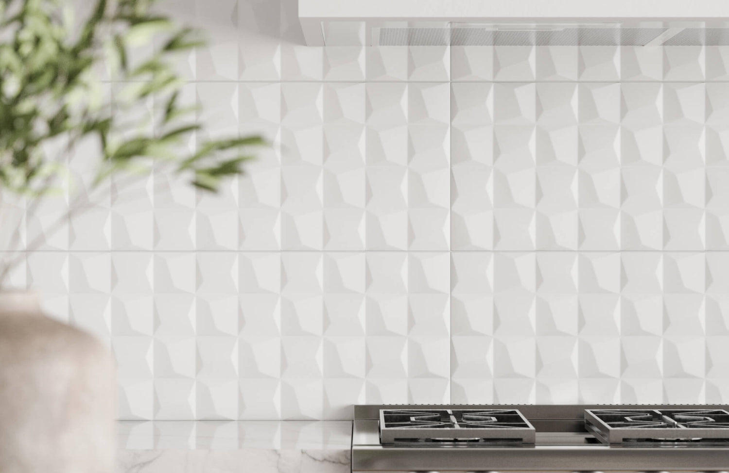
One particularly effective choice in this regard is Edward Martin’s Zayne 12x36 Matte Ceramic Tile in Blocks, as shown in the photo above. While matte in finish, its large-scale geometric block pattern enhances surface depth and subtly captures ambient light, reinforcing spatial clarity without overwhelming brightness. Its sculptural surface adds dimensionality, making even compact kitchens feel architecturally enriched and well-lit. This tile’s design synergy with contemporary layouts and its ability to subtly enhance luminosity make it an ideal option for achieving both spatial expansion and design distinction.
Seamless Visual Integration
White backsplashes act as visual anchors that unify diverse materials, finishes, and textures in the kitchen. They coordinate effortlessly with different cabinet styles, countertop surfaces, and hardware finishes. This makes them particularly useful in transitional designs that blend old and new aesthetics. Their neutral tone avoids overpowering other design elements, allowing features like open shelving or statement lighting to stand out. White tiles also offer design consistency, especially in kitchens that use mixed metals or contrasting materials. This visual harmony helps establish a cohesive and balanced interior.

Versatility in Styling
White backsplashes offer superior design flexibility and harmonize with nearly any material palette, hardware selection, or design concept. They function as either a visual anchor or a supporting backdrop in both restrained and expressive kitchens.
Matches with All Countertops
White tiles adapt seamlessly to a variety of countertop materials, including quartz, granite, marble, and concrete. When paired with dark counters, white offers contrast that enhances spatial depth and visual interest. For lighter counters, it supports a seamless, monochromatic aesthetic that appears clean and continuous. In natural stone applications, white backsplashes highlight the unique veining and pattern of the surface. This ability to complement or contrast gives white a wide range of styling options. Its compatibility across countertop finishes ensures long-term design cohesion.
Supports Colorful Cabinetry
As vibrant cabinet finishes gain popularity, white backsplashes help balance strong color statements. Rich tones like dark blue, hunter green, and gray benefit from a crisp white backdrop that lightens the overall palette. White tiles provide visual breathing room, ensuring bold cabinetry doesn’t overwhelm the space. In two-tone kitchens, white backsplashes act as a neutral buffer between upper and lower cabinets. They also highlight hardware details, crown molding, and paneling by providing a clean, uninterrupted canvas. This balance enhances color confidence without compromising design clarity.
Fits All Design Styles
From minimalist modern kitchens to vintage or industrial aesthetics, white backsplashes adapt to nearly any interior design scheme. Clean lines and simple layouts pair well with contemporary environments, while textured or handmade white tiles add charm to traditional spaces. Layout patterns such as herringbone, chevron, or vertical stack add depth without changing the color. These variations introduce movement and texture, enhancing visual dynamics. White’s neutrality also allows it to blend into the background or stand out, depending on finish and format. Its versatility ensures relevance across trends and periods.

Neutral Color Alternatives
Gray, greige, and off-white tones offer subtle variations on classic neutrals, appealing to homeowners who seek warmth and sophistication without sacrificing adaptability. These colors deliver tonal richness and expand the backsplash palette while preserving flexibility.
Gray for a Modern Look
Gray backsplashes have grown in popularity due to their clean, modern appearance and subdued tone. Light grays work well in Scandinavian and minimalist interiors, while charcoal tones bring depth to contemporary spaces. The neutrality of gray allows it to pair effectively with stainless steel, black fixtures, and cool-toned countertops. Glossy or matte finishes can dramatically affect how gray tiles absorb or reflect light. This color also masks dirt and water marks better than stark white, improving practicality. As a result, gray offers a modern yet low-maintenance alternative to traditional backsplash colors.
A standout example of this trend is the Natasha 2x6 Glossy Porcelain Tile in Fog, as displayed in the picture above. With its soft, misty hue and glossy surface, the tile embodies the elegance and functionality of modern gray design. Its reflective finish also enhances brightness while maintaining the understated sophistication that gray is known for. The slim 2x6 format allows for creative layout patterns such as vertical stacks or herringbone, contributing both visual rhythm and contemporary flair. Ideal for kitchens seeking a refined yet expressive look, this Natasha tile elevates gray from simple neutral to a deliberate, style-forward statement.
Greige for Warmth
Greige blends the coolness of gray with the earthiness of beige, creating a warm and balanced neutral. This color suits farmhouse, rustic-modern, and transitional kitchen designs that lean into organic materials and finishes. Textured tile options like tumbled stone or handcrafted ceramics also elevate greige’s natural appearance. It pairs beautifully with wood cabinetry, matte black accents, and brass fixtures. Greige backsplashes bring a soft, grounding effect that enhances cozy, inviting interiors. Their rising popularity reflects a shift toward comfort-driven, nature-inspired aesthetics.
Off-White in Traditional Kitchens
Off-white tones like ivory, linen, and cream offer a softer alternative to pure white. These colors complement antique brass, oil-rubbed bronze, and other warm-toned metals. In heritage or classic kitchens, off-white adds historical character and visual warmth. Slight color variation in handmade or marble-effect tiles also enhances texture and depth. These tones work well in kitchens that aim for an aged, refined, or vintage-inspired look. Off-white tiles maintain brightness without the sterility of stark white, providing a timeless balance.

Impact of Material and Finish
The appearance and functionality of backsplash color are strongly influenced by material composition, surface treatment, and grout details. These technical factors shape visual intensity, tactile appeal, and maintenance outcomes.
Glossy vs Matte Effects
Glossy tile finishes reflect light and create a clean, sleek look that enhances white and light-colored backsplashes. These tiles amplify brightness and are ideal for smaller or darker kitchens where illumination is crucial. Matte finishes, by contrast, offer a more muted and tactile appearance suited to rustic, farmhouse, or Scandinavian interiors. The choice between glossy and matte impacts not only aesthetics but also maintenance and visibility of smudges. Glossy tiles show more water spots and fingerprints, while matte surfaces offer a more forgiving texture. Understanding finish performance helps achieve both functional and visual goals.
Material Texture and Tone
Tile material affects how backsplash color is perceived under different lighting and design conditions. For instance, glass tiles tend to deepen color saturation and boost reflectivity, making whites and blues appear more vivid. In contrast, ceramic tiles offer a consistent tone and finish across installations, providing a clean, uniform look. Porcelain tiles, known for their density and smooth surface, deliver a refined matte or polished finish that enhances both modern and classic kitchen styles. On the other hand, natural stone tiles like marble or travertine introduce organic variation and complex undertones. Taken together, these material differences contribute to the depth, richness, and texture of the final backsplash effect. As a result, selecting the right material enhances the expression of color and the overall kitchen atmosphere.
Grout as a Visual Tool
Grout color and joint spacing significantly influence the look of a tiled backsplash. For a clean, uninterrupted appearance, matching grout creates a seamless, continuous surface that emphasizes color uniformity. In contrast, contrasting grout, such as black with white tiles, adds definition and draws attention to the tile pattern. This approach is particularly effective in geometric or stacked layouts, where lines are an intentional part of the design. Alternatively, medium-tone grout offers a practical middle ground, balancing durability and aesthetic appeal in busy kitchens. Ultimately, whether subtle or bold, grout choice plays a critical role in shaping the backsplash’s final visual impact.

Context and Coordination
Backsplash color should not exist in isolation—it must serve as an integral component within a larger design ecosystem. In well-executed kitchens, the backsplash acts as a connective tissue that binds disparate visual elements into a cohesive narrative.
Visual Hierarchy and Flow
Understanding how the eye travels across the kitchen is critical in designing for cohesion.
The kitchen is a layered visual field, and the backsplash sits at the intersection of vertical and horizontal planes. Its color and material should be selected to guide the eye, either by creating continuity or deliberate contrast. White backsplashes, in particular, are frequently used to stretch vertical sightlines, especially in darker or more compact kitchens. Light backsplashes extend sightlines in kitchens with dark flooring or cabinetry, while darker backsplashes can anchor light, minimalist schemes. Strategic alignment between countertop edge, backsplash height, and cabinet elevation also enhances rhythm and movement within the space. When visual hierarchy is respected, the kitchen reads as calm and intentional rather than chaotic.
Transitional Zones and Framing
The backsplash also plays a functional role as a transitional surface that unifies neighboring design elements. Backsplashes operate as transitional surfaces, especially in two-tone or mixed-material kitchens. They mediate between upper and lower cabinetry, or between counters and open walls, creating visual handoffs that support spatial logic. A white or soft neutral tile often serves as a neutral bridge in these layered designs, maintaining clarity between zones. In open-concept homes, the backsplash can even serve as a boundary marker, framing the cooking zone without erecting physical dividers. Choosing a backsplash that shares undertones or finishes with both neighboring surfaces helps establish soft boundaries and prevent abrupt visual breaks. This transitional role is key in achieving architectural fluency.
Texture, Scale, and Composition
Coordination isn’t just about color; it’s about how the backsplash contributes to the kitchen’s overall compositional balance. Rather than focusing solely on finish type, this dimension considers how tile size, pattern layout, and material expression influence the kitchen’s visual architecture.
Large format tiles can simplify the visual field by reducing grout lines, making them ideal for modern, minimalist spaces. When executed in white or off-white, they maintain brightness while softening visual noise. In contrast, smaller tiles, especially in herringbone, chevron, or stacked layouts, add rhythm and complexity, pairing well with simple cabinetry to introduce depth. Subtle textures or dimensional patterns enrich the tactile language of the space without overwhelming it.
These layout and scale choices influence how the backsplash interacts with adjacent surfaces, such as countertop thickness or cabinet frame size. When coordinated well, they contribute to a feeling of proportion and spatial clarity. Texture, when used thoughtfully, becomes a design tool that reinforces the kitchen’s structural rhythm and layered visual identity.
To support these nuanced design decisions, Edward Martin’s Augmented Reality (AR) tool allows users to preview tile selections in real-time, directly within their kitchen environment. This immersive experience helps homeowners and designers assess how backsplash colors, finishes, and textures interact with surrounding cabinetry, countertops, and flooring before making final choices, ensuring visual harmony and spatial coherence from the start.

Color Psychology and Preferences
Backsplash color decisions are shaped by subconscious emotional triggers, regional styles, and lifestyle needs. Understanding these psychological and cultural patterns provides insight into why certain colors continue to lead or gain favor.
Emotional Response to White
White evokes feelings of cleanliness, order, and freshness—qualities essential to a kitchen’s function. It aligns with perceptions of hygiene and safety, making it an intuitive choice for food preparation areas. Beyond its practical appeal, the color also reflects simplicity and stability, helping to reduce visual noise and enhance mental clarity. These traits resonate strongly with homeowners who prioritize functionality and a sense of calm in their living spaces. As a result, the psychological comfort offered by white continues to support its widespread popularity across demographics. This emotional reassurance solidifies white as a foundational design element in kitchen planning.
Influence of Age and Region
Color preferences often vary based on demographic and regional influences. Younger homeowners are generally more inclined to experiment with bold or moody tones, adding a sense of personality and trend-forward style. In contrast, older buyers tend to favor whites and soft neutrals, appreciating their timelessness and calming effect. Regional aesthetics also play a significant role: coastal and Mediterranean areas typically gravitate toward whites and blues that echo the surrounding landscape, while southwestern and mountain regions lean into warm, earthy hues like terracotta and greige. Both cultural traditions and climate influence how color is perceived and applied in design. Together, these factors shape dynamic and evolving regional backsplash trends.
Reflecting this regional affinity for grounded, nature-inspired palettes, our Harley 3x12 Polished Porcelain Tile in Greige, as displayed in the picture above, embodies the kind of soft elegance favored in rustic-modern and transitional kitchens. Its warm, greige tone bridges cool and earthy aesthetics, making it particularly appealing in regions where organic textures and tonal depth are valued. The polished finish also adds a refined surface sheen that elevates greige from casual to sophisticated, aligning with the preferences of homeowners who desire warmth without sacrificing visual clarity. This tile resonates with regional styles that prioritize comfort, harmony, and timeless appeal.
Practicality and Resale Considerations
White and neutral backsplashes are preferred by real estate professionals for their broad marketability. They help potential buyers imagine their own style within a clean, neutral palette. Light colors also photograph well and make listing images more appealing. For homeowners planning to sell, white backsplashes offer a safe, low-risk investment. Their long-term viability and timelessness minimize the need for costly future updates. As a result, white continues to dominate for both personal use and real estate strategy.

Blue as a Rising Trend
Blue is emerging as a preferred backsplash color in both accent applications and full-scale designs. It brings emotional richness and visual character while retaining enough versatility to blend into a wide range of interiors.
Role in Modern and Coastal Design
Blue tiles are increasingly used in coastal, transitional, and modern classic kitchen designs. Pale sky blue evokes feelings of openness and relaxation, making it particularly suited to bright, light-filled spaces. On the other hand, deeper shades like dark blue and blue-violet introduce drama and elegance, often elevating high-end interiors with a touch of sophistication. Drawing from nature, blue also reflects elements such as the sea and sky, aligning seamlessly with biophilic design principles. Its broad tonal range allows it to complement a variety of aesthetics, from soft, calming neutrals to bold, high-contrast pairings. As more homeowners look to express personality through design, blue continues to rise in popularity as a statement color that remains both approachable and refined.
A notable example of this rising trend is Edward Martin’s Natasha 2x6 Matte Porcelain Tile in Denim, as shown in the photo above. With its rich yet calming blue tone and soft matte finish, this tile brings depth and tranquility to contemporary kitchens. The compact 2x6 format lends itself well to creative layouts, making it a versatile option for backsplashes that quietly command attention. Blue, in this application, feels grounded yet expressive—an ideal hue for evoking both serenity and structure. Whether used as a full installation or an accent feature, this tile blends naturally into environments that celebrate light, airiness, and subtle coastal influence. Its shade of blue also offers a modern nod to tradition while encouraging a confident, layered palette.
Accent Use and Feature Walls
Blue is often employed as an accent color behind ranges, sinks, or within open shelving niches, where it adds depth without overwhelming the space. Glossy blue subway tiles create vibrant focal points that catch the light and infuse the kitchen with energy and movement. In contrast, matte or handmade blue tiles introduce a rustic, artisan quality, making them well-suited for bohemian or cottage-inspired designs. Designers frequently pair blue backsplashes with white cabinets to create a striking contrast and elevate the overall composition. When used thoughtfully, blue adds visual interest and character while maintaining a sense of balance, making it an ideal choice for kitchens that seek both creativity and control.
Compatibility with Finishes
Blue pairs well with a wide range of finish materials, including brushed brass, polished chrome, and natural wood. In kitchens featuring marble countertops, blue veining can be subtly echoed through tile selection, creating a cohesive and intentional design narrative. Cooler shades of blue harmonize effortlessly with stainless steel and aluminum hardware, while warmer tones complement gold and bronze accents with equal elegance. The undertone of the blue, whether cool, dusty, or deeply saturated, also plays a key role in determining its compatibility with surrounding elements. This inherent flexibility gives blue strong integration potential across diverse kitchen palettes. As finish options continue to expand, blue remains a dynamic and adaptable choice for backsplash design.
Why White Leads and What’s Next
White remains the most popular and strategic backsplash color due to its versatility, brightness, and universal appeal. However, evolving consumer tastes and the desire for personal expression are driving interest in subtle neutrals and expressive hues, particularly blue, which offers both tranquility and character. From soft coastal tones to deeper, more dramatic shades, blue is gaining traction as a sophisticated alternative that still harmonizes with a wide range of design styles.
To ensure every element in your space aligns seamlessly, consider working with Edward Martin’s design services. From selecting the perfect backsplash material to harmonizing cabinetry, lighting, and layout, our team is here to help you shape a space that feels as thoughtful as it is beautiful. Because great design isn’t just seen—it’s felt!