Choosing tile can feel straightforward at first, especially when browsing beautifully styled showroom displays or polished online product images. However, tile often changes dramatically once it is placed inside an actual living environment where lighting, surrounding materials, grout color, and surface texture all interact differently. A tile that appears warm and inviting online may look cold beside your cabinetry, while a finish that seems elegant in a showroom can become overly reflective under residential lighting. Because tile is a long-term design investment, relying on a single sample or digital image can lead to costly and frustrating mistakes.
Ordering multiple tile samples allows you to make a far more informed and confident decision before installation begins. By comparing different finishes, scales, patterns, and undertones directly within your space, you gain a clearer understanding of how each option performs both visually and functionally. In addition, reviewing several samples side by side helps narrow your design direction more effectively while ensuring the final selection complements your lighting conditions, furnishings, and architectural style.

Getting samples of Harper 3x12 Glossy Ceramic Tile in Basil helps reveal how its subtle tonal variation interacts with surrounding finishes like the Astrid 24x48 Polished Porcelain Tile in Oyster on the lower wall surround and Tatum 1x3 Matte Porcelain Mosaic Tile in Vein Cut Dune across the shower floor
Why Viewing Multiple Tile Samples Improves Decision Making
Ordering multiple tile samples provides a clearer and more reliable way to evaluate how materials will behave once installed inside a real environment. Instead of depending entirely on digital renderings or showroom displays, you can compare finishes, undertones, and textures directly within the room where the tile will ultimately be used.
Understanding Color Variation Between Samples
Tile color rarely appears exactly the same in person as it does online because photography, monitor calibration, and lighting conditions all influence visual perception. Natural materials such as marble, limestone, travertine, and slate contain inherent shade variation, veining, and mineral movement that may only become noticeable when several samples are viewed together. Even manufactured ceramic and porcelain tiles can differ slightly depending on production batch, glaze application, and print technology.
Undertones are also important when coordinating tile with existing finishes. A tile that initially appears bright white may reveal warm cream, gray, beige, or even green undertones once placed beside cabinetry, countertops, or painted walls. Comparing tile samples directly within the intended space helps reveal these tonal changes more accurately before making a final decision.
For the most accurate assessment, place samples in the exact room where the installation will occur and observe them under changing lighting conditions throughout the day. Positioning samples both vertically and horizontally can also help simulate how the tile will appear once installed across walls or floors.
Identifying Texture and Finish Differences
Tile finish significantly affects both visual appearance and day-to-day functionality, which makes handling multiple samples essential before making a final selection. Matte finishes diffuse light softly and create a more understated appearance, while polished surfaces reflect light aggressively and often feel brighter or more formal. Honed finishes offer a low-sheen alternative that balances softness with subtle refinement, whereas textured surfaces add dimension and tactile depth.
Surface texture also influences maintenance requirements and practicality. Glossy tiles may be easier to wipe clean on backsplashes, yet they can highlight fingerprints, water spots, and glare more visibly. Textured tiles can introduce warmth and architectural detail, although heavily structured surfaces may trap residue or require more detailed cleaning in moisture-prone environments. Testing samples by touch and under direct lighting helps reveal how visible marks, reflections, and texture variations may become over time.
Preventing Expensive Design Regrets
Ordering several tile samples helps prevent costly mistakes that often occur when selections are made too quickly or based solely on online images. A tile that seems neutral in a product photo may look noticeably yellow beside cool-toned countertops, while a polished surface that appears elegant digitally may create excessive glare beneath bathroom lighting. Reviewing multiple samples together allows you to identify these problems before installation begins.
Physical samples also improve communication with contractors, installers, and design professionals by providing a concrete reference point for grout color, layout direction, edge trim, and finish coordination. Investing in a few extra samples early in the planning stage can ultimately prevent expensive replacement costs, installation delays, and long-term dissatisfaction with the finished space.

Observing how artificial lighting from the Oswald Pendant in Dusty Iron interacts with samples of Juliet 7x8 Hexagon Matte Porcelain Tile in Rust alongside the effects of natural daylight makes it easier to see how the tile’s earthy undertones, matte texture, and terracotta-like surface shift throughout the space
How Lighting Changes the Appearance of Tile Samples
Lighting has a direct influence on how tile color, finish, and surface texture are perceived throughout the day. Testing multiple samples under realistic lighting conditions helps ensure the chosen material maintains a consistent and desirable appearance once installed.
Evaluating Samples in Natural Daylight
Natural daylight provides one of the most accurate ways to evaluate tile because it reveals undertones and surface characteristics more clearly than artificial lighting. However, daylight shifts continuously depending on room orientation, weather conditions, and time of day. East-facing spaces, for instance, often receive cooler morning light, while west-facing rooms develop warmer tones later in the afternoon, causing the same tile to appear noticeably different within a single day.
Sunlight also enhances texture visibility and pattern variation. Veining, marbling, and surface relief often become more pronounced in direct daylight because shadows and highlights create stronger contrast across the tile surface. Softer ambient daylight, however, may reduce pattern intensity and create a calmer overall appearance.
To evaluate samples properly, place them near windows during morning, afternoon, and evening hours. Observing the tile under changing daylight conditions provides a more accurate understanding of how the material will behave once installed permanently.
Comparing Tiles Under Artificial Lighting
Artificial lighting changes tile appearance significantly because each light source produces a different color temperature and intensity. Warm lighting enhances earthy and beige undertones, while cooler lighting often sharpens grays, whites, and blue-based hues. These differences become especially noticeable in kitchens, bathrooms, and living spaces where tile is frequently viewed under artificial illumination during evening hours.
Layered lighting systems further influence perception by creating varied shadowing and reflection across the tile surface. Recessed lighting may intensify shine directly beneath fixtures, while under-cabinet lighting can highlight backsplash texture and grout joints more dramatically. Testing tile samples beneath the exact fixtures planned for the space helps identify which finish and color maintain the most balanced appearance under everyday conditions.
Understanding Gloss and Reflection Levels
Gloss level affects how aggressively tile interacts with light, making finish selection an important part of the evaluation process. Polished and glossy tiles reflect light strongly, which can brighten a room and create a more luxurious appearance. However, increased reflectivity may also amplify glare, reveal smudges, and highlight surface imperfections under concentrated lighting.
Matte and low-sheen finishes behave differently because they diffuse light rather than mirror it directly. This softer effect reduces glare and often creates a calmer, more natural atmosphere that works particularly well in contemporary interiors, spa-inspired bathrooms, and expansive floor installations. Reviewing samples from multiple viewing angles under both direct and indirect light helps determine whether the finish supports the desired atmosphere and maintenance expectations.

Comparing samples of Marlow 24x48 Grip Porcelain 2cm Paver Tile in Titanium alongside existing furniture such as the Kendra Outdoor Dining Chairs in Natural and the Verdanta Outdoor Dining Table in Aged Grey allows a clearer understanding of how its warm undertones and travertine-inspired pattern interact across the overall palette
Comparing Tile Samples with Existing Materials
Tile should never be selected independently from the surrounding finishes already present in a room. Comparing samples beside cabinetry, paint, fixtures, fabrics, and countertops helps ensure the final installation feels cohesive rather than visually disconnected.
Matching Tile Samples with Cabinetry and Countertops
Cabinetry and countertop materials strongly influence how tile undertones are perceived. Warm wood stains can intensify beige or cream undertones within tile, while cool painted cabinetry may make the same tile appear sharper or more gray. Stone countertops also introduce additional complexity through veining, reflectivity, and mineral movement that can either harmonize with or compete against the tile pattern.
For a more accurate comparison, place tile samples directly beside cabinet doors, countertop remnants, or painted surfaces instead of reviewing them separately. Evaluating the materials together under the room’s actual lighting conditions helps reveal which combinations create the strongest visual balance.
Coordinating Samples with Wall Colors and Decor
Wall paint, textiles, and decorative accents can dramatically alter how tile color is interpreted within a space. Even neutral tiles may appear warm, cool, creamy, or muted depending on nearby furnishings and surrounding color palettes. A soft greige tile, for example, may look warm beside beige upholstery but noticeably cooler near crisp white walls.
To avoid visual inconsistency, compare tile samples alongside planned fabrics, rugs, paint swatches, and decorative materials whenever possible. Viewing the tile within the broader design composition helps determine whether it supports the intended atmosphere while maintaining continuity throughout the room.
Testing Samples Against Metal and Fixture Finishes
Metal finishes introduce additional warmth, coolness, and contrast into a space, which directly affects how tile undertones are perceived. Brass and gold hardware typically emphasize warm tones, while chrome and polished nickel sharpen cooler hues and marble-inspired surfaces. Matte black fixtures, on one hand, often create stronger visual definition by increasing contrast between the tile and surrounding finishes.
Because these interactions become highly visible in kitchens and bathrooms, testing samples beside faucets, cabinet pulls, lighting fixtures, and plumbing trim is essential. This comparison process helps identify which tile tones remain balanced across multiple finish types and prevents unexpected clashes once installation is complete.

Having multiple samples of Isabel 2.5x12 Matte Porcelain Tile in Rust together helps in seeing its tonal variation and deciding on the right grout color and spacing across expansive spaces
Why Tile Size and Pattern Require Multiple Samples
Tile scale and pattern repetition often appear very different once installed across a larger surface compared to how they look in a single sample piece. Viewing several samples together provides a clearer understanding of layout flow, grout interaction, and visual balance before installation begins.
Understanding Pattern Variation Across Multiple Tiles
Many tile collections intentionally include pattern variation to create a more natural and realistic appearance. Marble look porcelain, terrazzo surfaces, and decorative printed tiles often feature shifting veining, tonal movement, and graphic variation that cannot be fully understood through a single sample.
This variation becomes especially important across expansive surfaces such as shower walls, open floors, or full-height backsplashes where repeated patterns may become visually obvious. Arranging several samples side by side allows you to evaluate whether the collection feels balanced, overly repetitive, or excessively dramatic once repeated across a larger area.
To better assess pattern flow, rotate samples in different directions and position them according to the planned installation layout. This process reveals how movement transitions across grout joints and whether the overall composition supports the intended aesthetic.
Visualizing Grout Lines and Tile Spacing
Grout color and spacing significantly affect the final appearance of tile layouts because they influence visual continuity and pattern definition. Light grout often creates a softer and more seamless appearance, while darker grout emphasizes tile shape and layout geometry more aggressively.
To simulate the finished installation more accurately, tape multiple tile samples together using realistic grout spacing. Comparing grout options beside the samples also helps determine whether the layout will feel cohesive, graphic, subtle, or visually busy once installed.
Comparing Large Format and Small Format Tile Samples
Tile size directly affects room proportion, visual continuity, and maintenance requirements. Large format tiles create fewer grout joints, which can make rooms feel cleaner, more open, and visually streamlined. Smaller tiles, however, introduce additional texture, craftsmanship, and decorative detail through increased grout definition and pattern repetition.
When evaluating scale, consider the dimensions of the installation area as well as the overall architectural proportion of the room. Oversized tiles may overwhelm narrow backsplashes or compact powder rooms, while extremely small tiles used across expansive floors can create visual fragmentation and require more grout maintenance over time.

Yanna Dining Chairs in Matte/Bone and the Selena 55" Outdoor Dining Table in Cream pair effortlessly with the Leona 12x12 Checkerboard Polished Porcelain Tile in Marfil and Amani Bronze flooring, demonstrating how narrowing tile samples to a focused palette of warm neutrals and earthy tones can create a more cohesive and visually balanced space
Managing Sample Selection Without Feeling Overwhelmed
Ordering multiple tile samples can improve confidence during the selection process, although reviewing too many unrelated options at once often creates confusion rather than clarity. Establishing a structured comparison method helps simplify evaluation and keeps the focus on materials that genuinely support the room’s design goals.
Limiting Samples to a Focused Color Palette
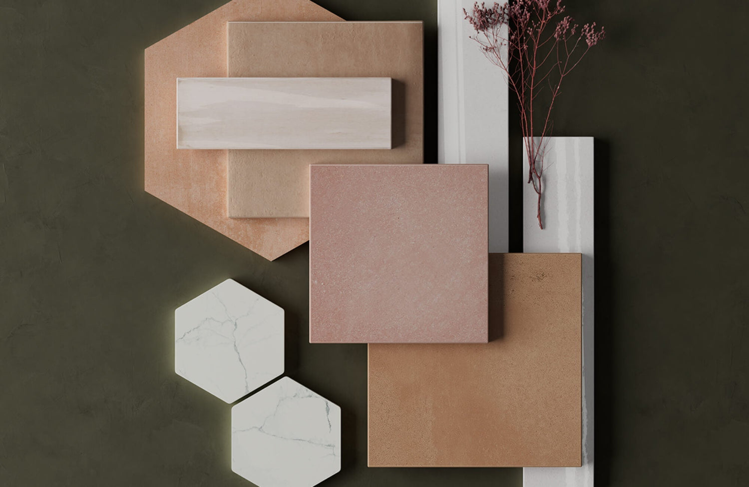
One of the simplest ways to reduce decision fatigue is by narrowing samples to a closely related palette rather than comparing drastically different styles simultaneously. Reviewing warm neutrals together, for example, creates a more manageable process than mixing cool grays, bright whites, bold patterns, and earthy tones all at once.
Concentrating on a small group of stylistically related tiles also makes subtle differences in undertone, texture, and finish easier to identify. This approach helps maintain visual clarity while narrowing the selection more efficiently.
Creating a Simple Evaluation System
Organizing samples according to practical criteria such as lighting performance, maintenance, texture, finish reflectivity, and compatibility with surrounding materials creates a more objective decision-making process. This system helps distinguish visually similar options that may perform very differently once installed.
Photographing samples throughout the day and labeling observations beside each tile can further simplify comparison. Reviewing the images later often reveals which options maintain the most consistent and visually balanced appearance across different lighting conditions.
Knowing When You Have Found the Right Tile
At a certain point, ordering additional samples may create unnecessary uncertainty rather than improving the decision. The goal is not to find a mathematically perfect tile but to select one that balances visual appeal, practicality, durability, and compatibility with the surrounding environment.
Long-term comfort should also matter more than momentary novelty. A tile that consistently feels balanced, cohesive, and appropriate for the space will often remain visually satisfying far longer than a highly dramatic option selected purely for immediate impact.
Why Ordering Multiple Tile Samples Leads to Better Design Decisions
Ordering multiple tile samples before making a final decision is one of the most effective ways to ensure the finished installation looks cohesive, balanced, and appropriate for the space. Comparing samples under realistic lighting conditions and alongside surrounding materials allows you to evaluate color variation, texture, finish, scale, and pattern flow with far greater accuracy than online images or showroom displays alone. Moreover, reviewing several options together helps prevent expensive design mistakes, improves coordination with cabinetry and fixtures, and clarifies which tile best supports both the room’s aesthetic goals and practical requirements. Instead of relying on assumptions, multiple samples provide the confidence to choose a tile that will remain visually satisfying and functional long after installation is complete.
In addition to comparing physical samples, visualizing tile directly within your space can further simplify the decision-making process. Our augmented reality (AR) tool allows you to preview different tile styles, colors, and layouts in real time, helping you see how each option interacts with your lighting, furnishings, and surrounding finishes before installation begins. By combining physical samples with digital visualization, you can make more confident design choices with greater accuracy and clarity.