


Floral wallpaper is one of the few design decisions that affects every other choice in a room. The pattern sets the palette, influences the furniture, and determines how much the rest of the space needs to recede in order for the wall to feel intentional rather than busy. Done well, a floral can make a room feel deeply personal and carefully composed. Done without enough consideration, the same pattern can make a space feel heavy, dated, or difficult to style around. In this blog, we'll cover everything that goes into styling floral wallpaper well, from choosing the right pattern to building a room that knows how to carry it.

The Elvynne Mirror in Antique Silver and Esme 15" Wall Sconces in Polished Nickel sit cleanly against a dark botanical floral wallpaper on an off-white ground, keeping this powder room fresh rather than fussy.
What Makes Floral Wallpaper Feel Current Or Dated
Not every floral ages the same way. The difference between a pattern that feels considered and one that feels like it belongs to another era almost always comes down to the same handful of decisions: scale, palette, line quality, and the tone of the background it sits on.
How Scale Changes The Way A Floral Pattern Is Perceived
A small, densely repeated floral reads very differently from a large, open one, and scale is often the first thing that signals whether a pattern feels current or dated. Small-scale florals with tight repeat patterns tend to feel busier and more traditional, especially when the motifs are highly detailed and closely spaced. Larger-scale florals, particularly those with generous negative space between the blooms, carry more visual calm and sit more comfortably in contemporary interiors. The wall size matters too. A large pattern in a small room can feel immersive in the right way, or oppressive in the wrong one, depending on the palette and background tone. Scale is not just about the size of the flower itself, but about the breathing room the pattern allows around it.
The Role Of Background Color In Whether A Floral Feels Heavy Or Light
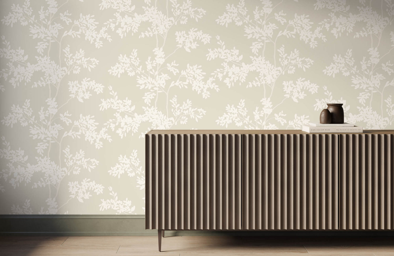
The background of a floral wallpaper does more work than the blooms themselves. A white or off-white ground keeps the pattern feeling open and fresh, allowing the motifs to sit cleanly against the wall rather than compete with it. Deeper backgrounds in forest green, navy, charcoal, or black can feel rich and intentional when the pattern is the right scale, and the room can absorb the depth. Where florals tend to age poorly is on mid-tone backgrounds that are neither light enough to feel airy nor dark enough to feel deliberate. Beige grounds with faded multi-color blooms are the most common example of this, and they are the hardest to style around. The background sets the mood before a single piece of furniture enters the room.
The off-white ground is one of the most reliable foundations for a floral wallpaper that needs to work across four walls without becoming heavy. The powder room in the image above demonstrates this directly, where dark botanical motifs on a light background read with clarity and presence without making the small space feel enclosed. Our Botanique Wallpaper in Winter achieves this through its off-white field, where stylized blooms and branching forms in blue-gray, beige, and soft brown sit cleanly against the background rather than competing with it. The muted, cool palette keeps the pattern feeling restrained rather than decorative, which is what allows it to hold its own across a full room without requiring the surrounding finishes to do significant work to balance it.
When Botanical Illustration Style Works And When It Doesn't
Botanical illustration, the kind that references scientific drawings with carefully rendered leaves, precise petal detail, and a sense of specimen study, has had a sustained presence in well-designed interiors for good reason. At its best, it feels considered and unhurried, more like a collector's choice than a decorating decision. Where it loses its footing is when the illustration style becomes overly sentimental. Roses with too much shading, petals with gradient fills, and motifs that prioritize realism over graphic clarity all push a botanical wallpaper toward feeling dated rather than refined. The line between a botanical that feels like a design object and one that feels like a country cottage keepsake is thinner than it appears, and it usually comes down to how clean and restrained the rendering is. Cleaner line work ages better than highly decorative illustration.
Painterly Vs. Graphic Florals And The Spaces They Suit
Painterly florals, those with visible brushwork, loose edges, and a watercolor or oil-paint quality, carry a softness that works well in spaces meant to feel personal and lived-in. They suit bedrooms, sitting rooms, and dining rooms where warmth is the intention and the rest of the room is relatively restrained. Graphic florals, with flat color, defined outlines, and a more abstracted take on the botanical form, tend to read more contemporary and hold their own in spaces with cleaner architecture and harder finishes. The choice between the two is less about trend and more about what the rest of the room is doing. A painterly floral in a room full of raw materials and angular furniture will feel out of place in the same way a bold graphic floral will in a room of soft linen and aged wood.

A restrained leaf pattern and warm wood cabinetry show how much a single wall of wallpaper can carry, with the Shadow Orchard Wall Art anchoring the counter below it.
Choosing The Right Room For Floral Wallpaper
The room itself should guide the decision before anything else. How much natural light it receives, how tall the ceilings are, how much uninterrupted wall the pattern will cover, and how long someone typically spends in the space all shape whether a floral wallpaper will feel intentional or overwhelming.
Why Powder Rooms And Small Spaces Handle Bold Florals Well
The powder room is one of the few spaces where committing fully to a bold floral rarely goes wrong. Because the room is small and used briefly, the pattern does not have a chance to fatigue the eye the way it might in a space where someone spends hours at a time. The limited wall surface also means a large-scale or deeply saturated floral reads as a considered moment rather than an overcommitment. There is no requirement for the pattern to work alongside a full room of furniture, competing surfaces, and layered textiles. That containment is exactly what makes small spaces so well-suited to florals that might feel too much anywhere else in the home.
Using Floral Wallpaper In A Primary Bedroom Without Overcommitting
The primary bedroom is a strong candidate for floral wallpaper, but it asks for more restraint than a powder room does. Because it is a space someone returns to daily and spends real time in, the pattern needs to feel calming rather than visually demanding. Softer florals with quieter palettes tend to serve bedrooms better than high-contrast or densely layered patterns. The amount of wall the paper will cover matters here more than in almost any other room. A bedroom with large windows, built-ins, or architectural breaks in the wall will carry a floral differently than one with four largely uninterrupted surfaces. Knowing how much of the pattern will actually be visible once the room is furnished is often what separates a bedroom that feels quietly immersive from one that simply feels busy.
Dining Rooms As The Right Canvas For Large-Scale Pattern
Dining rooms reward boldness in a way that other rooms in the home often do not. The space is used for specific occasions rather than all-day living, which means a more dramatic pattern has room to make an impression without becoming exhausting. Ceiling height plays a significant role here. Taller ceilings give a large-scale floral the vertical space it needs to unfold properly, whereas the same pattern in a room with lower ceilings can feel compressed and heavy. Dining rooms also tend to have good wall continuity, with fewer windows and doors interrupting the surface, which allows the repeat of the pattern to complete itself and read as intended. It is one of the rooms where committing to the full four walls consistently produces the strongest result.
Where Floral Wallpaper Usually Doesn't Work
Kitchens present one of the more difficult environments for floral wallpaper, not because of aesthetics but because of the practical realities of the space. Heat, moisture, and proximity to cooking surfaces put any wallpaper under stress, and florals with complex colorways or delicate grounds show wear and discoloration more readily than simpler surfaces. Home offices are another space where florals tend to underperform. A patterned wall that competes with the visual activity of a working environment adds noise rather than calm. Rooms with very low ceilings and limited natural light are also difficult, as a floral pattern in those conditions tends to close a space in rather than give it any sense of openness or depth.
Accent Walls Versus Full-Room Application
The decision between papering one wall and committing to all four comes down to the scale of the pattern and the amount of light in the room. A single accent wall works well when the floral is bold enough to anchor the space on its own, and the remaining walls are kept in a tone that belongs to the palette of the paper. Full-room application tends to work best when the pattern itself has enough restraint, whether through scale, palette, or background tone, that it does not read as relentless when it wraps the entire space. Where things tend to go wrong is in the middle ground: a pattern that is too busy for four walls but not strong enough to carry a single one. Committing clearly in one direction almost always produces a more resolved result than compromising between the two.
A pattern with enough restraint in its palette and scale can carry a full wall without requiring the room around it to recede entirely. The botanical leaf pattern running across the wall behind the cabinetry above belongs to our Bower Wallpaper in Taupe II, where delicately illustrated leaves in dark taupe sit against an off-white ground in a repeat open enough to read clearly without crowding the surface. The two-tone palette keeps the pattern from competing with the warm wood cabinetry flanking it on both sides, and its DreamScape Terralon construction handles the humidity and moisture exposure that a laundry room or utility space places on a wall surface over time.

The Isabel 2.5 x 12 Matte Porcelain Tile in Frosted Linen keeps the floor quiet so the mauve floral wallpaper can lead, with the Esmeralda Small Mirror in Polished Brass above the black vanity doing the same.
Keeping The Rest Of The Room From Fighting The Pattern
Once a floral wallpaper is on the wall, every other decision in the room becomes a response to it. The goal is not to eliminate everything else but to make sure nothing else is competing for the same attention. Furniture, textiles, floors, and décor all need to play a supporting role without feeling absent.
Why Solid, Textured Fabrics Work Better Than Printed Ones
Printed textiles on sofas, chairs, or curtains introduce a second pattern that the room then has to reconcile with the wall. In most cases, that reconciliation never fully happens, and the space ends up feeling busy rather than considered. Solid fabrics in linen, velvet, boucle, or cotton allow the wallpaper to remain the dominant element while still contributing warmth through texture alone. A linen sofa in a tone pulled from the wallpaper's background, or velvet cushions in one of the flower colors, connects the room without adding another layer of pattern to manage. Texture carries the weight that print would otherwise reach for, and it does so without competing for the same attention.
Choosing Furniture Silhouettes That Don't Compete With The Wall
The shape of a piece of furniture affects how much visual weight it places against a patterned wall. Heavily carved or ornate pieces, particularly those with decorative detailing on legs, backs, or arms, tend to clash with a floral because both are asking to be noticed at the same level of detail. Cleaner silhouettes, whether that means a simple linen sofa with straight lines or a dining chair with a gently curved back and no surface ornamentation, allow the eye to rest on the furniture without being pulled away from the wall. This does not mean every piece needs to be minimal or contemporary. A well-proportioned traditional chair with a simple profile can sit comfortably in a floral room. What matters is that the furniture's detailing does not compete with the pattern's own level of intricacy.
How Floor Color And Material Affect The Way The Pattern Reads
The floor anchors everything above it, and its color and material have a significant effect on how the wallpaper reads from the moment someone enters the room. A dark wood floor draws the eye downward and creates a grounding contrast that allows a lighter or more delicate floral to feel lifted and airy above it. Light stone or pale oak flooring keeps the overall room feeling open, which works well with deeper or more saturated floral palettes that might otherwise make the space feel heavy. Where floors tend to create problems is when their own pattern, whether that is a strong wood grain, a geometric tile, or a heavily veined stone, introduces a second layer of visual activity that the floral then has to sit alongside. In those cases, the wall and floor are both asking for attention, and neither wins.

The Priya 14" 1 Light Flush Mount in Matte Black/Opal Matte Glass anchors the floral wallpaper ceiling without competing with it, while the warm orange and olive tones in the pattern echo the dark green cabinetry below.
Building A Color Palette Around A Floral
A floral wallpaper arrives with its own palette already built in, which is both an advantage and a challenge. The colors are already decided. What remains is how to distribute them through the rest of the room so the space feels like a single, considered environment rather than a wall with furniture placed in front of it.
Pulling One Color From The Pattern And Carrying It Through The Room
The most reliable way to build a room around a floral wallpaper is to identify one color within the pattern and repeat it deliberately in the furnishings, textiles, or surfaces elsewhere in the space. It does not need to be the dominant color in the wallpaper. Often it is more effective to lift a secondary or accent color, something that appears in the blooms or the stems, and bring it forward through a sofa, a curtain fabric, or a painted piece of furniture. This creates a thread of color that connects the wall to the rest of the room without making the relationship feel forced or overly matched.
The color does not need to appear in large quantities to do its job. A single upholstered chair in a tone pulled from the wallpaper, or a set of cushions in that color distributed across the seating, is often enough to establish the connection. Repeating it in three or four places throughout the room, even in small amounts, creates the sense that the palette was planned rather than arrived at by accident. The key is consistency of tone. Pulling a dusty rose from a floral and pairing it with a brighter or cooler pink elsewhere will read as a mismatch rather than a relationship.
When To Lean Into The Palette And When To Contrast It
Leaning into the palette of a floral wallpaper means building the room primarily from the colors already present in the pattern, allowing the space to feel deeply immersed in a single color story. This works particularly well when the wallpaper's palette is already well resolved, with colors that have a clear relationship to one another in tone and temperature. A floral with warm terracotta, aged cream, and olive will support a room built almost entirely from those same tones, and the effect can feel very intentional. Contrasting the palette means introducing a color that sits outside what the wallpaper offers, typically a deeper neutral or a tone from the opposite end of the warmth spectrum, to create separation between the wall and the rest of the room.
Contrast tends to be the stronger choice when the floral palette is already very saturated or complex, because adding more of those colors to the furnishings can push the room past the point of feeling considered. A deeply colored floral on a dark background, for example, often benefits from furniture and textiles in very restrained tones, warm whites, pale stone, or natural linen, which give the eye somewhere to rest. The contrast does not need to be dramatic to be effective. Even a subtle shift in tone or temperature between the wall and the furnishings is enough to create the breathing room the room needs.
Neutrals That Sit Well Next To Floral Wallpaper
Not all neutrals respond to floral wallpaper in the same way, and choosing the wrong one can make the pattern feel disconnected from the rest of the room rather than grounded by it. Warm neutrals, those with yellow, red, or brown undertones, tend to sit most comfortably next to florals with organic palettes. Creamy whites, warm taupes, and soft terracottas share the same temperature as most botanical color stories and allow the room to feel cohesive without requiring an exact color match. Cool neutrals, grays, and blue-whites in particular, work better alongside florals with cooler palettes, those built around lavender, dusty blue, or soft sage, where the temperature of the neutral reinforces rather than fights the tone of the pattern.
A useful way to test whether a neutral is working is to hold a sample of it against the wallpaper and look at whether the colors in the floral appear to lift or flatten. A neutral that shares the same undertone as the background of the wallpaper will almost always produce a more integrated result than one chosen in isolation. Warm white walls next to a floral on a warm ivory ground, for example, will feel like the same room. Cool white walls next to that same floral will create a subtle but noticeable disconnect that is difficult to resolve with furnishings alone.
How Ceiling And Trim Color Affect The Overall Balance
The ceiling and trim are often treated as afterthoughts when a bold wallpaper is involved, but they have a significant effect on how contained or expansive the room feels. A white ceiling above a floral wallpaper keeps the room feeling open and gives the pattern a clean boundary at the top of the wall. Painting the ceiling in a color pulled from the wallpaper, particularly a deeper tone from within the palette, wraps the room in a way that feels intentional and immersive rather than accidental. It is a choice that works best in rooms where the ceiling height is generous enough to absorb the color without making the space feel compressed. Trim color operates differently. White trim creates a clear frame around the wallpaper and separates the pattern from the architecture of the room, which tends to make the floral read more like a deliberate installation. Trim painted in a tone closer to the wallpaper's background dissolves that frame and allows the pattern to feel more continuous with the walls.
The decision about trim color also affects how the room reads at the transition points, around doors, windows, and baseboards, where the wallpaper meets the painted surface. A high-contrast trim in bright white next to a dark or deeply saturated floral can feel jarring at those edges, drawing attention to the boundary rather than the pattern itself. Toning the trim down even slightly, moving from a stark white to a warm off-white or a soft stone, softens those transitions and allows the wallpaper to remain the focus rather than the line where it ends.
Applying wallpaper to the ceiling rather than the walls is one of the more committed versions of the ceiling color decision, and the kitchen above shows how effectively it can work when the pattern is restrained enough not to compete with the surfaces below it. Our Botanique Wallpaper in Fall covers the ceiling in stylized blooms and branching forms in soft gray, olive green, and rich brown against an off-white field, a palette that pulls directly from the dark green cabinetry below without repeating it. The off-white ground keeps the ceiling feeling open rather than heavy despite the pattern, and the warm brown tones in the motifs echo the brass hardware and wood-toned fixtures throughout the space. That color relationship between the ceiling pattern and the room below is what makes the application feel intentional rather than decorative for its own sake.

The Wilma Wall Sconce in Aged Brass and Celia 5 x 10 Glossy Ceramic Tile in Royal Green show how the right supporting choices make a beige leaf floral wallpaper feel like a decision rather than a guess.
Making A Confident Decision Before Committing To A Floral
Inspiration is easy to find. The harder part is moving from a saved image to a decision that holds up in the actual room, with its specific light, its particular proportions, and everything else that will live inside it. The right floral wallpaper is not the one that looks best on a screen. It is the one that makes sense for the space once every other variable has been considered.
Questions To Ask Before Ordering A Sample
Before requesting a sample, it is worth working through a short set of questions that the inspiration phase rarely forces anyone to confront. How much uninterrupted wall will the paper actually cover once doors, windows, and any built-ins are accounted for? What is the primary light source in the room, and is it warm or cool? How long does natural light stay in the space, and does it shift significantly between morning and evening? What is already fixed in the room, the floor, the trim, and any existing furniture that is not being replaced, and how does the palette of the wallpaper sit alongside those elements? These questions do not require a designer to answer, but they do require the room to be looked at honestly rather than imagined in an idealized version of itself.
How To Read A Pattern At Full Scale Versus On A Screen
A floral wallpaper seen on a screen is almost always misleading, not because the color is necessarily wrong, though screen calibration does affect this, but because scale is nearly impossible to judge from a digital image. A pattern that reads as delicate and airy on a phone or a laptop can arrive at full repeat and feel much larger, much denser, or much more dominant than anticipated. Ordering a physical sample and pinning it to the actual wall is the only reliable way to assess how the pattern will behave at scale, how the repeat lands across the surface, how the background tone reads in the room's specific light, and whether the colors hold the relationship to the existing room that they appeared to have in the product image.
When A Floral Is The Right Choice And When Another Direction Serves Better
A floral wallpaper is the right choice when the room has a clear anchor point, enough natural light to support the pattern, and a clear palette to build the rest of the space around. It works when the commitment feels exciting rather than uncertain, and when the alternatives feel less resolved by comparison. When the hesitation is less about which floral and more about whether a floral at all, that uncertainty is usually worth paying attention to. A large-scale textured wallcovering, a deeply toned paint color, or a simple grasscloth can deliver the same sense of presence and intention that a floral does, without requiring the same level of coordination across the rest of the room. The strongest spaces are rarely the ones built around the most interesting wall. They are the ones where every decision, including the wall, was made in service of the room as a whole.
What A Well-Chosen Floral Actually Requires
Styling floral wallpaper without it feeling dated is not a matter of avoiding the wrong patterns. It is a matter of making the right decisions around the one you choose. Scale, background tone, room selection, palette distribution, and the restraint applied to everything else in the space all determine whether a floral reads as intentional or overwhelming. A pattern that might feel heavy in one room can feel perfectly calibrated in another. The difference is rarely the wallpaper itself. It is how clearly the rest of the room was built to receive it. When those decisions are made in sequence and in relationship to one another, a floral wallpaper stops being a risk and becomes exactly what the room needed.
If you are comparing floral patterns, colorways, or scales, or trying to understand how a wallpaper might work alongside the materials and finishes already in your home, our Personalized Design Consultation can help bring clarity to the process. Our team can offer tailored guidance based on your specific room, your existing palette, and your broader design goals, helping you move forward with a choice that holds up well beyond the moment you make it.