


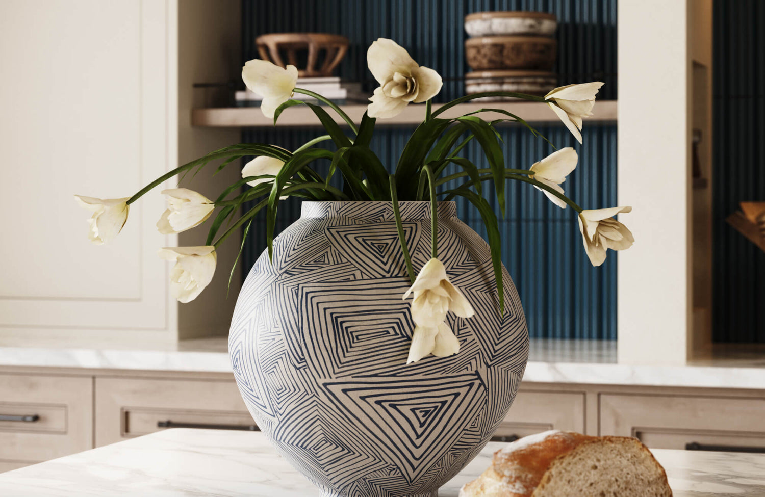
Decorative objects give a room its final layer of shape, texture, and personality. A vessel on a console, a sculptural bowl on a coffee table, or a collected piece on open shelving can make a space feel finished without overwhelming the furniture around it. The challenge is that these same details can quickly make a room feel crowded when they are too small, too numerous, too similar, or disconnected from the larger design.
Styling decorative objects without creating clutter is not about removing character from a home. It is about giving each piece enough purpose and space to be understood. A strong arrangement considers where the object will live, how the surface is used, what scale the furniture can support, and how each material relates to the room around it. When those decisions are made with restraint, decorative objects feel intentional rather than accumulated.

Evelora Mirror in Black and Cielo Outdoor Console Table create a grounded vignette where rounded reflection, warm wood texture, and softly scaled vessels feel composed rather than crowded.
Choose Objects Based on Surface Purpose and Scale
Before decorative objects can be arranged well, they need to be matched to the surface they occupy. A piece that works beautifully on a mantel may feel intrusive on a coffee table, while an object with presence on a console may feel undersized on open shelving. Surface function and furniture scale should guide the first styling decision, because clutter often begins when decor is chosen in isolation from how the space is actually used.
Separate Display Surfaces From Everyday Surfaces
Display surfaces can hold more visual weight because their primary purpose is decorative. Mantels, built-ins, open shelves, and formal consoles often have room for sculptural objects, vessels, framed pieces, books, and collected accents. These surfaces can support height, depth, and rhythm, as long as they are not filled from edge to edge.
Everyday surfaces need more restraint. A coffee table should leave room for drinks, books, remotes, or serving pieces. A nightstand needs space for a lamp, reading material, and personal essentials. An entry console often functions as a landing place for keys, sunglasses, or mail. A dining table may need a low centerpiece that can move easily when the table is in use.
This distinction should guide both object type and object quantity. On mixed-use surfaces, choose pieces that combine order with form. A decorative bowl can hold keys while adding a low rounded silhouette. A tray can gather candles, remotes, or small accents so they read as one composition. A decorative box can conceal practical items without disrupting the line of a table, media cabinet, or console.
Match Object Size to the Surface
Scale determines whether decorative objects feel intentional or incidental. A piece that looks substantial on a narrow shelf may disappear on a large dining table. A tall vase that gives presence to a console may overwhelm a nightstand. The object should feel proportionate to the surface beneath it and the room around it.
Large furniture usually benefits from fewer, stronger pieces. A wide coffee table can support a generous bowl, a broad tray, or one main grouped arrangement. A long console may need a vertical object paired with a lower anchor to keep the composition from feeling stretched. In the console arrangement shown with the round mirror and carved wood cabinet, Edward Martin’s Ingram Porcelain Vase Set brings low, rounded volume to one side, while Edward Martin’s Upton Table Lamp adds height and a vertical counterpoint without requiring several smaller accessories.
Surface depth matters as much as length. A narrow console may not suit an oversized bowl, even if the table is long. A shallow shelf may need flatter objects, while a deep shelf can handle layered books, vessels, and sculptural forms. The goal is not to fill the entire surface. It is to choose objects with enough presence for the furniture they occupy.
Scale and Proportion Guidelines by Surface
Different surfaces call for different styling decisions. The table below offers a practical way to compare scale, function, and common clutter risks before placing decorative objects.
|
Surface Type |
Best Decorative Object Approach |
What to Avoid |
|
Coffee table |
Low bowls, trays, book stacks, or one main grouped arrangement |
Tall pieces that block views or crowd daily use |
|
Console table |
A taller vase or sculpture paired with a lower anchor |
Several similar-height objects lined across the surface |
|
Open shelves |
Alternating books, larger objects, and negative space |
Filling every shelf with the same density |
|
Mantel |
Edited objects with controlled height and clear spacing |
Pieces that compete with mirrors, artwork, or screens |
|
Dining table |
One central vessel, bowl, or movable low arrangement |
Multiple unrelated objects that interrupt use or conversation |
|
Nightstand |
One functional anchor with one small decorative accent |
Overlayered styling that leaves no usable surface |
These guidelines are not fixed measurements. Exact spacing, object height, and quantity depend on furniture size, room layout, sightlines, and daily use. Decorative objects should not block conversation across a dining table, interfere with television viewing, obscure mirror reflections, crowd a lamp, or make a high-use surface difficult to maintain.

Petaline Wallpaper in Taupe I, 52" x 132" and Celia 5x10 Glossy Ceramic Tile in Deep White pair botanical pattern with vertical ceramic texture for a layered bedroom backdrop.
Edit Down to Fewer Stronger Pieces
Once the surface has been defined by purpose and proportion, the arrangement becomes easier to evaluate. Most cluttered surfaces do not need more styling. They need a clearer edit, where the strongest objects remain and pieces that duplicate scale, shape, or function are removed, relocated, or stored.
Decide What to Keep Relocate or Store
Begin by clearing the surface completely. This gives you a clean view of the furniture’s shape, finish, and proportions before deciding what belongs there. A surface often feels cluttered because objects have been added gradually, not because the room lacks decor.
Sort decorative pieces into three categories: keep, relocate, and store. Keep objects that support the room’s palette, scale, material language, and function. These are usually the pieces with the clearest silhouette, strongest texture, or most meaningful connection to the space. Edward Martin’s Cavendry Travertine Vase Set is the kind of piece that can justify staying in an edited arrangement because its cylindrical forms, natural stone texture, and warm neutral color provide both height and material presence.
Relocate items that may work better elsewhere. A small sentimental object that feels lost on a large coffee table may have more impact on a bookshelf, bedside table, or private surface where it can be viewed more closely. A decorative box that crowds a console may work beautifully on a media cabinet. A small vessel that lacks presence on its own may become useful within a tray or grouped arrangement.
Store pieces that are seasonal, repetitive, or no longer aligned with the room’s direction. Seasonal accents are most effective when they are edited in and out with intention rather than layered into permanent displays. A room rarely benefits from carrying every object, every season, and every decorative idea at once.
Replace Small Filler With Objects That Carry Presence
Clutter is often a scale issue before it is a quantity issue. Several small objects can create more visual activity than one substantial piece with a clear silhouette. A large decorative bowl, tall vase, sculptural form, or well-proportioned tray can hold a surface with confidence while requiring fewer supporting elements.
Visual presence comes from proportion, material, shape, and placement. A stone bowl with natural variation can bring weight to a coffee table. A ceramic vase can introduce vertical movement to a console. A sculptural object can become a focal point on a shelf when given enough space around it. These pieces do not need excessive layering because their form already carries visual responsibility.
Small objects are not inherently problematic. They become cluttered when they appear in large numbers or sit without context. A small vessel, candle, or decorative accent often works best on a book stack, inside a tray, or beside pieces of different heights. Left alone across a wide surface, small items tend to feel scattered.
When purchasing new decor, consider whether the piece solves a specific styling need. It should add height, weight, texture, containment, contrast, or continuity. A decorative object should do more than fill a gap. It should make the arrangement clearer. If scale, finish, or product suitability is uncertain, Edward Martin’s contact page can support questions about measurements, availability, material characteristics, and coordination with existing furnishings.

Rovian Console Table in Black, Selanna Mirror in Bone, and Leona 24x24 Checkerboard Polished Porcelain Tile in Calacatta and Nero Marquina frame the entryway with graphic contrast and sculptural clarity.
Use Negative Space to Give Objects Definition
Editing creates room for the objects that matter, but the space around those objects is what allows them to register. Without enough breathing room, even well-chosen pieces can lose their shape and presence. Negative space turns restraint into a visible design tool, giving each object the clarity it needs to feel intentional. In interior styling, it is not unused space. It is what allows a vase, bowl, tray, sculpture, or stack of books to be seen as a deliberate choice. When every gap is occupied, the eye has no place to rest, and even beautiful pieces begin to lose impact.
This is especially important on visible surfaces such as mantels, shelves, consoles, and coffee tables. A mantel often benefits from cleaner spacing because it sits near eye level and may relate to artwork, a mirror, or a television. A deep bookshelf can support more layering if the objects vary in height, shape, and depth. A coffee table needs enough open area for daily use. A console can hold a more decorative arrangement when the wall, mirror, artwork, or lighting around it provides balance.
Grouping also depends on negative space. Several small objects placed evenly across a surface can feel scattered, while the same objects gathered into one clear composition may feel more intentional. On the entry console shown beside the tiled staircase, Edward Martin’s Morton Bull has enough open space beneath the table to read as a sculptural focal point, while the Hawthorne Porcelain Bowl and the Redmont Desk Lamp occupy the tabletop without crowding the mirror or surrounding wall. The arrangement works because each piece has a distinct zone rather than competing for the same visual space.
There is no universal percentage of empty space that works in every room. Visual balance depends on furniture scale, color contrast, object height, surrounding architecture, and material relationships. A dark sculptural object on a pale surface may need more breathing room than a tonal ceramic vessel on a similarly colored console. A large object with a strong outline may require fewer supporting pieces than a quieter object with a softer profile.
A useful test is to remove one item after the arrangement feels complete. If the remaining objects become easier to see, the surface is likely carrying too much. If the arrangement suddenly feels unresolved, the removed piece may have been providing needed balance. Negative space should make a surface feel deliberate, not sparse.

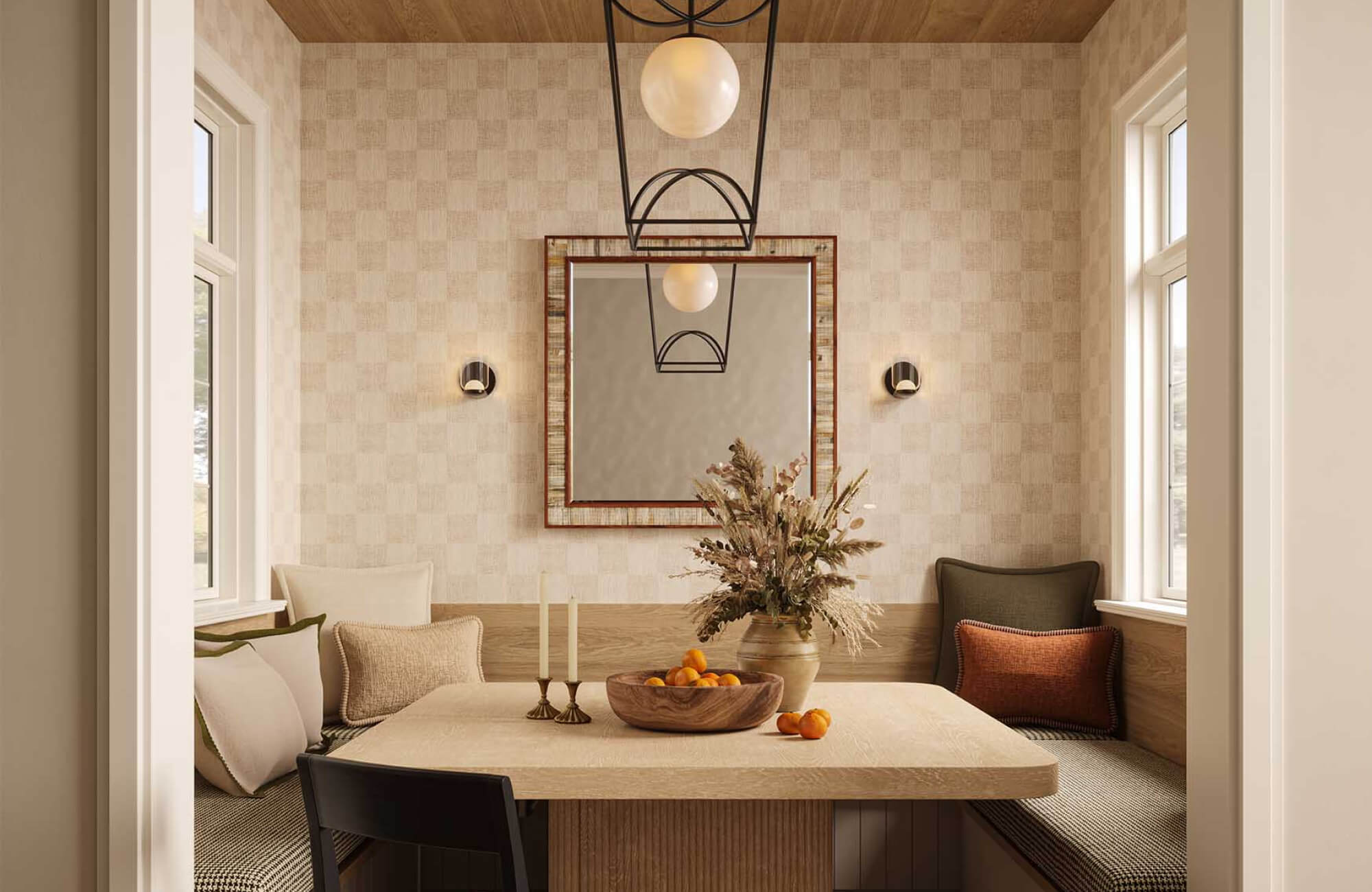
Laurent Walnut Round Dining Table in Matte, 60", Rita Dining Chairs in Taupe, Set of 2, and Fionn Wall Sconce in Vintage Brass create a warm dining setting around a restrained centerpiece.
Connect Decorative Objects to the Larger Room
A surface may be well edited and carefully spaced, but decorative objects still need to belong to the room beyond that single tabletop or shelf. Color, material, finish, and proportion help connect smaller accents to larger design elements, so the styling feels integrated rather than placed at the end.
Repeat Color Material and Finish With Intention
Cohesion begins with selective repetition. Choose one or two visual threads that can carry through the room, such as warm wood, soft ceramic, natural stone, dark metal, woven texture, or a restrained neutral palette. Objects can vary in form while still feeling connected through tone, finish, or material.
Color echoes are often more effective than exact matches. A ceramic object does not need to duplicate a rug color precisely. It can sit within the same tonal family. A stone accent does not need to match a tile installation exactly. It can repeat the feeling of mineral variation, softened contrast, or natural texture.
Material contrast should be controlled rather than abundant. Travertine, marble, ceramic, porcelain, wood, metal, glass, and woven textures can work together when there is a clear hierarchy. A stone bowl may pair well with a wood tray. A ceramic vase may sit comfortably beside a metal accent if both relate to the room’s palette. Too many unrelated finishes in one small area can make the composition feel unsettled.
Symmetry benefits from the same restraint. Paired lamps, balanced mantel objects, or matching nightstand pieces can create a calm architectural rhythm, but a room can feel staged when every object is doubled or mirrored. Repeating one tone, material, or shape is often more refined than matching every detail.
For decorative pieces involving candles, lighting, delicate finishes, stone, ceramic, metal, or glass, follow manufacturer care and safety guidelines. Heat, moisture, flame, weight, and surface protection can affect both the object and the furniture beneath it. Protective pads, coasters, and thoughtful placement help preserve the surface while keeping the styling functional.
Relate Objects to the Larger Interior
Decorative styling becomes stronger when it is considered alongside the room’s larger design elements. Rugs influence palette, softness, and pattern. Lighting introduces metal finishes, scale, and glow. Mirrors affect reflection and sightlines. Furniture establishes proportion, material weight, and silhouette. Tile and vanities can introduce color, texture, stone-look surfaces, or ceramic finishes that decorative objects may echo.
In a living room, a travertine or ceramic object might relate to a stone-look fireplace surround, a textured rug, or a warm wood coffee table. In an entryway, a decorative bowl may connect to a mirror frame, console finish, or nearby lighting. In a dining room, Edward Martin’s Denwick Rosa Marble Small Bowl can draw out the warmth of wood furniture while echoing soft blush tones in surrounding textiles or wallcoverings. The nearby use of Edward Martin’s Evella Mirror in Cream shows the same principle at a larger scale, where a softly shaped frame connects wall decor to lighting, upholstery, and the room’s warmer palette.
For larger room updates, Edward Martin’s design services can help connect decorative styling with broader decisions such as furniture scale, finish coordination, rug placement, lighting, mirrors, tile, and material palettes. This is especially useful when the issue is not one crowded surface, but the relationship between decorative objects and the room as a whole. The strongest interiors rarely treat decor as an afterthought. Small objects should reinforce the larger design language already present in the space, not compete with it.
A More Considered Way to Style Decorative Objects
Decorative objects are most effective when they appear chosen, not accumulated. A composed room does not depend on filling every shelf, table, mantel, or console. It depends on understanding what each surface needs, selecting pieces with the right scale, and allowing enough space for those pieces to be seen. The most successful arrangements are built through a sequence of decisions. Surface purpose determines how much decor the area can support. Editing reveals which objects have presence and which ones create unnecessary noise. Negative space gives each piece definition. Repetition connects individual objects to the room’s larger palette, materials, and proportions.
Clutter-free styling is not a rejection of personality. It is a way of making personality more visible. Sentimental pieces, collected objects, sculptural forms, vessels, bowls, trays, and books all have more impact when they are placed with rhythm and intent. A considered approach allows the eye to move through the room without interruption. It gives furniture its proper weight, keeps surfaces usable, and connects decorative objects to the broader architecture of the interior. The result is not an empty space, but a more discerning one, where each object contributes to the quiet balance of the whole.