


Modern wallpaper has evolved from a decorative background into one of the most useful tools in interior design. It can shape the mood of a room, add texture where paint may feel too flat, introduce color with more depth, and create a sense of personality without requiring a full renovation.
If you are new to wallpaper, the many choices can feel overwhelming at first. Patterns, finishes, colors, scale, and placement all affect how the final room feels. Modern wallpaper is now more flexible than ever, allowing you to choose a look that feels bold, subtle, classic, or experimental, depending on your home’s style and your comfort level.
The most successful wallpaper choices do not simply follow a trend. They support how you want a room to feel and how you actually use the space. By understanding the main interior design trends with modern wallpaper, you can choose a style that feels current, practical, and personal.

Wallpaper as a Statement Surface
Modern wallpaper can create a clear focal point without covering every wall in the room. Used thoughtfully, it frames key areas, highlights architecture, and gives the space structure without making it feel visually heavy.
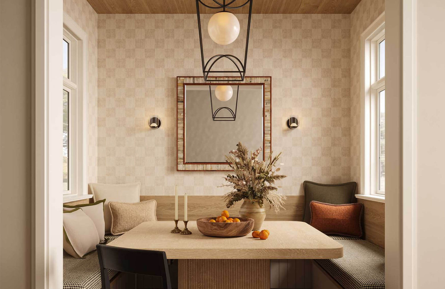
Feature Walls
A feature wall is one of the easiest ways to introduce modern wallpaper into your home. It works by placing wallpaper on a single wall that already has a natural purpose, such as the wall behind a bed, sofa, dining banquette, console table, or bathroom vanity. Because that wall is already visually important, wallpaper makes the area feel complete rather than random.
In a bedroom, wallpaper behind the bed can serve as a visual anchor, adding the impact of a headboard or artwork without needing either. A soft botanical print can make the room feel restful, while a geometric design can create a more tailored look. In a living room, wallpaper behind the sofa can define the seating area and help connect the furniture to the room’s architecture.
For the best result, choose a wall that is not interrupted by too many windows, doors, or large openings. A cleaner wall allows the pattern to read clearly. If the room already has several strong design elements, such as colorful rugs or detailed furniture, a quieter wallpaper may be the better choice. If the room is simple, a stronger pattern can provide the character that the space is missing.
Ceiling Designs
Wallpapered ceilings have become a stylish way to add interest in places people often overlook. The ceiling is sometimes called the fifth wall, and using wallpaper there can make a room feel more layered and thoughtfully finished. This works particularly well in bedrooms, dining rooms, powder rooms, nurseries, and small sitting areas.
A ceiling design does not always need to be dramatic. A soft stripe, cloud-like pattern, delicate floral, or pale textured wallpaper can add depth without overpowering the room. Edward Martin’s Botanique Wallpaper in Fall, 52" x 132", as shown in the photo above, brings a soft botanical pattern to the ceiling, adding warmth and detail while letting the dark green cabinetry and tiled wall stay visually grounded.
In a dining room, a darker or metallic wallpaper can make the space feel more intimate, especially when paired with a chandelier or pendant light. In a child’s room, a playful ceiling pattern can add imagination while keeping the walls calmer.
Before choosing ceiling wallpaper, consider the room’s height. A lower ceiling often works better with lighter tones or subtle patterns because they help the space feel open. Higher ceilings can handle deeper colors or stronger designs. Lighting also matters because ceiling fixtures can highlight the wallpaper, especially if the material has texture, sheen, or raised detail.
Framed Wallpaper
Framed wallpaper offers a polished way to use pattern without covering a full wall. This technique places wallpaper inside molding, picture-frame trim, or large panel sections. It creates the feeling of custom wall treatment while using less material than a full installation.
This approach is useful if you like wallpaper but want a more controlled effect. In a dining room, wallpaper panels can add elegance without overwhelming the furniture. In a hallway, framed wallpaper can break up long walls and create visual rhythm. In a bedroom, panels on either side of the bed can create symmetry and add softness.
Framed wallpaper also works well with classic, transitional, and modern interiors because it combines pattern with structure. The trim gives the wallpaper a defined boundary, which can make even expressive designs feel more refined. To keep the look cohesive, choose molding that relates to the room’s existing details, such as baseboards, door frames, or cabinetry.

Texture Driven Wallpaper
Textured wallpaper adds depth and warmth without relying on bold prints or busy patterns. It works as a subtle background layer, giving bedrooms, dining rooms, home offices, and living spaces a more finished feel without drawing too much attention.
Grasscloth Looks
Grasscloth and grasscloth-inspired wallpapers bring a woven appearance that feels natural and grounded. Real grasscloth is made from natural fibers, while printed or vinyl versions can mimic the look with easier maintenance. Both options add subtle variation, which helps walls feel less flat than painted surfaces.
This type of wallpaper is especially effective in rooms where you want warmth and quiet detail. In a bedroom, a grasscloth look can create a restful backdrop behind layered bedding. In a home office, it can make the space feel more refined without becoming too formal. In an entryway, Edward Martin’s Litchfield Wallpaper in Olive, 52" x 132", as shown in the photo featured above, adds a woven-looking texture that brings depth to the walls while complementing the natural light, patterned floor, and warm metallic accents.
Because grasscloth has visible fibers and seams, it is best to see those qualities as part of the design rather than flaws. The slight variation from panel to panel gives the wall character. If you prefer a more consistent finish, choose a printed grasscloth-effect wallpaper instead. It gives you a similar visual texture with a more even appearance.
Linen and Plaster Effects
Linen, limewash, brushed plaster, and Venetian-style wallpaper effects are ideal if you like the softness of wallpaper but want the restraint of painted walls. These designs create subtle movement across the surface, making the room feel layered without introducing a strong motif.
A linen-effect wallpaper can make bedrooms, nurseries, and sitting rooms feel gentle and relaxed. It works well behind upholstered furniture because both materials share a soft, woven quality. Plaster-effect wallpaper, on the other hand, brings a more architectural feeling. It can suggest the look of hand-applied wall finishes without the cost or permanence of real plaster work.
These styles are especially useful in homes where you want a modern, organic, or minimalist interior that still feels warm. Plain paint can sometimes make a room feel unfinished, especially in spaces with simple furniture. A linen or plaster-effect wallpaper solves that problem by adding surface variation while keeping the palette understated.
Raised Details
Embossed, ribbed, fluted, and dimensional wallpapers add interest through shadow and light. Instead of relying on color or print, these designs create movement through the surface itself. As light changes throughout the day, the raised areas become more visible, giving the wall a subtle sense of depth.
Raised-detail wallpaper works well in rooms with clean-lined furniture because the wall texture becomes part of the architecture. A ribbed design can make a hallway feel more structured. A fluted pattern can add vertical emphasis behind a console or bed. An embossed design can bring softness to a dining room or powder room.
When using this type of wallpaper, it is helpful to keep nearby decor simple. Too much wall art or too many competing materials can reduce the effect. Let the texture have space to be noticed. Pair it with smooth stone, matte metal, simple wood, or plain upholstery so the surface detail remains clear and intentional.

Nature-Inspired Patterns
Nature-inspired wallpaper brings softness and visual interest through botanicals, landscapes, and organic forms. Modern versions feel more refined than traditional florals, offering everything from dramatic murals to subtle patterns inspired by stone, water, or clouds.
Oversized Botanicals
Oversized botanical wallpaper uses large leaves, branches, flowers, or stems to create a strong but organic statement. Because the motifs are larger, the design often feels more modern than a small traditional floral. It gives the wall a sense of movement while keeping the subject familiar and approachable.
This style is effective in bedrooms, powder rooms, reading corners, and sitting areas. In a bedroom, a large botanical print can create a calm focal point behind the bed. In a powder room, it can turn a small space into a memorable design moment. In a sitting area, it can soften structured furniture and add a more relaxed mood.
To keep oversized botanicals from feeling overwhelming, pay attention to the background color. A pale or muted background will feel softer, while a dark background will feel more dramatic. Edward Martin’s Bower Wallpaper in Taupe II, 52" x 132", as shown in the photo above, shows how a muted botanical pattern can bring movement to the walls while staying calm alongside warm wood cabinetry, neutral trim, and natural light.
Also consider how much of the wall will remain visible after furniture is added. Large-scale leaves or flowers need enough open space to show their shape.
Scenic Murals
Scenic wallpaper murals create an immersive effect by showing landscapes, forests, gardens, mountains, coastlines, or distant horizons. Unlike repeating wallpaper, murals often function more like wall-sized artwork. They can make a room feel larger, calmer, or more atmospheric depending on the scene.
Murals are best used on walls where the image can be appreciated without too many interruptions. A dining room, bedroom, stair landing, or spacious hallway can all work well for this type of wallpaper. Tall bookcases, large cabinets, or multiple frames may block key parts of the image, so it is important to plan furniture placement before installation.
A scenic mural can also influence the mood of the entire room. A misty forest can feel quiet and restful. A coastal scene can feel open and breezy. A garden mural can bring romance and softness. For a modern result, choose murals with balanced color palettes rather than overly bright or overly detailed scenes.
Abstract Nature
Abstract nature-inspired wallpaper is a good choice if you want an organic feeling without a literal floral or landscape design. These patterns may suggest water movement, stone veining, cloud formations, sand, shells, vines, or desert shapes. The connection to nature is present, but it is more subtle.
This style works well in modern interiors because it blends natural influence with artistic interpretation. A wallpaper inspired by stone veining can bring movement to a dining room or entryway. A water-like pattern can soften a bathroom or bedroom. A cloud-inspired design can make a nursery or reading room feel peaceful without looking overly themed.
Abstract nature patterns are also easier to pair with different furniture styles. Since they are not tied to one specific image, they can work with wood, boucle, leather, metal, linen, and stone. If your home already has natural materials, this type of wallpaper can echo those textures in a softer, more decorative way.

Color Led Wallpaper Choices
Wallpaper brings color into a room with more depth than paint by layering tone, pattern, texture, and finish on a single surface. By starting with the mood you want, you can choose shades that make the space feel calm, intimate, fresh, or more layered.
Warm Neutrals
Warm neutral wallpaper is a strong choice if you want a room to feel calm, grounded, and easy to live with. Shades such as cream, sand, beige, clay, taupe, oatmeal, and soft brown work well in modern organic, Scandinavian, Japandi, and transitional interiors. They add warmth without demanding too much attention.
These wallpapers are especially useful in rooms where you want comfort and flexibility. In a bedroom, warm neutral wallpaper can create a soft backdrop for layered bedding. In a living room, it can support wood furniture, woven rugs, and textured fabrics. In an entryway, it can make the space feel welcoming without relying on bold color.
The key is to avoid choosing a neutral wallpaper that looks too flat. Look for subtle texture, tonal variation, or a quiet pattern. These details help the wall feel finished while still keeping the room calm. Warm neutrals also pair well with black accents, brass finishes, natural stone, and soft white trim.
Deep Moody Shades
Deep wallpaper colors can make a room feel intimate, polished, and expressive. Navy, charcoal, forest green, burgundy, chocolate, aubergine, and deep plum work especially well in dining rooms, libraries, bedrooms, and powder rooms because they create a more intimate, atmospheric feel.
These colors work especially well in rooms used during the evening. A dining room with deep wallpaper can feel more inviting under warm lighting. A bedroom with a dark, patterned wall can feel restful when paired with soft bedding and layered lamps. A powder room is a natural place for richer wallpaper because it is used briefly, so a bolder design feels enjoyable rather than overwhelming. That same sense of depth can work beautifully in a home office as well, and Edward Martin’s Vista Mural, 312" x 132", as shown in the photo featured above, illustrates how a moody landscape design can make the space feel focused, grounded, and refined.
If you are hesitant about dark wallpaper, start with a smaller room or a single wall. You can also balance the depth with lighter trim, mirrors, pale stone, or warm metal finishes. The goal is not to make the space feel heavy, but to create contrast and mood.
Soft Color Accents
Soft color accents are ideal if you want wallpaper that feels fresh but not overpowering. Muted blue, sage, blush, butter yellow, dusty lavender, and faded terracotta can add personality while remaining gentle enough for everyday living. These colors bring more presence than neutrals but are easier to live with than highly saturated shades.
This approach works well in bedrooms, nurseries, breakfast nooks, laundry rooms, and guest spaces. A sage wallpaper can make a room feel relaxed and connected to nature. A muted blue can create a clean, airy mood. A soft blush or faded terracotta can add warmth without feeling overly sweet.
To make soft color wallpaper feel current, pair it with grounded materials. Natural wood, woven textures, matte ceramics, stone, and simple metal finishes can prevent pastel or muted shades from feeling too delicate. You can also echo one color from the wallpaper in a small detail, such as a cushion, lampshade, or artwork, to make the room feel more cohesive.

Pattern Scale and Visual Balance
Wallpaper works best when the pattern scale fits the room, furniture, and amount of visible wall space. By considering motif size, spacing, and repeat, you can choose a design that feels balanced rather than too busy or too understated.
Small Scale Prints
Small-scale prints bring quiet detail to a room. They are useful when you want a pattern, but you do not want the wallpaper to dominate the space. Dots, fine florals, pinstripes, tiny geometrics, and delicate repeating motifs can add charm and softness without becoming the main focus.
These patterns work especially well in compact rooms, closets, built-ins, powder rooms, and layered interiors. In a small powder room, fine print can make the space feel considered without making the walls feel too loud. That balance comes through nicely with Edward Martin’s Somerset Wallpaper in Tan I, 52" x 132", as shown in the photo featured above, where the subtle repeating motif adds texture and warmth while letting the green vanity, sculptural mirror, and brass fixtures stand out. Inside a closet or cabinet back, a small pattern can add a pleasant surprise. In a bedroom, it can provide gentle movement behind calm furniture and bedding.
Small-scale prints are also helpful if your room already has strong furniture, artwork, or rugs. Because the pattern is more restrained, it can sit behind other elements without competing. To keep the look clean, choose colors that relate to the room’s existing palette.
Large Scale Designs
Large-scale wallpaper designs create a more confident visual statement. Oversized geometrics, broad abstract forms, large botanicals, and mural-like patterns can make a room feel intentional and designed. They are often best for walls with enough open space to show the full shape of the pattern.
A large-scale design can make a plain room feel more dynamic. In a dining room, it can give the space presence without needing much additional artwork. In a bedroom, it can act as a strong backdrop behind the bed. In a living room, it can help define a seating area when the furniture is simple.
The main thing to consider is viewing distance. A large pattern needs enough room to be seen properly. If the wall is too narrow or heavily blocked by furniture, the design may feel cut off. Before committing, check the pattern repeat and picture how often it will appear across the full wall. This gives you a better sense of whether the design will feel balanced in the actual room.
Repeat and Proportion
Pattern repeat refers to how often the design repeats across the wallpaper. This detail affects whether a wallpaper feels calm, active, formal, or playful. A tight repeat can create a busier surface, while a wider repeat often feels more open and relaxed.
Proportion matters because the pattern needs to relate to the wall size and the furniture in front of it. For example, a tiny print behind a large bed may feel too delicate, while a huge pattern in a narrow hallway may feel compressed. The best choice depends on how much of the wall is visible and how close you are when viewing it.
Samples are especially important here. A small swatch can show color and texture, but it may not reveal how the full repeat behaves. If possible, view a larger sample or use a digital mockup. This helps you see whether the spacing, motif size, and rhythm make sense for the room.

Pairing Wallpaper With Modern Interiors
Wallpaper feels more natural in a room when it connects with the furniture, lighting, flooring, textiles, and decor around it. Instead of matching every detail, aim for a shared color, material, shape, or mood that helps the whole space feel cohesive.
Furniture Balance
Furniture balance is important because wallpaper and furniture share the same visual field. If the wallpaper is bold, cleaner furniture shapes can help the room feel controlled. If the wallpaper is subtle, more sculptural or detailed furniture can bring interest without overwhelming the space.
For example, a dramatic botanical wallpaper can pair well with a simple upholstered bed or streamlined sofa. A quiet linen-effect wallpaper can support curved chairs, carved wood, or a more detailed headboard. The goal is to avoid having every element compete for attention at the same time.
Color can also create balance. Choose one shade from the wallpaper and repeat it in a pillow, rug, chair, lampshade, or artwork. This does not need to be exact, but it should feel related. Repeating a color in small ways helps the wallpaper feel connected to the room rather than isolated on the wall.
Material Contrast
Modern interiors often feel more layered when different materials are combined with intention. Wallpaper can work with wood, stone, metal, tile, glass, leather, linen, and upholstery. The contrast between these surfaces gives the room depth.
Textured wallpaper pairs well with smooth marble or polished stone because the surfaces balance each other. Botanical wallpaper can feel grounded when placed near natural wood. Geometric wallpaper can look sharper with brass, black metal, or glass. Plaster-effect wallpaper can soften spaces with metal shelving, stone counters, or modern lighting.
When choosing wallpaper, look at the materials already in the room. If the space has many hard surfaces, such as tile, stone, and metal, wallpaper can add softness. If the room has many soft materials, such as upholstery, rugs, and curtains, a cleaner graphic wallpaper can add structure.
Lighting Effects
Lighting can change how wallpaper looks throughout the day. Natural light may make colors appear brighter in the morning and softer later in the afternoon. Lamps, sconces, and overhead lights can bring out texture, sheen, or shadow in ways that are not obvious from a sample alone.
This is especially important for dark, metallic, glossy, or textured wallpaper. A metallic detail may glow under warm lighting but look subtle in daylight. Dark wallpaper may feel rich in a well-lit room, but too heavy in a space with limited light. A raised pattern may become more noticeable when placed near sconces or directional lamps.
Before making a final choice, test wallpaper samples in the actual room. View them during the day and at night. Place them near the furniture, flooring, and lighting you already have. This simple step can prevent surprises and help you choose wallpaper that works in real conditions.
Choosing Wallpaper That Feels Timeless
Modern wallpaper trends can make your home feel fresh, but the best choices still need to suit your architecture, lifestyle, and long-term preferences. A wallpaper that looks appealing online may not be the right fit if it does not support how you use the room. Before choosing, consider the room’s purpose, lighting, existing finishes, and furniture style. When the wallpaper works with these elements, it becomes more than decoration; it becomes a practical design feature that adds color, texture, pattern, and atmosphere while still feeling comfortable to live with.
If you need help finding the right wallpaper for your space, contact us to explore options that suit your home and style. You can also use our design service for personalized guidance on colors, patterns, placement, and finishes.