


A sofa filled with colorful throw pillows can either feel effortlessly layered or strangely chaotic, and the difference is often smaller than most people realize. Many combinations that look beautiful individually start competing once they share the same space, while others that seem unlikely on paper come together surprisingly well. In this blog, we’ll show you how to mix colored throw pillows without clashing, including practical color strategies, foolproof combinations, and styling techniques that help create a more cohesive, intentional look.

What Actually Makes Pillow Colors Clash
Mixing colored throw pillows becomes much easier once you stop thinking of “clashing” as simply using too much color. More often, what feels off comes from imbalance, competing tones, or combinations that are all asking for attention at the same time, which means the issue is usually styling, not color itself.
Why Bold Color Does Not Automatically Mean Bad Styling
A lot of people play it safe with throw pillows because bold color sounds risky, but a stronger color is not automatically what makes an arrangement feel chaotic. In fact, some of the most polished sofas and beds rely on richer blues, deep greens, rust tones, or warmer jewel-inspired accents to create personality and contrast. The difference is usually in how those colors are introduced and whether they feel connected to something else already happening in the room. A bold pillow that echoes artwork, upholstery undertones, or nearby decor often feels intentional rather than random. So if you have been avoiding stronger colors altogether, the real goal is not dialing everything down, but learning how to make contrast feel controlled.
Bold color often feels more approachable when it is balanced by softer supporting tones rather than competing against several equally strong accents. As shown above, our Merelle 22” x 22” Down Pillow in Terracotta demonstrates this well, where its rich reddish-brown tone becomes the visual anchor while the surrounding beige, light brown, and warm neutral pillows help create contrast without overwhelming the arrangement. The result feels layered and inviting rather than busy, showing how one stronger color can bring personality to a space when the rest of the palette is allowed to play a quieter supporting role.
The Real Problem With Competing Undertones
This is where a lot of throw pillow combinations quietly go wrong, even when the colors technically “match” on paper. You might pair a warm mustard with a cooler blue or mix beige tones that seem similar at first glance, only to realize the arrangement feels subtly uncomfortable without immediately knowing why. That tension often comes from undertones fighting each other rather than the main colors themselves. Warm tones usually feel more cohesive when layered with other warm-leaning shades, while cooler tones tend to sit more naturally together unless you are intentionally creating contrast. Once you start paying attention to whether your colors lean warm, cool, muted, or crisp, mixing pillows becomes far less trial and error.
How Too Many Accent Colors Start Fighting For Attention
Sometimes the issue is not the colors themselves, but the fact that every pillow seems to be trying to be the focal point at once. A sofa layered with teal, mustard, coral, emerald, and bright patterned accents might sound playful in theory, but without some visual hierarchy, your eye does not know where to settle. That is usually when a throw pillow arrangement starts feeling busy instead of intentionally layered. Strong styling still needs a little breathing room, which often means letting one or two colors lead while the others play a supporting role. If your current setup feels “off” and you cannot quite explain why, too many competing accents are often the real culprit.

Build Your Throw Pillow Color Palette The Smarter Way
Trying to mix colored throw pillows gets much less intimidating once you stop choosing colors in isolation. Instead of guessing what might work together, it helps to build your palette from elements already living in the room, which usually leads to combinations that feel far more natural and pulled together.
Pull Colors From What Is Already In The Room
One of the easiest ways to make throw pillow colors feel cohesive is by borrowing from what is already around you instead of starting from scratch. Artwork, rugs, curtains, accent chairs, bedding, or even smaller decor details often already contain a palette you can work with, which makes the entire process feel much less random. This does not mean your pillows need to match those elements exactly, but they should feel visually connected enough that the room reads as intentional. A rust tone pulled from artwork, or a muted green that echoes nearby decor, will almost always feel more grounded than introducing a completely unrelated color just because it looks appealing on its own. If you are unsure where to begin, your room has probably already given you the answer.
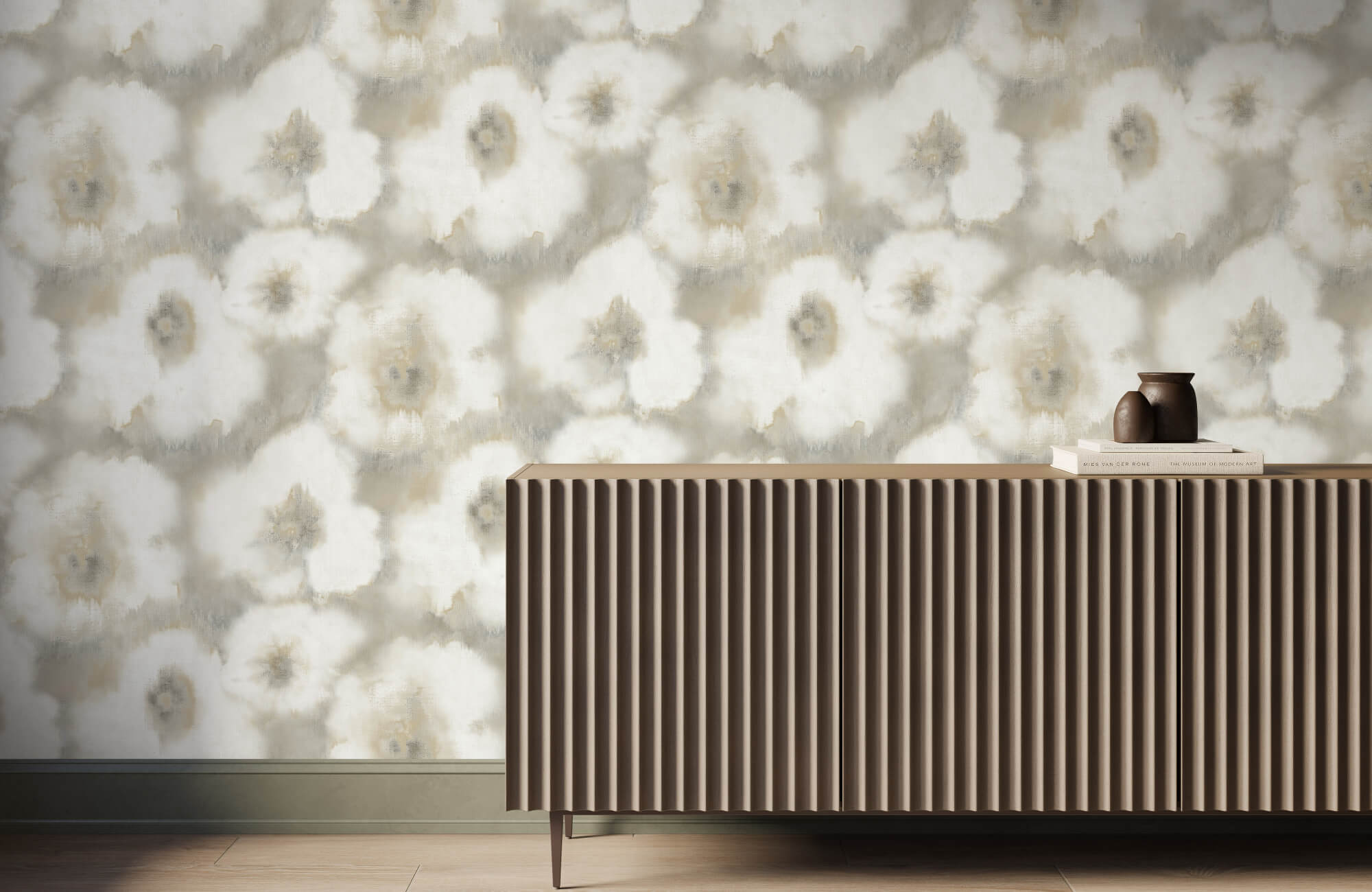
Some of the most cohesive throw pillow arrangements happen when the colors already exist elsewhere in the room. As shown above, our Brielle 18” x 18” Down Pillow in Natural / Brown echoes the warm brown tones found in the wallpaper, bedding, and wood accents, while its soft beige center ties naturally into the lighter finishes throughout the space. Because the palette feels connected to elements that are already present, the layered look reads as intentional and collected rather than something assembled from unrelated colors.
Use A Dominant Color, A Supporting Tone, And An Accent
When too many throw pillow colors compete equally, the arrangement usually starts feeling chaotic, which is why a little structure helps. A simple way to approach it is by thinking in layers: one dominant color that anchors the arrangement, a secondary tone that supports it, and a smaller accent that brings contrast or energy. This keeps the mix feeling dynamic without making every pillow fight for attention at once. For example, a sofa might feel balanced with deep blue as the lead, softer beige or gray as support, and a touch of rust or muted gold for warmth. You do not need to follow a rigid formula every time, but giving the arrangement some visual hierarchy makes styling much easier.
When Monochromatic Layering Works Better Than Mixing Contrasts
Not every room benefits from bold contrast, and sometimes staying within one color family actually creates a stronger result. If your space already has a calm or more refined design direction, layering different shades of the same color can make the throw pillow arrangement feel rich without becoming visually busy. Think navy paired with dusty blue and softer slate tones, or warm beige layered with camel and deeper taupe instead of forcing in an unrelated accent just to create variation. Texture becomes especially important here because color alone is doing less of the visual work, so woven fabrics, velvet, linen, or subtle tonal variation help keep the arrangement from falling flat. If contrast keeps feeling awkward in your space, monochromatic layering may simply be the smarter route.
How Neutral Throw Pillows Can Keep Stronger Colors Grounded
Strong color usually works best when it has something calmer to balance against, which is where neutral throw pillows quietly do a lot of heavy lifting. Without that visual pause, brighter or deeper colors can sometimes feel like they are piling up rather than working together. Cream, taupe, soft gray, warm beige, or even charcoal can help anchor bolder pillows so the arrangement feels intentional instead of overwhelming. This does not mean neutrals have to be boring placeholders either, since textured fabrics or richer neutral tones can still add plenty of visual interest. If your colorful throw pillow mix feels like it is trying a little too hard, adding a neutral layer is often what pulls everything back into balance.

Throw Pillow Color Combinations That Actually Work Together
Once you understand what causes colors to clash, mixing throw pillows becomes much more enjoyable because you can focus on combinations that already have a natural sense of balance. The goal is not memorizing design rules, but finding palettes that suit your space, whether you want something relaxed, warm, dramatic, or a little cleaner and more modern.
Blue, Green, And Earthy Tones That Feel Relaxed Instead Of Busy
If you want a throw pillow mix that feels calm but still layered, blue and green paired with earthy tones is one of the easiest combinations to get right. Softer sage, olive, dusty blue, navy, camel, and warm beige tend to work especially well together because they feel naturally connected rather than overly styled. This palette works beautifully in homes with wood finishes, linen upholstery, natural rugs, or interiors that lean organic and relaxed. The key is mixing depth instead of using multiple equally saturated tones that all demand attention at once. Done well, this kind of palette feels effortlessly collected rather than like you tried to force a color story.
Blue tones tend to feel especially approachable when they are paired with lighter neutrals and natural textures rather than competing with multiple bold colors at once. Our Merelle 22” x 22” Down Pillow in Navy reflects this balance beautifully, combining a deep blue woven surface with crisp white whipstitching that softens the contrast and gives the color more room to breathe. As shown above, it is the kind of shade that can anchor a throw pillow arrangement while still working comfortably alongside warm beige, cream, olive, or other earthy tones that help the palette feel calm and collected.
Warm Terracotta, Rust, And Golden Tones That Layer Beautifully
Some spaces benefit from a little more warmth, and this is where terracotta, rust, muted gold, and warmer neutrals can make a throw pillow arrangement feel incredibly inviting. These colors tend to work especially well on cream, beige, taupe, brown, or even charcoal seating because they bring contrast without feeling harsh. There is a richness to this palette that feels cozy without automatically leaning seasonal, which is important if you want something that works year-round. Layering slightly different warmth levels helps the arrangement feel dimensional instead of flat, so pairing rust with softer clay or deeper amber often works better than repeating one exact tone. If your room feels a little cold or visually flat, this direction can add warmth in a very natural way.
Jewel Tones That Feel Rich Without Overwhelming The Space
Jewel tones can look incredibly beautiful in throw pillow styling, but they work best when you treat them with a little restraint. Emerald, sapphire, burgundy, deep plum, and richer teal tones bring instant depth, though piling too many saturated shades together can make the arrangement feel heavy fast. Letting one jewel tone lead while supporting it with softer neutrals or darker grounding shades usually creates a much stronger result. Velvet or other richer fabrics tend to work especially well here because the texture naturally complements the depth of the color. If you love dramatic color but still want the room to feel polished, jewel tones can absolutely work without making the space feel overdesigned.
Soft Pastel Pairings That Still Feel Grown-Up
Pastels do not have to feel overly sweet or childlike when the palette is handled thoughtfully. Dusty blush, muted lavender, soft blue, sage, and chalkier neutral tones can create a throw pillow mix that feels airy and sophisticated rather than overly precious. The difference usually comes from choosing more muted versions instead of anything overly bright or candy-like, which keeps the arrangement feeling more refined. Pairing pastels with stronger grounding textures like linen, boucle, or woven fabrics also helps add maturity and dimension. If you want color without visual heaviness, softer palettes can work beautifully while still feeling very intentional.
Black, White, And Color Accents For Cleaner Modern Styling
If your style leans cleaner, sharper, or more contemporary, a black-and-white foundation with one thoughtful color accent can be incredibly effective. This approach works because the strong contrast already creates structure, which means you only need a small amount of color to bring personality into the mix. A muted olive, rust, dusty blue, or even a richer burgundy can work beautifully here, depending on how warm or cool the rest of the room feels. The key is keeping the accent controlled instead of turning the arrangement into a full rainbow against a monochrome base. If you want something modern but not sterile, this balance tends to land really well.

Mixing Patterned And Solid Throw Pillows Without Creating Chaos
Adding patterned throw pillows can make an arrangement feel far more layered and interesting, but this is usually where things start going wrong when there is no visual balance holding everything together. The good news is that mixing solids and prints does not need to feel complicated once you know what actually keeps the combination from looking chaotic.
Why Pattern Scale Matters More Than Most People Think
One of the fastest ways to make a throw pillow arrangement feel visually messy is by mixing patterns that all compete at the same scale. If every pillow has a similarly sized print, whether that is tight geometric repetition, medium florals, or equally bold stripes, your eye struggles to separate them, and the whole setup starts blending into noise. A stronger mix usually comes from giving the arrangement some variation, like pairing one larger statement pattern with something smaller and quieter, so each pillow has room to breathe. This creates contrast without forcing every piece to fight for the same level of attention. If your patterned pillows feel “off” even though you like them individually, scale imbalance is often the reason.
Keeping Mixed Prints Connected Through Shared Colors
Patterns do not need to match exactly to work together, but they do need some kind of visual connection, or the arrangement can start feeling random fast. The easiest way to create that connection is through shared color, whether that means repeating one dominant shade across multiple prints or pulling a supporting tone through different pillow designs. For example, a striped pillow, an abstract print, and a softer botanical can absolutely sit together if they all echo a similar blue, rust, sage, or neutral family somewhere in the design. That shared thread helps the arrangement feel cohesive even when the patterns themselves are quite different. Without that relationship, mixed prints often read less like intentional layering and more like unrelated leftovers landing on the same sofa.
When Solids Are What Save The Whole Arrangement
Sometimes the smartest styling move is not adding another patterned pillow, but giving the eye somewhere calmer to land. Solid throw pillows do a lot more than fill space, since they help break up visual activity, create breathing room, and stop mixed prints from overwhelming the arrangement. Texture becomes especially useful here because a solid linen, velvet, boucle, or woven pillow can still bring plenty of depth without introducing another competing pattern. This is often what separates a thoughtfully layered setup from one that feels like it is trying too hard to impress. If your current throw pillow mix feels busy, swapping in one or two strong solids is often what brings the whole arrangement back under control.

How To Make Mixed Throw Pillows Feel Intentional Instead Of Random
Once you have the colors right, the final difference usually comes down to styling decisions that seem small but completely change how the arrangement reads. The same exact pillows can feel beautifully layered or strangely chaotic depending on how they are arranged, balanced, and edited.
Arrangement Order Can Change How The Colors Read
Even if you have chosen a great mix of throw pillow colors, placement can completely change how those colors feel once everything is on the sofa or bed. A bold accent shoved into the center may suddenly dominate the arrangement, while the same pillow placed toward the edge can feel much more balanced and supportive. Grouping similar tones too closely can also make the setup feel heavy in one area while leaving the rest visually disconnected. This is why styling is not just about what pillows you choose, but how your eye moves across the arrangement once they are in place.
A helpful way to approach this is by building outward instead of placing pillows randomly wherever they fit. Start with your larger or more grounding pillows at the back or outer edges, then layer smaller accents or stronger colors where they can add personality without taking over. On beds, symmetry often creates a cleaner look, while sofas can usually handle a slightly more relaxed arrangement. Accent chairs usually need much less, since trying to force a full layered setup into a smaller seat often feels crowded fast.
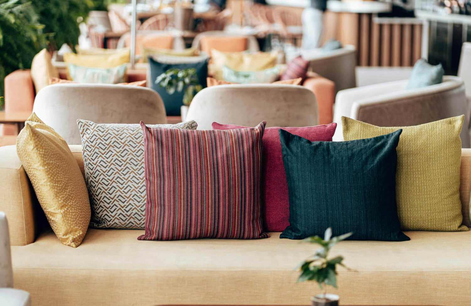
Placement often matters just as much as the colors themselves when you are trying to create a more cohesive throw pillow arrangement. As shown above, our Merelle 22” x 22” Down Pillow in Olive and Merelle 22” x 22” Down Pillow in Ivory help create a natural sense of visual hierarchy, with the deeper olive tone adding depth in the background while the lighter ivory pillows keep the arrangement feeling open and balanced. The smaller rust accents introduce contrast without dominating the composition, allowing each color to contribute without competing for attention.
Why Texture Helps Mixed Colors Feel More Cohesive
Color does a lot of the visual work, but texture is often what makes mixed throw pillows feel thoughtfully layered instead of flat or disconnected. A room full of pillows in identical smooth cotton, even in beautiful colors, can sometimes feel less interesting than a smaller mix where linen, velvet, boucle, or woven finishes bring more variation. Texture softens the pressure for color to do everything, which makes stronger combinations feel easier on the eye. It also helps similar shades feel more dimensional, especially when you are layering monochromatic or closely related tones.
If your throw pillow mix feels a little too coordinated or oddly one-note, texture is often the missing piece rather than another new color. A rust velvet beside a woven neutral or a soft boucle paired with cleaner linen instantly adds more depth without disrupting the palette you already built. This is especially useful if you want color but still prefer a calmer, more refined overall look. Sometimes the arrangement does not need more contrast; it just needs more tactile variation.
Knowing When To Edit Back Instead Of Adding Another Pillow
One of the easiest mistakes to make when styling throw pillows is assuming that if something feels slightly off, the solution is adding one more pillow to fix it. In reality, that extra addition often makes the arrangement feel heavier, busier, or less intentional because the original issue was not a lack of volume, but a lack of editing. Mixed throw pillows usually look strongest when each piece has enough room to contribute rather than fighting for space. If your eye feels restless looking at the arrangement, that is often a sign that something needs to come out, not that something new needs to come in.
A good styling reset is to remove the pillow you feel least attached to and reassess before buying or adding anything else. This instantly helps you spot whether the problem was overcrowding, repetitive color, or too much competing pattern. The same logic applies to smaller accent chairs, where over-layering almost always works against you. Sometimes, the most polished throw pillow arrangement is simply the one that stopped at the right moment.
Bringing Color Into Your Space With More Confidence
Mixing colored throw pillows does not have to feel like a design puzzle where one wrong choice throws everything off balance. More often than not, successful combinations come from paying attention to undertones, creating a clear color hierarchy, and building from elements already present in the room rather than chasing individual colors in isolation. Once those foundations are in place, layering contrast, pattern, and texture becomes much more intuitive, allowing the arrangement to feel collected rather than forced. The goal is not creating a perfectly coordinated display, but a space that feels comfortable, intentional, and visually connected.
If you are still deciding which colors, patterns, or textures work best together, Edward Martin’s Personalized Design Consultation can help simplify the process. Whether you are refreshing a sofa, styling a bed, or trying to create a more cohesive palette throughout the room, personalized guidance can help you narrow down options that suit both your space and your design preferences. Sometimes a second perspective is all it takes to identify what is working, what is competing for attention, and what will create the most balanced result.