


Choosing wall art for a bedroom begins with a single, honest question: how do you want the room to feel when you walk in? A bedroom is not simply another decorated space. It is where the day begins and ends, a room that should support rest, comfort, and a sense of personal ease that no other space in the home needs to carry the same way.
The best bedroom wall art does not need to be the most expensive, the largest, or the most striking piece you can find. It needs to feel right for the room, connected to the existing space character, and considered enough to make everything feel complete without making it feel busy. When mood, scale, placement, color, subject, and finish are all understood together, choosing art becomes less daunting and far more intuitive.

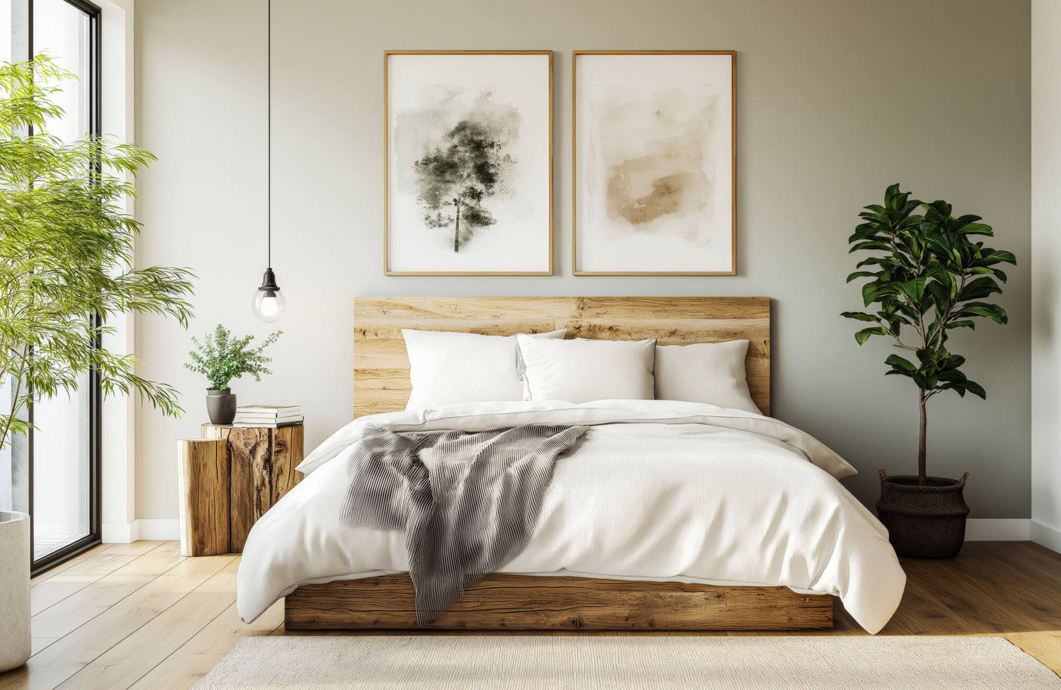
A large abstract work anchors the bed wall with depth and warmth, its dark, layered tones and gold undertones adding intimacy to a bedroom composed in cool gray, warm timber, and terracotta accents
Start With the Feeling You Want in the Room
Before looking at frames, prints, or canvases, decide what emotional tone you want the bedroom to have. The first decision should always be rooted in atmosphere, how the art changes the feeling of the room once it is on the wall, not simply how it looks on its own.
Define the Bedroom Mood
Start by naming the mood you want the bedroom to express. For a peaceful room, look for art with soft shapes, muted tones, open compositions, or nature-inspired imagery. Landscapes, gentle abstracts, botanical prints, and simple line drawings often work well, as they give the eye something pleasant to rest on without demanding too much attention. Edward Martin's Follow the Wind Wall Art is a fitting example; its delicate botanical composition and soft blue-gray tones can bring a sense of natural stillness to a room, the kind of piece that feels effortless in a bedroom where calm is the intention.
For a more intimate feeling, consider art with deeper tones, softer contrast, or layered texture. Moody photography, tonal abstract work, or pieces with warm earth shades can add depth without making the room feel heavy. If the bedroom is meant to feel fresh and airy, lighter artwork supports that intention. Pale backgrounds, simple compositions, and pieces with open space keep the room feeling relaxed, an approach that works especially well in smaller bedrooms, where dense or busy artwork can make the walls feel crowded.
Match Art to How You Use the Space
The way you use your bedroom should shape the type of art you choose. If the room is primarily for sleep, softer and more restrained art is usually the better choice, pieces that help the room feel settled rather than active, especially on the wall that faces the bed.
If the bedroom also includes a reading corner, vanity, desk, or lounge chair, those areas can carry art with more personality. A small framed print near a chair makes the corner feel intentional; a more detailed work near a dresser creates a finished vignette. In these cases, the art gives a specific area its own character without disturbing the restful quality of the room as a whole
Not every wall needs the same level of visual energy. The art above or opposite the bed should feel calmer, while secondary areas can handle pieces with stronger color, pattern, or presence.
Avoid Art That Feels Too Stimulating
Some artwork that looks beautiful in a hallway, office, or living room can feel too intense in a bedroom. Crowded compositions, harsh color contrasts, or pieces with sharp visual movement can make the room feel less restful. Since the bedroom is a private space, comfort should take precedence over impact.
This does not mean the art has to be plain. It simply means it should not compete with the room’s purpose. If a piece makes the eye move too quickly or creates a sense of tension, it may be better suited for another space in the home. A useful test is to imagine seeing the artwork first thing in the morning and last thing at night. If it feels calming, personal, or pleasant in both moments, it is likely a strong choice for the bedroom.

A single horizontal artwork above the bed sits in considered proportion to the headboard, its warm, nature-inspired tones drawing from the room's palette of cream, soft blue, and natural wood without overpowering the wall it anchors
Choose a Size That Fits the Wall and Furniture
Scale is one of the most important decisions in choosing bedroom wall art; a piece that is too small can look disconnected, while one that is too large can overpower the bed, dresser, or surrounding wall. A well-sized piece relates to the furniture below it and the open wall around it, so the artwork feels intentional rather than placed as an afterthought.
Measure Before You Choose
Before choosing bedroom wall art, measure the wall and the surrounding furniture. This gives you a clearer sense of what size will actually work in the space. Above a bed, the artwork or grouping should typically be narrower than the headboard so it feels connected without extending too far past the furniture.
A practical starting point is to choose art approximately two-thirds to three-quarters the width of the headboard. If the headboard is 72 inches wide, artwork between 48 and 54 inches wide will often feel balanced. This is not a rigid rule, but it prevents the piece from reading too small or too wide for the wall it occupies.
The same principle applies above a dresser. The artwork should feel related to the furniture below it without matching its width. Leaving space on both sides keeps the arrangement relaxed and considered.
Decide Between One Piece and a Grouping
A single large piece is often the most resolved choice for a bedroom. It creates a clear focal point, reduces visual clutter, and works especially well above a bed or dresser. A piece like Edward Martin’s Quiet Study Wall Art, with its understated composition and generous scale, is exactly the kind of piece that can anchor a bed wall with presence and calm. If the bedding, rug, or curtains already carry a pattern, one strong artwork keeps the room from feeling too busy.
Grouped art can also be beautiful, but it requires more control. Two matching pieces above a bed create symmetry, while three related prints can build flow across a wider wall. A gallery arrangement can work in a bedroom, but it should feel edited rather than accumulated. When using multiple pieces, maintain consistency in at least one element, such as frame finish, artwork style, color palette, or spacing. That coherence is what allows a grouping to feel intentional rather than collected without direction.
Leave Enough Space Around the Art
Wall art needs room to be seen. If a piece is hung too close to the ceiling, the headboard, or the furniture beside it, the wall can feel compressed. Open space around the artwork allows it to stand out and gives the room a more considered, unhurried appearance.
Above a bed, leave enough distance between the headboard and the bottom of the artwork so the arrangement feels connected but not crowded. In most bedrooms, 6 to 10 inches above the headboard tends to work well, though the right distance will depend on the bed height and the size of the frame. For walls without furniture beneath them, center the artwork at approximately eye level. The goal is simply that the art feels natural to view, not oddly high or low, not squeezed into a corner, but placed with the same care as everything else in the room.

A floral artwork placed to the left of the bed, rather than centered above it, shows how placement shapes a room's character. The off-center positioning leaves the bed wall open and lets each piece of art occupy its own considered space within a room full of personal detail
Place Art Where It Strengthens the Room
Placement is not about filling empty walls; the right location can frame the bed, soften a dresser, balance a corner, or give the room a more deliberate sense of structure. Rather than placing art wherever space allows, consider how the eye moves through the room and choose positions that support its main features without making every wall compete for attention.
Make the Bed Wall the Main Focus
The wall above the bed is the most natural location for bedroom wall art. Since the bed is typically the largest piece of furniture in the room, artwork above it can anchor the entire space, creating a clear focal point and making the bed feel more complete.
When choosing wall art, consider the headboard's shape. A tall headboard may suit a lower, wider piece, while a simple platform bed may benefit from larger artwork that adds vertical presence. If the headboard already has a strong texture or detail, choose art that complements it rather than competes with it.
Practicality also matters here. Avoid very heavy or unstable pieces directly above where you sleep unless they are properly secured. Lightweight framed prints, canvas art, or textile pieces are often the most sensible choices for this position.
Style the Dresser Wall With Purpose
A dresser wall offers an opportunity to create a more layered bedroom moment. Art above a dresser can work alongside lamps, trays, vases, books, or mirrors to build a finished arrangement, particularly useful when the bed wall already carries enough visual presence.
The artwork should relate to the dresser without overwhelming it. A vertical piece can add height above a lower dresser; a horizontal piece can echo the furniture's form. If objects are displayed on the dresser, let the art serve as background rather than competing for equal attention. This area can carry slightly more detail than the wall above the bed, since it is not always the first place the eye settles. The colors and sensibility, however, should still connect to the rest of the room.
Use Smaller Art in Quiet Corners
Not every piece of bedroom art needs to be large. A small framed work can bring a more personal, finished quality to corners, nightstands, or narrow walls, especially in rooms that feel incomplete without needing another focal point. Edward Martin's Quiet Orchard Wall Art is a considered example of this: its intimate scale and soft, nature-inspired composition make it well-suited to a nightstand wall or reading corner, adding warmth and presence without overpowering the surrounding space.
A slim vertical print beside a bed can draw the eye upward without occupying much space. A small artwork near a reading chair makes the corner feel considered. A pair of small pieces above nightstands can create balance when no large artwork anchors the bed wall.
The discipline here is restraint. Small art should read as a thoughtful detail, not a space filler. Choose pieces that add warmth or personal character while still supporting the room's overall tone.

Two botanical prints in soft pink tones sit above the bed on a blue-gray accent wall, their warm, floral hues drawing from the blush bedding and connecting to the cool wall color in a way that feels balanced rather than matched
Coordinate Color Without Making Everything Match
Color helps bedroom wall art feel connected to the room, but matching every tone too closely can make the space feel flat. A more considered approach is to repeat a few colors from the room while allowing the artwork to introduce subtle contrast, present enough to hold its own, connected enough to feel like it belongs.
Pull Colors From What You Already Own
Before choosing wall art, look at the colors already working in your bedroom. Bedding, curtains, rugs, lamps, throw pillows, wood tones, and wall paint can all provide direction. The artwork does not need to include every color in the room, but repeating one or two tones creates a sense of connection.
If the bedroom has cream bedding, walnut furniture, and muted green pillows, art with soft neutrals and a touch of green can feel cohesive. If the room has blue-gray walls and white linens, art with pale blue, charcoal, or warm beige can bring the palette together naturally. This approach is especially useful when the choice feels overwhelming. Rather than starting from an open-ended search, begin with the colors already succeeding in the space.
Add Contrast in a Controlled Way
A bedroom composed entirely of similar tones can sometimes feel unresolved. Wall art can introduce contrast without making the room feel loud. In a mostly neutral space, artwork with muted terracotta, olive, navy, or deep gray can give the room more definition without unsettling its calm.
Contrast can also come from the balance of light and dark. A pale room may benefit from artwork with deeper lines or shaded areas; a darker bedroom may need art with more open, lighter space to keep the walls from feeling too heavy. The goal is not to create tension but to give the room enough variation to feel genuinely layered. When introducing contrast through art, consider how much of that color the room can hold. A small amount of a stronger shade is often sufficient and easier to live with over time.
Balance Warm and Cool Tones
Color temperature affects how settled a bedroom feels. Cool tones, such as blue, gray, and green, can feel serene, but an excess of cool shades may make the room feel distant. Warm tones, such as beige, rust, clay, and soft brown, feel inviting, but too much warmth can make the space feel heavy.
Wall art can help correct that balance. If the bedroom has cool gray walls, artwork with cream, tan, blush, or natural wood tones can soften the effect. If the room has warm walls or warm wood furniture, art with soft blue, green, white, or charcoal can introduce a sense of freshness. This is a relatively simple way to bring more balance to a bedroom without repainting walls or replacing major furniture. The art becomes a bridge between what is already in the room.

A soft landscape painting above the bed introduces warm terracotta and blush tones into a room defined by cool blue bedding and gray walls, a single, calming subject that bridges the room's warm and cool tones without imposing a theme
Choose Subjects That Feel Personal and Restful
The subject of bedroom wall art should suit the private nature of the space, quieter, more personal, and more closely connected to what makes you feel genuinely at ease than art chosen for more public rooms. What matters most is that the piece is comfortable to live with and supports the mood you want to return to each day.
Look for Calming Imagery
Certain subjects naturally work well in bedrooms because they feel settled and easy to be near. Landscapes, botanical studies, soft abstracts, gentle figure drawings, textile-inspired prints, and understated photography all give the eye something pleasant to rest on without creating restlessness.
Nature-inspired pieces are particularly versatile. A misty landscape brings depth; a floral print softens the wall; a simple leaf study adds an organic detail without imposing a theme. These subjects translate across many different interior styles. For those who prefer something less literal, abstract art can create a similar feeling through shape and color alone. Soft curves, washed tones, and layered forms bring movement without tying the room to a specific subject.
Use Personal Art With Intention
Personal pieces can make a bedroom feel more meaningful. Travel prints, family photographs, inherited artwork, handmade pieces, or art connected to a significant place give the room a sense of memory and character. The bedroom, however, is still a space for rest, so personal art should be chosen with care.
Select images that bring comfort rather than emotional complexity. A peaceful travel photograph may suit the bedroom more naturally than a crowded event image. A delicate inherited sketch may work better near a dresser than directly above the bed. Framing can also elevate personal art. A simple mat, a consistent frame, or a considered arrangement can transform meaningful pieces into part of the room's design rather than leaving them feeling temporary or informal.
Avoid Overly Literal Themes
A thematic direction can be useful, but too much of one idea can make a bedroom feel decorated rather than lived in. Coastal art can be beautiful, but if every piece references shells, waves, and ocean tones, the room loses its subtlety. The same applies to floral, rustic, glam, or minimalist approaches taken too far.
A more refined way to suggest a theme is to let one piece carry the idea. If you are drawn to a coastal feeling, choose one calm seascape or an abstract in sand and blue tones. If you prefer a botanical sensibility, one strong plant-inspired work often communicates more than several smaller ones. This gives the room a point of view without making it feel predictable, and leaves space for the design to evolve.

A large figurative canvas sits centered above the headboard, framed by ornate wall moulding and flanked by pendant lights, showing how the right artwork, scaled to the wall and lit with intention, becomes fully integrated into the room's architecture rather than simply hung upon it
Finish the Look With Frames, Materials, and Lighting
The finishing details can shift how bedroom wall art feels once it is in the room. Frames, materials, and lighting together determine whether a piece reads as casual, polished, warm, modern, or soft and whether it feels integrated into the room or simply placed upon it.
Choose a Frame That Supports the Style
A frame changes the personality of the artwork it holds. Wood frames add warmth and work well alongside natural textures, woven accents, and relaxed interiors. Black frames add definition and can sharpen even a simple print. White frames feel light and suit airy rooms or spaces with pale walls.
Metal frames can introduce a more polished quality, particularly effective in bedrooms with brass, bronze, or chrome accents, as long as the finish connects to something else already in the room. A brass-toned frame, for instance, feels considered rather than incidental when it echoes the nearby lamp hardware or drawer pulls. The mat deserves equal attention. A wide mat can give a small print more presence and importance; no mat can make art feel more immediate and modern. Choose the option that best serves the room, not just the artwork itself.
Consider Texture Beyond Framed Prints
Bedroom wall art is not limited to paper prints or stretched canvases. Textile pieces, woven hangings, plaster-style panels, ceramic wall works, and sculptural elements can all introduce texture in ways that framed prints cannot. These options are particularly valuable when the bedroom already has a restrained color palette and needs depth rather than color.
A woven wall hanging can soften a room with many hard or smooth surfaces. A canvas can feel relaxed and substantial without the formality of glass. A framed print can bring a cleaner, more tailored quality. Each material produces a different effect; the right choice depends on what the room requires. Texture is also a considered way to add layering when you want more depth without introducing stronger color.
Use Lighting to Highlight the Art Gently
Lighting makes art feel more intentional, but in a bedroom, it should stay soft. A picture light, sconce, shaded lamp, or warm-toned bulb can draw the eye to the artwork without making the room feel harsh. Edward Martin's McAvoy 24" Picture Light in Aged Brass is a well-suited choice; its warm brass finish and directed light bring focused, understated illumination to a piece without competing with the restful quality of the room. This is especially effective above a dresser or beside a reading corner.
Avoid lighting that creates glare on glass frames. If the artwork faces a window, consider matte glass, acrylic glazing, or a canvas finish to reduce reflection and make the piece easier to enjoy throughout the day. Warm lighting is almost always more flattering in a bedroom than cool lighting, as it gives art a softer appearance and helps the entire space feel more comfortable once the day begins to settle.
Bring the Bedroom Together
Choosing wall art for a bedroom becomes clearer when each decision is guided by the room's mood, scale, placement, color, subject, and finish, considered together rather than in isolation. The right piece does not simply fill an empty wall. It helps the bedroom feel complete, personal, and deeply at ease.
Begin with the wall that carries the most presence, usually the space above the bed or dresser, and choose art that works with the room rather than apart from it. When the scale feels balanced, the colors feel connected, and the subject feels natural to live with, the artwork becomes one of the details that makes a bedroom feel truly and enduringly settled.
If you would like guidance in selecting wall art that suits your space and feels cohesive within your home, we invite you to reach out for personalized support. Our design services are available to help you compose interiors that are refined, considered, and entirely your own.
