


A thoughtfully chosen piece of wall art does more than fill a space; it brings clarity, warmth, and visual balance to a living room, turning a well-furnished interior into something that feels genuinely considered. Whether it is a statement canvas above a sofa, a sculptural wall piece, or a curated gallery arrangement, the right artwork connects to the room's architecture, its material palette, and the way the space is actually lived in.
When scale, color, placement, and materiality are considered together, wall art becomes an integral part of the living room design rather than a separate accessory. This approach makes it easier to choose living room wall art that feels elegant, cohesive, and enduring.

The Quiet Study Wall Art reinforces the room’s design language by connecting traditional influences, layered textures, and curated wall displays into a cohesive aesthetic composition
Establish The Living Room’s Design Language
Before selecting any piece, it helps to read the room itself, its architectural details, furniture silhouettes, and material palette, because the most successful living room wall art begins with a clear understanding of this foundation. When that context is firmly in place, artwork can be chosen with real purpose, allowing each piece to support and strengthen the room's overall visual narrative rather than simply occupying wall space.
Align Artwork With Interior Style And Architecture
A modern living room often benefits from abstract wall art, oversized canvas prints, or minimalist line drawings that emphasize clean geometry and open negative space. In a traditional interior, framed landscapes, botanical studies, portraiture, or classical art prints can complement millwork, carved furniture, and formal symmetry. Transitional spaces usually require a more balanced approach, where contemporary subject matter is softened by refined framing or classic proportions.
Organic modern interiors feel most cohesive with textured wall art, earth-toned compositions, and nature-inspired pieces that relate to wood, linen, stone, and woven materials, while coastal living rooms are better served by softer seascapes, airy abstract prints, or natural-fiber wall décor that complements a relaxed, airy palette. When artwork reflects both the interior style and the architectural character of a room, the result feels intentional rather than simply styled.
Define The Mood Through Subject Matter And Form
Wall art shapes the emotional register of a living room through subject matter, color psychology, line quality, and compositional movement. Soft landscapes, tonal abstracts, and muted botanical prints create a calm, grounded atmosphere suited to relaxed seating areas and quieter spaces designed for rest and conversation, while bold geometric artwork, expressive brushwork, or high-contrast photography introduces energy, sophistication, and visual presence.
A formal living room can often support a more commanding statement piece, while a casual family room may benefit from warmer imagery and gentler transitions. Artwork should also reflect how the room is used, whether for entertaining, everyday gathering, or quiet retreat, because when mood and function are aligned, the artwork deepens both the emotional tone and the lived experience of the space.
Create Continuity Through Motifs And Materials
A cohesive living room does not require exact color matching, but the artwork should share a visual relationship with its surroundings through repeated undertones, similar textures, complementary motifs, or linework that echoes shapes already present in the room. Walnut wood, ivory upholstery, and aged brass accents, for example, pair naturally with warm neutral artwork, earthy abstract forms, or softly textured canvas pieces, while a living room with black metal details and cool gray upholstery may feel more refined with monochrome prints, architectural photography, or blue-based abstract compositions.
These connections should feel subtle and layered rather than literal or coordinated. When motifs and materials are thoughtfully repeated, artwork becomes part of the design composition rather than something placed beside it.

The Earthbound Trace Wall Art illustrates how proper scale and visual weight can establish a focal point while maintaining proportional harmony within architectural niches and built-in features
Determine Scale, Proportion, And Visual Weight
Scale has a direct and immediate effect on how balanced and finished a living room feels, particularly when artwork is placed above major furniture pieces or across large wall planes. Beyond physical measurements, proportion and visual weight determine whether a piece feels properly anchored within the room or simply hung upon it, which is why these qualities deserve just as much consideration as color or style.
Size Artwork In Relation To Furniture And Wall Planes
When wall art is placed above a sofa, console table, fireplace mantel, or media cabinet, the piece or grouping should generally span about two-thirds to three-fourths of the furniture's width. This proportion establishes a clear visual relationship between artwork and furniture, helping the arrangement feel grounded rather than floating. A large horizontal canvas, a paired print set, or a structured gallery arrangement almost always reads better above a standard sofa than a single undersized piece.
Wide wall planes can support panoramic prints, triptychs, or multi-panel compositions that distribute visual mass evenly across the surface, while narrower walls call for portrait-format artwork, vertical diptychs, or slender sculptural wall pieces that preserve negative space. When artwork is scaled in proper relation to both the furniture and the wall plane, the room gains stronger spatial balance and a more resolved focal point.
Respond To Ceiling Height And Room Volume
Ceiling height shapes the orientation, placement, and overall presence of wall art within a living room in ways that go beyond simple measurement. Tall ceilings can accommodate vertical artwork, stacked compositions, or oversized canvas pieces that draw the eye upward and honor the architectural height, while lower ceilings often benefit from wider horizontal artwork that extends the perceived width of the room without amplifying any sense of compression.
In open-plan living rooms, larger walls may require greater visual mass because the artwork is seen from multiple angles and distances, and vaulted ceilings, double-height walls, and extended feature walls may call for multi-piece installations to maintain proportion across the full architectural volume. When artwork responds to the room's scale and not simply its own dimensions, it feels integrated with the architecture rather than applied to it.
Balance Visual Weight Through Contrast And Framing
Visual weight refers to how commanding a piece appears regardless of its actual size. A dark artwork with strong tonal contrast, dense detail, or a substantial frame can feel more dominant than a larger piece rendered in pale tones with open negative space. Frame thickness, mat width, color saturation, subject complexity, and edge definition all influence how much presence a piece commands.
This becomes particularly important in living rooms with statement furniture, patterned rugs, sculptural lighting, or high-contrast architectural finishes. A visually heavy artwork can anchor a restrained room, while a lighter piece can bring softness to an interior that already carries strong design elements, and balancing visual weight allows the artwork to elevate the room without competing with the surrounding composition.

The Dusk Fold Wall Art demonstrates how tonal variation, texture, and controlled contrast can strengthen visual rhythm while complementing an existing living room color palette
Coordinate Color, Tonality, And Visual Rhythm
Color connects wall art to the living room palette, while tonality and composition determine how the eye moves through the space. A refined selection looks beyond surface color matching to consider undertones, contrast, lighting temperature, and visual rhythm because it is this deeper layer of coordination that gives a room its sense of ease and cohesion.
Work With Undertones And Lighting Temperature
Every living room carries undertones that shape how artwork colors read once installed. Warm interiors built around beige, cream, camel, walnut, terracotta, or brass pair naturally with earthy compositions, muted reds, ochre, taupe, and soft brown tones, while cool interiors defined by gray, black, chrome, marble, or blue accents can support charcoal prints, deep green artwork, blue abstracts, and monochromatic photography.
In mixed-tone spaces, artwork that holds both warm and cool notes can connect different finishes without forcing an exact match. Lighting also transforms color; warm bulbs deepen reds and yellows, while cooler light sharpens blues, grays, and contrast edges, and when the effects of artificial light are considered alongside undertones, the artwork reads as cohesive across both natural daylight and evening illumination.
Control Contrast For A Strong Focal Point
Contrast determines how strongly artwork stands out against the wall, furniture, and surrounding décor, and understanding this dynamic is key to creating a focal point that feels intentional rather than accidental. In a neutral living room, bold artwork can introduce saturation, depth, and a defined focal point without overwhelming the palette, while in a colorful living room, quieter artwork with softer tonal values may be more effective because it prevents visual clutter and chromatic fatigue.
High-contrast black and white art can add structure to modern interiors, especially when paired with clean-lined furniture and architectural lighting, and low-contrast artwork creates a calmer effect that is particularly suited to relaxed, minimalist, or tonal living room interiors. Used thoughtfully, contrast guides attention while preserving the room's overall sense of harmony.
Use Composition To Guide Movement
Composition, the arrangement of line, form, texture, negative space, and color, directs how the eye moves through both the artwork and the room, giving it a quiet but powerful influence over how a space feels to inhabit. Strong vertical movement makes a living room feel taller, while horizontal movement makes it feel wider and more settled; curved forms soften angular furniture, while geometric compositions bring structure to relaxed upholstery and organic materials.
Artwork with generous negative space feels calm and refined, making it particularly effective in minimalist, contemporary, or luxury interiors, while denser compositions with layered detail carry more energy and are usually most successful when the surrounding décor is visually restrained. When composition supports the room's sightlines and spatial rhythm, the artwork feels like it belongs, not like something placed in front of the design.

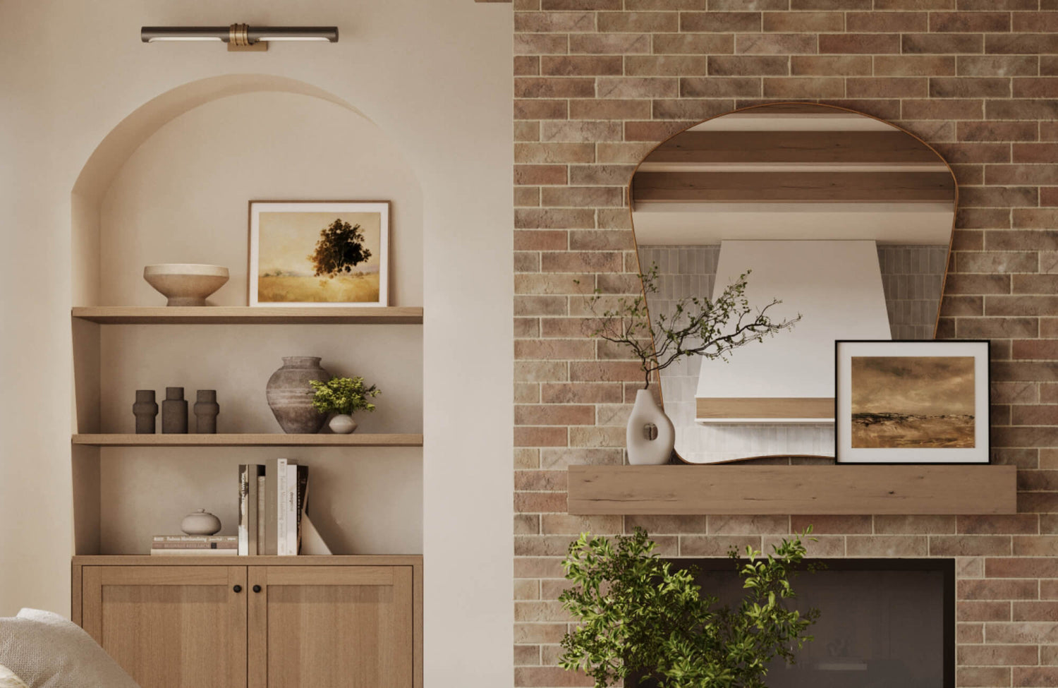
The Borrowed Dawn Wall Art highlights how strategic placement and thoughtful alignment can enhance sightlines while creating a well-composed display within a living room setting
Plan Placement, Sightlines, And Display Format
Placement determines how wall art relates to furniture, architecture, and the viewer's natural field of vision, and a well-resolved display is the result of thinking through hanging height, clearance, axis alignment, and spacing with the same care given to the artwork itself. Whether the room calls for one defining piece or a curated grouping, these decisions shape how finished and intentional the final arrangement feels.
Position Artwork According To Eye Level And Clearance
A widely used professional guideline places the center of the artwork at approximately 57 to 60 inches from the floor, keeping it aligned with the average eye level and ensuring it relates to the people in the room rather than the architecture above them. When artwork is hung above a sofa, console, or fireplace mantel, the bottom edge should generally sit 6 to 10 inches above the furniture, creating a visual connection between the artwork and the piece below while allowing enough negative space for the arrangement to feel considered rather than crowded.
In rooms with very tall ceilings, the artwork may need slight adjustment, though it should still relate to human scale rather than to the ceiling height alone; pieces hung too high detach from the seating arrangement and lose their ability to anchor the room's focal point. Correct placement gives any living room a more deliberate, gallery-quality presence.
Choose A Statement Piece Or Gallery Arrangement
A single oversized artwork creates a clean, commanding focal point and works especially well in modern, minimalist, and luxury living room interiors, where removing visual noise allows the piece's scale, surface texture, and color field to make a fuller impression. A gallery arrangement, by contrast, creates a more collected, layered effect, combining framed prints, photography, or original works into one curated composition that tells a more nuanced visual story.
For a gallery wall to feel refined rather than accumulated, spacing, proportional balance, frame coordination, and visual weight must all be carefully considered, and mixed frame finishes can succeed when they share a material tone, color temperature, or profile depth. The right format ultimately depends on whether the room needs bold simplicity or a more layered visual narrative.
Align Artwork With Architectural Axes
Architectural features already establish the focal points, sightlines, and spatial hierarchy of a room, and artwork placement should honor that structure rather than work against it. A fireplace, built-in shelving, wall paneling, or media wall provides a natural axis for living room wall art. Centering a piece above a mantel reinforces symmetry, while placing artwork beside built-ins can soften cabinetry and balance vertical mass.
In rooms with large windows, artwork should complement the view by addressing adjacent wall areas rather than competing with it, and where wall paneling is present, artwork should fit within the molding dimensions so the architectural detail remains legible. When placement follows the room's architectural logic, the living room feels ordered, resolved, and complete.

The Golden Drift Wall Art showcases how tactile materials, quality framing, and timeless craftsmanship contribute to lasting visual appeal and enduring interior versatility
Refine Materiality, Framing, And Longevity
Once the design direction and placement are established, the final selection should give careful thought to the artwork's surface, substrate, frame profile, and long-term adaptability. These details determine depth, durability, and how enduring the piece feels, not just today, but as the surrounding interior continues to evolve.
Introduce Texture Through Surface And Substrate
Texture adds dimensional depth to living room wall décor, and in neutral interiors where subtle material variation carries much of the visual interest, this quality becomes especially important. Textured canvas art, woven wall hangings, plaster relief pieces, mixed-media artwork, and sculptural wall panels create tactile richness beyond flat imagery, and these surfaces also interact with natural and artificial light, producing shadow, movement, and depth throughout the day.
A room with smooth leather, polished stone, or sleek metal may benefit from softer organic materials that reduce visual hardness, while a living room with linen, bouclé, rattan, or reclaimed wood can support layered textures that enhance warmth and continuity. Through materiality, the artwork connects with the room's surfaces rather than relying on color alone.
Select Frame Profiles That Reinforce The Design Concept
Framing does more than contain an artwork; it manages the transition between the piece, the wall surface, and the interior elements surrounding it, quietly shaping how the entire display is received. Thin black frames suit modern, industrial, and contemporary interiors well, offering definition without ornamentation and allowing the artwork itself to hold the attention, while natural wood frames introduce warmth and material continuity that feels especially at home in organic modern, Scandinavian, coastal, and transitional spaces.
In more formal traditional living rooms, ornate gold or carved frames add a layer of ceremony that complements classical artwork and antique-inspired furnishings with ease, and floating frames lend canvas artwork a clean, gallery-quality presence while preserving the shadow depth around the piece—a subtle detail that adds dimension without drawing focus away from the work itself. When the frame is chosen in genuine support of both the artwork and the room's design concept, the finished display has a quality that is immediately felt: not assembled, but resolved.
Choose Artwork With Enduring Design Flexibility
The most enduring wall art is chosen not for the moment but for the long view—pieces that reflect personal sensibility, honor the home's architecture, and work naturally within the room's core color palette. Neutral abstracts, refined landscapes, architectural prints, and well-composed textured pieces carry this quality well, adapting across design evolutions without losing their resonance, and when artwork is selected with that kind of intention, it remains beautiful and relevant even as furniture, accessories, and design sensibilities shift over time.
Trend-driven artwork still has its place, though it tends to feel most at home in smaller pieces or secondary areas where it can be refreshed without disrupting the room's broader composition. For larger, more considered investments, the piece should carry both emotional meaning and visual compatibility with the living room's long-term direction, something that feels just as right years from now as it does today, and that is what allows a space to feel genuinely elevated: current without being temporary, personal without being precious, and enduring in the way that only truly considered design can be.
Creating A Living Room With Lasting Visual Impact
The most successful living room wall art is not the result of individual decisions made in isolation, but of a way of thinking that holds proportion, color, placement, materiality, and architectural awareness together as a whole. When artwork is chosen in genuine relation to the room's furniture and design direction, it strengthens the composition rather than completing it as an afterthought, and that distinction is felt immediately.
Scale, visual weight, framing, and texture each contribute their own layer of depth and character, the kind that moves a room from well-designed to genuinely livable. By treating wall art as part of the interior rather than an addition to it, the living room becomes something more considered: cohesive, quietly sophisticated, and naturally expressive of the people who inhabit it.
Edward Martin’s design services can help identify wall art and décor selections that complement your furnishings, architectural features, and overall vision for the space. Contact us to create a thoughtfully curated living room that reflects both your style and the way you live!