


Warm-toned rugs do more than add color; they shape the atmosphere of a space with intention and depth. Defined by hues in the red, orange, and yellow spectrum, along with earthy tones like terracotta, ochre, and rust, these colors naturally evoke a sense of warmth, grounding, and vitality.
Technically, the richness of these tones is no accident. Warm colors in rugs are carefully crafted through specific dyeing methods and fiber selections. With that in mind, this blog will break down which colors are considered warm in rug design, explore their impact across interior styles, and offer expert guidance on how to choose the right warm tones for your space.

What Defines Warm Tones in Rugs
To truly understand what makes a rug feel warm, it helps to look beyond surface color and consider how these tones behave visually and structurally. From the principles of color theory to the unique characteristics of specific hues, warm tones are shaped by both science and craftsmanship.
The Science Behind Warmth
Broadly speaking, warm colors, typically spanning red through yellow on the color wheel, are associated with visual heat sources like firelight and sunlight. These hues evoke feelings of energy, intimacy, and vibrancy, making them ideal for anchoring and enlivening interior spaces.
In terms of perception, warm tones appear to advance toward the viewer, which can make rooms feel cozier and more inviting. Moreover, their lower light reflectance value (LRV) means they absorb more light, enhancing that intimate effect. In rugs, this warmth is further influenced by pile height and fiber twist, which interact with lighting to deepen or soften the overall tone.
Additionally, material choice greatly influences how warmth is expressed. Wool, with its natural lanolin content, absorbs dyes deeply and develops rich, nuanced warm hues. On the other hand, synthetic fibers like polypropylene and polyester may produce more uniform color but can appear flatter and less dimensional. Furthermore, dye methods, such as acid dyeing for wool or solution dyeing for olefin, also impact how accurately warm tones render and how well they age.
Characteristics of Warm Rug Hues
Building on this foundation, warm rug colors often include reds (crimson, brick, burgundy), oranges (paprika, rust, tangerine), and yellows (gold, mustard, amber), each with earthy undertones that suit a range of interiors from traditional to Mediterranean and bohemian styles.
Importantly, these colors do more than simply decorate a surface. Beyond their hue, they carry distinct emotional tones: reds suggest luxury and drama; golden tones feel elegant and historical; earthy oranges bring grounded warmth. Designers often manipulate hue, saturation, and value (HSV) to fine-tune these effects, whether to energize a space with high-saturation red or soften it with a muted ochre.
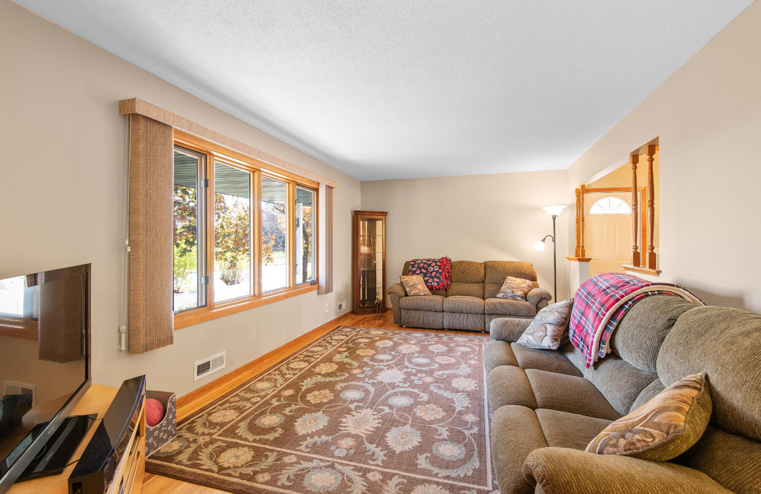
Finally, natural dye variations, particularly in hand-knotted rugs, create abrash, subtle tonal shifts prized for their handcrafted, dynamic look. A perfect example is Edward Martin’s Marcela Cotton Blend Rug in Lake / Spice. Featured above, its soft, woven texture and spice-red flecks layered over a muted base show how warm hues can add depth and calm, enhancing a room’s atmosphere without overpowering it.

The Psychology and Ambiance of Warm Rug Colors
Beyond aesthetics, warm rug colors have a profound impact on how we experience a space emotionally and physically. By influencing mood, energy, and spatial perception, these hues quietly shape the way a room feels the moment you step inside.
Creating a Welcoming Atmosphere
Right away, warm hues like amber, terracotta, and rust evoke comfort, security, and hospitality, associations rooted in the glow of firelight and sunlight. In home settings, rugs in these tones instantly create a sense of warmth and approachability, especially in social spaces like entryways, living rooms, and dining areas.
Moreover, red and orange-based rugs stimulate engagement, while plush textures enhance the physical sensation of coziness. In minimalist or modern interiors, a warm-toned rug can soften the visual starkness of cool materials like metal or concrete, balancing the overall aesthetic.
This strategy, commonly used in biophilic and human-centered design, prioritizes emotional well-being through sensory elements. For instance, Edward Martin’s Georgette Polyester Pile Rug in Desert / Multi exemplifies this with its sunbaked palette and distressed details, subtly transforming a neutral room into a more welcoming and lived-in space, as illustrated in the image above.
Enhancing Energy and Vibrancy
In addition to comfort, certain warm tones, like scarlet, tangerine, and goldenrod, stimulate alertness and creativity. In spaces meant for activity or interaction, such as family rooms or studios, these hues energize without overwhelming when used thoughtfully.
As an example, a paprika-colored rug with a geometric pattern can define zones while injecting personality. Furthermore, the vibrancy of these hues depends heavily on fiber type and finish: high-luster materials amplify brightness, while matte wool tones offer more grounded vibrancy suited for balanced energy.
Making Large Spaces Feel Intimate
Warm tones also offer a clever way to manipulate spatial perception. Because they naturally advance in space, they are highly effective in reducing the perceived scale of oversized or open-plan areas. In doing so, they help define zones, guide visual focus, and create a sense of enclosure.
For example, placing a deep red or rust-toned rug beneath a sectional can anchor the room while enhancing cohesion. In addition, tight patterns or dark borders can further reinforce spatial definition. When combined with radiant heat or dense wool textures, warm rugs deliver both physical and psychological warmth, ideal for cooler climates or expansive interiors needing a cozier touch.

Key Warm Color Families for Rugs
Warm-toned rugs span a diverse range of color families, each bringing its own mood, story, and visual weight to a space. To better understand how these hues function in design, it’s helpful to explore the distinct character and impact of each warm color group.
Rich Reds and Deep Burgundies
For starters, reds and burgundies are among the most iconic warm rug tones, rooted in traditional rug weaving practices from regions like Persia and Turkey. Often achieved using natural dyes like madder root or cochineal, these hues offer rich saturation and enduring depth.
Crimson, ruby, and burgundy evoke luxury and formality, ideal for dining rooms, libraries, or foyers where a sense of opulence is desired. In particular, these tones work well in intricate motifs, anchoring spaces visually while adding timeless drama.
From a material standpoint, wool remains the preferred fiber for red hues due to its superior dye retention and ability to produce abrash, subtle tonal shifts that enhance artisanal appeal. For example, Edward Martin’s Pascal Polyester Face Rug in Burgundy / Graphite exemplifies this richness, blending deep red with charcoal and gold for a grounded yet elegant effect, as shown in the photo above.
Earthy Oranges and Terracottas
Moving through the spectrum, orange tones, including paprika, burnt sienna, and terracotta, strike a balance between vibrancy and earthiness. These colors reflect natural pigments and are commonly found in rustic, Mediterranean, and bohemian interiors.
As a result, they lend warmth and softness without overwhelming a space, especially in relaxed settings like living rooms or bedrooms. Muted versions or those with clay undertones feel especially grounded and approachable. To maintain their integrity, orange dyes require UV-stable formulations. Additionally, distressed finishes or textured weaves further elevate their appeal by masking wear and reinforcing a sun-baked aesthetic.
Golden Yellows and Sunny Ochres
Next, yellows and ochres, such as marigold, mustard, and amber, bring a luminous warmth that enlivens interiors without becoming overpowering. Historically symbolic of light and prosperity, these hues translate beautifully into both classic and modern designs.
Thanks to their high reflectivity, they are especially useful in low-light spaces and work well in loop piles or flatweaves that offer visual warmth with subtle texture. However, their brightness must be carefully managed in southern exposures, where intense light can oversaturate color. For longevity, synthetic fibers help preserve golden tones in high-use spaces, while natural dyes like turmeric offer richness in artisanal wool rugs, with some sensitivity to fading.
Warm Neutrals and Browns
Finally, warm neutrals, camel, taupe, chestnut, and chocolate, are essential grounding tones that support rather than dominate a space. Their adaptability makes them ideal for minimalist, transitional, and contemporary interiors.
Because these hues mimic natural materials, they blend seamlessly with wood, leather, and stone. Often featured in looped or hand-loomed rugs, they prioritize texture over pattern and wear well in busy areas. On top of that, brown dyes are among the most stable, making them ideal for performance rugs while offering understated elegance that complements nearly any palette.

Pairing Warm Toned Rugs with Decor Styles
Because warm-toned rugs are so versatile, the key to using them effectively lies in how they complement your overall design style. Whether your space leans classic, modern, or somewhere in between, the right warm rug can enhance character, cohesion, and comfort with just the right balance of tone and texture.
Traditional and Classic Interiors
Notably, in traditional spaces, warm rugs reinforce elegance and formality. Deep reds, burgundies, and golden ochres pair beautifully with symmetrical layouts, carved wood furniture, and layered fabrics. Classic motifs like medallions or florals echo historical references often found in Persian or Oriental rugs.
Furthermore, a wool rug with natural abrash adds depth and authenticity, especially when coordinated with dark-stained woods and rich textiles. This pairing not only grounds the room but also ties in complementary elements like brocade drapes or antique brass accents for a cohesive, timeless feel.
Bohemian and Eclectic Spaces
Shifting to a more relaxed aesthetic, bohemian and eclectic interiors thrive on mix-and-match design, making warm-toned rugs ideal for tying together varied textures, colors, and artifacts. Earthy hues like terracotta, paprika, and marigold bring cohesion without enforcing symmetry.
Moreover, flatweaves or distressed, overdyed rugs with tribal motifs enhance the collected, lived-in feel of these spaces. Layering multiple rugs adds depth and dimension, while warm tones provide contrast against saturated or jewel-toned furnishings.
For instance, Edward Martin’s Hutchinson Polyester Face Rug in Sand / Terracotta captures this balance, blending sun-washed tones with vintage-inspired patterns that ground the space while preserving its relaxed character, as featured above.
Modern and Contemporary Settings
In contrast, modern and contemporary interiors, often defined by minimal color palettes and clean lines, benefit greatly from the softness and visual warmth that warm-toned and neutral rugs provide. While ochre, rust, and clay tones create contrast against hard materials like concrete or glass, neutral options in camel, sand, or taupe offer a more subtle complement to minimalist designs.
To that end, solid or subtly patterned rugs in low-pile or flatweave constructions help maintain clarity without introducing visual clutter. Additionally, high-quality materials like low-luster wool or Tencel blends emphasize texture over ornamentation, allowing warm rugs to function as understated yet grounding focal points.
Farmhouse and Rustic Charm
Finally, in farmhouse and rustic interiors, where comfort, craftsmanship, and natural materials take center stage, warm-toned rugs find a perfect home. Muted reds, ochres, and browns align seamlessly with this aesthetic, complementing reclaimed wood, stone, and linen finishes.
Equally important, distressed textures and heirloom motifs reinforce the nostalgic, lived-in feel of these spaces. Materials like wool, jute, or cotton wear beautifully over time and help define open-concept layouts without disrupting their flow. In these settings, a warm rug does more than decorate; it supports the room’s sense of warmth, history, and authenticity.

Choosing the Right Warm Rug for Your Space
Choosing the right warm-toned rug isn’t just about picking your favorite shade; it’s about how that color interacts with your space, lighting, and surroundings. With a few key considerations, you can ensure the rug not only looks beautiful but also enhances the overall feel and function of the room.
Considering Room Size and Light
One of the first considerations is that room proportions and lighting significantly influence how warm hues are perceived. Because tones like red, orange, and gold visually advance, they can make a room feel more intimate. Therefore, in smaller spaces, opt for lighter warm shades, golden wheat, muted terracotta, or soft apricot, to maintain a sense of openness while still introducing cozy warmth.
Conversely, deeper tones such as burgundy or paprika are better suited to larger or sunlit areas, where they add visual weight without overwhelming the space. Additionally, northern-facing rooms, which receive cooler, bluish light throughout the day, particularly benefit from warm rugs in rust, marigold, or amber to counteract the coolness and enhance comfort. Meanwhile, in southern-facing rooms, already rich in warm daylight, more subdued tones like clay or ochre help maintain a balanced visual temperature.
Harmonizing with Existing Furniture and Wall Colors
Once lighting and scale are considered, the next step is to harmonize the rug with your existing furniture and wall colors. For example, cool undertones such as gray or blue may clash with bold warm hues unless bridged with complementary accents like wood finishes or warm-toned textiles.
In many cases, using analogous palettes, pairing rust rugs with camel seating and gold decor, creates a cohesive flow. On the other hand, complementary schemes (like terracotta paired with navy) introduce visual contrast and energy, but must be carefully balanced in scale and proportion. As a guideline, the 60-30-10 rule can be helpful: assign 60% to a dominant color (like wall paint), 30% to a secondary tone (like upholstery), and 10% to accent elements, including rugs. To reinforce continuity, repeat the rug’s hue in smaller accessories such as ceramics, pillows, or framed art.
Material and Texture Matters
Equally important is the rug’s material and texture. Natural fibers like wool are preferred for their superior dye absorption, softness, and durability. In particular, warm hues like crimson or ochre appear rich and dimensional in wool, especially in hand-knotted constructions that develop character over time.
That said, synthetic options such as polypropylene or polyester are excellent for active areas or budget-conscious projects. While these materials produce brighter and more uniform tones, thoughtful weaving techniques and layered finishes can still offer visual depth.
In terms of feel and appearance, texture significantly influences the overall impact. Plush piles in cinnamon or gold heighten a room’s coziness, ideal for lounges and bedrooms. Meanwhile, flatweaves or loop piles in terracotta or caramel work better in dining areas or hallways, where a lower profile is beneficial. For example, Edward Martin’s Georgette Polyester Pile Rug in Spice / Indigo, as featured above, showcases this beautifully with its richly textured surface and distressed finish, proof that even synthetic rugs can deliver warmth, character, and depth.
Pattern and Design Impact
As you finalize your rug selection, consider the impact of pattern and design. Specifically, intricate motifs like medallions or florals disperse color across the surface, softening the effect of bold hues such as red or rust. This makes them ideal for spaces that benefit from subtle warmth without visual heaviness.
Alternatively, geometric and tribal patterns in warm palettes can energize social spaces or eclectic rooms by introducing rhythm and movement. In contrast, minimalist designs let the color itself shine, aligning with contemporary or Scandinavian interiors that prioritize simplicity.
Additionally, scale should not be overlooked. In smaller rooms, tight, repeating patterns help preserve spatial clarity. In expansive spaces, larger motifs in ochre or sienna tones anchor furniture groupings and fill visual voids. If layering rugs, vary both pattern and scale to maintain depth while allowing the warm-toned piece to retain its role as a focal point.
To complete the selection process with confidence, Edward Martin offers a complimentary design consultation service. This personalized experience includes curated samples, one-on-one guidance from a designer, and dedicated follow-up support, ensuring your rug, tile, or furniture choices reflect both your aesthetic and practical needs.
Should you need additional assistance or have specific questions, visit the Contact Us page. Edward Martin’s expert team is available to provide tailored recommendations, answer design inquiries, and help refine your space with thoughtful, cohesive selections.
The Subtle Power of Warm Rug Color
Nonetheless, warm-toned rugs, whether rendered in crimson, terracotta, ochre, or chestnut, do far more than inject color. They shape the way a room feels, how it functions, and how seamlessly it flows. Defined by their ability to enhance visual warmth and emotional tone, these hues anchor interiors, create unity, and elevate everyday living.
As you refine your design, remember to consider how warm colors interact with light, scale, and material choices. At Edward Martin, we curate each piece with intention, offering rugs that infuse depth, comfort, and style into any space, transforming rooms not just visually, but experientially.