


Most ceilings get treated as an afterthought, but the right wallpaper application can completely change how a room feels the moment you look up. Whether you are drawn to a bold fifth wall, a quieter textured finish, or something that makes the ceiling feel more connected to the rest of the space, the way wallpaper is applied makes a bigger difference than many people expect. In this blog, we’ll walk through which wallpaper applications work best and how to choose an approach that actually feels right for your space.

When A Statement Ceiling Makes Sense
Wallpaper on the ceiling can completely change how a room feels, but it does not automatically suit every space. Before committing to a fifth wall treatment, it helps to look at how your ceiling interacts with the room’s proportions, lighting conditions, and overall atmosphere so the finished result feels intentional rather than overwhelming.
How Ceiling Height Changes The Final Look
Ceiling height plays a major role in how wallpaper will actually read once it is installed overhead. In lower rooms, darker or visually dense ceiling treatments can make the space feel more enclosed, which may work if you want a cozier or more intimate effect, but can feel heavy if the room already feels compressed. Standard ceiling heights usually offer the most flexibility, since the visual impact depends more on scale, color contrast, and surrounding finishes. Taller ceilings, on the other hand, often handle wallpaper more comfortably because there is enough vertical breathing room for the design to make a statement without crowding the space. Looking at the proportion first helps you choose a ceiling treatment that works with the room instead of against it.
Rooms Where Fifth Walls Create More Impact
Some rooms naturally benefit more from a statement ceiling because people spend more time noticing the full space rather than moving through it quickly. Dining rooms, for example, often work well because the ceiling remains visible while seated, giving the wallpaper a stronger presence throughout the experience. Powder rooms are another strong candidate, since smaller enclosed spaces can handle bolder overhead treatments without needing to balance multiple connected zones. Bedrooms can also benefit when the goal is creating a softer or more immersive atmosphere, especially above the bed. Entryways work differently, but they can still create impact by making the first visual impression feel more considered and memorable.
How Lighting Changes Ceiling Wallpaper
Lighting can dramatically change how ceiling wallpaper looks throughout the day, sometimes more than people expect. Natural light may soften certain colors and make texture feel more dimensional, while direct sunlight can create glare that makes reflective finishes feel harsher overhead. Artificial lighting also matters, since recessed lights, pendants, or chandeliers can either highlight the wallpaper beautifully or create uneven shadows that disrupt the design. A pattern that feels balanced in a sample may read very differently once light starts hitting it from multiple angles above eye level. This is why it helps to think about how the room is actually used from morning through evening before choosing a ceiling application.
Choosing The Mood You Want Overhead
A statement ceiling works best when it supports the feeling you want the room to create instead of acting as a disconnected design feature. If your goal is drama, stronger contrast, or more visually defined ceiling treatments can help pull attention upward and create a bold focal point. If you want something softer, quieter textures, or lower-contrast applications may feel more natural within the space. Some ceilings are meant to make a room feel more intimate, while others help open the room visually by drawing the eye upward in a lighter way. Defining that emotional direction early makes the decision process much clearer and helps prevent choices that feel visually confusing later.

Ceiling Wallpaper Applications That Work Best
Once you decide a statement ceiling makes sense, the next step is choosing how the wallpaper will actually be applied. The installation approach has a major impact on how bold, structured, or immersive the finished ceiling feels, so it helps to match the application style to how much visual presence you want overhead.
Full Ceiling Coverage
Covering the entire ceiling with wallpaper creates the strongest fifth wall effect because there is no visual interruption pulling attention away from the design. This approach works especially well when you want the ceiling to act as a clear focal point rather than a subtle supporting detail. In rooms with the right proportions, full coverage can make the space feel more intentional and cohesive, especially when the ceiling would otherwise feel plain or underutilized. It also tends to create a cleaner overall look since the treatment feels deliberate instead of partial or decorative. If your goal is to make the ceiling feel like a true design feature, full coverage often delivers the most noticeable impact.
Wrapping Wallpaper Onto The Upper Walls
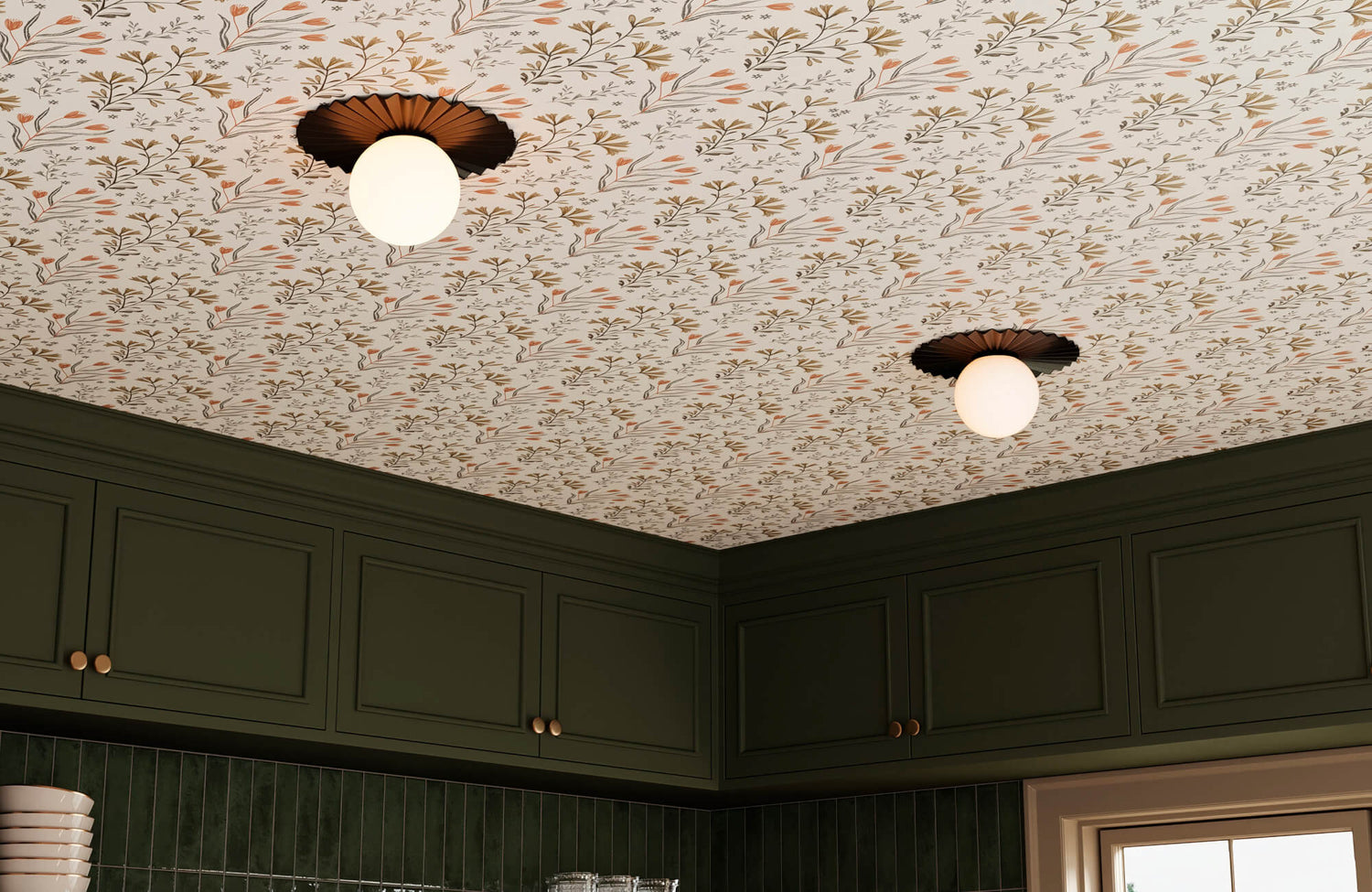
Extending wallpaper from the ceiling slightly onto the upper walls creates a more immersive effect by softening the visual break between vertical and overhead surfaces. This approach can make a room feel more enveloping, which works especially well in spaces where you want a cocooned or intentionally layered atmosphere. It also helps the wallpaper feel less isolated, since the transition between surfaces becomes more fluid instead of stopping abruptly at the ceiling line. This can be especially useful in rooms where sharp architectural transitions feel too rigid for the look you want. If the goal is creating continuity rather than a clearly separated ceiling feature, this application tends to feel more natural.
The wallpaper shown above would work especially well for this type of ceiling application because its abstract floral pattern introduces gentle movement that can transition naturally from the ceiling onto the upper walls without creating a harsh visual break. Our Petaline Wallpaper in Taupe I, 52" x 132" balances bold pattern with a softer visual presence through its lightly washed brown silhouettes and light taupe ground, which helps the space feel layered and immersive rather than visually overwhelming. That makes it a particularly strong choice when you want this application to create a cocooned atmosphere while still feeling refined and easy to live with over time.
Framed Ceiling Insets
Framed ceiling insets offer a more controlled way to introduce wallpaper without committing to full overhead coverage. Instead of treating the entire ceiling as the statement, this approach contains the wallpaper within a defined section, which helps create visual impact while maintaining more restraint. It works well if you want the ceiling to feel intentional, but do not want the wallpaper to dominate the entire room. This type of application can also help emphasize symmetry, especially when centered around a chandelier, pendant, or other architectural focal point. For spaces that benefit from structure and balance, framed insets often feel polished without becoming overwhelming.
Wallpaper Inside Coffered Ceilings
Coffered ceilings naturally create defined sections that make wallpaper placement feel more intentional from the start. Instead of forcing wallpaper across one uninterrupted surface, the architectural framework helps break the application into contained areas that already feel organized. This can make bolder ceiling treatments feel easier to manage visually because the structure keeps the design from overwhelming the room. It also allows the ceiling details themselves to remain part of the design instead of disappearing beneath the wallpaper. If your space already has architectural ceiling features, working within those boundaries often creates a stronger and more cohesive final result.

Wallpaper Designs That Work Best On Fifth Walls
Once the application style is decided, the wallpaper design itself becomes what shapes how the ceiling actually feels in the room. Some patterns create movement, others introduce structure, while quieter finishes can shift the atmosphere without making the ceiling feel overly dominant. Choosing the right design comes down to how much visual energy you want overhead and how naturally that choice fits the rest of your space.
Botanical Wallpaper
Botanical wallpaper tends to work especially well on fifth walls because its organic shapes create softer movement that feels more natural overhead than rigid repetition. Flowing leaves, branches, or nature-inspired motifs can help guide the eye upward without making the ceiling feel visually harsh or overly structured. This makes botanical designs a strong option if you want the ceiling to feel expressive while still maintaining a sense of ease. They also tend to soften rooms with sharper furniture lines or more structured architectural details by introducing contrast through movement rather than heaviness. If your goal is creating a ceiling that feels layered and inviting, botanical wallpaper often delivers that balance well.
Geometric Wallpaper
Geometric wallpaper creates a much different effect by emphasizing order, repetition, and architectural rhythm. Clean lines, repeated forms, and structured layouts can make a ceiling feel sharper and more intentional, especially in rooms where you want stronger visual definition overhead. This works particularly well in spaces with modern interiors, cleaner silhouettes, or architectural details that already support that sense of structure. However, because geometric patterns naturally draw attention to repetition and alignment, they tend to feel more visually assertive than softer organic designs. If you want the ceiling to feel crisp, deliberate, and more design-forward, geometric wallpaper can create that kind of impact effectively.
The wallpaper shown above is a good example of how geometric patterns do not have to feel overly sharp or formal to work overhead. Our Essex Wallpaper in Taupe II, 52" x 132" would be especially effective on a fifth wall because its checkerboard layout brings structure and rhythm, while the layered linework breaks up that repetition enough to keep the ceiling from feeling stiff or overly commanding. The softer taupe and brown palette helps the pattern read with more subtle dimension instead of high contrast, which matters even more when the design sits above eye level. If you want a ceiling treatment that feels polished and architectural but still comfortable to live with long-term, this kind of geometric pattern strikes that balance well.
Grasscloth And Textured Looks
Not every statement ceiling needs an obvious pattern to make an impact, which is where grasscloth and textured wallpaper styles tend to perform especially well. These finishes create depth through material character, surface variation, and subtle dimension rather than relying on bold visual contrast. This makes them a strong choice if you want the ceiling to feel more refined and layered without becoming the loudest element in the room. Textured looks also respond well to changing light, which helps the surface feel dynamic without looking overly busy from below. If your space already has enough visual movement, a quieter texture often creates a stronger long-term result than adding another dominant pattern.
Scenic Murals
Scenic murals turn the ceiling into a true visual destination by introducing imagery that feels expansive, immersive, or intentionally dramatic. Whether the design suggests clouds, landscapes, abstract scenery, or artistic compositions, this type of wallpaper shifts the ceiling from background surface to focal storytelling element. Because of that, scenic murals tend to work best in spaces where you want the ceiling to create a memorable emotional effect rather than simply add decorative detail. They can make smaller rooms feel more transportive or give larger spaces a stronger sense of personality when used thoughtfully. If you want your fifth wall to feel bold and highly intentional, this is often one of the most impactful design directions.
Tonal And Minimal Patterns
Tonal and minimal wallpaper designs work well when you want ceiling interest that feels intentional without demanding constant attention. These patterns rely on subtle contrast, restrained repetition, or gentle surface movement to create depth in a quieter way. Because the visual shift is softer, they tend to integrate more easily into a wider range of interiors without making the ceiling feel disconnected from the rest of the room. This makes them especially useful if you want the fifth wall to feel considered but still flexible as surrounding decor changes over time. When done well, subtle ceiling treatments often feel just as sophisticated as bolder choices, simply through a more restrained approach.

Making Ceiling Wallpaper Feel Connected
A statement ceiling tends to work best when it feels like part of the room’s overall design rather than a separate feature added for impact alone. Even bold ceiling wallpaper can feel cohesive when it relates clearly to the finishes, colors, and architectural details already shaping the space. The goal is to make the fifth wall feel intentional within the full room instead of visually disconnected once everything comes together.
Pulling Colors From The Room
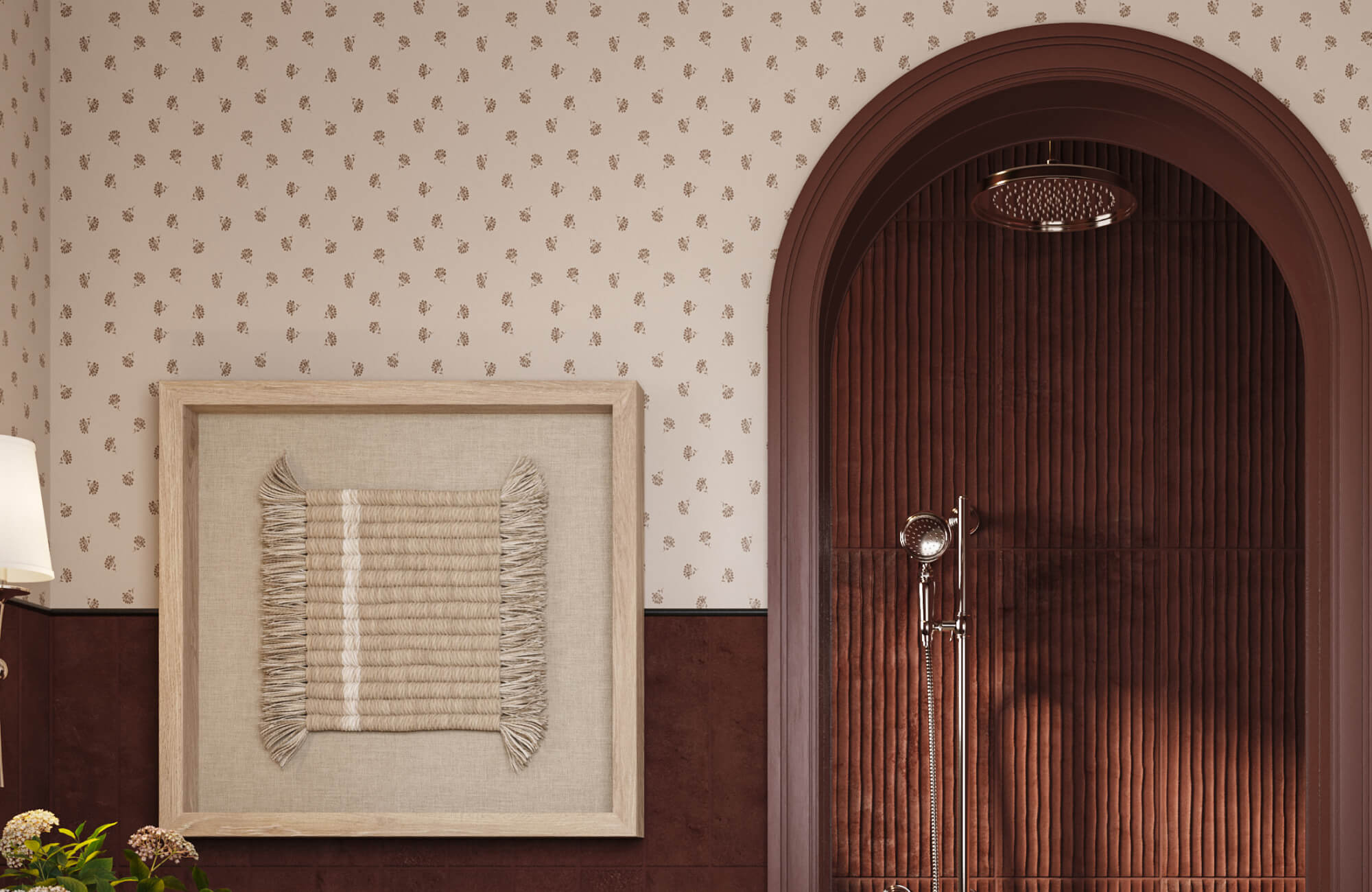
Ceiling wallpaper usually feels more grounded when its colors already have a connection to something else in the room. That could be tones found in upholstery, rugs, drapery, artwork, or smaller decorative accents that help the wallpaper feel like part of an existing palette instead of an isolated design move. Even when the wallpaper introduces stronger contrast, repeating familiar tones helps the eye accept the ceiling more naturally as part of the space. This becomes especially important in rooms where the ceiling treatment is meant to stand out without making the rest of the design feel fragmented.
A practical way to approach this is to identify two or three tones that already appear consistently throughout the room before narrowing your wallpaper options. You do not need exact matching, but some visual relationship should exist so the ceiling feels intentionally tied back to the surrounding environment. If a wallpaper color has no connection to anything below, the ceiling can start to feel visually detached, no matter how attractive the pattern looks on its own.
Coordinating With Trim And Paint
Trim and paint play a bigger role in ceiling wallpaper cohesion than many people expect because they create the transition between the fifth wall and everything surrounding it. A wallpaper that looks beautiful in isolation can feel awkward if the trim color cuts against it too harshly or if the surrounding paint creates visual tension. When those surrounding finishes feel coordinated, the ceiling tends to read as a natural extension of the room instead of a disconnected decorative layer. This is especially noticeable in spaces with crown molding, detailed trim work, or strong architectural framing.
Before committing, it helps to look at how your wallpaper interacts with the actual trim and paint colors already in the room rather than evaluating samples in isolation. Sometimes adjusting a paint tone slightly creates a much smoother transition than forcing a wallpaper to work against an incompatible surrounding finish. Even simple changes like warmer whites, softer neutrals, or deeper complementary trim colors can make the ceiling treatment feel significantly more integrated.
Working Around Ceiling Lighting
Lighting fixtures can either strengthen a statement ceiling or unintentionally disrupt how the wallpaper reads once installed. Chandeliers, pendants, recessed lighting, and flush mounts all influence how shadows fall, where glare appears, and which parts of the wallpaper receive the most visual emphasis. A ceiling treatment that feels balanced in theory can quickly feel uneven if the lighting creates distracting hotspots or leaves sections visually flattened. Because the ceiling is viewed from below, even small lighting issues tend to feel more noticeable than they would on a vertical wall.
It helps to think about your lighting layout before choosing wallpaper instead of treating fixtures as an afterthought. If your room has strong direct lighting, highly reflective surfaces may feel harsher overhead than expected, while subtle textures often perform better under changing light conditions. Looking at where light naturally falls throughout the day can also help you avoid ceiling choices that lose their intended effect once the room is fully in use.
Keeping Walls From Competing
When the ceiling becomes the visual statement, the surrounding walls usually need to support that choice instead of competing for equal attention. If every surface introduces a strong pattern, bold contrast, or equally dominant visual movement, the room can quickly start to feel crowded rather than intentionally layered. A statement ceiling tends to feel stronger when there is enough restraint elsewhere for the eye to process the overhead design clearly. This does not mean the walls need to feel empty, but they should complement the ceiling rather than fight for the same level of attention.
A useful way to evaluate this is to step back and ask where you actually want the eye to land first when entering the room. If the answer is the ceiling, the wall treatments should help support that hierarchy instead of creating multiple competing focal points. Simpler paint finishes, quieter textures, or more restrained wall decor often make the ceiling feel far more effective than trying to maximize visual impact on every surface at once.

When A Softer Ceiling Works Better
A statement ceiling does not always need to be bold to feel intentional. In some rooms, a quieter approach creates a stronger result because it adds depth and interest without making the space feel overly busy or harder to live with over time. Knowing when to hold back can often lead to a ceiling treatment that feels more refined, flexible, and naturally connected to the rest of the room.
Rooms That Need Texture More Than Pattern
Some rooms already have enough visual movement without adding a bold ceiling pattern into the mix. If your space includes layered textiles, detailed furnishings, expressive artwork, or strong material variation, another dominant pattern overhead can start to make the room feel crowded rather than thoughtfully designed. In these cases, texture often does the job better by adding dimension without competing for constant attention. A grasscloth-inspired finish, subtle woven look, or lightly textured surface can still make the ceiling feel elevated while keeping the room calmer overall. Sometimes the most effective statement is the one that adds quiet depth instead of asking to be the loudest feature in the room.
A simple way to gauge this is to stand in the room and notice how much your eye is already processing before the ceiling becomes part of the equation. If several surfaces are already carrying strong visual weight, texture usually integrates more naturally than another obvious pattern. This tends to create a more balanced result, especially in spaces meant to feel relaxed rather than highly dramatic.
Ceilings With Existing Architectural Interest
If your ceiling already has beams, coffers, molding, paneling, or other architectural details, wallpaper does not necessarily need to take over the entire visual conversation. Those built-in features already create shape, rhythm, and structure, so layering a highly assertive wallpaper on top can sometimes make the ceiling feel busier than intended. In many cases, a softer wallpaper treatment works better because it supports the architecture instead of competing with it. The goal is to let those existing details remain part of the design rather than visually burying them under too much contrast or movement. A more restrained ceiling treatment often helps the architecture feel more intentional rather than less noticeable.
Designs That Stay Flexible Over Time
Some ceiling treatments look exciting in the moment, but become harder to live with as your room evolves. Furniture gets rearranged, decor changes, paint colors shift, and what once felt like the perfect dramatic choice may start to feel limiting a few years later. Softer wallpaper designs tend to age more comfortably because they give you more flexibility to update the rest of the room without forcing every future decision to work around one dominant ceiling feature. This does not mean subtle has to mean boring, but it does mean choosing something that can adapt as your style changes. A ceiling you still enjoy long-term is often the smarter design decision than one that only feels exciting at installation.
If flexibility matters to you, it helps to think beyond what looks striking today and consider how the ceiling will interact with future updates. Tonal patterns, restrained textures, and lower-contrast designs usually give you far more freedom if furniture, lighting, or surrounding finishes change later on. That kind of versatility can make the entire room easier to refresh without feeling like the ceiling is locking every decision in place.
Bringing Your Fifth Wall Vision Together With More Confidence
A statement ceiling can completely reshape how a room feels, but the strongest results come from choosing an application, pattern, and level of visual impact that genuinely fit your space instead of simply following what feels dramatic in the moment. As this guide has shown, the right fifth wall treatment depends on how your ceiling interacts with lighting, architectural details, surrounding finishes, and the atmosphere you actually want to create. When those decisions feel intentional, ceiling wallpaper becomes much more than a decorative feature. It becomes part of how the entire room feels connected and complete.
If you are weighing wallpaper styles, comparing how different ceiling applications might work, or trying to make sure your finishes feel cohesive before committing, our Personalized Design Consultation can help you move forward with more clarity. Getting expert guidance can make a major difference when you are balancing wallpaper, paint, trim, lighting, and the broader design direction of the room all at once. Whether you are creating a dramatic fifth wall or leaning toward something quieter and more adaptable, we can help you bring the full vision together with greater confidence.