Mid-century modern wallpaper is a wallcovering style inspired by the design movement that shaped homes from the 1940s through the 1960s. It is known for clean geometry, warm colors, abstract forms, organic shapes, and a sense of optimism that still feels fresh in today’s interiors. For someone new to the style, mid-century modern wallpaper can seem bold at first. However, once you understand its history, patterns, colors, and practical uses, it becomes easier to see why it remains a favorite for living rooms, bedrooms, dining areas, kitchens, powder rooms, and creative spaces. It gives your walls personality without requiring an overly decorated room, which is one reason it continues to work so well in modern homes.

The Origins of Mid-Century Modern Wallpaper
Mid-century modern wallpaper developed alongside a broader design movement that valued function, simplicity, new technology, and relaxed living. Understanding these roots helps explain why the style feels historically grounded while still fitting naturally into today’s interiors.
Postwar Design Mood
After World War II, many homes began to move away from formal, heavy interiors. People wanted rooms that felt brighter, more open, and easier to live in, and wallpaper became one way to bring that new mood into the home. Instead of relying on carved woodwork, dense fabric, or traditional ornament, homeowners could use wallpaper to add energy to a wall. Patterns became cleaner and more playful, reflecting a culture that was interested in progress, comfort, and modern family life.
This is why mid-century modern wallpaper should not be seen as simply “old-fashioned.” Its roots are forward-looking. It came from a period when interiors were being reimagined for casual entertaining, open living spaces, and everyday comfort.
Modernist Influence
Modernist design had a major influence on the development of mid-century wallpaper. The movement favored clean lines, useful forms, and visual clarity, which led wallpaper designs away from overly detailed florals, damasks, and formal decorative patterns. Instead of filling walls with heavy ornament, mid-century wallpaper often used abstraction. A pattern might feature repeating circles, angled lines, simplified leaves, or scattered shapes that suggested movement without feeling crowded.
This influence matters because it explains why the style still feels organized. Even when a mid-century wallpaper is bold, it usually has a clear visual system behind it. The pattern is not just decoration; it is part of the room’s structure.
New Materials and Printing
The popularity of mid-century modern wallpaper also grew as production methods improved. Improved printing methods made sharper graphics, richer colors, and consistent repeat patterns easier to produce. As wallpaper became more accessible, stylish interiors were no longer limited to expensive custom decoration. More homeowners could bring modern design into their houses through wallcoverings that felt current, expressive, and practical.
This history also helps explain the style’s confident look. Mid-century wallpaper often uses color and pattern with a directness that earlier wallcoverings did not always have. The designs were made for a changing world, and their clean printed quality became part of their appeal.

Defining the Look of Mid-Century Modern Wallpaper
Mid-century modern wallpaper becomes easier to recognize once you understand its key visual cues. Its look comes from the way shapes, colors, rhythm, and open space work together across the wall.
Geometric Patterns
Geometry is one of the strongest signs of mid-century modern wallpaper. Common shapes include circles, diamonds, triangles, arches, grids, starbursts, and abstract linework. These patterns often repeat in a way that creates movement across the wall. Depending on the spacing, scale, and color contrast, geometric wallpaper can look precise and orderly or loose and playful.
What makes these designs mid-century is not just the use of shapes. It is the clean confidence of those shapes. The forms tend to be simplified rather than ornate, which helps the wallpaper feel graphic instead of fussy.
Atomic Motifs
Atomic motifs are another recognizable part of the mid-century look. These designs were influenced by the excitement surrounding science, technology, space exploration, and the future. You may see starbursts, boomerangs, satellite-like forms, molecule patterns, and irregular bursts that seem to move across the wall. These motifs convey energy and optimism, which is why they are often associated with the more playful side of mid-century design.
Still, atomic wallpaper is only one part of the category. Not every mid-century modern wallpaper needs a space-age pattern. Some designs are quieter, more organic, or more structured, which gives you a wide range of choices within the same general style.
Organic Forms
Mid-century modern wallpaper is not limited to sharp geometry. Many designs use softer shapes inspired by nature, including leaves, stems, stones, waves, seedpods, and freeform silhouettes. These organic forms reflect the mid-century interest in connecting indoor spaces with the natural world. Rather than resembling realistic botanical prints, the shapes are usually simplified and abstract.
This gives the wallpaper a softer visual effect while keeping the design modern. A pattern may suggest a garden, forest floor, or flowing water without showing those elements literally. That balance between nature and abstraction is a key part of the style.
Signature Colors
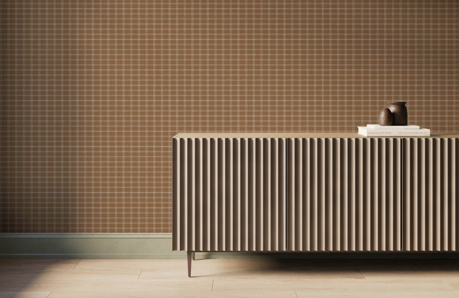
Color plays a major role in identifying mid-century modern wallpaper. Common shades include mustard yellow, olive green, burnt orange, teal, walnut brown, cream, dark gray, muted pink, and warm beige. These colors are often earthy but still graphic. A wallpaper might combine olive and cream for a calm effect, or orange and teal for something more expressive. The palette can be bold, but it usually has warmth.
For a softer take, choose patterns with cream, taupe, tan, or soft gray backgrounds. For a stronger retro look, use deeper contrast and saturated accents to make the design feel more energetic.

Why Mid-Century Wallpaper Still Works Today
Mid-century modern wallpaper remains popular because it offers more than nostalgia. Its structure, warmth, and character make it a practical choice for interiors that need personality without excessive decoration.
Timeless Structure
Many mid-century wallpaper patterns still work because they are based on strong design principles. Repetition, proportion, contrast, and balance help the designs feel composed rather than random. A well-structured wallpaper can make a room feel more intentional. Even a bold pattern may feel controlled when the shapes are arranged with rhythm and spacing.
This is one reason mid-century wallpaper often ages better than novelty prints. It may have historical roots, but the design logic behind it is not tied to one moment. When the pattern is balanced, it can remain appealing for years.
Warm Minimalism
Modern interiors often lean simple, with clean furniture, neutral walls, and limited decoration. Mid-century wallpaper fits well into this setting because it adds personality without requiring many extra objects. A patterned wall can create warmth, depth, and interest in a room that might otherwise feel plain. Instead of filling shelves with decor or relying on several accent colors, wallpaper can create one clear design statement.
This makes the style useful for those who want a home that feels simple but not empty. Edward Martin’s Petaline Wallpaper in Taupe I, 52" x 132", as featured in the photo above, shows how a soft repeating motif can add quiet movement to a bedroom while keeping the palette calm and restrained. The result supports a clean, edited look while giving the space enough pattern to feel warm and complete.
Retro Without Feeling Dated
Mid-century wallpaper can bring vintage character into a home without making the space feel like a time capsule. The key is to treat it as a single design element rather than the beginning of a full-period recreation. A modern room can include a mid-century-inspired wallpaper and still feel current. Contemporary flooring, simple paint colors, updated lighting, and clean furniture can all help the wallpaper feel fresh.
This balance is part of its appeal. You can enjoy the style’s history and personality without making your room look staged or overly themed.

Choosing the Right Mid-Century Wallpaper for Each Room
The right mid-century wallpaper depends on how the room is used, where the pattern will appear, and how much visual energy the space can handle. A design that feels lively in a powder room may feel too active in a bedroom, so each room needs a different approach.
Living Room
The living room can often support more expressive mid-century wallpaper because it is usually one of the home’s main gathering spaces. A feature wall behind a sofa, fireplace, media unit, or built-in shelving can give the room a clear focal point. For a large living room, a bigger pattern can feel confident and architectural. In a smaller living area, a lower-contrast print may offer the same mid-century character without overwhelming the space.
The main question is whether the wallpaper should lead the room or support it. If you want the wall to become the main visual feature, choose a stronger pattern. If you want a calmer backdrop, select a softer palette or a more even repeat.
Dining Room
A dining room is a natural place for mid-century wallpaper because it can handle more style and atmosphere than a purely practical room. Since dining spaces are often used for meals, conversation, and hosting, wallpaper can help the room feel more complete. Graphic patterns work especially well above wainscoting, on a single statement wall, or throughout a smaller enclosed dining room. The right design can make the space feel more intentional without needing much additional decoration.
If the dining room is used mostly in the evening, deeper colors can create a more intimate feeling. If it connects to a kitchen or living area, a lighter pattern can help the transition feel smoother.
Bedroom
Bedroom wallpaper should usually feel calmer than wallpaper used in social spaces. Mid-century designs can still work beautifully, but the pattern, contrast, and color should support rest. A wall behind the bed is often the best placement because it creates a headboard effect. Organic motifs, muted geometric patterns, and softer colors can add character without making the room feel too busy.
For a restful look, avoid extremely high-contrast patterns directly in your main line of sight from the bed. A quieter design can still give you the mid-century feel while keeping the bedroom comfortable.
Kitchen
Mid-century wallpaper can bring charm to a kitchen, especially in breakfast nooks, pantry areas, open shelving sections, or small accent walls. Because kitchens include moisture, heat, and frequent cleaning, practicality matters as much as pattern. Washable wallpaper is usually the better choice for this type of space. It should be placed away from direct heat, heavy splashes, and areas where steam collects.
Small-scale geometric patterns often work well in kitchens because they add detail without taking over the room. A breakfast corner, for example, can become more inviting with a modest mid-century print that adds color and rhythm.
Powder Room
A powder room is one of the easiest places to try a bold mid-century wallpaper. Since the space is small and used briefly, it can handle stronger colors, higher contrast, or more playful patterns. This is where atomic motifs, oversized geometry, or dramatic palettes can feel especially effective. The wallpaper can turn a simple guest bathroom into a memorable design moment.
For a moodier take, Edward Martin’s Brocade Wallpaper in Black/Tan II, 52" x 132", as featured in the photo above, shows how a high-contrast pattern gives depth and character to the room. The warm wood vanity and layered lighting make the space feel dramatic without requiring much additional decor.
Peel-and-stick wallpaper can also be useful in this type of room if you want a lower-commitment update. It allows you to explore a stronger style without making a permanent decision right away.

Styling Mid-Century Modern Wallpaper with Furniture and Decor
Once you choose the wallpaper, the furniture, materials, lighting, and decor around it determine how balanced the room feels. Each supporting element should complement the wallpaper, giving the space structure without competing with the pattern.
Furniture Pairings
Mid-century wallpaper works especially well with furniture that has clean lines, simple shapes, low profiles, and tapered legs. These forms reflect the wallpaper’s clean look without making the room feel crowded. If the wallpaper has a busy repeat, solid-colored upholstery usually creates the best balance. A streamlined sofa, credenza, lounge chair, or dining chair can give the room structure while letting the wallpaper remain the main source of pattern.
Edward Martin’s Porter Wallpaper in Olive Night I, 52" x 132", as featured in the photo above, shows how a subtle repeat can sit comfortably behind simple dining furniture without overpowering the room. The Orielle Lounge Chair in Taupe adds to that balance with its clean silhouette and soft upholstery, allowing the patterned wall, warm wood tones, and seating to work together in a composed way. Furniture that is overly carved, bulky, or decorative can fight with the wallpaper. When the wall already has strong movement, simpler furniture helps the room feel composed.
Wood and Natural Texture
Wood is one of the strongest partners for mid-century wallpaper. Walnut, teak, oak, and other warm-toned finishes help ground graphic patterns and bring natural warmth into the room. Texture also matters. Woven rugs, linen curtains, ceramic lamps, and matte surfaces can soften the crispness of printed wallpaper. This prevents the room from feeling flat or overly polished.
The goal is contrast. Wallpaper brings pattern and color, while natural materials bring depth and a touchable quality. In the photo featured above, Edward Martin’s Fleurin Walnut Oval Dining Table in Matte, 96", reinforces that balance with its warm wood finish and clean oval form, creating a natural anchor beneath the patterned wall. Together, these elements give the dining room a polished look while keeping it warm and comfortable.
Lighting Choices
Lighting can change the way mid-century wallpaper looks throughout the day. Warm bulbs tend to enhance colors like mustard, olive, burnt orange, brown, and cream, while cooler light can make those same tones feel duller. Mid-century-inspired lighting can support the look without making the room feel theatrical. Globe lamps, cone shades, simple sconces, and sculptural ceiling fixtures all work well when used with restraint.
Wall sconces are especially useful near patterned wallpaper because they can highlight texture, color, and repeat. Good lighting helps the wallpaper feel intentional rather than simply applied to the wall.
Art and Accessories
Accessories should be chosen carefully when wallpaper already carries strong visual interest. The best approach is to let the wallpaper lead and use decor to reinforce it. Simple framed art often works better than highly detailed pieces over a busy pattern. Accessories can repeat one or two colors from the wallpaper, so the room feels connected without becoming too matched.
Open space is also important. Not every surface needs an object, and not every wall needs art. When you leave breathing room, the wallpaper has more impact.
Bringing Mid-Century Modern Wallpaper Home
Mid-century modern wallpaper is a wallcovering style defined by clean shapes, warm color, abstract pattern, and a design history rooted in modern living. It can feel playful, refined, bold, or subtle depending on the pattern you choose. To use it well, consider the room’s purpose, the pattern scale, the color relationship with existing finishes, and the amount of visual energy you want. To find the best fit for your space, contact us or explore our design services for personalized wallpaper guidance.