


Abstract wall art does something no other decorative element quite manages: it shapes the feeling of a room without showing a recognizable scene or subject. Through color, scale, movement, texture, and composition, a single piece can make a space feel calmer, bolder, more grounded, more refined, or quietly alive. The right work does not simply fill a wall; it helps define the emotional tone and visual identity of the entire room.
Choosing abstract art with intention means looking beyond the piece itself. The room's mood, existing palette, furniture proportions, wall dimensions, interior style, material finishes, and daily function all inform whether a work of art feels connected to its surroundings or separate from them. When these elements are considered together, abstract wall art becomes part of the design, not a finishing touch applied after everything else is decided.

Shadow Orchard Wall Art complements the Bridgette 36" Single Vanity in Smokey Celadon with 3 cm White Zeus Quartz Top, creating a calm bathroom mood, blending soft abstract texture with muted green cabinetry and warm vintage-inspired details
Start With The Mood You Want To Create
Abstract art communicates through form, color, scale, and movement rather than subject matter, which means the emotional register of a piece is its most important quality. Before considering color matching or size, it is worth deciding how the room should feel — restful, expressive, refined, or energized — since that clarity will guide every choice that follows.
Calm Abstract Art
Calm abstract art belongs in rooms designed for quiet and restoration, such as bedrooms, reading corners, meditation spaces, nurseries, and intimate sitting areas. Soft shapes, muted colors, low contrast, tonal layering, blurred edges, and fluid brushwork all invite the eye to rest rather than search. Pale neutrals, misty blues, soft greens, warm grays, chalky whites, and muted taupes support a peaceful atmosphere, particularly when the room already includes linen upholstery, light wood furniture, woven textures, and soft ambient lighting. In these spaces, the art and the room breathe together.
Bold Abstract Art
Bold abstract art is the right choice when a room needs a strong focal point or a greater sense of visual life. Saturated color, sharp contrast, dynamic brushwork, angular forms, and expressive compositions give a wall immediate presence well suited to living rooms, dining rooms, offices, entryways, and open-plan spaces where the artwork can carry the room. To keep the result feeling composed rather than chaotic, let the artwork lead the palette, keep surrounding furnishings more restrained, and repeat one or two of its colors through pillows, rugs, lighting, or accessories.
Minimal Abstract Art
Minimal abstract art creates sophistication through restraint, using negative space, delicate linework, subtle geometry, and carefully balanced composition rather than intensity of color or movement. This approach suits modern, Scandinavian, Japandi, transitional, and organic interiors where simplicity, proportion, and material quality define the design language. It is also especially effective when the room already has strong furniture forms, architectural details, textured walls, or layered natural materials, allowing the artwork to add refinement without competition.

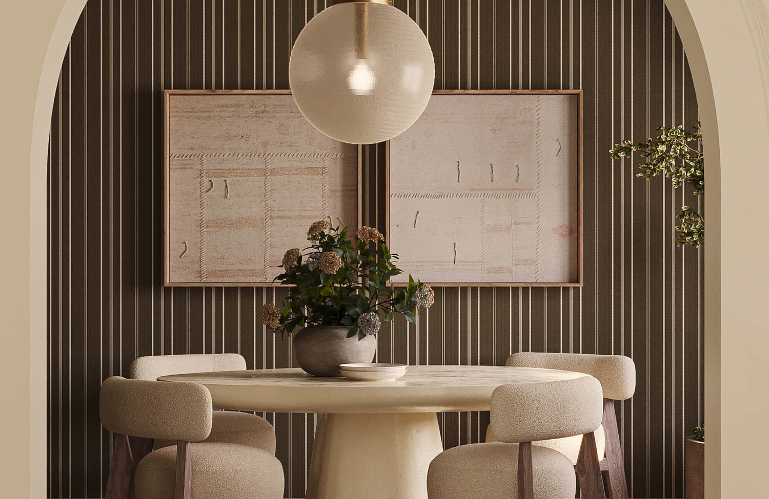
Borrowed Dawn Wall Art reinforces the room’s earthy palette, echoing the olive green walls, the Fleurin Walnut Oval Dining Table in Matte, 96", and soft neutral seating
Match The Artwork To The Room’s Color Palette
Color determines whether a piece of abstract art settles quietly into a room, creates deliberate contrast, or draws the full composition together. The most reliable approach is to pull one or two colors from existing elements like pillows, rugs, upholstery, curtains, bedding, ceramics, and choose artwork that echoes those tones without matching them exactly. Slight variations in value, a softer green or a warmer beige or a deeper rust, further create the sense of a layered, considered palette rather than something overly coordinated.
Abstract art can also introduce a focal point where a room feels too quiet or visually flat. Darker artwork on pale walls, warm artwork in cool-toned rooms, or a colorful piece in a neutral interior can add depth and personality, provided the surrounding furniture and accessories remain more composed. For a softer effect, tonal abstract art in beige, cream, taupe, gray, greige, or ivory can bring movement through brushwork and subtle shifts in value without relying on strong contrast.
Undertones deserve equal attention. They affect whether the artwork feels connected to the room's fixed finishes, which are the elements that cannot be easily changed. Warm artwork with cream, terracotta, ochre, camel, blush, or brown relates naturally to brass, oak, walnut, warm white walls, and tan upholstery. Cooler artwork with blue, slate, charcoal, crisp white, silver, or green-gray undertones suits chrome, marble, black accents, and cool gray palettes. Comparing the work against flooring, cabinetry, stone, hardware, and wall color before committing also helps ensure the piece supports rather than works against the room's larger design language.

Greyward Vale Wall Art is sized to sit neatly above the shelf, creating a balanced focal point that complements the Corentin Walnut Round Dining Table in Matte, 48"
Choose The Right Size And Placement
Scale determines whether abstract wall art feels grounded in a room or visually adrift. When placing a piece above a sofa, bed, console, fireplace mantel, or dining bench, it should relate to the width of the furniture below it. A general guide is to choose artwork spanning roughly two-thirds to three-fourths the width of that furniture, proportional enough to feel intentional, without overwhelming the wall or disappearing against it.
Large abstract art anchors open walls, vaulted rooms, spacious entryways, and open-plan living areas, adding visual weight and a clear focal point. On wider walls, coordinated sets like diptychs, triptychs, or related abstract pairings create rhythm and balance without depending on a single oversized piece. These groupings work well above sectionals, dining tables, hallway walls, long consoles, and bedroom walls, provided the pieces share a common color, frame style, composition, or sense of movement that holds them together.
Placement height also shapes how integrated the artwork feels. As a principle, abstract art should sit close to eye level or relate visually to the furniture beneath it, rather than floating disconnected from the room. In living rooms and bedrooms, where people are most often seated, the artwork may need to hang slightly lower than it would in a hallway or entryway. The right height and spacing allow a piece to feel accessible and genuinely part of the room's arrangement, rather than decorative but distant.

Earthbound Trace Wall Art adds a woven, organic focal point above the wainscoting, complementing the Elodie 48" Single Vanity in Whitewashed Oak with 3 cm White Zeus Quartz Top and the room’s warm traditional character
Coordinate Abstract Art With Interior Style
Abstract art belongs in almost any interior, but the piece should still support the room's visual language. Line quality, composition, palette, frame style, and surface texture all determine whether the artwork feels connected to its surroundings or at odds with them.
Modern Interiors
Modern interiors relate naturally to abstract art with clean lines, bold shapes, strong contrast, and a clear sense of structure. Black-and-white compositions, color-blocked forms, geometric arrangements, and simplified linework reinforce the crisp visual language of modern furniture and architecture, especially alongside streamlined sofas, metal accents, glass tables, smooth cabinetry, and sharp architectural details.
To prevent the room from feeling too resolved, balance graphic abstraction with at least one softer element. A bold geometric piece above a sofa reads as more inviting when paired with textured upholstery, a woven rug, or warm wood furniture; a contrast that preserves a polished, contemporary quality while allowing the space to feel livable.
Organic Interiors
Organic interiors call for abstract art that feels fluid, textural, and connected to the natural world. Flowing forms, earthy colors, layered brushwork, landscape-inspired tones, and mineral-like movement support organic modern, coastal, rustic, and biophilic spaces. This type of artwork tends to use curved gestures, tonal blending, and natural palettes that echo wood, stone, linen, clay, sand, and greenery rather than sharp contrast or rigid geometry.
A softly layered abstract piece can also complement a linen sofa, oak table, stone fireplace, woven pendant, or plaster-style wall without competing for attention. For a cohesive result, look for artwork that echoes the room's material mood: warm neutrals for wood-heavy interiors, blue-gray tones for coastal spaces, or clay and olive shades for earthy, grounded palettes.
Traditional Rooms
Traditional rooms can incorporate abstract art beautifully when the composition feels refined and the palette is thoughtfully controlled. Rather than highly experimental or aggressively bold pieces, look for artwork with muted colors, painterly depth, soft movement, or elegant tonal transitions, qualities that allow abstract art to refresh classic furniture without unsettling the warmth of carved wood, tailored upholstery, panel molding, antique accents, or ornate lighting.
A restrained abstract piece can also create a graceful bridge between traditional and contemporary sensibilities. Artwork with warm neutrals, soft blues, gentle greens, or aged metallic tones can settle comfortably above a classic console or upholstered bed. A frame in wood, black, brass, or antique gold further connects the piece to the room's existing finishes, making the art feel like a considered choice rather than a counterpoint.
Eclectic Spaces
Eclectic interiors can support more expressive abstract art because they already rely on layered styles, mixed materials, and personal vision. Bolder color, unusual forms, mixed media, oversized scale, and expressive brushwork can all find a home here. The goal is not perfect coordination, but one clear point of connection that keeps the room feeling collected rather than assembled by chance.
That connection might be a color repeated from a rug, a frame finish that relates to the lighting, a textured surface that echoes woven decor nearby, or a mood that complements both vintage and contemporary pieces in the room. When at least one thread links the artwork to its surroundings, it can feel genuinely expressive while still contributing to a cohesive whole.

Meadowline Wall Art introduces a softly woven texture within a clean frame, contrasting the glossy finish of Mara 2 x 10 Ceramic Tile in Nettle Green for a warmer, more layered backsplash
Consider Texture Framing And Material Finish
Abstract wall art is not only image and color. Its surface, frame, and finish shape how it interacts with everything around it. These material details influence depth, polish, reflection, and visual weight, helping the artwork feel relaxed, structured, dimensional, or highly refined.
Canvas
Canvas abstract art carries a painterly, approachable quality that belongs naturally in living rooms, bedrooms, family rooms, and casual interiors. Its softer surface produces less glare than glass-covered prints, making it feel warmer and more at ease in spaces designed for comfort. Stretched canvas allows brushwork, tonal layering, and painted texture to remain visible, giving the artwork a tactile, expressive presence. This format pairs especially well with upholstered sofas, linen bedding, woven rugs, and fabric window treatments, where a large canvas can add visual presence without feeling overly formal.
Framed Art
Frames give abstract art structure and can connect the work to other finishes in the room. A wood frame adds warmth and relates to flooring, furniture, or cabinetry. A black frame provides definition against pale walls or light upholstery. Metallic frames, such as brass, gold, silver, and bronze, create a more polished effect and can coordinate with lighting, hardware, mirror frames, or decorative accents. The frame should also support the artwork rather than overpower it. It does not need to match every finish in the room exactly, but it should relate to at least one element with intention.
Textured Art
Textured abstract art adds tactile depth through surfaces such as impasto paint, plaster, mixed media, woven details, raised paper, or sculptural relief. These pieces are especially valuable in rooms with simple palettes, where they create visual richness through shadow, surface variation, and material contrast rather than additional color. Textured art works well above consoles, beds, sofas, and in entryways where directional light from a sconce, picture light, or nearby window can reveal ridges, brushmarks, or layered materiality. To allow the surface detail to remain the point of interest, keep nearby wall decor and accessories edited.

Northland Memory Wall Art helps define the kitchen as a warm gathering space, complementing Alden 8 x 48 Matte Porcelain Tile in Umber with earthy texture and inviting depth
Use Abstract Wall Art To Shape Room Function
Different rooms call for different kinds of visual energy, and abstract wall art can reinforce how a space is meant to feel and be used. Choosing artwork with the room's purpose in mind creates interiors that feel more focused, restful, atmospheric, or genuinely alive.
Living Rooms
In the living room, abstract wall art anchors the seating area and gives the space a clear visual center. A medium to large piece above a sofa, mantel, or console helps organize the furniture arrangement and creates a natural point of gathering. Since living rooms typically include several design elements like rugs, pillows, accent chairs, and tables, the artwork should connect to at least one of these through color, texture, or mood.
The goal is presence without imposition. A bold abstract piece can energize a neutral seating area. A softer composition can make the room feel relaxed and welcoming. If the room already has patterned textiles or strong furniture silhouettes, a more edited palette in the artwork keeps the arrangement composed. If the furniture is quiet and simple, the artwork can carry more movement, contrast, or expressive brushwork.
Bedrooms
The bedroom calls for abstract art that feels calm, gentle, and soft on the eye. Since the space is designed for rest, overly energetic compositions, harsh contrast, or intense color can work against the room's essential quality. Instead, muted palettes, blurred forms, fluid lines, tonal layering, and organic movement support a quieter atmosphere. Soft neutrals, pale blues, muted greens, warm grays, blush tones, and earthy shades all contribute to a more restful setting.
Placement matters here too. Abstract art above the bed becomes a serene focal point — unhurried, composed, present. A smaller piece above a dresser or reading nook adds quiet interest without dominating. In bedrooms with layered bedding, drapery, and upholstered furniture, the artwork should complement the softness of the textiles and exist in harmony with the room's overall calm.
Dining Rooms and Kitchens
Dining rooms and kitchens can support more confident abstract art because both spaces are woven into daily life, such as gathering, hosting, cooking, and conversation. In dining rooms, deeper color, metallic accents, expressive movement, or higher-contrast compositions make the space feel more memorable, particularly when viewed under evening light. In kitchens, abstract art softens functional surfaces like cabinetry, tile, stone, and metal appliances, adding warmth and personality without interfering with the room's practical purpose.
Because these spaces include several fixed finishes, the artwork should relate to what is already there. In a dining room, that connection might be the chair finish, table material, chandelier, rug, or tableware palette. In a kitchen, it may be the cabinet color, backsplash tile, countertop veining, or hardware. Rich colors, layered textures, or dynamic compositions can also add sophistication. A more restrained piece can bring just enough depth to make the space feel finished and complete.
Bathrooms
Bathrooms benefit from abstract wall art that adds softness, color, or texture without overwhelming the room's practical surfaces. Where tile, mirrors, stone, glass, and metal fixtures already define the space, artwork can introduce warmth and make the room feel more resolved. Look for pieces with moisture-conscious framing or protected surfaces in full baths. Soft neutrals, watery blues, muted greens, warm beige, and delicate linework work well above a bathtub, near a vanity, or on an open wall where the art contributes atmosphere rather than competing with tile or hardware.
In powder rooms, abstract art can be more expressive since smaller spaces often welcome a more considered design moment. A bold piece above the toilet, a tonal work beside a vanity mirror, or a textured abstract on a blank wall can create a polished focal point. For cohesion, connect the artwork to the room's existing finishes: brass hardware, marble veining, ceramic tile, wood accents, or wall color, so it feels integrated rather than applied from the outside.
Home Offices
In home offices, abstract wall art adds creative energy without becoming a distraction. The most effective pieces tend to have controlled movement, limited palettes, or structured compositions that support focus while still giving the space visual life. Geometric forms, subtle linework, tonal abstracts, and balanced color blocking help the workspace feel intentional, stimulating without noise.
Placement should also respond to how the space is used. Artwork behind a desk creates a considered video-call background and a defined sense of setting. A piece within the main sightline offers a visual pause during the workday. For productivity-focused environments, avoid work that feels restless or overly saturated. Choose pieces that bring rhythm, clarity, and a sense of quiet momentum to the room.
Abstract Wall Art Works Best When It Connects Mood Scale And Style
The most considered abstract wall art is chosen with the entire room in mind, supporting the mood you want to create, relating to the existing palette through complementary color, thoughtful contrast, or shared undertones, and sitting at a scale and height that feels integrated rather than imposed. Texture, framing, material finish, room function, and interior style all contribute to whether a piece of abstract art simply fills a wall or genuinely shapes the space around it.
When those elements come together, the artwork stops being a finishing touch and becomes part of the room's deeper design logic, adding depth, focus, and a sense of personality that feels natural to live with every day. For help finding a piece that suits a specific room, palette, or mood, contact us. We're glad to guide you toward something that feels both visually connected and personally expressive.