


Tile samples have a curious way of making multiple options look equally convincing until you try to make the final decision at home. What seems like a straightforward side-by-side comparison can quickly get confusing when lighting shifts, textures behave differently in your space, or a tile that looked perfect in your hand feels completely different once placed where it will actually be installed. That is why comparing samples properly matters just as much as ordering them in the first place. In this guide, we will show you how to compare tile samples at home in a way that helps you choose with far more clarity and far less second-guessing.

Glossy ceramic tile samples in varying green tones are arranged across a sculptural driftwood base, highlighting subtle glaze variation under warm light.
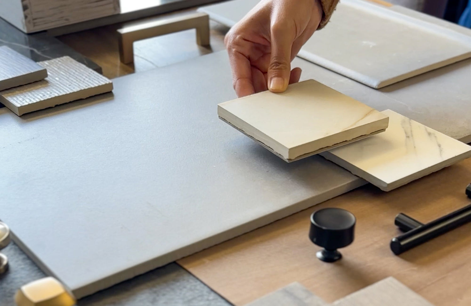
Set Up Your Tile Samples Like They Will Actually Be Experienced
A tile sample only becomes useful when it is evaluated under conditions that closely resemble the finished installation. Many comparison mistakes happen because samples are viewed in isolation rather than in the context for which they are meant. Before focusing on color, texture, or pattern, it helps to create a setup that reflects how the tile will actually be seen and experienced every day.
Testing Samples In The Exact Installation Zone
One of the most valuable things you can do during the sample stage is place each option directly in the area where it will eventually be installed. A tile that feels perfectly balanced on a kitchen island, dining table, or design board can look noticeably different once it is surrounded by the finishes, lighting conditions, and proportions of the actual room. The same tile may appear warmer beside wood cabinetry, cooler next to painted surfaces, or more dramatic when paired with darker materials. These subtle shifts are often difficult to predict until the sample is viewed in its true environment. Evaluating samples in the installation zone allows you to judge the tile as part of the overall design rather than as an isolated material.
That difference becomes especially noticeable with visually expressive surfaces. Our Mariel 1x12 Glossy Porcelain Tile in Opal Blue, for example, features softly rippled glazing and gentle blue-gray tones that respond differently depending on the surrounding finishes and available light. In one setting, the tile may feel bright and airy, while in another, it can take on more depth and dimension. What initially seems like a small variation on a sample board can become much more influential once the tile is introduced into the room where it will actually live. The closer your testing conditions are to the final installation, the easier it becomes to identify which option truly belongs in the space.
Live With Samples Before Making A Decision
The tile that captures your attention immediately is not always the tile you will appreciate most six months from now. Bold veining, dramatic color variation, and highly reflective finishes often create strong first impressions, but lasting appeal usually reveals itself more gradually. Rather than making a decision during a single comparison session, leave your samples out for several days and allow them to become part of your daily routine. Notice how they look during different times of day, how they interact with changing light, and whether your opinion remains consistent over time. The strongest option often becomes clearer once the excitement of a first impression begins to fade.
Many designers rely on this approach because it reveals how a material performs beyond that initial reaction. A tile that felt understated at first may become increasingly appealing as you continue encountering it throughout the day, while a more dramatic option can sometimes lose its impact once the novelty wears off. Living with samples allows you to evaluate them in a more natural and realistic way rather than forcing a decision based on a brief comparison. Over time, one option typically begins to feel more comfortable, more appropriate, and more connected to the space as a whole. That sense of consistency is often a stronger indicator of long-term satisfaction than any immediate emotional response.

A selection of tile samples is laid out on a board with beige, grey, and earthy tones placed next to each other as texture, edge detail, and light reflectivity are also assessed
Comparing Tile Samples Beyond Just Color
Color often drives the initial reaction to a tile sample, but it rarely tells the whole story. Texture, edge detail, light interaction, and scale can all influence how the finished installation feels once it becomes part of the room.
How Surface Texture Changes The Feel Of A Space
Surface texture can dramatically influence the atmosphere of a room, even when two tile samples appear nearly identical in color. A smoother finish often feels cleaner, more tailored, and visually restrained, while a more textured surface can introduce movement, warmth, and a stronger connection to natural materials. Textured stone-look tiles, for example, often bring a sense of depth and character that makes a space feel more grounded, whereas flatter surfaces tend to support a quieter and more architectural aesthetic. The important question is not simply whether the texture looks appealing up close, but whether it aligns with the mood you want the room to convey. In many cases, texture quietly influences how a space feels long before anyone consciously notices it.
Why Edge Detail Affects The Finished Installation Look
Edge detail is one of the easiest characteristics to overlook during a sample comparison, yet it plays a significant role in how the finished installation comes together. Rectified edges often create cleaner transitions between tiles and allow for tighter grout joints, contributing to a more refined and streamlined appearance. Softer or slightly irregular edges can produce a different effect, introducing a handcrafted quality that feels more relaxed and organic. These distinctions may seem subtle when examining a single sample, but they become far more noticeable once dozens or even hundreds of tiles are installed across a larger surface. Paying attention to edge detail early can help you visualize whether the final result will feel crisp and tailored or intentionally casual and expressive.
How Light Movement Across The Surface Changes Visual Depth
A tile does not simply exist within a room; it interacts continuously with changing light throughout the day. Some surfaces reflect light evenly and maintain a relatively consistent appearance, while others reveal shifting highlights and shadows that create a stronger sense of movement and depth. Glossy finishes often feel brighter and more dynamic as daylight changes, whereas matte surfaces typically offer a calmer and more predictable visual experience. Even subtle variations in texture can influence how light travels across the surface and how much dimension the tile appears to have from different viewpoints. Looking closely at how a tile responds to light often reveals more about its long-term visual impact than color alone ever could.
Our Amelia 2x13 Glossy Crackled Ceramic Tile in Denim makes that interaction especially easy to observe. Its rich blue flux glaze, softly pronounced crackle effect, and gently imperfect edges create a surface that rarely appears static, as changing light continuously brings different details to the forefront. In brighter conditions, the finish can feel luminous and reflective, while lower or angled light tends to emphasize its depth and moodier character instead. This type of surface movement can make a room feel more layered and visually engaging without relying on bold patterns or dramatic color variation. Evaluating these shifts during the sample stage provides a much clearer understanding of how the tile will contribute to the overall atmosphere of the space.
How Scale Can Feel Different Once The Tile Sits In Context
A tile sample represents only a small fragment of what the finished installation will ultimately become, which is why scale deserves careful consideration during the comparison process. A bold veining pattern that feels elegant on a sample may become far more prominent when repeated across an entire wall, while a simpler tile can often feel more sophisticated once it creates a continuous and uninterrupted surface. Tile size contributes to this effect as well, with larger formats generally producing a cleaner and more expansive appearance, while smaller tiles introduce additional rhythm through grout lines and repetition. What feels balanced within a sample board may create a completely different impression when applied at full scale. The most successful comparisons go beyond the sample itself and consider how the material will perform once it occupies the space it was designed to fill.
Because scale can be difficult to judge from a sample alone, our Augmented Reality (AR) Visualization Tool allows you to compare tile options within your actual space with far greater accuracy. By previewing different sizes, layouts, and coverage areas directly on your walls or floors, it becomes easier to understand how a tile will truly read once installed. Seeing a tile across an entire surface often reveals details that are difficult to judge from a sample alone, whether that's the effect of a large-format tile, the repetition of a pattern, or the visual weight of a particular color. When used alongside physical samples, AR can provide a more complete picture of how a tile may ultimately live within the room. It is often one of the most effective ways to narrow down strong contenders when multiple options still feel equally appealing.

Miley 4.5x9.1 Glossy Porcelain Tiles in Water run along the pool walls, where rippling reflections and shifting light give the surface a soft sense of movement.
Testing Tile Samples Against Real Daily Conditions At Home
Some of the most important differences between tile samples do not appear until they are exposed to the conditions of the room itself. Moisture, natural light, and daily routines can all change how a surface is perceived, often revealing qualities that are easy to miss during a standard comparison.
How Wet Areas Can Change Surface Perception
Tiles intended for moisture-prone spaces deserve to be evaluated beyond dry showroom conditions. Water can alter how a surface reflects light, reveal texture that seemed subtle before, and change the way color is perceived throughout the day. A matte finish may appear richer and more dimensional when damp, while a glossy tile can suddenly feel far more reflective than expected. Even minor shifts can influence the overall mood of a bathroom, shower, mudroom, or pool area once the tile is installed across a larger surface. Taking the time to lightly dampen a sample can reveal characteristics that may never become apparent during a traditional side-by-side comparison.
Pool settings make these changes especially noticeable because water, sunlight, and constant surface reflection are all working together. Our Miley 4.5x9.1 Glossy Porcelain Tile in Water above demonstrates this particularly well, where its glossy finish and subtle relief create significantly more movement than a dry indoor sample might initially suggest. Testing for these shifts early helps you determine whether that added movement supports the look you're trying to create or becomes more visually dominant than expected once repeated across a larger area.
Consider How The Tile Fits Your Daily Routine
The most successful tile choice is not always the one that looks best during a comparison session, but the one that continues making sense once daily life is taken into account. A polished surface that feels elegant in a sample board presentation may be less appealing if it constantly highlights water spots, smudges, or other signs of everyday use. Likewise, a heavily textured tile can look rich and expressive until you begin considering the level of maintenance it may require over time. Thinking through how the room is actually used helps place visual appeal into a more realistic context. Design and practicality are not competing priorities; the strongest selections usually manage to support both.
This is where it helps to mentally walk through the routines that shape the space each day. Consider whether the tile will be surrounded by splashes in a family bathroom, muddy shoes in an entryway, or frequent activity in a busy kitchen. A surface that feels perfect for a rarely used powder room may not be the strongest choice for a room that supports everyday family life. The best tile decisions often come from balancing appearance with the realities of how the space functions. When a tile aligns with both your design goals and your daily routine, it tends to remain satisfying long after the initial excitement of choosing it has passed.
Making The Final Tile Decision Feel A Lot Less Overwhelming
Comparing tile samples at home is really about giving yourself enough real-world context to make a decision you will still feel good about once everything is installed. The right option is often not the one that makes the loudest first impression, but the one that keeps making sense the more you test it in your actual space. When a tile continues looking right in different lighting, from different angles, and within your daily routine, that consistency usually tells you a lot. By that point, the decision tends to feel far less overwhelming and much more grounded.
If you are down to a few strong options and they are all starting to look the same, that is usually when an outside perspective can make the process feel much easier. Our Personalized Design Consultation helps you compare your tile choices within the context of your actual space, existing finishes, and overall design direction. Sometimes a quick expert conversation is all it takes to spot the option that fits most naturally instead of continuing to second-guess every detail. That way, you can move forward feeling confident in your decision rather than wondering what you may have missed.

