


Black and white tiles have a history of making a strong design statement. From the ancient mosaics of Rome to the elegant entryways of the Victorian era, this timeless color pairing has consistently captured the imagination of homeowners and designers alike.
Today, in an age of ever-changing trends, the classic duo is experiencing a powerful resurgence, proving its enduring appeal. This article will explore the compelling reasons behind this trend, from the psychological impact of the colors to the practical versatility of the tiles themselves, helping you understand how to harness their power in your own home.

The Enduring History of a Classic Palette
Black and white tilework has held a prominent place in architectural and interior design for centuries, valued for its contrast, clarity, and enduring sophistication. From ancient palaces to post-war American homes, this dual-tone palette has been continuously reinterpreted to reflect the cultural and aesthetic priorities of its time.
The Origins of the Checkerboard
The checkerboard pattern dates back to ancient civilizations, with early examples found in Mesopotamian mosaics and Roman bathhouses. The high-contrast black and white design served both decorative and practical purposes; its geometric regularity helped define spatial zones, while the stark visual contrast provided clarity in low-light conditions. In the Renaissance and Baroque periods, checkerboard floors became a hallmark of European cathedrals and estates, showcasing precision tiling techniques such as encaustic and inlaid marble. The grid-like layout emphasized architectural symmetry, aligning with classical ideals of balance and order.
This timeless format lives on today in contemporary products like Edward Martin’s Palmer 12x12 Checkerboard Matte Porcelain Tile in White and Nero, illustrated in the image above. With its clean lines and durable porcelain construction, the Palmer tile captures the essence of historic design while meeting modern performance standards.
A Symbol of Status and Craftsmanship
During the 18th and 19th centuries, black and white flooring became synonymous with opulence and fine craftsmanship. In neoclassical and Victorian interiors, hand-cut stone tiles, often marble or limestone, were meticulously laid to create dramatic entryways and grand bathrooms. The choice of high-contrast stone not only demonstrated wealth but also mastery in stonemasonry and design. Tile manufacturers in the late 1800s, especially in Europe and the United States, began producing ceramic and porcelain versions that mimicked these prestigious looks, bringing the style into upscale middle-class homes. The precision and permanence of these installations turned the black-and-white palette into a long-term design investment.
The Mid-Century Modern Revival
Following World War II, the black and white palette experienced a resurgence, thanks to the rise of Mid-Century Modernism. This era embraced clean lines, functionalism, and minimalism, principles that aligned naturally with monochromatic design. Hexagonal and penny tiles in black and white were especially popular in American bathrooms and kitchens, favored for their affordability, ease of cleaning, and visual crispness. Designers like Charles and Ray Eames promoted simplicity through high-contrast palettes, which translated well to small-format tiles and vinyl flooring. This period cemented black and white as not only a nod to the past but also a forward-thinking design choice.

The Psychology of Monochrome Contrast
The use of black and white in interior design taps into deeply rooted psychological and perceptual principles, offering powerful tools for shaping how we experience space. This high-contrast palette is not only aesthetically striking but also functionally effective in influencing spatial perception, emotional tone, and visual hierarchy.
Creating Space and Light
White surfaces naturally reflect more light, making them ideal for visually expanding compact or low-light environments such as bathrooms. When paired with black, the contrast intensifies brightness by enhancing the perception of luminance. Glossy white ceramic tiles, for example, bounce ambient light across walls and floors, contributing to a cleaner, more open atmosphere. Strategically using black as an accent, such as in grout lines, trims, or fixtures, frames the space and increases the perception of order and structure. This interplay of tones leverages the principles of light reflectance value (LRV), optimizing both functionality and visual clarity.
A refined example of this effect is Edward Martin’s Leona 24x24 Checkerboard Matte Porcelain Tile in Calacatta and Nero Marquina, featured above. The large-format tiles and marble-look veining enhance both scale and natural light distribution, while the matte finish softens glare and provides a grounded, luxurious feel. This pairing not only creates visual depth but also enhances spatial flow, making it ideal for bathrooms that aim to balance classic elegance with modern light dynamics.
Adding Depth and Drama with Black
While white amplifies openness, black introduces a sense of depth, enclosure, and sophistication. When used sparingly, such as in floor tiles, niche backdrops, or graphic patterns, black acts as a visual anchor, giving the eye a resting point and enhancing spatial definition. Matte black finishes, popular in contemporary fixtures, absorb light, creating a tactile, grounded effect that adds richness without overwhelming the space. This darker tone evokes feelings of luxury, mystery, and intentionality, particularly effective in minimalist or spa-inspired designs where material contrast is used to communicate quality and calm.
The Balance of Opposites
Psychologically, black and white represent opposing but complementary forces, light and dark, positive and negative, presence and absence. Their pairing creates a harmonious tension that appeals to the human brain's desire for equilibrium and order. In tilework, this dynamic can be orchestrated through symmetry, pattern repetition, or directional layout to evoke different emotional responses, whether it's the serenity of a checkerboard pattern or the energy of a herringbone stripe. This visual duality also supports universal design principles, making features easier to distinguish for users with visual impairments, an important consideration in ADA-compliant spaces.

Creative Patterns and Modern Tile Shapes
Contemporary tile design has moved well beyond traditional checkerboard layouts, embracing innovative patterns, dimensional forms, and nuanced surface treatments. Today’s black and white tilework showcases not only color contrast but also architectural rhythm and tactile variation, key elements in modern bathroom design.
Beyond the Checkerboard
While the checkerboard remains iconic, designers are increasingly experimenting with geometric motifs such as herringbone, chevron, and basketweave to introduce movement and complexity. Hexagonal tiles, particularly in matte black or glossy white, offer a fresh, modular alternative that blends classic aesthetics with modern flair. Elongated shapes like picket tiles and narrow subway formats allow for vertical stacking or offset arrangements, creating visual interest without overwhelming small spaces. These layouts provide designers with flexibility to manipulate perception, drawing the eye upward for height or outward for width, while still maintaining a monochrome palette.
A standout example of this geometric evolution is Edward Martin’s Quinn 12x12 Matte Porcelain 1x1 Hexagon Mosaic Tile in Black & White Flower, featured above. The floral motif, formed by carefully arranged black hexagons within a white field, adds subtle pattern and charm to vintage-inspired bathrooms. This mosaic format brings texture, slip resistance, and historical character to the floor, while maintaining a clean, high-contrast look that fits seamlessly within both traditional and contemporary designs.
The Power of Grout
Grout color and line thickness are key factors in defining tile patterns and emphasizing contrast. In black and white installations, grout can either sharpen geometry or soften transitions. For instance, white tiles with black grout enhance the grid effect, creating a bold, graphic look reminiscent of Bauhaus influences. Conversely, tone-on-tone grout minimizes visual seams, allowing shapes or surface textures to take precedence. Epoxy and urethane-based grouts also offer superior stain resistance and color retention, making them ideal for high-moisture bathroom environments. Designers now view grout as a design element in its own right, part of the composition rather than a neutral filler.
Mixing Textures and Finishes
Monochromatic doesn’t mean monotonous. Advances in manufacturing have made it possible to combine multiple finishes, matte, gloss, honed, and textured, within a single color scheme. White tiles with a crackle glaze, for example, catch light differently than adjacent matte tiles, adding depth and subtle complexity. Black tiles with a three-dimensional relief or fluted surface introduce tactility, offering a sensory counterpoint to smoother areas. When used thoughtfully, the interplay of textures can delineate wet and dry zones, add spa-like ambience, or draw attention to architectural features such as niches and backsplashes.

Pairing Monochrome Tiles with Decor Trends
Black and white tilework provides a versatile foundation for layering other design elements, allowing you to adapt timeless surfaces to evolving interior trends. When paired strategically with textures, materials, and color, monochrome tiles become the canvas for both classic and contemporary bathroom aesthetics.
Warming Up the Space with Wood and Texture
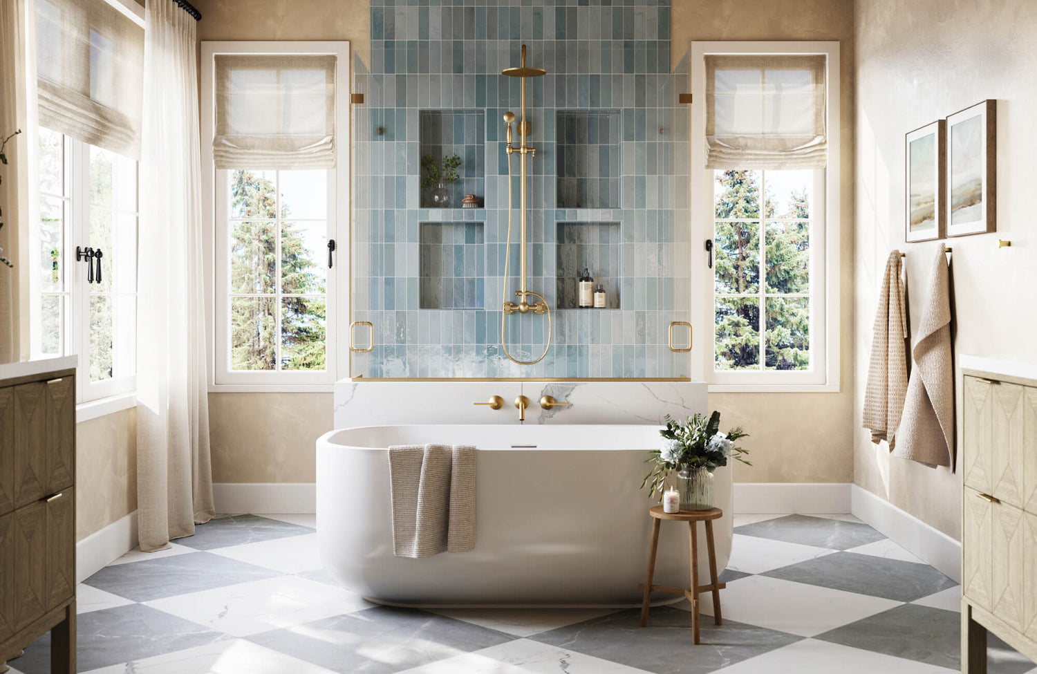
To offset the crispness of black and white tiles, designers are increasingly incorporating organic materials, particularly wood, to introduce warmth and tactile contrast. Natural oak vanities, walnut shelving, or slatted teak paneling soften the graphic sharpness of monochrome tilework and add biophilic appeal. Textural additions such as woven baskets, linen shower curtains, or ribbed plaster finishes enhance sensory richness without disrupting the clean palette. These combinations not only create visual balance but also evoke the calm, spa-like qualities favored in wellness-centered design.
In the bathroom shown above, Edward Martin’s Leona 12x12 Checkerboard Matte Porcelain Tile in Amani Bronze and Nero Marquina grounds the space with its marble-look finish and earthy undertones. The warm brown veining of Amani Bronze contrasts elegantly with the deep Nero Marquina, complementing the natural wood cabinetry and beige wall tile. This subtle tonal shift maintains the timeless appeal of checkerboard layouts while introducing a more inviting, nuanced color story ideal for transitional and nature-inspired interiors.
Metals and Finishes as Accents
Metallic finishes act as both functional and decorative complements to monochrome tiles. Brushed brass and warm gold fixtures lend a sense of luxury and warmth, especially against matte black tiles or white subway layouts. Chrome and polished nickel reinforce the graphic clarity of black and white while aligning with more traditional or transitional styles. Matte black hardware, often used for faucets, mirror frames, or shower enclosures, can create cohesion when echoed in tile grout or niche detailing. The finish and reflectivity of metals also influence light distribution and perceived texture, shaping the overall ambiance.
Pops of Color and Greenery
A restrained color palette makes an ideal backdrop for introducing intentional accents. Towels, planters, artwork, or cabinetry in saturated hues, such as emerald green, terracotta, or navy, can infuse personality without clashing with the monochrome scheme. Live greenery, particularly in bathrooms with natural light, adds both vibrancy and air-purifying benefits. Species like ferns, pothos, and snake plants thrive in humid conditions and provide an organic counterbalance to the hard lines of tile. By keeping color accents modular and easily replaceable, you can maintain long-term design flexibility while still embracing trend-driven decor.

Durability and Longevity for a Lasting Home
In bathroom design, durability is as critical as aesthetics. Black and white tilework, when paired with the right materials and installation practices, offers long-lasting performance in wet, busy environments. Understanding the technical aspects behind tile choice, safety, and return on investment ensures a space that remains functional and beautiful for decades.
Choosing the Right Materials
Not all tiles are created equal. Porcelain, known for its density and low water absorption rate (typically <0.5%), is ideal for bathroom floors and walls, especially in shower zones. It offers superior durability compared to ceramic, which is more porous and best suited for lower-impact areas. Both materials are available in matte and glazed finishes that replicate natural stone or concrete, combining aesthetic flexibility with structural integrity. For high-impact zones, rectified tiles with precisely cut edges allow for tighter grout joints, reducing the risk of cracking and moisture penetration over time.
A strong example of both visual character and technical performance is Edward Martin’s Quinn 12x12 Matte Porcelain Pinwheel Mosaic Tile in Black & White, featured above. This mosaic format blends timeless geometry with durable construction, using matte-finished porcelain for improved slip resistance and longevity. The pinwheel layout provides movement and classic charm, while the small-format pieces enhance traction and accommodate slight floor variations, ideal for older homes or high-use bathrooms.
Safety and Practicality
Durability also means prioritizing user safety. Slip resistance is a key factor in bathroom tile selection. Tiles rated with a high coefficient of friction (COF) or classified as R10 to R13 under European DIN standards provide better grip in wet conditions, making them ideal for flooring. Textured or matte finishes typically offer better traction than glossy ones, which can become slippery when wet. Additionally, proper waterproofing beneath tiled surfaces, using systems like uncoupling membranes or waterproof backer boards, is essential for preventing mold, mildew, and structural damage.
A Smart Investment
Installing black and white tilework is not just a stylistic choice; it’s a long-term investment. This classic palette transcends trends, reducing the need for costly renovations down the line. High-quality porcelain or ceramic tiles can last 30 years or more with minimal maintenance, offering excellent lifecycle value. Furthermore, well-installed tile increases a home’s market appeal and resale potential, particularly when paired with modern features such as underfloor heating or accessible design elements. Maintenance is also straightforward; most tiles resist stains, scratches, and chemical cleaners, making them ideal for busy households.

Low-Maintenance Elegance for a Pristine Space
One of the key advantages of black and white tilework in bathrooms is its ability to deliver timeless style without demanding intensive upkeep. When selected and maintained properly, monochrome tiles offer both visual appeal and practical performance, making them ideal for those seeking low-maintenance elegance.
Hiding Dirt in Plain Sight
Contrary to expectation, black and white tiles, especially when patterned or textured, can effectively conceal dirt, water spots, and soap residue between cleanings. Medium-sized black floor tiles are particularly good at camouflaging dust and scuff marks, while white wall tiles can mask hard water stains when properly glazed. Patterned or variegated tile layouts, such as hexagons or mosaics, naturally diffuse visual imperfections, making minor grime less noticeable. Strategic grout selection also makes a significant impact: mid-tone or darker grout lines resist staining and maintain a cleaner appearance over time compared to stark white grout.
Matte vs. Glossy Finishes
The choice between matte and glossy finishes impacts both aesthetics and maintenance. Glossy tiles reflect more light and can make small bathrooms appear brighter, but they also highlight smudges, fingerprints, and water spots, particularly in high-touch areas like backsplashes or shower walls. Matte tiles, on the other hand, have a softer, more contemporary look and tend to hide surface debris more effectively. They also offer better slip resistance, which is an added benefit for flooring. In high-moisture environments, a honed or satin finish provides a balanced compromise, offering moderate sheen with easier maintenance.
To simplify the decision-making process, Edward Martin offers an Augmented Reality (AR) Visualization Tool that allows you to preview both matte and glossy tile finishes directly in your bathroom using your mobile device. Once you’ve identified a finish that suits your aesthetic and lighting, you can seamlessly request Edward Martin tile samples to evaluate surface feel, tone, and quality. Together, these tools bridge digital planning and tactile verification for a streamlined, informed design experience.
Best Practices for Cleaning
Maintaining a pristine look requires simple but consistent care. Regular sweeping or vacuuming removes loose debris, preventing abrasion on tile surfaces. For deeper cleaning, pH-neutral tile cleaners or diluted vinegar solutions are effective for ceramic and porcelain tiles, avoiding damage to the glaze or grout. Non-abrasive brushes and microfiber cloths are recommended to preserve surface integrity.
Sealing grout, particularly in floors and wet areas, every 12–18 months can prevent discoloration and moisture infiltration. For persistent buildup, steam cleaning is a safe and chemical-free method that penetrates grout lines and textured surfaces. For all care, maintenance, or general upkeep, it's always best to consult the manufacturer's guidelines to ensure the best results and protect your tile investment.
Timeless Contrast, Enduring Value
Black and white tiles continue to trend in bathroom design for their architectural clarity, material resilience, and adaptability across styles, from historic to modern. Their high-contrast aesthetic enhances spatial perception, while durable surfaces like porcelain and ceramic ensure long-term performance in moisture-prone environments.
Innovative patterns, grout techniques, and complementary finishes expand their design potential without complicating upkeep. When paired with natural textures, metallic accents, or curated color pops, monochrome tilework becomes both timeless and current. For those seeking longevity with visual impact, this palette remains a smart, sophisticated foundation worth serious consideration.