


Choosing wallpaper can feel overwhelming, especially when trends rise and fall at a dizzying pace. Yet while certain colors and motifs dominate social media for a season, others quietly endure for decades. The difference lies not in popularity but in principle, as truly timeless wallpaper draws from architecture, history, craftsmanship, and the way you naturally experience space.
If you want walls that will still feel relevant years from now, it helps to look beyond what is momentarily fashionable. Instead, lasting designs echo structural balance, celebrate natural forms, and rely on material depth rather than novelty. As you explore the styles below, you will see that enduring wallpaper is not about playing it safe. Rather, it is about choosing patterns that evolve gracefully with your space.

Architectural Geometry
Geometric wallpaper remains timeless because it reflects the underlying structure of architecture itself. By echoing proportion, repetition, and symmetry, these patterns feel inherently balanced and seamlessly integrated into a space.
Linear Structures and Vertical Stripes
Few patterns demonstrate architectural alignment as clearly as the vertical stripe. By guiding the eye upward, stripes subtly elongate walls and create the impression of higher ceilings. As a result, even modest rooms can feel more expansive and refined. This optical enhancement alone contributes to the stripe’s lasting appeal across traditional and modern interiors alike.
With its tailored rhythm and understated color palette, our Windsor Wallpaper in Olive II, 52" x 132" brings a refined architectural presence to any space. The vertical stripes guide the eye upward, subtly enhancing ceiling height, while the layered olive green tones add warmth without overpowering the room. Because the contrast remains gentle and controlled, the pattern also delivers dimension and structure in a way that feels polished rather than bold. As a result, it offers the kind of timeless sophistication that complements both classic and contemporary interiors.
However, proportion plays a crucial role in maintaining sophistication. Stripes with gentle tonal variation tend to feel timeless because they add dimension without harsh contrast. Alternating widths inspired by Regency design also introduce rhythm, while muted or matte finishes soften the overall visual impact. When thoughtfully scaled, stripes provide structure and elegance in much the same way tailored clothing enhances your silhouette without overwhelming it.
Mid-Century Geometric Repeats
Interlocking forms such as hexagons, honeycombs, Moroccan trellis, and fretwork gained prominence during the Mid-Century Modern movement, yet their appeal has proven remarkably durable. Their disciplined repetition and balanced spacing also create a framework that feels architectural rather than ornamental. Because these patterns rely on precision, they maintain clarity even as surrounding furnishings evolve.
To preserve longevity, scale and color restraint are essential. When geometric repeats are executed in monochromatic or low-contrast palettes, the emphasis remains on form instead of trend-driven color. This allows the pattern to function as a structural layer within the room, quietly reinforcing its lines and proportions. In turn, the wallpaper becomes less of a statement piece and more of an integrated design element that continues to feel relevant over time.
Our Essex Wallpaper in Black II, 52" x 132", shown in the image above, perfectly reflects the principles of mid-century geometric repeats through its disciplined grid composition and refined tonal contrast. Its structured checker pattern introduces architectural clarity, while the softened black palette prevents the design from feeling stark or overpowering. From a distance, it reads as a cohesive textural layer; however, as you move closer, the subtle variation within each square reveals depth and craftsmanship. This balance between precision and restraint allows the wallpaper to function as an integrated design element, reinforcing proportion and rhythm within the space while maintaining timeless appeal.

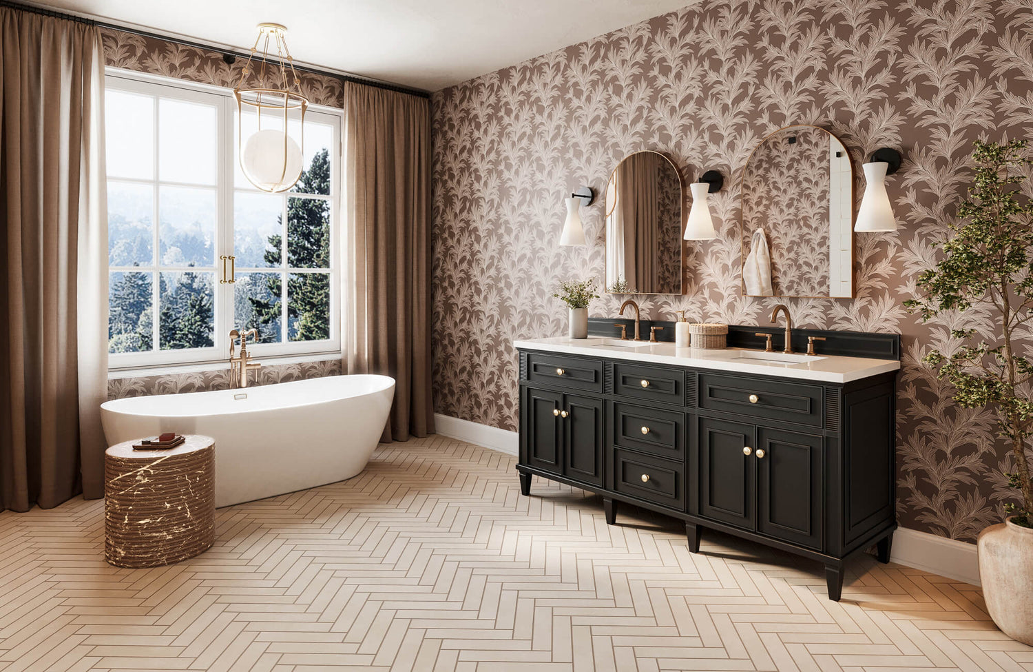
Botanical
Botanical wallpaper remains enduring because it reflects your natural affinity for the outdoors. By translating organic forms into interior surfaces, these patterns create a sense of calm and balance that feels both grounding and timeless.
William Morris and Arts and Crafts
The lasting appeal of William Morris and the Arts and Crafts movement stems from a deep respect for craftsmanship and clarity of form. Morris designs are known for their dense yet balanced compositions, where intertwined florals and foliage unfold in earthy, complex tones like sage, indigo, and muted red. Although intricate, the patterns maintain harmony through thoughtful repetition and proportion.
Importantly, these designs avoid dramatic shading or illusionistic effects. Rather than attempting to create three-dimensional depth, they celebrate the wall as a decorative surface. As a result, the wallpaper feels intentional and artisanal. When paired with natural materials such as wood, stone, or linen, the overall effect is cohesive and grounded, reinforcing a sense of authenticity within your interior.
As a modern interpretation of Arts and Crafts tradition, our Botanique Wallpaper in Winter, 52" x 132", displayed above, reflects the movement’s emphasis on balanced repetition and botanical clarity. Its stylized florals are thoughtfully spaced to create harmony across the wall, allowing the pattern to feel composed rather than busy. The bluish gray, beige, and soft brown tones also reinforce this restraint, adding depth and warmth without relying on heavy contrast or illusionistic effects. When paired with natural wood, stone, or textured fabrics, the design feels cohesive and grounded, offering heritage character that remains timeless rather than nostalgic.
Chinoiserie
Chinoiserie operates more like fine art than conventional repeating wallpaper. Instead of tight, predictable patterns, it presents expansive scenes of flowering branches, birds, and delicate landscapes that unfold across the wall. Because the design is less repetitive, it reduces visual fatigue and creates a more immersive experience.
Soft palettes such as powder blue, sepia, or grisaille further enhance its adaptability. These restrained tones allow the artistry to stand out without overwhelming the room, making it suitable for both classic and contemporary settings. When used thoughtfully, often as a focal wall, Chinoiserie introduces narrative depth and refined elegance that continues to feel relevant rather than time-bound.
Our Hillrise Mural Wallpaper, 312" x 132", embodies this Chinoiserie sensibility through its expansive, panoramic composition that transforms the wall into a continuous landscape. Rather than relying on a confined repeat, the design unfolds in a fluid scene that invites the eye to travel, creating a sense of depth and atmosphere within the room. Its mural scale also enhances the immersive quality, making it especially impactful as a feature wall in dining rooms, bedrooms, or formal living spaces. Hillrise captures the artistic narrative and refined elegance that define Chinoiserie, while offering a fresh interpretation suited to contemporary interiors.

Textural and the Mimicry of Raw Materials
Although bold patterns may fall in and out of favor, texture consistently endures. By emphasizing surface quality over graphic statement, textural wallpaper creates depth and warmth that feels timeless rather than trend-driven.
Natural Grasscloth and Woven Fibers
Grasscloth wallpaper, woven from natural fibers such as sisal, jute, or seagrass, has long been favored for its understated sophistication. Its beauty lies not in uniformity but in variation. Subtle shifts in tone, visible seams, and organic irregularities create a dynamic surface that responds to changing light throughout the day.
These inconsistencies are precisely what give grasscloth its authenticity. Rather than appearing flat or manufactured, the material introduces warmth and tactile depth. As a result, it functions as a refined neutral backdrop that supports a range of styles. Whether your space leans minimalist or traditional, woven fibers provide continuity and texture without overwhelming the overall design.
For a more tailored interpretation of woven texture, our Franklin Wallpaper in Charcoal, 52" x 132", seen above, offers a sophisticated alternative to traditional grasscloth. Inspired by the tactile quality of fabric, its dark gray tones and softly irregular linear detailing create a layered, textile-like surface that feels dynamic yet controlled. Unlike natural fibers that embrace pronounced variation, Franklin delivers a consistent finish while still capturing the warmth and depth associated with woven materials. As a result, it provides the same grounded elegance as grasscloth, with a slightly more polished and versatile aesthetic.
Trompe l’Oeil Plaster and Stone Effects
Advancements in printing technology have made it possible for wallpaper to convincingly replicate finishes such as Venetian plaster, limestone, or tadelakt. Unlike the glossy faux finishes of previous decades, contemporary interpretations focus on nuanced tonal variation and matte surfaces. This restraint allows the effect to feel architectural instead of decorative.
Such designs are particularly effective in transitional areas like hallways or entryways, where subtle texture enhances spatial flow. Our Skyveil Mural in Mistfall IV, 208" x 132", exemplifies this approach through its atmospheric tonal gradation and mineral-inspired movement that closely resembles hand-applied plaster. Rather than presenting a literal image, it creates the illusion of depth through soft layering and matte variation, allowing the wall to feel architectural and immersive. By introducing this sense of material permanence without the weight or expense of real stone or limewash, the mural adds quiet sophistication and enduring dimension to your interior.

Tone on Tone Damasks
Damask has endured for centuries because it balances ornament with refinement. In modern interiors, its longevity is preserved through tone-on-tone palettes that soften contrast and emphasize texture over drama.
Historical Elegance Reimagined for Modernity
Although traditional damask was often associated with richly colored Victorian rooms, modern interpretations take a more restrained approach. By narrowing the tonal range and simplifying intricate detailing, the pattern becomes more architectural and less ornamental. This refinement also allows the wallpaper to serve as a textured foundation rather than a commanding focal point.
Because of this subtlety, damask adapts effortlessly to contemporary settings. Our Brocade Wallpaper in Black/Tan II, 52" x 132", featured above, reflects this modern restraint through its classic ornamental symmetry and refined two-tone palette, which softens contrast while preserving depth. The intricate motif feels rooted in traditional textile design, yet the controlled coloration keeps it architectural rather than overly decorative. It also pairs seamlessly with clean-lined furniture and contemporary accents, allowing you to enjoy historical richness within a balanced, updated interior.
Scaling for Visual Impact
Beyond color and detail, scale determines how damask performs within a room. Larger motifs can anchor expansive spaces, particularly those with higher ceilings, by giving the walls a confident presence. Conversely, smaller repeats introduce intimacy, making them well-suited for studies, bedrooms, or powder rooms where a sense of enclosure feels intentional.
Even in compact areas, an oversized damask can also succeed when proportion is thoughtfully considered. The key lies in aligning the pattern’s scale with the room’s architectural dimensions. When balanced correctly, the wallpaper enhances spatial harmony rather than competing with it, ensuring the design feels deliberate and timeless.

Cultural Motifs and Globally Inspired Classics
Patterns rooted in global heritage endure because they carry stories shaped by history and craftsmanship. When you incorporate these motifs thoughtfully, they introduce depth and character that feel layered rather than trend-driven.
Toile de Jouy
Toile de Jouy is distinguished by its finely detailed pastoral or scenic compositions, traditionally rendered in a single ink color on a light ground. Classic palettes such as red or cobalt on cream evoke a sense of old-world charm; however, contemporary interpretations have refined their presence. When executed in charcoal, navy, or black, the pattern takes on a sharper, more graphic clarity that tempers overt nostalgia.
This evolution in color transforms toile from quaint to crisp. Although the storytelling scenes remain intact, the updated palette allows the wallpaper to integrate seamlessly into modern interiors. In this way, you preserve the artistry and narrative tradition of toile while ensuring it feels relevant and composed within a contemporary setting.
For a more atmospheric take on scenic wall design, our Downland Wallpaper in Black I, 52" x 132" offers a contemporary alternative to traditional toile. Instead of intricate figurative illustration, it presents rolling hills through softly layered white washes set against a deep gray ground, creating a moody and expansive landscape effect. The absence of a detailed narrative also allows the design to feel modern and understated, while still capturing the timeless appeal of nature-inspired scenery.
Ikat and Tribal Geometrics
Ikat patterns are recognized for their softly diffused edges, a result of traditional resist-dye weaving techniques. This subtle blurring introduces warmth and movement, preventing the geometry from appearing rigid or machine-perfect. The balance between precision and irregularity is precisely what gives Ikat its enduring authenticity.
Because Ikat merges structured repetition with organic softness, it adapts effortlessly to a variety of materials and styles. It complements wood, leather, linen, and layered textiles, reinforcing a collected and grounded aesthetic. Over time, its artisanal character continues to resonate, allowing the pattern to evolve with your space rather than feel confined to a particular trend cycle.
Designing Walls That Last for Decades
Wallpaper designs never go out of style when they align with architectural structure, natural influence, and material authenticity instead of fleeting trends. By choosing geometry that reinforces proportion, botanicals that connect to nature, textures that add quiet depth, or heritage motifs rooted in craftsmanship, you create walls that feel intentional and enduring. Ultimately, timeless wallpaper succeeds because it supports your space rather than competing with it, allowing your interiors to grow and adapt beautifully over time.
If you are ready to bring this level of intention into your own space, thoughtful guidance can make all the difference. Our team is here to help you select wallpaper that complements your architecture, reflects your aesthetic, and stands the test of time. Whether you have questions about materials, scale, or installation, reaching out connects you with experts who can ensure your walls are designed not just for today, but for decades to come.
