


When thinking about making a room feel larger, we often focus on furniture or layout, but wallpaper color also plays an important role in how spacious a room appears. Different colors influence how light is reflected and how visual boundaries are perceived, which directly affects the overall sense of space. By understanding how certain tones create depth and openness, it becomes easier to make a room feel less confined without altering its structure. In this article, you’ll learn which wallpaper colors can make a room look bigger, how to use them effectively in your space, and how to make a confident, well-informed decision.

Light Colors That Expand Visual Space
Light wallpaper colors are one of the most effective ways to make a room feel larger, as they reflect more light and soften visual boundaries. Rather than drawing attention to the walls, these shades help create a seamless look, making the space feel more open and less confined.
Soft Whites
Soft whites do more than simply brighten a room, as they also help reduce visual interruptions along the walls. When the eye is not forced to stop at strong color changes, the space feels more continuous and open. A slightly warm white often feels more natural than a stark, cool white, making the room more comfortable to spend time in. This approach is reflected in Edward Martin’s Strafford Wallpaper in Tan II, 52" x 132", which features a soft white base layered with delicate light-brown botanicals, as shown in the photo above, adding gentle detail without disrupting visual flow. This subtle warmth allows you to maintain a sense of openness without creating a space that feels too stark or clinical.
Pale Neutrals
Pale neutrals such as light beige or soft taupe introduce warmth while still keeping the room visually open. These tones work well when you want a space to feel inviting without sacrificing brightness. They are especially useful in rooms with limited natural light, where pure white may feel too flat or harsh. By adding a gentle layer of color, pale neutrals help create depth while maintaining an overall sense of spaciousness.
Light Pastels
Light pastels introduce color without overwhelming the room. Muted tones like light blue or light green can subtly shape the mood while keeping the space feeling airy and open. Because these shades are low in intensity, they do not visually pull the walls inward. Instead, they offer a balance between personality and openness, making them a practical choice for smaller spaces.
Monochrome Light Palettes
Using a consistent light color across the walls creates a more unified and uninterrupted look. When there are fewer visual breaks, the eye can move smoothly across the room without being drawn to contrasting elements. This continuous flow helps reduce the perception of boundaries, making the space feel larger than it is. A monochrome approach also makes it easier to layer furnishings and decor without disrupting the overall sense of openness.

Cool Tones That Push Walls Back
Cool tones naturally create a sense of distance, making them especially effective for visually expanding a room. These colors influence how depth is perceived, helping walls appear farther away and making the space feel more open and less confined.
Soft Blues
Soft blues are often associated with open skies, which is why they work particularly well in smaller rooms. When used on walls, this color can create a calming atmosphere while also enhancing the perception of depth. The light, airy quality of soft blue helps prevent the walls from feeling close or enclosing. As a result, the room feels more expansive without relying on structural changes.
Muted Greens
Muted greens create a subtle connection to nature while maintaining a balanced and uncluttered look. Shades like sage or soft olive provide enough color to add interest without overwhelming the space. Edward Martin’s Porter Wallpaper in Olive Night I, 52" x 132" illustrates this approach well, featuring a woven-like olive green base with white donkey motifs in a pared-back, hand-sketched style, as shown in the photo featured above, adding character while keeping the overall look grounded and refined. These tones can help create a relaxed environment while still keeping the room visually light. By avoiding overly saturated greens, the space remains open and easy on the eyes.
Cool Grays
Cool grays offer a refined and modern option for those who prefer a neutral palette. These tones can enhance the sense of space by maintaining a clean, understated backdrop. Because they do not draw excessive attention, cool grays help the room feel more expansive and less visually crowded. They are particularly effective in interiors where simplicity and clarity are key.
Gradient Effects
Gradient effects introduce a gradual shift between tones, which adds depth without creating sharp visual breaks. This smooth transition encourages the eye to move across the surface, reducing the sense of fixed boundaries. When applied thoughtfully, gradient wallpaper can make walls feel less rigid and more expansive. It also adds subtle visual interest while maintaining a calm and cohesive look.

Low Contrast Designs That Keep Flow Continuous
Visual flow plays an important role in how spacious a room feels. When contrast is kept low, the eye moves more smoothly across surfaces, allowing the space to feel continuous, cohesive, and less visually confined.
Tone on Tone Patterns
Patterns that stay within the same color family add visual interest without disrupting the room’s overall flow. Because there is little contrast, the eye can move smoothly across the surface without stopping at sharp differences. This creates a more unified look, which helps the space feel larger and more cohesive. By keeping variation subtle, these patterns enhance the design while maintaining openness.
Subtle Textures
Texture can introduce depth without relying on strong color contrasts. A lightly textured wallpaper adds dimension to the walls while maintaining a calm and uncluttered appearance. Because the variation is tactile rather than visual, it does not interrupt the flow of the space. This makes it a practical option when you want to add interest without making the room feel smaller.
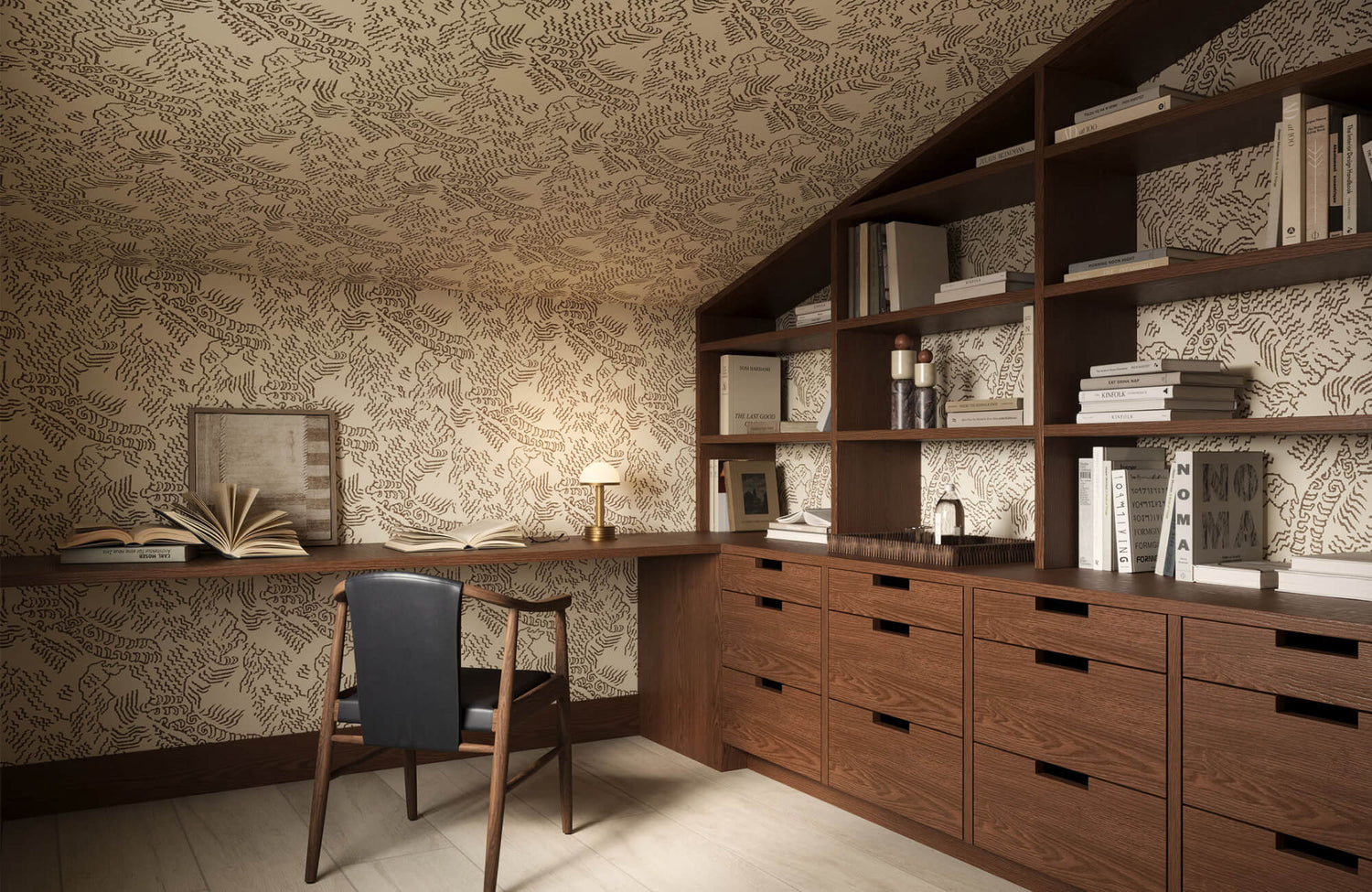
Minimal Pattern Scale
Small-scale patterns tend to blend into the background rather than dominate the room. When patterns are understated, they do not compete for attention or create visual breaks. This allows the eye to move more freely, which helps maintain the illusion of space. A similar effect can be seen with Edward Martin’s Somerset Wallpaper in Tan I, 52" x 132", as shown in the photo featured above, where the fine, evenly spaced pattern adds subtle detail without interrupting the room’s overall flow. Choosing a minimal scale ensures that the design supports openness rather than limiting it.
Soft Metallic Accents
A subtle touch of metallic detail can enhance how light moves across the room. These finishes reflect light gently, adding brightness without introducing harsh contrast. When used in moderation, they can make the space feel more dynamic while still maintaining visual continuity. This balance helps the room feel both refined and spacious.

Vertical and Horizontal Color Illusions
The direction of a pattern can influence how the room size is perceived. By choosing the right orientation, it becomes possible to visually adjust how tall or wide a space feels without changing its actual dimensions.
Vertical Light Stripes
Vertical stripes naturally draw the eye upward, which helps create the impression of higher ceilings. This visual movement shifts attention away from the room’s actual height and emphasizes vertical space instead. A similar effect can be seen with Edward Martin’s Windsor Wallpaper in Black II, 52" x 132", as shown in the photo featured above, where the evenly spaced vertical lines guide the eye upward while maintaining a clean, structured look. When stripes are kept in light tones, the effect feels more subtle and less distracting. As a result, the room appears taller without overwhelming the overall design.
Horizontal Soft Bands
Horizontal designs can visually extend the room width by guiding the eye across the space. This is especially useful in narrow areas where the goal is to create a more balanced proportion. When the bands are soft and low in contrast, they stretch the room without creating strong visual divisions. This approach helps the space feel wider while maintaining a calm and cohesive look.
Elongated Patterns
Patterns that follow a single direction introduce a sense of movement that can influence how space is perceived. Instead of feeling confined by fixed boundaries, the eye is encouraged to move along the pattern. This reduces the boxed-in effect that can occur in smaller rooms. By creating a gentle visual flow, elongated patterns help the space feel more open and less restricted.
Ceiling Continuation
Extending wallpaper slightly onto the ceiling helps blur the line between vertical and overhead surfaces. When this boundary becomes less defined, the room feels taller because the eye is not confined to a clear stopping point. This technique works particularly well with light or low-contrast designs that maintain visual continuity. Over time, it creates a more seamless and elevated sense of space.

Reflective and Light-Enhancing Colors
Light interaction is just as important as color choice when creating a sense of space. Certain finishes and tones help light move more effectively throughout the room, enhancing brightness and making the space feel more open.
Glossy Finishes
Glossy wallpaper reflects light across surfaces, helping to brighten the entire room. This increased light distribution can make walls feel less solid and more open. When used in moderation, glossy finishes can also enhance the sense of space without creating glare or distraction. The key is to balance reflectivity so the room feels brighter while remaining comfortable.
Pearlescent Tones
Pearlescent finishes respond subtly to changing light conditions, creating a soft variation across the surface. This gentle shift adds depth without introducing strong contrast or heaviness. Because the effect is subtle, it keeps the walls visually engaging without overwhelming the space. Over time, this layered look helps maintain a sense of openness while adding subtle depth.
Light-Enhancing Neutrals
Some neutral tones reflect light more effectively than others, which can influence how spacious a room feels. Shades like off-white or light cream help maintain brightness while introducing a gentle warmth. This balance prevents the room from feeling too flat or too stark. This effect is well demonstrated by Edward Martin’s Berkshire Wallpaper in Tan II, 52" x 132", as shown in the photo featured above, where the soft neutral base allows light to spread evenly across the surface. As a result, the space remains open while still feeling comfortable and inviting.

Avoiding Colors That Shrink a Room
While many colors can help a space feel larger, others can have the opposite effect. Understanding which tones to avoid allows you to make more informed choices and prevents the room from feeling closed in or visually restricted.
Dark Saturated Colors
Dark, saturated colors such as dark blue, dark gray, dark brown, and rich burgundy absorb light, making walls appear closer than they actually are. This effect reduces the sense of openness, especially in smaller rooms with limited natural light. When applied to large surfaces, these tones can create a more enclosed, compact atmosphere. While they can add depth, they are best used sparingly to avoid making the space feel restricted.
High Contrast Combinations
High contrast color combinations can visually divide a room into smaller sections. Each color shift creates a stopping point for the eye, which disrupts the sense of continuity. As a result, the space may feel more segmented and less open. Keeping contrast minimal helps maintain a smoother visual flow and a more expansive feel.
Busy Multicolor Patterns
Patterns with multiple colors and complex designs can introduce too many focal points within a space. This level of visual activity can overwhelm the room, making it feel more confined. When the eye is constantly shifting between details, the overall sense of openness is reduced. Simpler patterns help maintain clarity and support a more spacious appearance.
Heavy Warm Tones
Strong warm colors such as deep red, orange, or yellow can make a room feel more enclosed. These tones tend to advance visually, bringing walls closer in perception. In smaller spaces, this effect can quickly reduce the sense of openness. When used in softer or muted versions, they are easier to balance without overwhelming the room.
Choosing the Right Wallpaper Color for Space
When choosing wallpaper, color plays a key role in how large or small a room feels. Wallpaper colors that make a room look bigger are typically light shades such as white, off-white, light gray, pale blue, and soft green, as these reflect light and soften visual boundaries. Cool tones and low-contrast designs further enhance this effect by creating a sense of depth and allowing the eye to move more freely across the space. By understanding how these elements work together, it becomes easier to select wallpaper that naturally makes a room feel more open and spacious. If you need guidance, you can always contact us or explore our design service for tailored recommendations.