


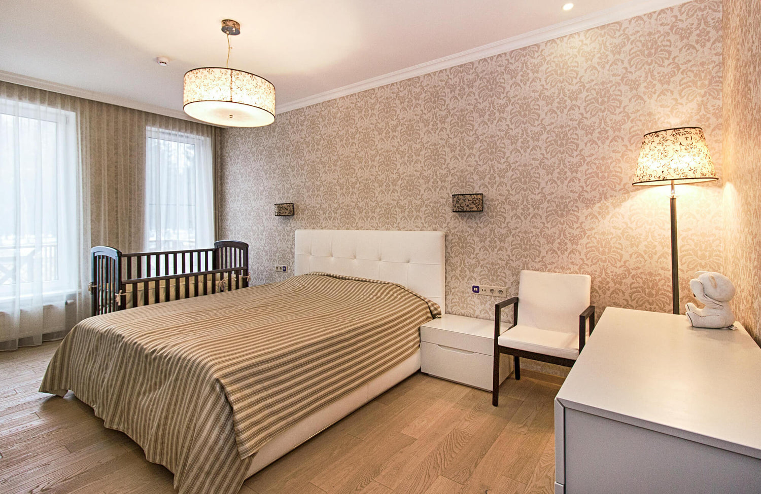
Choosing the best wallpaper color for your bedroom is about more than picking a shade that catches your eye. The color you live with every day quietly shapes how the room feels, how easily you relax at night, and how refreshed you feel in the morning. Because the bedroom is where you begin and end each day, the atmosphere it creates matters more than you might expect.
As we explore options, we will focus on the elements that truly shape your bedroom’s atmosphere. You will come to understand how color supports relaxation, how lighting and room size shape the way wallpaper appears in your space, and how your personal style helps refine the final selection. With these considerations in place, choosing the right wallpaper color becomes a confident, well-considered decision rather than a matter of guesswork.

How Bedroom Wallpaper Color Influences Mood and Sleep
Before considering style or current trends, it is worth first understanding how color directly influences the way you feel in the space. Because the bedroom is meant for rest and recovery, the most suitable wallpaper color is one that encourages calm, reduces mental tension, and supports quality sleep rather than adding visual stimulation.
Soft Blues for Calm
If your goal is to create a peaceful, sleep-friendly space, soft blue tones are often among the best wallpaper colors to consider for a bedroom. Light to mid-range blues have long been associated with reduced stress and a slower heart rate, making them well-suited for spaces dedicated to rest. When you surround yourself with a gentle blue, it subtly mirrors elements of nature such as open sky or still water, which can help your mind settle more easily at the end of the day.
That said, balance plays an important role. Highly saturated or vivid blues can sometimes feel sharper or more energetic than expected, which may not suit a space meant for winding down. In contrast, a muted sky blue or dusty blue creates a calm backdrop that feels soothing without making the room seem cold or uninviting. In bedrooms with warm evening lighting, these softer shades tend to mellow further, creating an environment that feels stable, comfortable, and supportive of rest.
Gentle Greens for Balance
If you are deciding on the best wallpaper color for a bedroom and want something calm yet not overly cool, gentle green is a strong option to consider. Positioned at the center of the color spectrum, green feels naturally balanced, making it well-suited for a space intended for both rest and renewal. Shades like sage, eucalyptus, or softened olive introduce a subtle connection to nature without overwhelming the room.
For example, a design such as Brocade Wallpaper in Olive II, 52" x 132" offers a refined take on green. Its olive tone provides depth, while the brocade pattern adds quiet texture without becoming visually dominant. This type of wallpaper works especially well if you want your bedroom to feel restorative rather than dramatic. Green adds dimension to the walls without demanding attention, and when paired with wooden furniture or natural fabrics, it can also create a cohesive setting that feels grounded and comfortable.
Warm Neutrals for Comfort
For a bedroom that feels comfortable and familiar, warm neutrals remain one of the most reliable wallpaper color choices. Shades such as beige, greige, and soft taupe create a sense of ease and stability, allowing the room to feel settled rather than visually demanding. This makes them particularly suitable for shared bedrooms or for anyone who prefers a calm, adaptable backdrop.
A design like Berkshire Wallpaper in Taupe II, 52" x 132", illustrates how a neutral can still offer character. It features a simple, structured grid pattern brought to life by rich brown linework with a hand-drawn look, set against a light taupe canvas. The pattern introduces subtle structure, while the taupe base keeps the overall effect warm and approachable.
As always, undertones deserve careful attention. A neutral that leans too yellow or too pink may shift noticeably under different lighting conditions. Reviewing samples alongside your flooring, bedding, and natural light at various times of day helps ensure the wallpaper maintains a balanced and cohesive appearance once installed.
Lavender and Soft Mauve for Serenity
For a bedroom that feels restful yet slightly distinctive, soft lavender or pale mauve can be among the best wallpaper color options to consider. These shades combine the calming qualities of blue with a gentle touch of warmth from red, creating a balanced tone that feels soothing without appearing plain.
Keeping the shade light is essential. Deeper purples can feel too dense for a space intended for sleep, especially in smaller rooms. In contrast, a soft lavender or muted mauve, particularly in a bedroom with good natural light, can add subtle character while preserving a calm and comfortable atmosphere.

Choosing Wallpaper Color Based on Room Size and Light
Once you have a sense of the mood you want to create, the next step is to look at the physical characteristics of your bedroom. The size of the space and the quality of light it receives throughout the day play a significant role in how a wallpaper color will actually appear once it’s on the wall.
Light Colors for Small Bedrooms
In a compact bedroom, lighter wallpaper colors are often the most effective choice. Shades such as cream, pale gray, soft blush, or misty blue reflect available light, helping the room feel more open and less confined. Rather than absorbing light, these tones allow it to move more freely across the walls, which subtly expands the sense of space.
A design such as Plateau Wallpaper in Grey II, 52" x 132", which features abstract contours in light gray set against a white field, demonstrates how pattern can remain understated while still adding dimension. Its light gray detailing maintains brightness, and the white background keeps the room visually airy without feeling plain.
In smaller bedrooms, visual continuity is especially important. Strong contrast or very dark wallpaper can make the walls appear closer than they are. By selecting a light, consistent color with a subtle design, you create a seamless backdrop that softens the room’s edges and enhances its overall openness.
Dark Colors for Large Bedrooms
In a larger bedroom, very light walls can sometimes feel expansive to the point of being impersonal. In these cases, deeper wallpaper tones such as navy, charcoal, forest green, or muted clay can help create a stronger sense of intimacy and definition within the space. Darker colors naturally add weight to the room, giving it a grounded and cohesive feel. When balanced with sufficient lighting and lighter bedding or furnishings, these richer shades can transform a large bedroom into a space that feels warm, settled, and comfortably enclosed rather than overly open.
North and South Facing Rooms
The direction your bedroom faces plays an important role in how the wallpaper color appears and changes throughout the day. North-facing rooms tend to receive cooler, softer light, which can make blue or gray wallpapers look crisper than expected. In this setting, choosing a shade with slightly warmer undertones can help prevent the space from feeling overly sharp or subdued.
South-facing rooms, by contrast, benefit from warmer and more consistent natural light. This often allows cooler colors to maintain balance without feeling cold. To choose with confidence, take time to view wallpaper samples at different times of day, since natural light can subtly change a color’s tone and depth.
Artificial Lighting Considerations
Artificial lighting deserves careful attention, especially since most of your time in the bedroom is spent in the evening. The type of bulb you use can subtly shift the appearance of your wallpaper. Warm lighting tends to soften earthy tones and bring out the richness in beige or taupe shades, while cooler lighting can make blues and grays appear more pronounced.
For that reason, it is important to assess your chosen wallpaper under the lighting conditions you use at night. A color that feels balanced in natural daylight may take on a different character after sunset. Viewing samples in the evening also helps ensure the shade remains comfortable and consistent when it matters most.

Matching Wallpaper Color With Bedroom Style
With mood and room conditions in mind, the next step is to consider how wallpaper color aligns with your overall design style. The most suitable choice for your bedroom is one that strengthens the aesthetic you are creating, ensuring the walls feel intentional and fully integrated with the rest of the space.
Modern Minimalist Bedrooms
In a modern minimalist bedroom, restraint in color is essential. Shades such as soft gray, warm white, or muted earth tones support clean lines and uncluttered surfaces without drawing attention away from the overall design. In this setting, wallpaper works best as a subtle foundation rather than a focal point. It should quietly enhance the shape of the furniture and the texture of materials in the room. A matte finish often suits this approach, reinforcing the simplicity and understated character that define minimalist spaces.
Classic and Traditional Bedrooms
Classic and traditional bedrooms naturally allow for greater depth and richness in color selection. Shades such as dusty blue, soft sage, or refined burgundy can complement traditional furniture profiles and layered textiles with ease. In these spaces, wallpaper often plays a more defined role. Subtle patterns and well-chosen colors can reinforce symmetry and structure without overpowering the room. Instead of feeling like surface decoration, the wallpaper becomes a natural extension of the room’s design, complementing and reinforcing its architectural character.
Bohemian and Eclectic Bedrooms
In bohemian or eclectic bedrooms, wallpaper can take on a more expressive and defining role. Colors such as rust, golden yellow, deep blue, or rich green introduce personality and help the room feel layered and thoughtfully composed rather than conventional.
For example, Strafford Wallpaper in Olive Night I, 52" x 132", features a dark green base layered with delicate olive green botanicals. The deeper background creates mood and depth, while the botanical detailing adds movement and texture. This combination works well in eclectic spaces where pattern and color are part of the overall narrative.
Even in a creative setting, clarity remains essential. Choosing one dominant color to anchor the room prevents the layered elements from feeling scattered. With a clear color foundation in place, you can layer textiles, artwork, and furnishings with confidence while keeping the bedroom cohesive and comfortable.
Scandinavian-Inspired Designs
Scandinavian-inspired bedrooms are rooted in light, simplicity, and function. Wallpaper colors such as soft white, pale gray, or cool beige help maintain a bright and open feel while supporting the clean lines typical of this style. In these spaces, the goal is to work with natural light rather than compete against it. A subtle, understated pattern inspired by natural elements can introduce gentle interest without disturbing the calm, uncluttered atmosphere that defines Scandinavian design.

Personalizing Wallpaper Color for Lifestyle and Personality
Aside from general design principles, the most suitable wallpaper color for your bedroom should reflect the way you actually live. Your daily routines, energy levels, and personal preferences all influence which colors will feel comfortable and sustainable over time.
For High Energy Personalities
If you tend to be naturally energetic, very pale walls may feel underwhelming or flat. In this case, mid-tone colors such as deep green, muted blue, or warm brown can introduce character without creating excessive stimulation. The key is to choose depth over brightness. A wallpaper with controlled richness allows the room to feel expressive and engaging during the day while still maintaining a sense of calm in the evening. This balance ensures the bedroom supports both your personality and your need for rest.
For Rest Focused Retreat Seekers
If you view your bedroom as a quiet retreat from daily demands, softer wallpaper colors are often the most appropriate choice. Shades such as light blue, soft green, or gentle beige create a calm setting that feels composed the moment you enter the room. These tones reduce visual intensity and help establish a steady, restful atmosphere.
A design like Bower Wallpaper in Tan II, 52" x 132" reflects this approach well. It features delicately illustrated leaves in creamy brown tones layered over an off-white canvas, creating a refined botanical look that feels subtle rather than busy. The low contrast between the pattern and background allows the design to add interest without disrupting the room’s sense of calm.
By keeping both color and pattern understated, the bedroom places fewer demands on your attention. This makes it easier for your mind to slow down in the evening, allowing the space to feel consistently restorative and supportive of rest.
For Couples With Different Preferences
In a shared bedroom, finding common ground is essential. Rather than selecting a bold color that appeals strongly to only one person, a balanced option such as warm gray or soft green often creates a comfortable middle ground. Once the wallpaper establishes a neutral and cohesive base, individual preferences can be expressed through bedding, artwork, or accent pieces. This approach keeps the overall atmosphere harmonious while still allowing each person’s style to be reflected in thoughtful details.

Accent Walls vs. Full Room Coverage
Choosing the right wallpaper color involves more than selecting the shade itself. The way you apply that color within the room significantly influences the overall atmosphere and visual impact.
When to Use a Feature Wall
If committing to a strong wallpaper color across the entire room feels overwhelming, a feature wall behind the headboard can offer a balanced solution. This method lets you bring in depth and personality without wrapping the entire room in a single dominant color. Because the bed naturally draws attention, placing wallpaper on that wall creates a clear focal point and visual structure. Keeping the remaining walls in a softer or neutral tone maintains balance, ensuring the room feels intentional rather than enclosed.
Full Coverage for Immersive Atmosphere
Applying wallpaper to all walls creates a cohesive and immersive environment. This approach works especially well with softer tones that you want to experience consistently throughout the space, allowing the room to feel unified rather than segmented. When chosen carefully, full coverage also gives the bedroom a clear sense of intention and completeness. The most important consideration is selecting a color you feel comfortable living with from every angle, as it will define the room’s character day and night.
Ceiling and Niche Applications
For a more tailored and refined effect, wallpaper can also be applied to the ceiling or used to highlight architectural niches. A lightly colored ceiling treatment can soften the overhead plane and give the bedroom a more complete, thoughtfully designed feel. Introducing a contrasting shade within alcoves or recessed areas adds dimension without overpowering the primary walls. This method offers a controlled way to experiment with color, allowing you to introduce visual interest while maintaining overall balance in the room.

Practical Considerations Before Finalizing Your Color
Before making a final decision, it is important to think beyond the initial visual appeal. The best wallpaper color for your bedroom should continue to feel appropriate and comfortable over time, not just impressive at first glance.
Longevity and Trends
It is natural to be drawn to current color trends, especially when they feel fresh and inspiring. However, it is worth considering how that choice will feel several years from now, since bedroom wallpaper is not something most people change frequently. A color that feels balanced and timeless often proves more satisfying in the long run.
If you are drawn to a bold or trend-driven shade, choosing it in a removable wallpaper format provides added flexibility and makes future changes easier to manage. This approach allows you to enjoy the look now while keeping future updates simple and manageable.
Maintenance and Wear
Wallpaper color also influences how everyday wear appears over time. Darker shades may make dust more noticeable, while very light colors can reveal scuffs or marks more easily, particularly in high-contact areas. Selecting a durable, washable finish can simplify maintenance and help preserve the overall look. With the right material and color combination, your wallpaper can continue to appear well considered and maintained rather than showing signs of premature wear.
Resale and Flexibility
If selling your home is something you may consider in the future, it helps to think about how your wallpaper color will feel to potential buyers in the room. Neutral or widely appealing tones often make it easier for others to imagine their own furniture and style in the space, which can make the room feel more adaptable. At the same time, planning does not mean removing all personality. A balanced, thoughtfully chosen color can also reflect your taste while remaining versatile enough to suit a range of preferences later on.
Finding the Right Color for Your Bedroom
The best wallpaper color for a bedroom promotes relaxation, complements your room’s lighting and size, and reflects your personal style in a balanced way. In many cases, this means leaning toward softer tones such as light blue, gentle green, warm neutrals, or muted shades that support rest rather than stimulation. By considering how you want to feel in the space, how natural and artificial light affect the walls, and how the color fits with your furnishings, you can confidently narrow your choice. A well-selected wallpaper color should help your bedroom feel calm, cohesive, and comfortable at the end of the day and just as welcoming in the morning.
If you would like tailored guidance in selecting the right wallpaper for your bedroom, contact us for personalized support. Our design service can help you assess color options, lighting conditions, and your overall room layout, so you can move forward with a decision that feels confident, well considered, and aligned with your vision.
