


A bare white wall offers clarity, light, and architectural simplicity. Yet when paired with neutral textured wall art, that same blank canvas can become unexpectedly challenging. Without bold color or graphic contrast, textured artwork relies on shadow, depth, and subtle tonal shifts to command attention. The question is not how to compete with white, but how to orchestrate light, framing, scale, and surrounding decor so that texture becomes the focal point rather than fading into the background.
For those seeking premium home solutions, making neutral textured wall art stand out is an exercise in restraint and precision. From directional lighting and strategic framing to proportion and layered decor, every detail influences how texture is perceived. When thoughtfully composed, a white wall does not diminish neutral art. It amplifies its tactile elegance.

Master The Art Of Directional Lighting
Light is the single most powerful tool for enhancing neutral textured wall art. Texture only reveals itself when illuminated at an angle, creating highlights and shadows that define its depth. On a white wall, where color contrast is minimal, carefully controlled lighting transforms subtle relief into dramatic dimension.
Installing Hardwired Or Plug In Picture Lights
Picture lights offer a refined, architectural way to emphasize textured artwork. Mounted directly above the piece, a hardwired or plug in picture light casts a downward wash that grazes the surface. This grazing effect exaggerates ridges, brushstrokes, plaster relief, or woven fibers, allowing the artwork’s tactile qualities to emerge clearly against the flat white backdrop.
Hardwired options deliver a seamless, built-in aesthetic that feels intentional and permanent, ideal for formal living rooms or curated dining spaces. Plug in versions provide flexibility, particularly in apartments or evolving interiors where adaptability is valued. In both cases, the key lies in positioning the fixture so the beam skims across the surface rather than flooding it head-on. This angled illumination prevents the artwork from appearing flat and instead introduces sculptural contrast.
By defining light direction, you create visual hierarchy. The art becomes a destination rather than an afterthought.
Harnessing Natural Side Light From Windows
Natural light can be equally transformative when used strategically. Side lighting from adjacent windows produces soft, shifting shadows that animate textured wall art throughout the day. As the sun moves, highlights deepen and recede, giving the piece a dynamic presence that changes with time. This effect is especially compelling with Edward Martin’s Golden Drift Wall Art, where woven fibers and layered tassels respond beautifully to raking daylight, as seen in the image above.
Positioning neutral art perpendicular to a window rather than directly opposite it allows raking light to travel across the surface. This emphasizes raised details and subtle material variations, whether the artwork features plaster, linen, paper pulp, or carved wood. Complementing this interplay, Edward Martin’s Alena Wall Sconce In Aged Brass can frame the composition with a warm glow after sunset, ensuring the texture remains pronounced even when natural light fades. In minimalist interiors where white walls dominate, this balance of daylight and ambient illumination introduces warmth and nuance without altering the color palette.
Sheer window treatments can further refine the effect, diffusing harsh glare while preserving directional shadows. The result is understated drama that feels organic and refined.
Selecting The Right Bulb Temperature For Contrast
Bulb temperature significantly influences how neutral textured wall art reads against a white wall. Cool white light can flatten subtle tonal differences, making beige, ivory, and off-white textures blend into the background. Warmer light, by contrast, enhances depth and gently separates the artwork from crisp white paint.
A warm white range around 2700K to 3000K typically provides the most flattering contrast. It introduces a soft glow that highlights relief and natural materials without casting yellow undertones that distort the composition. In contemporary spaces with cooler architectural finishes, a slightly neutral 3000K bulb can maintain clarity while still emphasizing dimension.
Thoughtful lighting temperature ensures that your textured wall art maintains presence and distinction, even within an intentionally restrained palette.

Utilize Strategic Framing And Borders
Beyond lighting, framing plays a critical role in helping neutral artwork stand out. On a white wall, a frame acts as a visual boundary, defining where the art begins and the architecture ends. Without that delineation, subtle pieces can appear to dissolve into their surroundings.
Grounding The Piece With Dark Wood Or Black Frames
Dark wood or black frames introduce contrast without overwhelming a neutral composition. Against a white wall, these deeper tones establish a strong perimeter that anchors the artwork visually. The eye is naturally drawn to defined edges, and a bold frame creates that necessary distinction.
This approach is exemplified by Edward Martin’s Wintering Light Wall Art, whose softly graduated textile surface gains striking clarity within its crisp black frame in the image above. The darker border sharpens the transition between art and wall, allowing subtle tonal shifts to stand out with greater definition.
A matte black frame delivers modern clarity, ideal for minimalist interiors with clean lines. Rich walnut or espresso-stained wood adds warmth, complementing textured canvases in beige or taupe. In both cases, the darker border prevents the art from blending into the white background, creating a gallery-like presentation that elevates the entire wall.
This grounding effect is particularly effective for smaller pieces. Even modestly scaled neutral art gains authority when framed with intention.
Creating Depth With Shadow Box Enclosures
Shadow box frames offer another layer of sophistication. By setting the artwork slightly back from the glass, these enclosures create physical depth that mirrors the texture within the piece itself. The recessed presentation casts delicate internal shadows, reinforcing dimensionality.
For heavily textured works, such as plaster relief or mixed media compositions, shadow boxes protect protruding surfaces while accentuating their sculptural quality. The added space between art and glass prevents compression and allows light to interact naturally with the material.
On a white wall, this subtle three-dimensional framing creates a layered effect. The art no longer feels like a flat object mounted on drywall but rather an installation with presence and substance.
Adding Subtle Contrast Through Linen Matting
Linen matting introduces nuanced tonal contrast without departing from a neutral aesthetic. Instead of crisp white mats that disappear against the wall, consider soft ivory, oatmeal, or light taupe linen. The woven texture of the mat echoes the tactile quality of the artwork while gently separating it from the background.
This approach works especially well for textile-based or paper-based pieces. The mat becomes an extension of the artwork’s material story, enhancing cohesion while still providing visual distinction. The layered border of frame, mat, and art establishes rhythm and depth, ensuring the composition reads clearly from across the room.
In refined interiors where bold color is intentionally absent, these subtle variations in tone and texture become the language of contrast.

Command Attention Through Scale And Proportion
Scale can be more impactful than color when working with neutral textured wall art. On a bare white wall, proportion determines whether a piece feels intentional or incidental. Carefully considered sizing transforms subtle art into a commanding focal point.
Embracing Oversized Dimensions For Maximum Impact
Oversized neutral wall art leverages presence rather than pigment. A large-scale textured canvas spanning a substantial portion of the wall creates immediate visual weight. Even in muted tones, its sheer dimensions draw the eye and define the room’s axis.
Edward Martin’s Quiet Study Wall Art demonstrates this beautifully when displayed above a fireplace or anchoring a seating arrangement, as shown in the image above. Its intricate, time-softened pattern reads as both expansive and nuanced, commanding attention without relying on bold color.
In open-concept living spaces or bedrooms with high ceilings, expansive pieces prevent white walls from feeling sparse or unfinished. The texture reads more clearly at scale, allowing viewers to appreciate material nuances from both near and far.
Choosing oversized artwork requires confidence, but the payoff is significant. The white wall becomes a backdrop for tactile drama, rather than an empty expanse that diminishes subtlety.
Building Density With A Tightly Spaced Gallery Grid
When a single large piece is not feasible, a tightly spaced gallery grid can achieve similar impact. Grouping multiple neutral textured works in a precise arrangement builds visual density. The repetition of texture creates rhythm, while the collective scale commands attention.
Spacing is critical. Narrow gaps between frames maintain cohesion and prevent the white wall from interrupting the composition. Uniform framing further reinforces structure, allowing the artwork’s tactile qualities to take center stage.
A gallery grid works beautifully in transitional spaces such as hallways or above sofas, where continuous visual interest is desired. The result is curated and intentional rather than scattered.
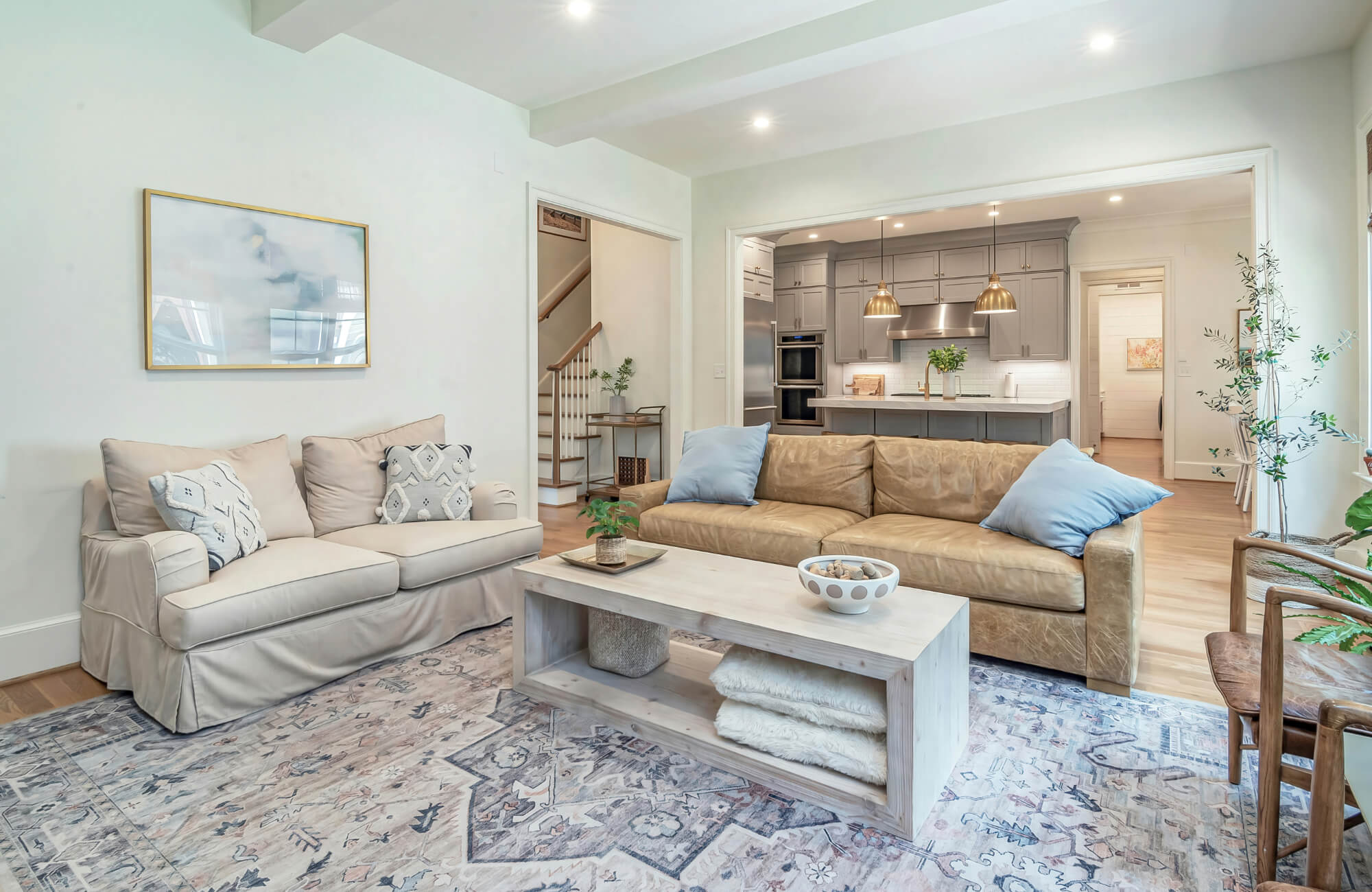
Anchoring The Art With Heavy Furniture Below
Furniture placement influences how wall art is perceived. Substantial pieces such as a solid wood console, a deep upholstered sofa, or a sculptural sideboard provide visual weight beneath the artwork. This anchoring effect prevents the piece from appearing adrift on a vast white surface.
Dark or richly textured furniture enhances contrast, particularly when paired with neutral art. The layering of material depth between floor, furniture, and wall creates a vertical narrative. The eye travels upward from grounded elements to the textured composition above.
Proportion between furniture and artwork should feel balanced. Ideally, the art spans a significant portion of the width of the piece below, establishing harmony that feels deliberate and refined.

Layer Contrast Through Surrounding Room Decor
Neutral textured wall art does not exist in isolation. Its impact is shaped by the decor that surrounds it. By thoughtfully layering complementary elements, you amplify texture and create contrast without introducing competing color.
Framing The Wall With Tall Dark Greenery
Tall, dark greenery introduces organic contrast against white walls and neutral art. Deep green leaves provide rich tonal depth that subtly frames textured compositions. Positioned on either side of the artwork, plants act as living borders that enhance visual definition.
The interplay between botanical forms and sculptural wall art adds dynamism. Smooth white paint, tactile artwork, and lush foliage create a layered composition that feels both grounded and vibrant. Large planters in matte black or dark ceramic further reinforce contrast, ensuring the art remains the central focal point.
This approach is particularly effective in contemporary living rooms and entryways where vertical space can be leveraged to full advantage.
Echoing The Texture With Edward Martin Pillows
Repetition strengthens design cohesion. Echoing the texture of your wall art through soft furnishings creates a subtle dialogue within the room. Edward Martin pillows, crafted with refined weaves and dimensional fabrics, can mirror the tactile quality of neutral textured wall art without overwhelming the palette.
Placed on a sofa beneath the artwork, these pillows extend the textural narrative into the seating area. Bouclé, nubby linen, or subtly raised patterns pick up on the relief of the art above, reinforcing continuity. The effect is layered yet restrained, allowing texture to remain the defining feature.
This thoughtful coordination transforms the wall from a singular focal point into part of a holistic design story, where materials and surfaces speak to one another.
Introducing Metallic Accents For Reflective Contrast
Metallic accents provide a different kind of contrast. Rather than relying on color, they introduce reflectivity. Brushed brass, antique gold, or matte black metal in nearby lighting fixtures, trays, or sculptural decor pieces catch light and subtly frame neutral textured art.
When paired with Edward Martin’s Shadow Orchard Wall Art, the interplay becomes especially refined. Its layered, linear textile composition, visible in the image above, gains depth when set against warm metallic finishes that echo its earthy undertones. The gentle sheen of brass or aged gold amplifies highlights and enhances shadow play across the woven surface.
Against a white wall, this combination feels curated and sophisticated rather than stark. The key is moderation. A few carefully placed metallic elements can elevate the composition, while excess may distract from the tactile centerpiece.
Elevate Your White Walls With Tactile Elegance
Neutral textured wall art does not need bold color to stand out against a bare white wall. It requires intention. Through directional lighting, thoughtful bulb selection, strategic framing, confident scaling, and layered decor, subtle materials gain presence and authority. A white wall is not a limitation but a refined canvas that allows texture, shadow, and craftsmanship to take precedence. When every detail is considered, neutral textured wall art transforms from understated to unforgettable, turning simplicity into a statement of tactile elegance.
For those refining a space or selecting the right piece, Edward Martin’s design consultation provides personalized guidance tailored to your layout and lighting conditions. If you have questions about scale, placement, or product details, you can also contact Edward Martin for expert support, ensuring your white walls become a backdrop for lasting sophistication.
