


A ceramic tile backsplash can look completely different depending on the grout you pair with it. The color, texture, and type of grout all influence how bold, soft, modern, or classic the final design feels. In this guide, we’ll break down the grout choices that matter most so you can create a backsplash that feels cohesive, practical, and perfectly matched to your style.

Why Grout Choice Matters for a Ceramic Tile Backsplash
Grout plays a bigger role in your backsplash than most people realize, influencing both how the tile looks and how well it holds up over time. It helps define the overall style of the space while supporting the long-term performance of the installation.
How Grout Affects the Look of Tile
Grout can completely change how your ceramic tile appears once it’s installed. It affects how visible the tile edges are, how clean or detailed the pattern looks, and how much contrast you see from a distance. Even subtle differences in grout tone can shift the backsplash toward a softer or more structured feel. The way grout outlines each tile influences how modern, classic, or bold the finished design looks. Because of this, choosing the right grout is just as important as choosing the tile itself.
Grout’s Role in Maintenance and Durability
Beyond appearance, grout helps protect the backsplash from moisture, spills, and everyday kitchen messes. A well-chosen grout type can make cleaning easier and keep the installation looking fresh longer. It also helps prevent dirt from settling into gaps, maintaining the integrity of the tile layout. When grout performs well, it keeps the entire backsplash stable and protected over time. This long-term reliability is a key reason grout choice shouldn’t be an afterthought.
Visual Balance Between Tile and Grout
The relationship between tile and grout contributes to the overall harmony of the backsplash. When the balance is right, the design feels intentional instead of busy or flat. Grout can either highlight the tile shape or let it blend more smoothly into the background. It also plays a role in how cohesive the backsplash feels with the surrounding cabinets, walls, and countertops. Understanding this balance helps you create a backsplash that looks thoughtfully put together.
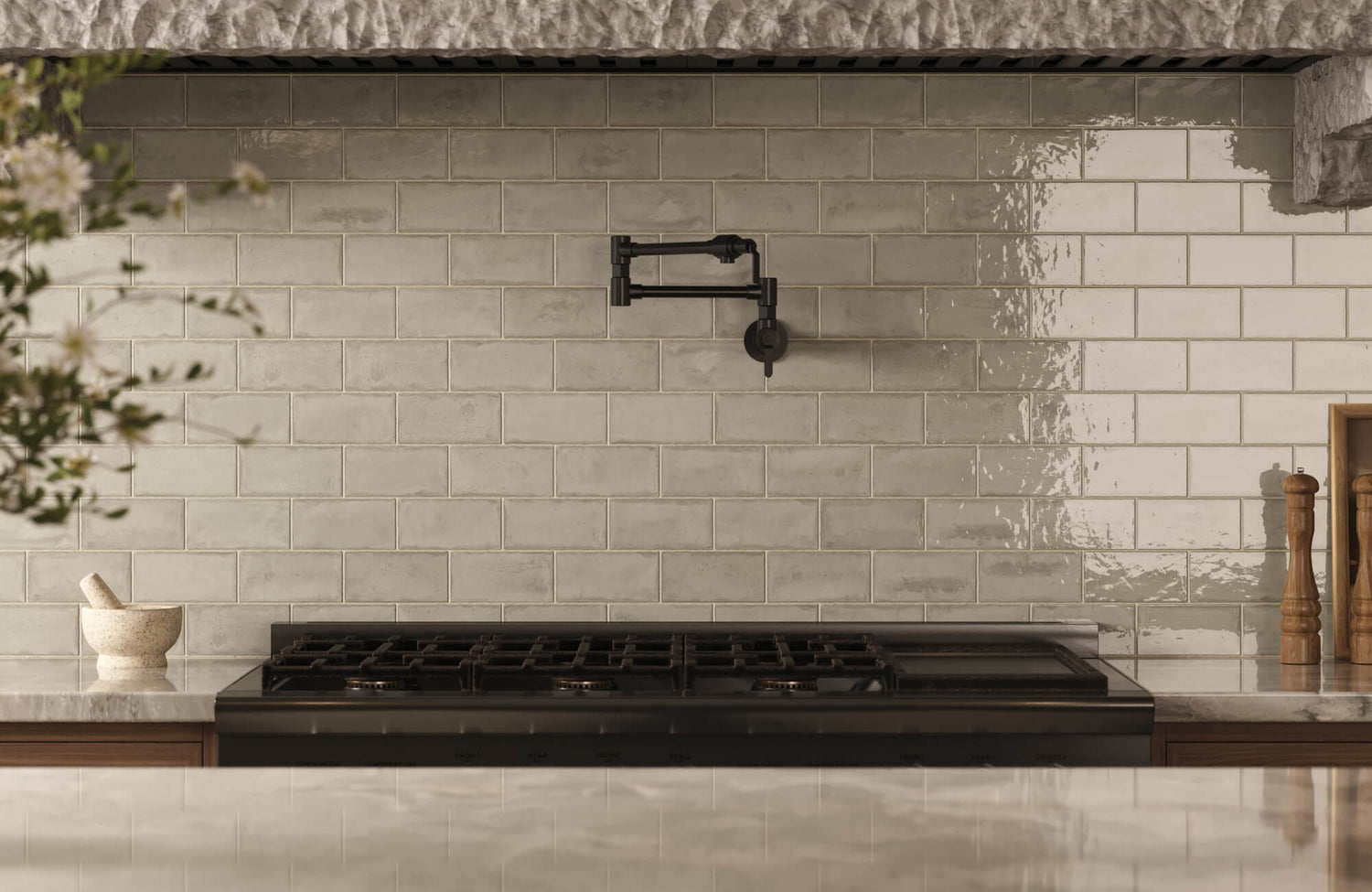
You can clearly see this balance in our Cleo 2x6 Glossy Ceramic Tile in Bone, shown above. Its soft gray-beige variation and gently reflective glaze work beautifully with a close-match grout, creating a backsplash that feels calm, cohesive, and intentionally blended. The handmade look adds character without overwhelming the space, allowing the grout to support the tile’s movement rather than compete with it.

Popular Types of Grout to Consider
Choosing the right grout type is just as important as choosing your tile because each option offers different strengths. Some provide added durability, while others create a smoother, more refined finish, depending on your backsplash design.
Sanded Grout
Sanded grout contains fine sand particles that help give it extra strength, making it ideal for wider joints. Its texture helps prevent shrinking and cracking, especially in larger gaps where stability matters. This makes it a good match for backsplashes with more pronounced spacing between tiles. It also offers a slightly textured look that works well in casual or rustic-inspired designs. If your layout calls for extra durability, sanded grout often delivers the support needed.
Unsanded Grout
Unsanded grout has a smoother consistency that works well for narrow grout lines and delicate ceramic tiles. Because it doesn’t contain sand, it’s less likely to scratch softer surfaces, making it a safer option for polished or glossy tiles. It also creates a cleaner, more refined finish that suits modern or minimalist backsplashes. The smooth application helps achieve tighter, more precise grout lines. This makes unsanded grout a solid choice when you want a sleek, uninterrupted look.
Epoxy Grout
Epoxy grout is known for being highly resistant to stains, moisture, and discoloration, which makes it incredibly durable. It’s a great fit for kitchens where splashes, oils, or frequent cleanup are part of daily life. The dense structure helps prevent grime from absorbing, keeping the backsplash looking newer for longer. Many homeowners appreciate that it stays consistent in appearance even after years of use. If long-term performance is a priority, epoxy grout is one of the strongest choices available.
Urethane Grout
Urethane grout offers flexibility that helps it adapt well to movement, making it especially useful in homes where surfaces expand or contract slightly. It also holds its color well over time, resisting fading in bright or high-use areas. This type of grout provides a smooth, even finish that complements a wide range of ceramic tile designs. It’s often chosen for its balance of durability and aesthetic consistency. For homeowners who want a grout that performs well without feeling overly rigid, urethane is a reliable option.

How to Choose the Right Grout Color
The color of your grout can dramatically change how your ceramic tile backsplash looks once everything is installed. It affects how visible the tile pattern appears, how bright the room feels, and the overall direction of your design.
Matching Grout for a Seamless, Clean Look
Choosing a grout color that closely matches your tile creates a smooth, uninterrupted appearance. This approach minimizes the visibility of grout lines, making the backsplash feel cleaner and more modern. It works especially well when you want the tile’s texture or finish to stand out rather than the pattern itself. Matching grout also helps small kitchens feel more open because there’s less visual contrast. If you like a simple, polished look, this is one of the most reliable options.
Contrasting Grout for Defined Lines
A contrasting grout color highlights the shape and layout of each tile, creating a more architectural look. This choice brings attention to patterns like subway, herringbone, or stacked layouts, making the design more visually dynamic. The high contrast can add energy to the space and emphasize clean geometry. It’s a great option if you want the backsplash to act as a focal point rather than a background element. Just keep in mind that stronger contrast naturally draws more attention to grout lines.
Neutral Grout for Classic, Low-Maintenance Style
Neutral grout offers a comfortable middle ground for homeowners who want balance and longevity. Shades like beige, soft gray, or taupe blend with most ceramic tiles without completely hiding the lines or highlighting them too strongly. These colors age well and tend to work across different design updates over time. Neutrals also help mask everyday cooking splatters better than very light tones. If you want something reliable and flexible, a neutral grout is often the safest route.
When to Use Bold or Dark Grout Colors
Bold or dark grout can create a striking, graphic look that immediately stands out. These colors work well when your backsplash needs a stronger presence or when the surrounding décor is simple and understated. They can also help define patterns on lighter tiles, adding depth and drama to the overall design. Darker grout is often easier to maintain visually since it hides stains better than pale options. This choice works best when you want personality without relying on vibrant tile colors.
You can see this approach beautifully in our Mikayla 5x5 Glossy Ceramic Tile in Espresso, shown above. Its deep brown tone pairs effortlessly with a dark grout, creating a bold, seamless backdrop that feels rich, warm, and intentional. The glossy finish catches light just enough to highlight the tile’s handcrafted variation, while the darker grout keeps the overall look grounded and sophisticated.

Grout Pairings for Popular Ceramic Tile Styles
Different tile styles interact with grout in unique ways, and choosing the right pairing helps each design reach its full potential. Some tiles look best with subtle, softened lines, while others benefit from sharper definition or gentle contrast.
Subway Tiles and Classic Pairings
Subway tiles work beautifully with both matching and slightly contrasting grout, depending on how bold you want the pattern to appear. A close-match grout keeps the layout clean and timeless, letting the tile’s finish take center stage. Slight contrast brings out the classic brick pattern, offering a bit more visual structure without feeling overwhelming. This versatility is one reason subway tiles remain a go-to choice for many kitchens.
Large Format Ceramic Tiles
Large format tiles benefit from grout lines that stay subtle and supportive rather than highly visible. Because these tiles cover more surface area, minimal contrast helps maintain a smooth, uninterrupted look. Softer grout tones also help keep the backsplash from feeling segmented. This approach works especially well in modern or minimalist kitchens that rely on clean, steady surfaces.
Textured or Handmade-Look Tiles
Tiles with handmade or textured finishes often look best with grout that complements their irregular edges. A softer, closer-match grout helps highlight the natural character of each tile without drawing attention to uneven lines. It enhances the artisanal quality and keeps the surface feeling warm and authentic. Too much contrast can make the handmade texture feel busy, especially in smaller spaces. Choosing a gentler grout pairing lets the charm of these tiles shine through.
Patterned and Decorative Tiles
Patterned tiles pair best with grout that supports the design rather than competes with it. A subtle or neutral grout tone keeps the focus on the artwork, shapes, or colors within the tile. This approach helps avoid visual clutter while still allowing the pattern to anchor the backsplash. Even a small amount of contrast can work as long as it doesn’t overpower the motif. When grout stays understated, decorative tiles feel more cohesive and intentional.

How Lighting and Kitchen Color Scheme Affect Grout Choice
Lighting and surrounding colors can shift how grout appears once your backsplash is installed. Natural light, cabinet tone, and countertop finishes all influence whether grout looks brighter, softer, or more defined.
Cooler Lighting vs. Warmer Lighting Effects
Lighting temperature has a noticeable impact on how grout reads in your space. Cooler light tends to sharpen grout lines, making them appear slightly brighter or more defined. Warmer lighting softens those edges, giving grout a more relaxed and muted feel. This difference can change how structured or seamless the backsplash looks throughout the day. Understanding your kitchen’s lighting helps you choose a grout tone that stays consistent with your desired mood.
Grout Choices for Light vs. Dark Cabinets
Cabinet color plays a major role in how much your grout stands out. Light colored cabinets often highlight grout lines more, so a softer or closer-match tone can help maintain balance. Dark colored cabinets, on the other hand, can absorb contrast, making stronger grout lines feel more intentional and grounded. The key is choosing a grout shade that complements the cabinet finish rather than competes with it. When both elements work together, the whole kitchen feels more cohesive.
How Countertops Influence Grout Visibility
Countertops sit directly beside the backsplash, so their color and pattern can shift how grout appears. Bold veining or strong movement in stone surfaces may make high-contrast grout feel too busy. More subtle countertops can support a slightly stronger grout outline without overwhelming the space. Even the undertone of the countertop can affect whether the grout looks warm, cool, or neutral. Pairing them thoughtfully ensures the transition between surfaces feels natural and well-coordinated.

Maintenance Considerations Before Choosing Grout
Grout plays a big role in how easy your backsplash is to maintain over time. Some options stay cleaner with less effort, while others need a bit more attention, depending on your kitchen habits.
Low-Maintenance Grout Options
Some grout types are naturally easier to care for and stay looking fresh with minimal effort. These options resist staining, handle frequent wipe-downs well, and maintain their texture even with daily cooking messes. They’re ideal for busy kitchens where quick cleaning is part of the routine. Choosing a low-maintenance grout helps keep the backsplash looking polished without extra steps.
Grout Colors That Hide Stains Better
Certain grout colors do a better job at concealing minor stains or discoloration. Mid-tone and slightly darker shades often mask everyday splashes or oil marks more effectively than very light colors. This can help the backsplash maintain its appearance between cleanings, especially in active kitchens. Choosing a stain-friendly color doesn’t replace regular upkeep, but it does make small marks less noticeable.
How Grout Affects Long-Term Cleaning
The type of grout you choose influences how easily dirt settles into the lines over time. Some varieties resist absorption and stay smoother, making it simple to wipe away spills or grease. Others may require more consistent cleaning to keep the surface bright and fresh. The long-term maintenance depends on how the grout interacts with moisture, oils, and daily kitchen use. Understanding this helps you choose an option that fits your comfort level with regular upkeep.
The Right Grout For a Ceramic Tile Backsplash
Choosing the right grout for a ceramic tile backsplash comes down to understanding how it affects both the look and performance of your space. The grout type determines how durable and easy to maintain your backsplash will be, while the grout color shapes the overall style, whether you want something subtle, bold, or balanced. By paying attention to lighting, cabinet finishes, and tile style, you can create a backsplash that feels cohesive, intentional, and visually steady for years. When the grout supports your tile instead of competing with it, the entire design comes together more naturally.
If you want help choosing a grout that works perfectly with your ceramic tile and overall kitchen design, our team can guide you through the process. A professional design consultation can help you narrow down the right grout type, color, and finish based on your lighting, layout, and style preferences. Book a design consultation today and let our experts help you create a backsplash that feels beautiful, practical, and perfectly aligned with the look you want to achieve.
