


Choosing the right shower tile color can significantly influence how quickly residue becomes noticeable and how often a shower starts to look unclean. While style certainly plays a role, tile color also influences how visible soap scum, water spots, and everyday buildup become over time. Making an informed choice can reduce maintenance effort and help your shower maintain a cleaner appearance between regular cleanings. In this article, we’ll walk you through which shower tile colors are easiest to keep clean and explain how lighting, materials, and everyday habits come together to shape how clean your shower appears each day.

How Tile Color Affects Visible Soap Scum and Water Spots
Soap residue and mineral deposits are often the first signs that make a shower appear unclean, even shortly after it has been cleaned. Because these marks sit directly on the tile surface, the tile color itself plays a big role in how noticeable they become over time.
Light Neutrals and Soft Contrast
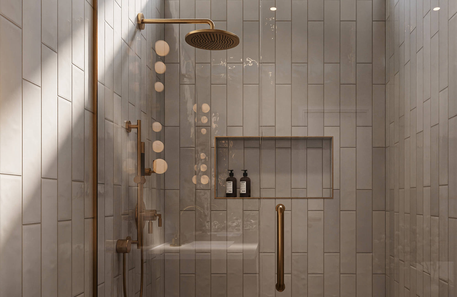
Soft whites, warm ivories, and light greige tones show how gentle contrast can work in your favor. These colors soften the edges of cloudy soap film, allowing residue to blend in rather than stand out. Unlike pure white, which tends to highlight every streak, softened neutrals help the surface look calmer between cleanings. This effect is illustrated in the photo featured above, where Edward Martin’s Cleo 2x6 Glossy Ceramic Tile in Bone demonstrates how a light neutral with subtle warmth maintains a clean, balanced appearance even when moisture is present. If you prefer a lighter shower that still feels forgiving, off-white tiles with understated undertones tend to stay cleaner-looking with less frequent wiping.
Mid Tone Colors as a Visual Buffer
Mid-tone colors such as beige, light brown, and soft tan are often the easiest shower tile colors to keep clean in terms of visible soap scum and water spots. Because these shades fall between light and dark, they soften the outline of residue instead of drawing attention to it. They also provide flexibility by concealing buildup without making the shower feel heavy or enclosed. With a balanced mid-tone color, cleaning becomes less reactive and more routine.
Dark Tiles and Mineral Deposits
By contrast, darker tiles such as dark gray, black, and dark blue create a strong contrast with mineral deposits. Because hard water spots dry lighter than the tile surface, they tend to stand out quickly. While dark tiles can look striking when freshly cleaned, they often require more frequent wiping to maintain that appearance. If your water has a high mineral content or cleaning happens less frequently, avoiding very dark tile colors can also help keep residue from becoming noticeable as quickly.

The Role of Tile Color in Hiding Grime Between Cleanings
Aside from soap scum, everyday grime also develops gradually with regular use and tends to show up differently. Tile color plays a key role in whether this buildup blends into the background or becomes noticeable quickly between cleanings.
Earth Tones and Natural Camouflage
Earth-inspired tones such as beige, light brown, and soft tan reflect the subtle variations commonly found in natural materials. Because these colors are not perfectly uniform, they do a better job of masking minor dirt patterns. Shades that echo natural stone also help the shower maintain a stable, consistent appearance even after several days of regular use. This makes them especially practical in showers that are used daily but not cleaned after every use.
Cool Grays Versus Warm Beiges
Cool gray tiles tend to show darker debris more clearly because they create a sharper contrast with residue and oils. Warm beige tiles, by comparison, soften that contrast and feel more forgiving. In showers that are used frequently, warmer tones help the space maintain a cleaner appearance with less visible buildup. They also tend to look more balanced across a variety of lighting conditions.
Patterned Color Variation
Tiles with gentle tonal variation help draw attention away from small areas of grime. When color shifts subtly across the surface, residue becomes less defined and harder to notice. This effect is clearly illustrated in the photo displayed above, where Edward Martin’s Mikayla 2.5x5 Glossy Ceramic Tile in Olive shows how soft shading within a single color family creates visual movement without feeling busy. Rather than presenting a flat, uniform surface, the tonal variation helps maintain a more even appearance that stays cleaner-looking for longer. This approach works especially well in showers where residue tends to collect unevenly.

How Lighting Changes the Cleanliness of Tile Colors
Lighting can dramatically influence how clean tile surfaces appear, sometimes even more than the tile color itself. Understanding how light interacts with your shower helps prevent unexpected results after installation.
Natural Light Exposure
Daylight reveals surface imperfections clearly because it is broad and directional. In showers with windows or skylights, residue tends to stand out more on glossy or very bright tiles, making color choice especially important. This effect is shown in the photo featured above, where Edward Martin’s Jaden 2.5x16 Glossy Ceramic Tile in Eggshell shows how a softly muted, light neutral can reflect natural light without making streaks or moisture marks overly prominent. By opting for tiles with a gentle tone rather than stark brightness, the shower is better able to maintain a consistently clean appearance as daylight shifts throughout the day.
Warm vs. Cool Artificial Lighting
Warm artificial lighting softens visual transitions and reduces harsh contrast across tile surfaces. Cool lighting, by comparison, sharpens edges and makes buildup more noticeable. Matching tile color to the lighting temperature helps the shower feel balanced, so imperfections do not draw immediate attention. This coordination is also helpful at night or in windowless spaces, where artificial lighting has a greater influence on how the shower is perceived.
Shadow and Corner Visibility
Corners and recessed areas often receive less light, which can exaggerate contrast on very light tiles. In these shadowed zones, streaks and uneven drying patterns tend to become more noticeable. Mid-tone tiles perform better in uneven lighting because they soften the difference between lit and shaded areas. As a result, the shower maintains a more uniform appearance, even where light does not reach evenly.
To better visualize how these lighting conditions affect tile color in your own space, our AR tool can also be helpful. It allows you to view different tile options under natural and artificial lighting so you can see how colors respond to shadows, corners, and changing light before making a final decision.

Tile Color Choices That Simplify Long-Term Maintenance
Keeping a shower looking clean over time takes more than just hiding residue between cleanings. Tile color also plays an important role in how aging, wear, and repeated cleaning become visible over time.
Aging and Color Stability
Some tile colors show changes more clearly as they age, especially in areas affected by hard water and frequent cleaning. Very pale tiles can develop uneven discoloration that becomes difficult to overlook, while deeper tones tend to wear more evenly. This principle is illustrated in the photo featured above, where Edward Martin’s Chantel 24x48 Matte Porcelain Tile in Imperial shows how a mid-tone surface with natural variation maintains a balanced appearance over time. By choosing a color with moderate depth, aging appears gradual rather than patchy, helping the shower retain a consistent, well-maintained look even after years of regular use and exposure to cleaning products.
Matching Color to Cleaning Frequency
When it comes to maintenance, frequency is just as important. If cleaning happens monthly rather than weekly, tile color should reflect that reality. Mid-tone neutral colors make it easier to go longer between cleanings without the shower looking neglected. This approach helps ensure the tile choice aligns with how the space is actually used and maintained.
Stain Visibility Over Time
Stains tend to become noticeable more quickly on light-colored tiles because contrast increases as residue builds up. Colors that are closer to the tone of common stains reduce this contrast, making marks less obvious. Choosing tiles that minimize the visual difference between the surface and buildup helps the shower age more gracefully. Over time, this approach reduces the appearance of wear and keeps the space looking well-maintained.

Coordinating Tile Color With Grout for a Cleaner Look
Tile color and grout need to work together to create a consistently clean appearance. Even a well-chosen tile can look untidy when the grout color does not complement it, making coordination an important part of the overall design.
Low Contrast Grout Pairings
When grout closely matches the tile color, discoloration becomes significantly less noticeable, and the surface appears more unified. This effect is especially clear in deep, saturated hues, such as Edward Martin’s Makenna 3x11 Glossy Porcelain Tile in Indigo, where the grout blends seamlessly into the tile body, as seen in the photo featured above. By keeping grout within one shade of the tile, the shower maintains a calm, cohesive appearance, and grout lines fade into the background rather than competing for attention. This low-contrast approach helps the space look cleaner overall and makes routine maintenance feel less visually disruptive.
Why White Grout Shows Dirt Faster
White grout tends to highlight moisture-related staining, residue, and mold growth. Because grout lines are porous, these changes often appear quickly and unevenly. Choosing light gray or beige grout helps preserve a bright look while reducing visible staining. This makes ongoing maintenance more manageable without significantly altering the overall appearance of the shower.
Grout Width and Color Interaction
Wider grout lines naturally collect more residue over time. When paired with high-contrast grout, that buildup becomes more noticeable. Using slightly darker grout with wider joints helps mask discoloration and maintain a more consistent appearance. This combination also makes the shower maintain a cleaner appearance between regular cleanings.

Choosing Tile Color Based on Household Use Patterns
How a shower is used plays a significant role in how tile color performs each day. Choosing colors based on real habits rather than ideal scenarios helps ensure better long-term satisfaction.
Busy Family Bathrooms
Shared bathrooms often experience frequent splashing, a range of products, and inconsistent drying. Mid-tone warm neutrals tolerate these conditions better because they reduce contrast with residue. These colors allow the shower to stay visually calm despite constant use. They also help limit how quickly everyday wear becomes noticeable.
Guest and Secondary Showers
In spaces that are used less often, lighter tiles tend to stay clean-looking because buildup develops more slowly. Since these showers are usually cleaned more thoroughly before guests arrive, brighter tones work well without becoming difficult to maintain. This makes it easier to keep the space looking fresh with minimal ongoing effort.
Pets and Hard Water Considerations
Pet washing and mineral-heavy water can leave visible marks quickly on dark tiles. Scratches, spots, and residue tend to stand out more on darker surfaces. Avoiding dark colors in these situations can make cleaning feel less frequent and less demanding. This choice helps the shower maintain a cleaner appearance, even with added wear from pets or hard water.
Choosing a Low-Maintenance Shower Tile Color
When it comes to what shower tile color is easiest to keep clean, mid-tone warm neutrals such as beige, light brown, and soft tan tend to perform best in everyday settings. These colors strike a practical balance by reducing the visibility of soap scum, water spots, and general buildup without demanding frequent cleaning. Because they can soften contrast, work well under a variety of lighting conditions, and age more evenly over time, mid-tone warm neutrals support a cleaner-looking shower with less ongoing effort.
By considering water quality, usage patterns, and cleaning habits alongside color choice, you can select a tile that helps your shower look fresh and stay easier to maintain over time. If you need help finding the right tile color for your space, contact us for guidance and recommendations tailored to your needs.
