


A stone fireplace often becomes the visual anchor of a room, shaping how the entire space is perceived and experienced. Choosing the right fireplace stone color is more than a matter of personal preference, as it directly influences the room’s brightness, warmth, and overall comfort in everyday use. In this article, we’ll explore how natural light, interior style, surrounding materials, and long-term maintenance influence the best color for a stone fireplace, helping you make a well-informed choice.

How Fireplace Color Shapes the Mood of a Room
Before furniture, artwork, or rugs come into play, the fireplace color establishes the room’s overall mood. As a prominent surface, it subtly influences whether the space feels light and open, grounded and intimate, or balanced and adaptable. Rather than searching for a perfect shade, the focus is on how you want the fireplace to function within the room.
Light Tones for an Open Feel
When the goal is to create a brighter, more open space, light stone colors are often the best color choice for a stone fireplace. White, cream, and light gray stones reflect natural light, helping daylight travel farther into the room, which is especially helpful in spaces with smaller windows, limited sun exposure, or darker flooring that tends to absorb light.
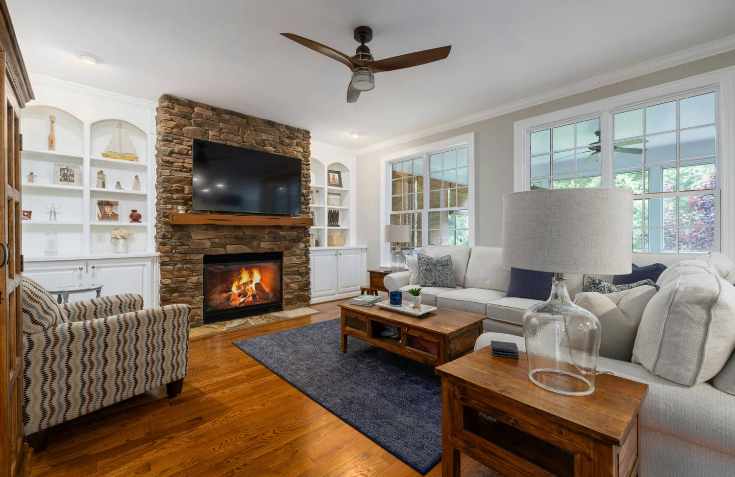
You can see this effect in the photo displayed above, where the light gray fireplace surround creates a calm, open backdrop and does not overwhelm the room. The honed marble look of Edward Martin’s Blair 24x48 Polished Porcelain Tile in Oniciata Grey shows how gentle tonal variation can add depth while preserving a clean, airy appearance. Light-toned stone like this also helps the fireplace feel composed and approachable, remaining visually present without dominating the space, while its low-maintenance qualities support everyday use.
Dark Colors for Depth and Drama
When the goal is to add depth and create a strong focal point, darker stone shades are often the best color choice for a stone fireplace. In these cases, dark gray, dark brown, and black stone introduce visual weight and structure, which helps large rooms feel more intentional, particularly when paired with light walls or high ceilings.
To keep a balanced effect, proportion and contrast become especially important. For example, breaking up a wide fireplace wall with lighter adjacent surfaces, a contrasting mantel, or lighting that highlights the stone’s texture helps maintain a refined look. When approached this way, darker stone works best as the room’s anchor, supported by simpler surrounding finishes that allow the fireplace to stand out without overwhelming the space.
Mid Tones for Balance
When flexibility and balance are the goal, mid-tone stone colors are often the best color choice for a stone fireplace. Colors like light brown, tan, and warm gray sit comfortably between light and dark, allowing the fireplace to add warmth without feeling heavy or limiting in style.
These mid-tones work especially well in rooms with mixed materials, such as wood floors paired with metal finishes or painted cabinetry. In open layouts, mid-tone stone helps the fireplace connect different areas of the space, creating a cohesive look without requiring every finish to match exactly.

Matching Fireplace Color to Interior Design Styles
Once the overall mood is established, the next step is to choose a fireplace color that aligns with your interior style so the space feels cohesive rather than fragmented. Rather than relying on strict rules, use stone color to reinforce the existing design language, allowing the fireplace to feel purposeful and naturally integrated into the room.
Modern and Minimal Interiors
In modern and minimalist interiors, the best colors for a stone fireplace are typically clean neutrals such as white, light gray, or dark gray. These tones support a streamlined aesthetic by emphasizing form and proportion rather than drawing attention to decorative color variation. Finish plays an equally important role, since overly busy surfaces can disrupt the calm that defines these spaces.
This approach is reflected in the photo featured above, where a stone-like surface creates a strong architectural presence without visual noise. A piece like Edward Martin’s Ramsey 24x24 Matte Porcelain Tile in Smoke demonstrates how controlled texture and a uniform gray tone can deliver the look of stone while maintaining a refined, minimal appearance. Surfaces like this allow the fireplace to feel intentional and grounded, offering subtle depth that remains balanced under both natural daylight and evening lighting.
Rustic and Farmhouse Homes
In rustic and farmhouse homes, the best color for a stone fireplace typically leans toward warmer tones. In these settings, beiges, tans, and natural browns reflect the undertones found in wood beams, plank flooring, and timeworn finishes, helping the space feel comfortable and grounded.
At the same time, natural variation works well in this style, provided it feels cohesive rather than scattered. Rather than using high-contrast stones that appear speckled from a distance, stones with tones that stay within the same warm family, such as soft creams blended with honey and muted browns, can also add depth and character while maintaining a finished, intentional appearance.
Traditional and Transitional Spaces
In traditional and transitional spaces, the best color for a stone fireplace is often a neutral tone with subtle variation. These stones adapt well as décor evolves, which is especially important since a fireplace is a long-term feature that most homeowners do not plan to replace. Stones with a consistent base color and gentle movement, such as warm gray with soft veining or beige with light tonal shifts, also offer flexibility without appearing dated. This approach helps the fireplace maintain a timeless presence while allowing the room’s color palette and furnishings to evolve naturally.

Considering Natural Light and Room Orientation
Even the right stone color can appear different depending on the lighting in the room. Because stone responds to changing light throughout the day, the same color can appear warmer, cooler, lighter, or darker depending on the room’s orientation and the time of day. By considering how light interacts with the space, it becomes easier to choose a fireplace color that feels consistent and reliable in everyday use.
North-Facing Rooms
North-facing rooms tend to receive cooler, more diffused daylight, which can affect how stone colors appear. In these conditions, some gray stones may look flatter or slightly blue, while very light stones can feel sharper than expected.
To create a more welcoming feel in a north-facing space, warmer neutral colors are often the best choice for a stone fireplace. Cream, beige, and warm gray can help balance cool light and keep the stone from looking dull. If gray is preferred, choosing a warmer gray rather than a cool one also helps the fireplace feel comfortable instead of cold.
South and West Facing Rooms
South- and west-facing rooms receive stronger sunlight, which can brighten surfaces and increase contrast throughout the space. As a result, a stone color that seems subtle in shaded light may appear noticeably lighter when exposed to direct sunlight. In these conditions, very bright white stone can lose definition, especially when paired with light-colored walls. Choosing an off-white, light gray, or a stone with visible texture and gentle color variation helps the fireplace maintain its presence and visual clarity, even during the brightest parts of the day.
This effect is illustrated in the photo featured above, where a textured, stone-look surface retains its depth under direct light rather than appearing washed out. Edward Martin’s Wren 12x24 Chiseled Porcelain Tile in Dune offers an authentic stone appearance with a subtly fluted surface that introduces a tactile, three-dimensional quality. It diffuses sunlight across the surface, creating a visually expansive effect while allowing the fireplace to remain defined and grounded in sun-filled spaces.
Artificial Lighting at Night
At night, the appearance of the stone is shaped by artificial lighting rather than natural light. Warm bulbs can soften whites and make grays feel gentler, while cooler lighting may mute beige tones and make darker stone appear more defined. Along with viewing physical samples under evening lighting, using an AR tool can also help you visualize how a stone color may read on a fireplace wall after dark, offering added clarity before finalizing your selection.

Coordinating Fireplace Color with Surrounding Materials
A stone fireplace is part of a larger material composition rather than a stand-alone element. Choosing the right color means considering how the stone interacts with nearby surfaces such as flooring, walls, trim, and built-ins. When undertones align, the fireplace feels intentional and well integrated into the space.
Flooring Compatibility
Flooring is often the largest visual surface in a room, so it plays a major role in how the fireplace stone is perceived. When floors are warm wood, very cool gray stone can feel disconnected unless other cool elements, such as black hardware or metal accents, help bridge the contrast.
With cooler flooring, such as concrete or gray tile, warmer stone colors can still work when the tone is kept balanced. Choosing a muted beige rather than a yellow-leaning one helps the fireplace sit comfortably alongside cooler floors. Rather than aiming for an exact match, focus on compatible undertones so the fireplace feels naturally connected to the rest of the space.
Wall Color and Trim
Wall color and trim effectively frame the stone fireplace, and influence how its color is perceived. Bright white walls can make cream stone appear warmer, while warmer wall colors can cause cooler stone to read more gray than intended.
A useful starting point is deciding whether the fireplace should blend into the space or stand out as a focal point. For a blended look, keeping both the wall and stone within the same warm or cool color family creates harmony. When contrast is preferred, it also works best when the difference is intentional and measured, such as pairing a warm stone with a slightly cooler wall color, without pushing the contrast so far that it feels unplanned.
Built-Ins and Mantels
Built-ins and mantels place color relationships front and center because they sit directly against the stone. Wood mantels can soften cooler stone tones, but they may also reveal clashing undertones when warm wood is paired with cooler stone.
Painted mantels and built-ins offer greater flexibility and control. When there is uncertainty, it is often easier to select the stone first and then adjust the paint color to complement it. This approach avoids forcing the stone to work around a finish that is simpler to change later.

Practical Factors That Affect Long-Term Color Satisfaction
Once the visual direction is clear, it is important to consider how the fireplace color will perform over time. Stone reacts differently to soot, dust, and daily use depending on its color and texture. Looking at these practical factors helps ensure the choice remains satisfying long after installation.
Maintenance and Soot Visibility
When a fireplace is used frequently, the stone color plays a noticeable role in maintenance. Light-colored stone tends to show soot and smudges more quickly, particularly near the firebox where heat and airflow are strongest. This does not make light stone a poor choice, but it does mean that gentle, regular cleaning and finishes that resist debris buildup become more important.
By contrast, darker stone is often better at disguising soot, as illustrated in the photo featured above, where Edward Martin’s Dawson 24x48 Matte Porcelain Tile in Charcoal maintains a clean appearance even with regular use. Its authentic stone look and non-porous construction help limit absorption and simplify upkeep, making surfaces like this a practical, low-maintenance choice for active living spaces.
Aging and Patina Over Time
Stone naturally changes over time, particularly in areas exposed to regular heat. Some stones develop a soft patina that adds depth and character, while others gradually shift in tone depending on the type and how they are sealed and cared for. For this reason, it is wise to choose a stone color that remains appealing even if it darkens slightly near the firebox. Using appropriate sealers and avoiding harsh cleaners also helps preserve the surface, as etched or discolored areas are more difficult to correct than routine soot or dust buildup.
Resale and Buyer Appeal
When resale is a consideration, neutral stone colors are generally easier for future buyers to live with, since they allow flexibility in decorating. Warm off-whites, balanced grays, light browns, and soft beiges tend to appeal to a wider range of tastes than highly bold or unusual colors.
That said, choosing a neutral does not require eliminating character. Deeper shades, such as dark gray, can still feel broadly appealing when they work in harmony with the room’s fixed elements. Focusing on how the stone complements permanent features helps the fireplace read as a lasting part of the home rather than a highly personal choice.

Popular Stone Fireplace Colors and When to Use Them
After considering mood, style, lighting, coordination, and long-term practicality, the best stone fireplace color often becomes clear. In most homes, a small group of proven color families consistently performs well across different settings. Understanding when to use each option helps you choose a color that fits your space with confidence rather than following short-term trends.
White and Off White Stone
White and off-white stone are strong options when the goal is to brighten a room and keep the fireplace feeling light and fresh. These colors work particularly well in spaces with limited natural light or when you want the stone’s texture to remain visible without adding visual weight.
For those concerned that pure white may feel too sharp, off-white also offers a softer alternative, maintaining brightness, especially with warm wood and warm lighting. Grout color plays an equally important role, as matching grout creates a more seamless appearance, while contrasting grout highlights the stone pattern and adds definition.
Gray and Greige Stone
Gray and greige stone offer a balanced, contemporary look, although undertones also play a key role in their performance. Cooler grays tend to pair well with black metal, stainless finishes, and crisp white surfaces, while warmer grays and greige work more naturally with wood floors and warm wall colors.
Greige is often a reliable choice when a room includes both warm and cool elements, as it helps bridge the two without feeling stark. When deciding between options, comparing a warmer and a cooler sample in your own lighting makes undertones easier to recognize and helps ensure the fireplace feels comfortable in everyday use.
Beige and Natural Brown Stone
Beige and natural brown stone bring warmth and a sense of familiarity, making them well-suited for cozy living rooms and traditional interiors. These tones pair easily with a wide range of wood finishes, from light oak to deeper walnut, without appearing mismatched.
This character is reflected in the photo displayed above, where a brick-style fireplace introduces warmth and texture without overwhelming the room. Edward Martin’s Everett 2x10 Matte Ceramic Tile in Almond offers a similar artisanal look, with natural shade variation that adds depth while maintaining a soft, balanced tone. Finishes like this help beige feel current rather than dated, while subtle brown undertones bring richness that keeps the fireplace inviting and grounded.
Choosing the Best Color for Your Stone Fireplace
The best color for a stone fireplace complements your lighting, suits your interior style, works with surrounding finishes, and supports how the space is used. When these elements align, the decision becomes clearer, allowing you to focus on colors that genuinely suit your room rather than sorting through every possible option. By considering these factors together, you can choose a fireplace color that feels intentional, balanced, and appropriate over time.
If you would like guidance tailored to your space, contact us to discuss your project and explore stone color options with confidence. We are here to help you make a well-informed choice that feels right for your home.