


If you’re working with a small kitchen, you know how quickly it can start to feel tight and limited. But with the right design choices, especially when it comes to kitchen tiles, you can make a compact space feel open, bright, and stylish. In fact, tile isn't just a finishing touch; it’s a key design element that can influence light, flow, and how big your kitchen actually feels.
In this blog, we’ll break down the smartest tile options for small kitchens, covering everything from size and shape to color, material, and layout, so you can make every square foot count.

Strategic Tile Sizes and Shapes for an Expansive Look
Once you’ve decided to use tile to open up your small kitchen, the next step is choosing the right sizes and shapes. Certain formats can create strong visual illusions that make the space feel wider, taller, or more continuous.
The Myth and Power of Large Format Tiles
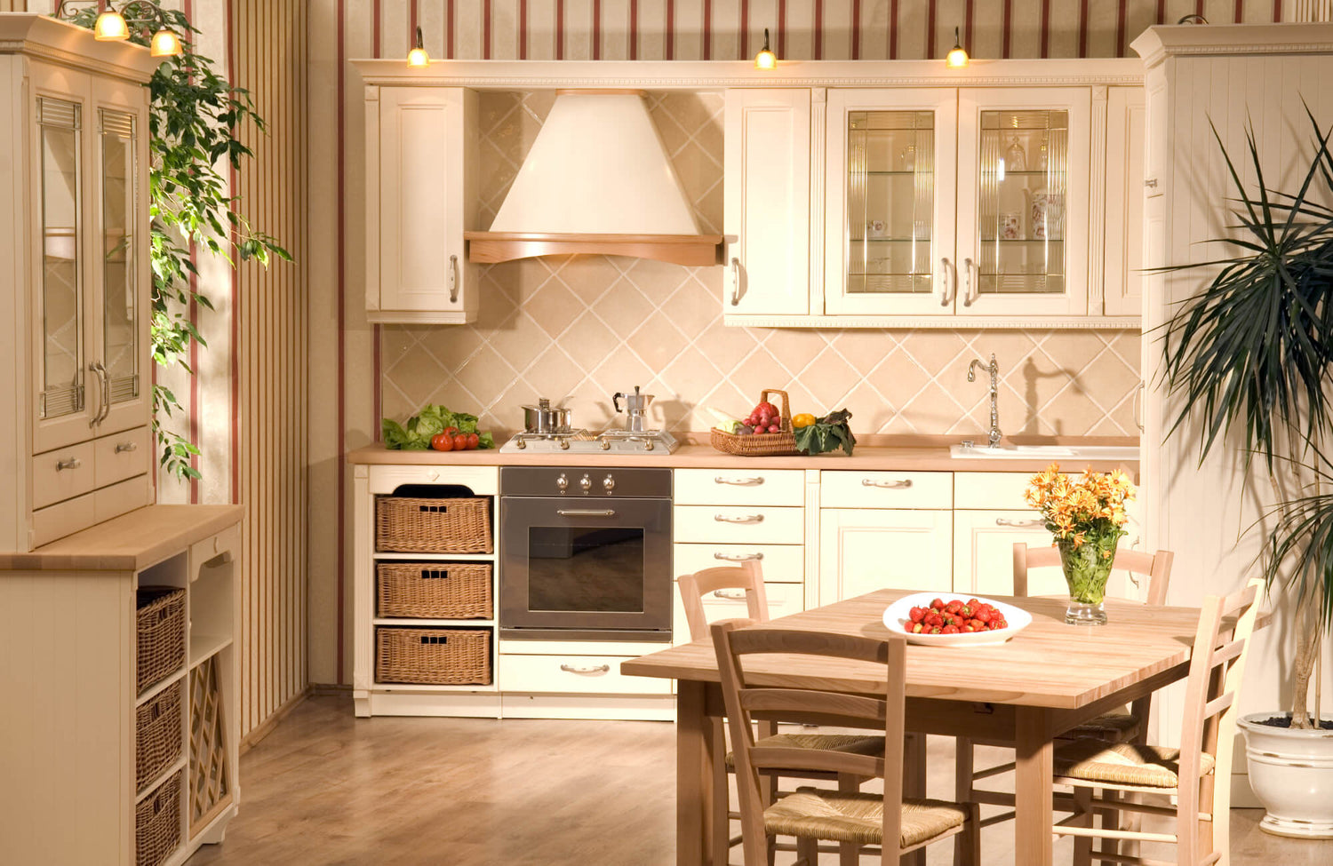
It’s easy to assume that large tiles might overpower a small kitchen, but the opposite is often true. Large format tiles, typically any tile larger than 12"x12", can actually make compact spaces feel more expansive by minimizing grout joints. With fewer lines breaking up the surface, the room appears more seamless and spacious. Porcelain options in sizes like 12"x24", 18"x36", or even 24"x48" work especially well when installed with minimal grout spacing and color-matched grout to maintain a smooth, uninterrupted look.
A great example of this strategy in action is Edward Martin’s Tatum 24x48 Matte Porcelain Tile in Vein-Cut Sand, shown above. The soft neutral tone and horizontal veining help visually stretch the space, while the large scale reduces grout lines for a more open, refined backdrop. For best results, it's important to prepare a level substrate, as large tiles are less forgiving of uneven surfaces and can result in visible lippage if not properly set.
Choosing Smaller Tiles and Mosaics Wisely
While large tiles excel on floors, smaller tiles and mosaics can be highly effective on walls, particularly backsplashes and accent areas. Their finer scale introduces texture and depth without overwhelming the room, especially when chosen in light-reflective materials like polished ceramic or glass.
To avoid visual clutter, stick with consistent patterns and avoid dark or high-contrast grout, which can emphasize tile edges and disrupt the flow. Arranged thoughtfully, whether in vertical stacks or linear formats like penny rounds and 1"x2" mosaics, these smaller tiles can add subtle elongation and a tailored sense of height or depth.
The Versatility of Rectangular and Geometric Shapes
If you’re looking for even more control over how the space feels, consider the shape and orientation of your tiles. Rectangular tiles, such as classic 3"x6" or 4"x12" subway styles, are highly versatile and can visually alter room proportions depending on their layout. For example, running bond or horizontal stacking widens narrow rooms, while vertical orientation draws the eye upward, enhancing ceiling height.
For more dynamic movement, geometric patterns like chevron or herringbone can lead the eye through the space and add layered dimension. These designs are most effective with subtle color palettes and low-contrast grout, which prevent the pattern from feeling too busy. For a more modern or statement look, hexagon or diamond tiles offer clean lines and spatial fluidity without compromising the sense of openness.

Using Color and Finish to Maximize Light and Space
After narrowing down your ideal tile size and shape, color and finish are key to reinforcing that sense of openness. The right combination can brighten the room, reduce visual clutter, and make surfaces feel more expansive.
The Illuminating Power of Light Colors
Light-colored tiles, particularly in shades of white, cream, soft gray, and pastel, are especially effective at boosting both natural and artificial light. By reflecting, rather than absorbing, illumination, these tones help brighten dim areas and blur spatial boundaries. Tiles with a high Light Reflectance Value (LRV) are especially effective; for example, a white-gloss ceramic backsplash can reflect up to 70–80% of incoming light, distributing it evenly across the room.
Edward Martin’s Zayne 12x36 Matte Ceramic Tile in Blocks, featured above, showcases how light color and subtle texture can work in harmony. Its sculpted surface introduces a quiet dimension while maintaining a soft white finish that bounces light throughout the space. The result is a backsplash that feels clean, understated, and visually uplifting, ideal for compact kitchens in need of extra brightness.
Creating Cohesion with Monochromatic Palettes
Building on the concept of light reflection, a monochromatic color scheme can enhance continuity and reduce visual clutter. By using variations of a single hue across floors, walls, and cabinetry, the eye moves smoothly through the space without interruption. This approach works particularly well in small kitchens, where even slight tonal contrasts can segment surfaces and make the room feel tighter.
For instance, pairing light gray floor tiles with slightly paler wall tiles and matching grout creates a seamless, unified look. Finishes in matte or satin lend a soft, glare-free texture that gently diffuses light and maintains a calming visual rhythm.
Strategic Use of Dark Colors
While light tones dominate most small-kitchen palettes, a touch of contrast can actually enhance spatial perception when used thoughtfully. Darker tiles, like deep navy, charcoal, or matte black, can help ground the design and introduce visual depth without overwhelming the space. They work best in concentrated areas, such as along lower cabinetry or behind a feature wall.
When placed beneath lighter, reflective surfaces, like white upper tiles or stainless-steel finishes, dark tones naturally recede, subtly reinforcing vertical height, to keep the space feeling cohesive, be sure to balance dark elements with consistent lighting and surrounding surfaces that maintain a bright, open tone.

Material and Texture Choices That Enhance Space
With color and finish working in your favor, the tile material itself has a significant impact on how light behaves and how the space feels. Some materials naturally reflect more light, while others add depth through subtle texture.
The Enduring Appeal of Porcelain and Ceramic
Among the most reliable and adaptable choices for small kitchens are porcelain and ceramic tiles. Their durability, wide range of finishes, and ease of maintenance make them ideal for high-use areas. Porcelain’s dense, low-porosity structure allows for large-format options that minimize grout lines and visually streamline the space. Meanwhile, glazed ceramic, especially in glossy or semi-gloss finishes, offers excellent light reflectance that can brighten compact rooms.
Edward Martin’s Chantel 12x11 Polished Porcelain Hexagon Mosaic Tile in Imperial, shown above, is a great example of how porcelain can also bring refined visual interest. Its polished surface subtly reflects light, while the geometric pattern introduces texture that feels modern but never overwhelming. It’s a smart choice for backsplashes or feature areas where performance and elegance need to go hand-in-hand.
Embracing the Elegance of Natural Stone
For those seeking organic warmth, natural stone tiles like marble, travertine, and limestone offer depth and sophistication. These materials introduce subtle veining and tonal variation that bring character without dominating the space. Polished marble, in particular, adds a gentle glow and can help brighten darker corners through its reflective surface.
While naturally elegant, it's worth noting that stone is a porous material, which means it may require sealing and occasional maintenance to protect against staining, especially in high-use areas. Still, when used thoughtfully, stone’s tactile richness can soften sharp edges in a compact kitchen. On floors, honed or lightly polished finishes are ideal, balancing light diffusion with slip resistance and a comfortable underfoot feel.
Creating a Brighter Kitchen with Glass and Mirror Tiles
To push light enhancement even further, glass and mirror tiles offer unmatched reflectivity. Glass tiles, whether frosted, glossy, or translucent, excel in backsplashes, where they catch and scatter light to create a sense of depth. Mirror tiles, often applied in mosaic or linear forms, can visually double the space when placed near open shelving or lighting fixtures.
As with natural stone, these materials benefit from thoughtful placement and care. While not porous, glass and mirror surfaces can show smudges or water spots more easily, so occasional cleaning helps maintain their crisp, polished look. Because of their luminous quality, both materials work best in targeted applications. Pairing them with matte or natural finishes nearby creates contrast and visual rhythm without overwhelming the space.

Smart Tile Layouts and Patterns to Open a Room
Bringing everything together, the way you lay your tiles can make a noticeable difference in how the kitchen is perceived. Strategic patterns and layout directions can guide the eye, stretch proportions, and give your space a polished finish.
The Optical Illusion of Diagonal and Chevron Layouts
Certain patterns, like diagonal and chevron layouts, can make a small kitchen feel noticeably larger. Setting tiles at a 45-degree angle breaks away from rigid wall lines, drawing the eye outward and into the corners of the room. This trick subtly expands floor space and minimizes the boxy appearance that small kitchens often have.
Similarly, chevron layouts, formed with tiles cut at angles to create continuous V-shapes, bring directional energy to both floors and walls. These layouts work especially well with light-colored or wood-look porcelain, enhancing movement and adding visual length without visual clutter.
Horizontal and Vertical Stacking for Visual Direction
For a more minimalist approach, consider stacked layouts. Uniform horizontal or vertical tile stacking offers a clean, structured look that quietly shapes how the room is experienced. Horizontal stacking emphasizes width, making narrow kitchens feel broader. Vertical stacking, on the other hand, pulls the eye upward and creates the impression of higher ceilings, particularly effective on backsplashes.
Edward Martin’s Natasha 2x6 Glossy Porcelain Tile in Oat, shown above, illustrates the power of this approach. Its soft oat tone adds warmth, while the glossy finish bounces light and emphasizes clarity. Whether aligned horizontally or vertically, this format brings order and elegance to compact kitchen spaces.
The Sophistication of Herringbone Patterns
For those wanting something more visually dynamic, the herringbone pattern adds both texture and movement. Composed of rectangular tiles in a staggered zigzag formation, this layout elongates sightlines and introduces rhythmic flow. On floors, it can visually stretch short dimensions. On walls or backsplashes, it provides vertical lift or lateral expansion depending on the tile orientation.
To make the most of this pattern, the Edward Martin Augmented Reality (AR) Visualization Tool allows you to preview herringbone tile designs directly in your space. After narrowing down your preferences, you can order a physical tile sample to ensure your selection aligns with your lighting and finishes. Together, these tools help translate a creative idea into a confident design choice.
Smart Tile Choices for a Spacious, Functional Kitchen
In the end, designing a small kitchen isn’t about working with limitations; it’s about designing with intention. From choosing tile sizes and layouts that expand visual boundaries to selecting materials and finishes that brighten and unify the space, every detail contributes to the overall effect. With a thoughtful approach, even the most compact kitchens can feel open, functional, and beautifully tailored to your style.
For guidance tailored to your needs, consider collaborating with a design expert or using visualization tools that make confident decision-making easier. Every square foot counts, and with the right tile, it can shine.