


Hanging wall art may seem straightforward at first, yet achieving a truly balanced and intentional look requires more than simply placing a frame on the wall. Every decision, from height and spacing to scale and lighting, plays a role in how your artwork is experienced within a space. When these elements are thoughtfully aligned, your walls begin to feel curated rather than accidental, creating a sense of harmony that naturally draws the eye.
At the same time, understanding these principles gives you the confidence to adapt them to different rooms, layouts, and personal styles. Whether you are working with a single statement piece or building a layered gallery wall, the right approach allows your art to connect seamlessly with its surroundings. As you explore these guidelines, you will begin to see how small adjustments can transform your walls into a cohesive and visually engaging part of your space.

The Eye Level Benchmark and the 57 Inch Standard
Getting the height right is the foundation of any well-curated wall. When your artwork aligns with natural sightlines, the entire space immediately feels more balanced, comfortable, and visually intentional.
The Museum Centerline Rule
A reliable guideline to follow is placing the center of your artwork at approximately 57 inches from the floor. This measurement corresponds closely to average eye level, which means your art feels easy to engage with the moment you walk into the room. Instead of adjusting your posture to view it, your gaze naturally lands where it should, creating a seamless and comfortable viewing experience.
However, achieving this placement requires a bit more precision than simply marking the wall. After identifying the midpoint of your frame, you need to consider how the hanging hardware affects where the piece will actually rest. Once you account for that slight shift, the artwork settles exactly where your eye expects it to be. This attention to detail may seem small, but it’s what gives your space that polished, gallery-like quality.
A piece like the Golden Drift Wall Art works especially well with this guideline because its 19-by-28-inch frame and vertically layered composition naturally draw the eye upward without feeling overpowering, as seen in the image above. Its hand-formed wool and jute knots, soft earthy tones, and elongated fringe add depth and texture, so placing its center near the 57-inch mark helps those details feel immediately engaging and easy to appreciate at eye level. In a bathroom, bedroom, or hallway, this kind of placement allows the piece to feel intentionally anchored while still bringing in the relaxed, organic character that makes the wall feel complete.
Consistency Across Different Heights
As soon as you start working with multiple pieces, maintaining consistency becomes even more important. It might feel intuitive to line up the tops or bottoms of frames, especially when they vary in size, but this often creates a jagged visual path that disrupts the flow of the wall. Your eye ends up moving unevenly, which can make the arrangement feel unbalanced.
Instead, keeping a consistent centerline allows every piece to relate back to the same visual anchor. As your gaze moves across the wall, it stays level, creating a sense of rhythm and cohesion. Even when your collection includes different sizes, styles, or frames, this approach ties everything together, making the overall display feel thoughtful and well-composed rather than scattered.

Dimensional Scaling and the Two-Thirds Ratio
Beyond height, scale determines how naturally your artwork fits within the room. When proportions are aligned, your art feels connected to its surroundings rather than floating or overpowering the space.
Anchoring Art to Furniture
When you hang art above furniture, the relationship between the two should feel intentional and balanced. A helpful guideline is to choose artwork that spans roughly two-thirds the width of the piece below it. This proportion creates a sense of stability, allowing the furniture to visually support the art rather than compete with it.
If the artwork is too small, it can feel disconnected, almost as if it’s drifting on the wall without purpose. On the other hand, when it’s too large, it can dominate the area and make the furniture feel secondary. By staying within that middle range, you create a composition where both elements work together, giving the space a more grounded and cohesive appearance.
The Vertical Clearance Gap
Just as important as width is the space between the furniture and the artwork. Leaving a gap of about 6 to 8 inches helps establish a clear visual connection without making the arrangement feel cramped. This spacing acts as a buffer, allowing each element to stand out while still feeling related. When this distance is consistent, the entire setup feels more deliberate and refined. The artwork also doesn’t appear to float too far above, nor does it feel squeezed into place. Instead, everything sits in a comfortable visual balance, making the area feel polished and easy to take in.

Geometric Logic for Multi-Piece Gallery Walls
When you move from a single piece to a gallery wall, the focus shifts from placing individual frames to shaping a cohesive composition. The goal is to create a unified display that feels intentional rather than scattered.
The Unified Silhouette Technique
Instead of thinking about each frame on its own, you should start by visualizing your gallery wall as one complete shape. Whether it forms a rectangle, square, or an organic cluster, this invisible boundary helps guide your arrangement so it reads as a single visual unit. Without this overall structure, even beautiful pieces can feel disconnected and chaotic.
To refine this, it helps to arrange your layout on the floor before committing to the wall. As you shift pieces around, you’ll start to notice how balance, weight, and spacing interact. Once the composition feels right, transferring it to the wall becomes much easier, and the final result feels cohesive and well-planned rather than improvised.
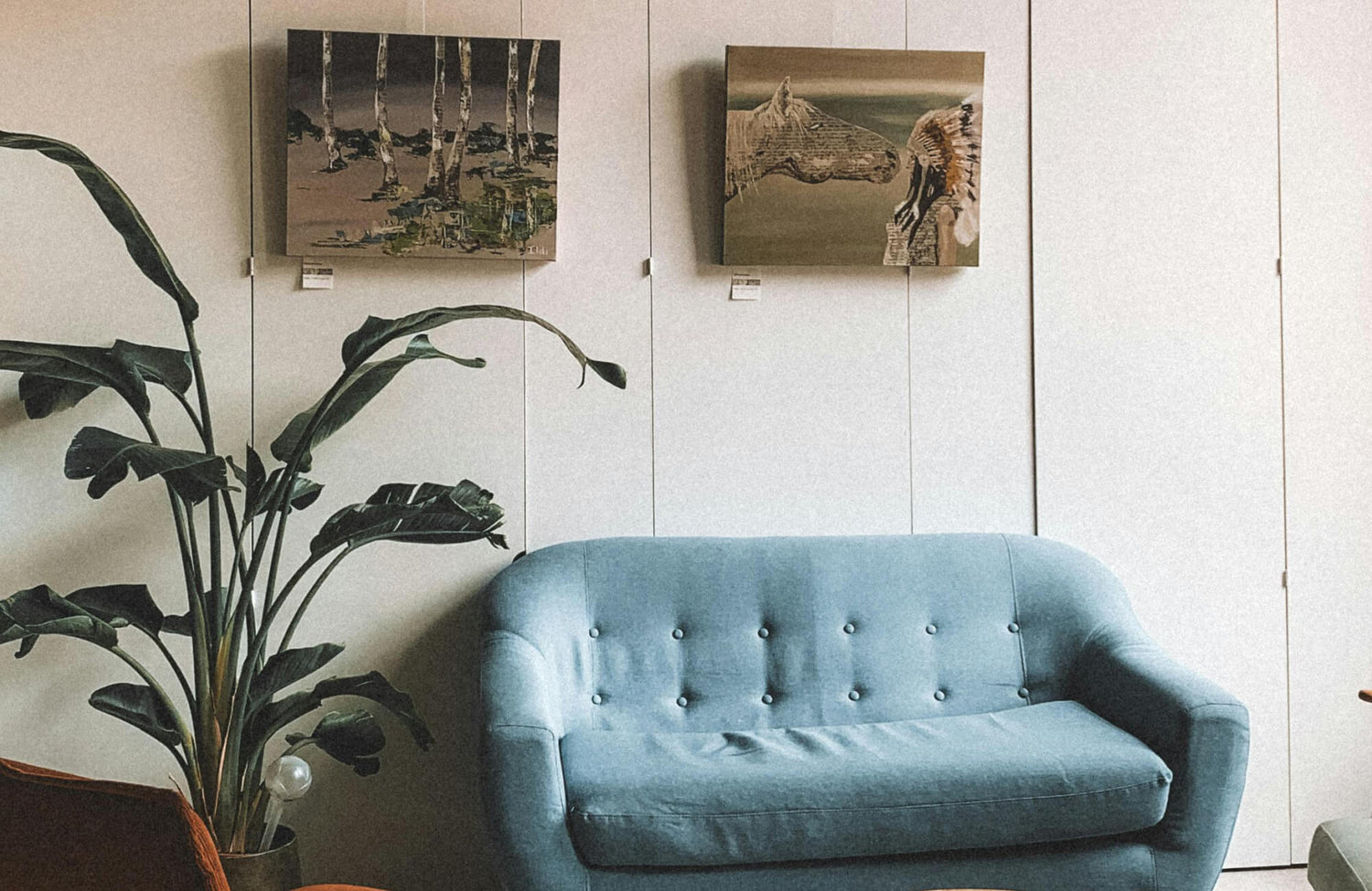
In a curated gallery wall, incorporating a piece like the Quiet Study Wall Art, shown in the photo above, can help anchor the overall composition while adding depth and character. Its refined, classic aesthetic and balanced proportions make it ideal for integrating into a larger arrangement without overwhelming surrounding pieces. When positioned thoughtfully within your chosen silhouette, it also contributes to a cohesive visual flow, allowing the gallery wall to feel intentional and harmonious. This kind of piece works especially well as a grounding element, helping tie together varying styles while maintaining a sense of structure and elegance.
The Two-Inch Spacing Constant
Equally important is the spacing between each frame, as it directly affects how your gallery wall is perceived. Keeping the gaps consistent, around two inches, creates a steady rhythm that visually links each piece together. This uniformity allows your eye to move smoothly across the arrangement without interruption. As a result, the collection begins to feel unified rather than fragmented. Even if the frames vary in size, style, or content, consistent spacing brings everything into harmony. Over time, this subtle detail makes the entire display feel more polished, structured, and visually satisfying.

Contextual Placement for Functional Zones
Although general guidelines provide a strong foundation, how you actually use a room should shape where your art goes. When placement reflects real-life habits, your artwork feels naturally integrated rather than purely decorative.
The Seated Perspective Shift
In spaces where you spend most of your time sitting, such as dining areas, reading corners, or home offices, standard hanging height can feel slightly off. When artwork is positioned too high, it creates a subtle disconnect, forcing you to look upward instead of engaging with it comfortably. Lowering the center of the piece by just a few inches brings it closer to your seated eye level, making the experience feel more natural.
As you settle into the space, this adjustment becomes increasingly noticeable in a positive way. The artwork feels more accessible and connected to your daily activities, rather than hovering above them. This creates a more intimate and inviting atmosphere, where the art becomes part of your environment rather than something separate from it.
A piece like the Hollow Morning Wall Art, featured above, is especially well-suited for these seated environments, where its calming composition and balanced proportions can be fully appreciated at a slightly lower viewing height. Its subtle textures and neutral tones also create a relaxed, grounding presence that complements focused or quiet moments, whether in a home office or reading nook. By positioning it closer to seated eye level, the artwork feels more connected to your daily routine, enhancing both comfort and visual harmony within the space.
Kinetic Viewing
Areas like hallways, staircases, and entryways require a more dynamic approach. Since you’re usually moving through these spaces, your interaction with art is brief and constantly shifting. Instead of fixing everything at a single height, arranging pieces to follow the natural flow of movement creates a more engaging visual experience.
As you walk through these areas, the artwork reveals itself gradually, guiding your eye along the path. This sense of progression keeps the display interesting without feeling forced. At the same time, slightly adjusting placement to avoid obstacles or tight passages ensures the art remains both visible and protected, making it well-suited to the rhythm of everyday movement.

Navigating Architectural Obstacles and Irregular Walls
Not every wall offers a clean, symmetrical canvas, which is why flexibility becomes essential. Instead of fighting these imperfections, you can use artwork strategically to create balance and visual harmony.
Counterbalancing Architectural Asymmetry
When your wall includes off-center elements like windows, doors, or built-ins, placing artwork strictly within the leftover space can make the imbalance feel even more pronounced. Your eye naturally notices when something feels “off,” especially if the arrangement reinforces that unevenness. Rather than trying to center art within a limited area, it’s more effective to think about the wall as a whole.
By placing a larger piece or a grouped arrangement where the wall feels visually empty, you can redistribute the weight across the entire surface. This creates a sense of equilibrium, even if the architecture itself isn’t perfectly balanced. As you step back, the eye no longer fixates on what’s misaligned. Instead, it reads the wall as cohesive and intentional.
Introducing the Shadow Orchard Wall Art into your layout can be a thoughtful way to soften and rebalance uneven architectural elements. Its nature-inspired composition and gentle tonal variation, as displayed in the picture above, create a visual anchor that helps redistribute attention across the wall without feeling forced. When positioned in an area that feels visually underweighted, it subtly shifts the focus, allowing the entire space to read as more cohesive and intentionally styled.
The Verticality Rule for Tall Ceilings
Rooms with tall ceilings often create a different kind of challenge, where standard art placement feels too low and disconnected from the upper portion of the space. If you leave too much empty wall above your artwork, the room can feel incomplete or slightly awkward in its proportions. Simply raising a single piece, however, can make it harder to view comfortably.
A more effective approach is to build upward rather than shift everything higher. By layering artwork vertically or choosing taller compositions, you guide the eye from the lower viewing level toward the ceiling in a natural progression. This creates a stronger connection between the human scale and the architectural height, making the space feel more balanced, cohesive, and thoughtfully designed.

Lighting Mechanics and Glass Reflection Management
Even when your artwork is perfectly placed, poor lighting can diminish its impact. By adjusting how light interacts with your pieces, you ensure they remain clear, vibrant, and easy to appreciate throughout the day.
The 30 Degree Light Angle
Lighting your artwork at the right angle makes a noticeable difference in how it’s perceived. When light hits the surface at roughly a 30-degree angle, it spreads evenly across the piece instead of creating harsh shadows or bright glare. This allows the artwork to remain visible and comfortable to look at from different positions in the room.
As this balanced lighting settles in, you’ll start to notice how much more detail becomes visible. Colors appear richer, textures stand out more clearly, and the overall presence of the piece feels stronger. With the right angle, your lighting doesn’t compete with the artwork; it enhances it in a subtle but impactful way.
Managing Environmental Reflections
Natural light can bring a room to life, but it can also interfere with how your artwork is viewed. When light reflects off glass surfaces, it can obscure the image, making it difficult to see details clearly at certain times of the day. This distraction can pull attention away from the art and toward the surrounding environment.
To minimize this, you can either adjust the placement of your artwork or choose materials that reduce reflection. Anti-reflective glass, for example, helps maintain clarity even in brighter spaces. As you reduce these visual interruptions, the artwork becomes easier to focus on, allowing it to remain the true focal point within your space.
Creating a Cohesive and Balanced Display
Hanging wall art follows a set of guiding principles that bring together height, proportion, spacing, and lighting to create a cohesive and visually balanced display. When applied thoughtfully, these rules ensure your artwork feels connected to both the wall and the surrounding space, enhancing how the room looks and functions. As a result, your walls become more than just a backdrop; they transform into intentional focal points that elevate the overall atmosphere of your space.
To bring these principles to life, selecting the right wall art is just as important as how it’s displayed. Choosing pieces that align with your space in terms of size, style, and color helps create a seamless and visually balanced look. If you’re looking for wall art that fits your vision or need guidance in making the right choice, our team is here to help. Feel free to contact us for expert recommendations and personalized assistance in finding the perfect pieces for your space.
