


Arranging wall art involves more than simply filling space. With a bit of planning, it can create a better sense of balance and improve the overall feel of the room. The way artwork is arranged naturally guides how the eye moves across the space and how different elements connect. By understanding key principles such as structure, proportion, and visual harmony, the process becomes easier to approach. In this article, we’ll explore the best way to arrange art on a wall, focusing on practical methods to plan, structure, and refine your layout so you can make informed decisions and achieve a more intentional and balanced result.

Defining The Role Of Your Wall Display
Before placing any artwork on the wall, it is important to understand the role the display will serve within the space. This provides a clear direction for the decisions that follow, helping the arrangement feel considered rather than random.
Establish A Visual Priority
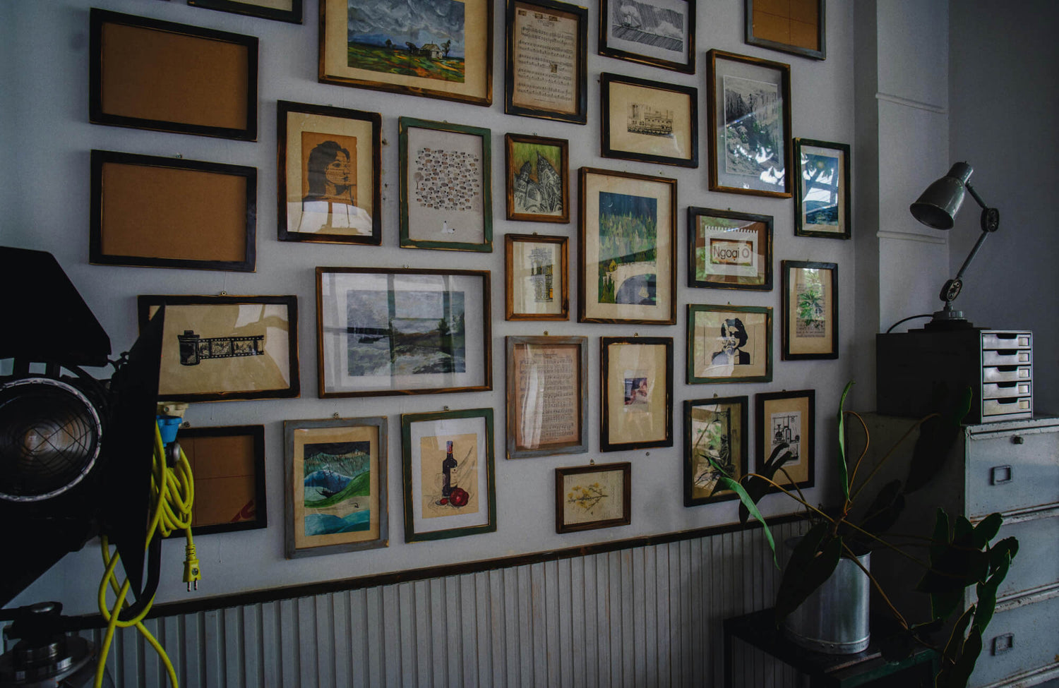
It helps to begin by deciding how much attention the wall should draw within the space. If the goal is to create a focal point, larger or more visually striking pieces can be used to draw attention naturally. In contrast, if the wall is meant to play a supporting role, a more subtle arrangement helps it blend with the surrounding elements.
This can be seen in the photo above, where Edward Martin’s Borrowed Dawn Wall Art is styled to draw attention without overwhelming the room. Its placement and scale allow it to stand out just enough against the patterned wall, while still complementing the surrounding furniture and finishes.
As a result, this distinction helps guide key decisions such as scale, spacing, and the selection of artwork. For instance, a focal arrangement often relies on a few impactful pieces; a more understated display works best with compositions that complement rather than compete with the rest of the room.
Consider Room Mood
Next, it is important to consider the overall mood the space is meant to convey. Different rooms often call for different approaches, with some benefiting from a calm and restrained arrangement, while others can accommodate a more expressive or layered display. When the artwork aligns with the room’s purpose, the result feels more cohesive and visually appropriate.
Instead of focusing only on individual preferences, it helps to consider how each piece contributes to the overall atmosphere. This approach allows the wall display to support the character of the space rather than distracting from it.
Plan Viewing Experience
It is also important to consider how the wall will be viewed within the space. Depending on whether it is seen while standing, sitting, or moving through the room, the arrangement should remain comfortable and easy to take in from different angles. Positioning key pieces within natural sightlines helps avoid awkward placement. When viewing conditions are considered early on, the overall arrangement tends to feel more intuitive and visually accessible.

Selecting A Clear Layout Structure
Choosing a clear layout structure helps organize artwork in a way that feels intentional and easy to follow. A defined structure maintains visual order and keeps the arrangement from appearing scattered or unbalanced.
Symmetrical Composition
Wall art in a symmetrical layout creates a sense of balance by arranging elements evenly around a central line. This approach is often used when a clean and structured appearance is preferred, as it introduces a clear sense of order. When pieces are aligned consistently, the arrangement develops a steady visual rhythm. As a result, the eye can move across the display easily, making the overall composition feel organized and easy to follow.
Grid Formation
A grid wall art layout is based on consistent sizing and equal spacing between pieces. When frames of the same dimensions are arranged in aligned rows and columns, the overall result appears orderly and structured. This approach works especially well for displaying collections such as photographs or prints. As the arrangement follows a clear and predictable pattern, attention tends to shift toward the artwork itself rather than the layout.
Gallery Wall Layout
A gallery wall allows for a mix of different sizes and orientations while still maintaining a sense of order. The key is to keep spacing consistent so the arrangement feels cohesive rather than scattered. This type of layout works as a unified composition, where each piece contributes to the overall display. Even with variation, an underlying structure helps hold the wall art arrangement together and keeps it visually balanced.
Freeform Arrangement
A freeform layout offers greater flexibility, but it still benefits from a thoughtful approach. Instead of following strict alignment, placement is guided by an implied boundary that helps maintain overall cohesion. This approach is often used to create a more relaxed and natural appearance. At the same time, keeping a loose structure in mind helps ensure the arrangement feels intentional rather than random.

Controlling Proportion Within The Arrangement
Proportion focuses on how individual pieces relate to one another within a composition. Managing these relationships carefully helps maintain balance and ensures the arrangement feels visually stable rather than uneven or disjointed.
Distribute Visual Weight
Visual weight refers to the level of attention each piece of wall art draws within an arrangement. Elements that are larger, darker, or more detailed tend to stand out more, so it is important to distribute them in a way that feels balanced. When too much visual weight is concentrated in one area, the wall art arrangement can appear uneven. By spacing these elements more evenly across the layout, the arrangement feels more stable and balanced. This allows the eye to move naturally across the arrangement without being drawn too heavily to one side.
Mix Sizes With Intention
Using a range of sizes can add depth and variation to an arrangement. However, the focus should be on thoughtful placement rather than simply including a wide mix of dimensions. Grouping similar-sized wall art too closely together can disrupt balance. A more effective approach is to vary sizes gradually throughout the composition. This creates a smoother visual flow and allows the eye to move across the display more naturally.
Build Around A Core Piece
Working around a central piece provides a clear starting point for the arrangement. This main element serves as a reference point, helping guide the placement of the surrounding artwork. Building outward from a core piece helps maintain structure, especially in larger arrangements. It also simplifies the process by allowing the composition to develop in a more organized and controlled manner.

Positioning Art In Relation To The Wall Space
Positioning focuses on how the arrangement sits within the wall area as a whole. Thoughtful placement helps the artwork feel grounded and visually connected to the surrounding space rather than appearing isolated.
Use Ideal Hanging Height
Hanging height plays an important role in how comfortable the artwork is to view. In most cases, positioning the arrangement at eye level creates a more natural and comfortable viewing experience. This allows the artwork to align with how people typically see the space without requiring posture adjustment. When pieces are placed too high or too low, they can feel disconnected from the rest of the room. Keeping the wall art arrangement within a consistent viewing range helps it feel more integrated and easier to engage with.
Maintain Consistent Spacing
Spacing between frames contributes significantly to the overall clarity of an arrangement. When gaps are kept consistent, the display appears more cohesive, even when the artwork varies in size or style. This consistency helps establish a visual rhythm that guides the eye across the wall. In contrast, uneven spacing can make the arrangement seem unplanned or disjointed. Maintaining even distances between pieces supports a more organized and balanced presentation.
Respect Wall Boundaries
The space around an arrangement is just as important as the arrangement itself. Leaving enough margin between the artwork and the edges of the wall helps prevent the display from feeling crowded. This surrounding space allows each piece to be seen more clearly without visual interference. When artwork is placed too close to corners or ceilings, it can appear compressed within the wall area. Allowing the arrangement to sit comfortably within its boundaries helps create a more balanced and visually stable result.

Integrating Art With Surrounding Elements
Artwork should be considered in relation to the surrounding elements within the room. When properly aligned with its environment, it feels more cohesive rather than isolated.
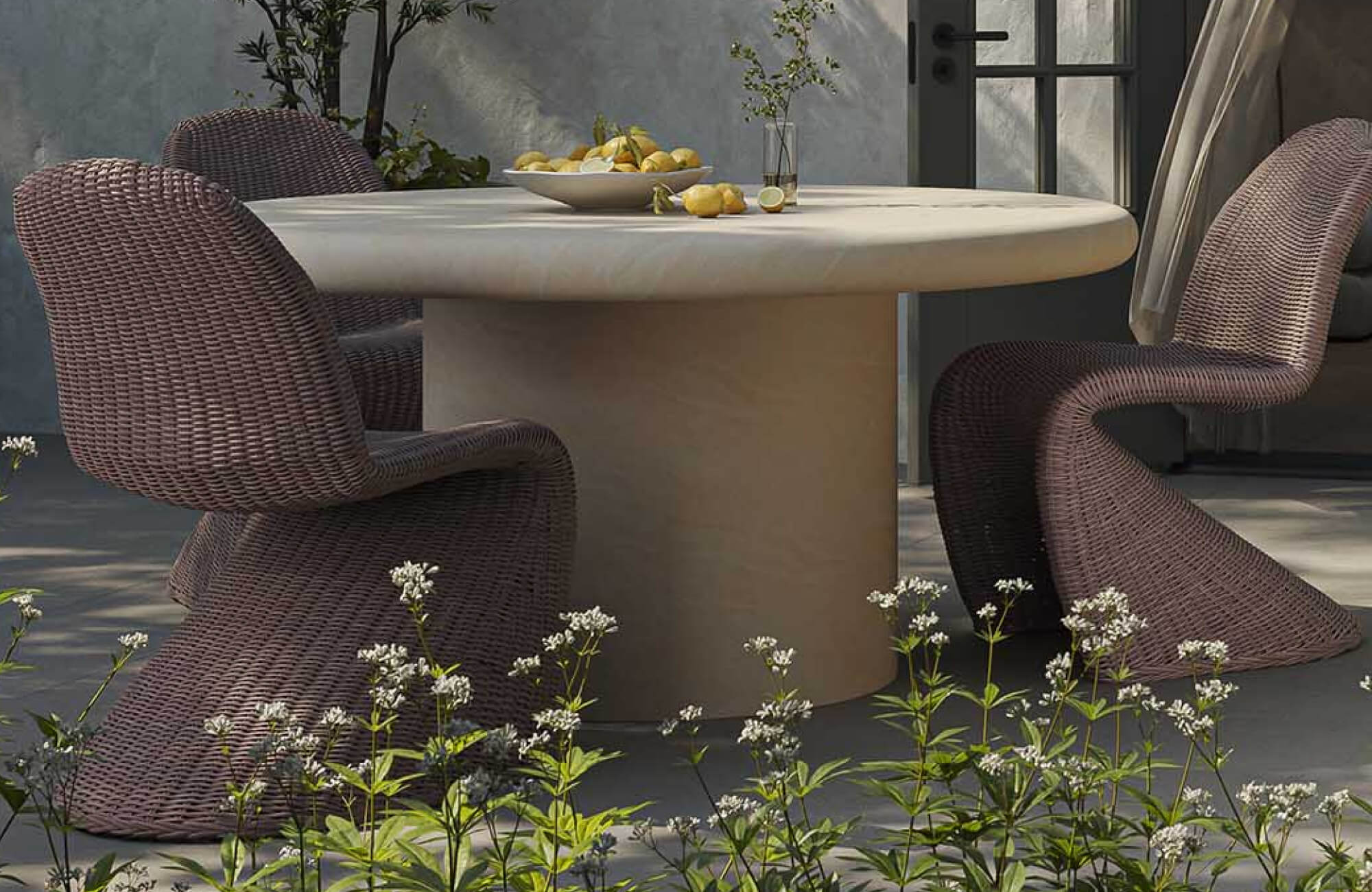
Align With Furniture Scale
When placing art above furniture, it is important to consider how the arrangement relates to the size of the piece below it. Wall art that is too small can feel disconnected, while pieces that are too large may dominate the area. Maintaining a balanced proportion helps create a stronger visual connection between the two elements.
This relationship is illustrated in the photo featured above, where Edward Martin’s Shaded Distance Wall Art and Lowland Path Wall Art are positioned in proportion to the Selena 55" Outdoor Dining Table in Cream. The combined width and scale of the artworks align well with the table beneath, allowing the arrangement to feel visually anchored within the dining area. As a result, the artwork becomes part of a cohesive composition rather than a separate feature.
Work With Architectural Lines
Architectural features such as windows, moldings, or ceiling lines can serve as natural guides for placement. Aligning artwork with these elements helps create a sense of structure and order within the arrangement. This approach also makes the placement feel more intentional, as it follows existing lines within the space. When these visual cues are considered, the wall art integrates more naturally into the room. Over time, this alignment contributes to a more cohesive and organized environment.
Anchor Key Zones
Certain areas within a room naturally draw attention due to their function or placement. Positioning wall art in these areas reinforces the overall layout and provides a clear focal point. This placement can help define specific zones within the space, making the room feel more structured. When artwork is used in this way, it supports the existing arrangement rather than competing with it. As a result, the space feels more balanced and visually connected.

Creating Visual Harmony Through Style Choices
Visual harmony depends on how different style elements come together within an arrangement. When elements such as theme, color, and framing are considered together, the display feels more cohesive and visually consistent.
Unify Through Theme
Using a common theme helps bring different pieces together into a more cohesive arrangement. This can be based on subject matter, artistic style, or a shared concept that links the artwork together. When there is a clear relationship between the pieces, the overall display becomes easier to interpret. It also reduces the likelihood of the arrangement feeling disjointed or unrelated. Over time, this consistency helps create a more unified visual experience.
Coordinate Frames And Finishes
Frames and finishes contribute to how the arrangement is perceived as a whole. Keeping them consistent can create a more structured and uniform appearance, while intentional variation can introduce subtle contrast. Even when mixing different frame styles, maintaining at least one shared element helps preserve cohesion. This could be a similar color, material, or finish that ties everything together. When considered carefully, frames support the artwork without distracting from it.
Balance Color Distribution
Color plays an important role in how balanced an arrangement appears. Repeating similar tones across different areas helps create a sense of continuity. When color is concentrated in one section, the arrangement can feel uneven or visually heavy. Distributing color more evenly allows the eye to move naturally across the display. This approach contributes to a more stable and visually connected composition.
A Balanced Approach To Arranging Art On A Wall
The best way to arrange art on a wall is to take a clear and thoughtful approach that considers both placement and visual relationships. When purpose, layout, proportion, positioning, and surrounding elements are carefully considered, the arrangement becomes easier to organize and refine. Each step helps ensure the display feels balanced and visually connected rather than random. With these principles in place, a wall can be arranged in a structured and cohesive way.
If additional guidance is needed, seeking support can help simplify the process and provide a clearer direction. For more personalized assistance, you can contact us to explore design services that provide practical guidance in creating a well-balanced arrangement.
