


Choosing the best wallpaper color for a small room is not just about style; it’s about creating a sense of space, comfort, and visual balance. In compact areas, color directly influences how open or enclosed a room feels, making it a key element in the design process. As we walk you through this topic, you’ll learn how different colors influence perception, how lighting affects your choices, and how to select a wallpaper that enhances both function and atmosphere.

How Color Shapes Spatial Perception
Before considering lighting or furniture, it’s important to understand how color alone shapes the space. In a small room, the right wallpaper color can subtly shift perception, making walls feel farther apart or closer together, even though the actual dimensions remain unchanged.
Light Tones Recede Visually
When choosing the best wallpaper color for a small room, lighter shades are often the most effective choice. Colors such as soft white, cream, light gray, light beige, and muted pastels like blush or powder blue can make walls appear farther away than they actually are. These tones create a more open feel by softening visual boundaries, allowing light to move more freely across the surface. As a result, the eye travels more smoothly around the room, helping the space feel brighter and less enclosed.
A closer look at Edward Martin’s Botanique Wallpaper in Winter, 52" x 132", further highlights this effect, with its light neutral base supporting a delicate botanical pattern without overwhelming the space. As shown in the photo above, the soft background complements natural light from the window, keeping the room bright, while the subtle motif adds depth without disrupting the sense of openness. This balance allows the walls to feel visually extended rather than defined, which is especially effective in narrow layouts. In this way, lighter wallpaper colors can enhance both brightness and perceived space while still introducing gentle detail.
Dark Shades Create Controlled Depth
Darker wallpaper colors can still work in small rooms when used with care. Colors like dark blue, dark gray, deep green, and black can add depth when applied to a single wall or a defined section. Instead of covering the entire room, using these colors selectively creates a layered effect, allowing one surface to feel more recessed without overwhelming the space. When balanced properly with lighter elements, darker tones can enhance dimension without making the room feel smaller.
Cool Colors Expand While Warm Colors Enclose
When choosing the best wallpaper color for a small room, color temperature is an important factor to consider. Cooler shades like light blue, soft green, and pale lavender tend to feel more distant, helping the room appear more open and spacious. Warmer colors such as light beige, soft yellow, or peach can still work, but they are best used in lighter tones so they do not feel too close or enclosing. By selecting lighter versions of both cool and warm colors, you can maintain comfort while still keeping the space visually open.

Evaluating Room Lighting Before Choosing Color
Once you understand how color works on its own, the next step is to consider how lighting will influence it in your space. Wallpaper can appear different throughout the day, depending on the amount and type of light present. By considering lighting, you can choose a color that remains consistent and supportive of the room’s overall feel.
Natural Light Direction Matters
The direction your room faces has a noticeable effect on how wallpaper color appears. North-facing rooms typically receive cooler, softer light, which can make colors appear slightly muted, so warmer tones can help restore balance. In contrast, south-facing rooms benefit from stronger, warmer light, allowing cooler shades to feel clear and well-defined without appearing dull. By considering the direction of natural light, you can choose a color that remains consistent and comfortable throughout the day.
This relationship between light and color is clearly reflected in Edward Martin’s Essex Wallpaper in Black II, 52" x 132", where the neutral pattern shifts subtly depending on daylight exposure. As shown in the photo featured above, the wallpaper appears brighter and more defined near the window, while areas farther from the light take on a softer, more subdued tone. This variation highlights how natural light can influence depth and clarity within the same space. In this way, selecting a wallpaper that adapts well to changing light helps maintain a balanced and consistent look throughout the day.
Artificial Lighting Alters Color Tone
At night, artificial lighting becomes the primary factor affecting how wallpaper color appears. Warm lighting tends to soften colors and highlight yellow or beige undertones, while cooler lighting can make grays and blues look more defined. This shift can change the overall mood of the room, especially in smaller spaces where lighting is more concentrated. Considering how the room appears in the evening helps ensure your wallpaper color stays comfortable and consistent throughout the day.
Enhancing Brightness With Subtle Finishes
The wallpaper finish also influences how light interacts with the surface. A slight sheen can help distribute light more evenly across the walls, improving overall brightness without creating glare. This effect is especially noticeable in smaller rooms, where light has limited reach and needs to spread more evenly across the space. Choosing the right finish helps create a more open and balanced atmosphere without overwhelming the space.

Selecting Colors Based on Room Function
After considering perception and lighting, the next step is to focus on how the room is used. The best wallpaper color should support the space’s function, ensuring it feels appropriate and comfortable for everyday use.
Bedrooms Need Soft, Restful Hues
When choosing the best wallpaper color for a small bedroom, softer tones are often the most effective. Colors such as light blue, soft green, warm beige, and pale gray help create a calm environment without making the space feel confined. These shades reduce visual intensity, allowing the room to feel more open and restful. As a result, the space supports relaxation while still maintaining a sense of lightness.
Work Areas Require Visual Clarity
In a small workspace, the best wallpaper colors are those that maintain clarity while avoiding visual fatigue. Light gray, soft brown, beige, and muted green work well because they provide a steady backdrop that supports focus without feeling dull. These shades help minimize distractions while still adding enough depth to keep the room from appearing flat. This creates a space that feels organized, balanced, and suitable for productivity.
In the photo featured above, Edward Martin’s Windsor Wallpaper in Grey I, 52" x 132", reflects this approach with its soft neutral tone and subtle linear pattern. It creates a clean, structured backdrop that supports the room’s layout without drawing unnecessary attention. The gentle pattern adds dimension while maintaining visual clarity, which is especially important in task-oriented spaces. In this way, neutral wallpaper colors help reinforce both focus and overall organization.
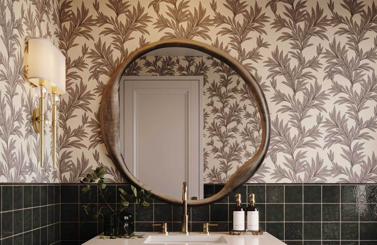
Bathrooms Allow for Light Experimentation
For small bathrooms, the best wallpaper colors can be slightly more expressive while still keeping the space bright. Light blue, soft green, pale pink, and gentle coral are good options because they add character without making the room feel closed in. Since these spaces are used briefly, a bit more color variation can feel refreshing rather than overwhelming. Keeping the tones light helps the room feel open, clean, and easy on the eyes.

Using Pattern and Scale to Influence Proportion
While color plays a key role in shaping a small room, pattern can further influence how the space is perceived. When used thoughtfully, it can subtly adjust proportions and improve the overall balance without making the room feel cluttered.
Small-Scale Patterns Maintain Openness
In small rooms, smaller-scale patterns are often the most effective choice. These designs help maintain visual flow by allowing the eye to move smoothly across the space. Subtle patterns can add texture and interest without overwhelming the room or making it feel busy. This allows the space to feel more detailed while still appearing open and balanced.
This effect is well demonstrated by Edward Martin’s Florette Wallpaper in Taupe II, 52" x 132", which features a delicate, closely spaced motif that adds visual interest without dominating the room. As shown in the photo featured above, the pattern remains soft and consistent across the walls, helping the space feel cohesive rather than crowded. The low contrast between the pattern and background allows the eye to move easily, maintaining a sense of openness. In this way, small-scale wallpaper designs can enhance detail while preserving balance in compact spaces.
Vertical Designs Add Height
In small rooms with low ceilings, vertical patterns can help make the space feel taller. By drawing the eye upward, these designs shift attention away from the room’s limited dimensions. This visual effect can make the space feel taller without changing its structure. Even subtle vertical details can gradually improve the room's overall look.
Horizontal Elements Expand Width
In narrow rooms, horizontal patterns can help make the space feel wider. By drawing the eye across the walls, they create the impression of added width. This effect can improve balance, especially in rooms that feel tight from side to side. Using horizontal elements in moderation helps maintain a natural and comfortable look.

Creating Harmony With Existing Room Elements
Once the wallpaper is selected, it should complement the rest of the room. In smaller spaces, poor coordination can make the design feel disjointed, especially when elements compete for attention rather than work together.
Balance Wallpaper With Furniture Presence
In small rooms, large furniture pieces can easily dominate the space. Selecting an appropriate wallpaper color can help soften their presence and improve overall visual balance. Lighter or more muted tones behind bulky items allow them to blend more naturally into the room. This approach helps the space feel more cohesive and less crowded overall.
This balance is clearly seen in Edward Martin’s Bower Wallpaper in Taupe I, 52" x 132", where a warm, muted background complements the darker vanity. As shown in the photo featured above, the wallpaper’s soft taupe tone and organic pattern help reduce the visual weight of the cabinetry, preventing it from overwhelming the room. The design adds depth, while helping the furniture blend more naturally into the space rather than standing out too strongly. This way, the right wallpaper color supports larger pieces while keeping the room balanced and cohesive.
Limit the Overall Color Palette
In small rooms, keeping the color palette limited helps create a more unified look. Introducing too many colors can make the space feel visually fragmented and less organized. Using a few consistent tones throughout the room helps establish a sense of continuity. This approach allows the space to feel more cohesive and visually balanced.
Use Accents to Support, Not Compete
In small rooms, accents should complement the wallpaper rather than draw attention away from it. Choosing materials and finishes that reflect similar tones helps create a more unified look. When elements work together, the space feels more organized and visually calm. This approach ensures the wallpaper remains a cohesive part of the overall design rather than competing with other details.

Avoiding Common Color Selection Errors
Even with careful planning, certain color choices can make a small room feel more confined than it actually is. Understanding what to avoid can help you make more confident and effective decisions when selecting wallpaper.
Choosing Colors Without Testing
Wallpaper can appear quite different once applied to your walls. Lighting conditions and surrounding elements can change how a color looks throughout the day. Testing samples in your actual space allows you to see these shifts before making a final decision. This step helps avoid unexpected results and ensures the color works well in your room.
Ignoring Transitions Between Surfaces
Walls are just one part of the room’s overall visual structure. The way wallpaper interacts with the ceiling and trim can influence how open or enclosed the space feels. Keeping the ceiling lighter can help create a sense of height, while coordinating trim colors supports a smoother visual transition. When these elements work together, the room feels more balanced and cohesive.
Overusing High Contrast
Strong contrasts can visually divide a small room into separate sections. This can make the space feel more confined and less cohesive overall. Gradual color transitions help maintain a smoother visual flow throughout the room. As a result, the space feels more open and visually unified.
Choosing the Best Wallpaper Color for a Small Room
The best wallpaper color for a small room is typically a light, balanced shade that helps the space feel more open and comfortable. Colors like soft white, light gray, pale beige, and muted pastels such as light blue or soft green are often effective because they visually expand the room and reflect available light. At the same time, slightly darker tones can still be used in a controlled way to add depth without overwhelming the space. By choosing colors that suit the room’s lighting and purpose, even a small area can feel more spacious, functional, and visually cohesive.
If you’re unsure which wallpaper color will work best for your space, getting a second opinion can make the process much easier. Our design service can help you refine your choices based on your room’s size, lighting, and overall style, making the decision process more straightforward. If you need guidance or a second opinion, feel free to reach out for personalized recommendations tailored to your space.

