


Choosing wallpaper can feel surprisingly overwhelming at first. With endless patterns, colors, and materials available, it is easy to get stuck between what looks good in theory and what actually works in your space. However, the perfect wallpaper is not just about visual appeal. It is about how well it fits your room, your lighting, and the way you live in that space.

Architectural Impact and Room Scale
Before choosing a color or pattern, you need to consider how wallpaper interacts with the size and structure of your room. When selected thoughtfully, it enhances the space rather than competing with it.
Scale of Pattern Relative to Room Size
The scale of a wallpaper pattern has a direct impact on how your room is perceived. In smaller spaces, larger patterns can actually create a sense of openness because your eyes are drawn outward, following the movement of the design rather than focusing on the room’s physical limits. As a result, the space feels less confined and more visually expansive, even if the square footage remains the same.
In contrast, very small or densely packed patterns can lose their impact in larger rooms. When viewed from a distance, these details tend to blur together, making the wall feel busy rather than intentional. To create balance, you should aim for a pattern that matches the proportions of the room so that it remains visually clear without overwhelming the space. When the scale is chosen correctly, the wallpaper feels naturally integrated into the room. Instead of dominating the design or fading into the background, it works in harmony with the architecture and helps establish a cohesive visual flow.
Navigating Structural Obstacles and Awkward Angles
Most rooms include architectural interruptions such as windows, doors, corners, or sloped ceilings, all of which can affect how wallpaper appears once installed. These elements can break up patterns in unexpected ways, and if the design is too rigid or structured, even small misalignments can become highly noticeable. As a result, what looked perfect in a sample may feel visually disrupted once applied across an uneven surface.
To create a smoother and more forgiving result, you should consider patterns that can adapt to these irregularities. Organic designs, textured finishes, or non-directional prints allow the wallpaper to flow more naturally around obstacles without drawing attention to seams or interruptions. This flexibility helps maintain a consistent look, even in rooms with complex layouts. By thinking about these structural details early in the process, you also reduce the risk of installation issues and visual inconsistencies. More importantly, you ensure that the finished space feels cohesive, where the wallpaper complements the architecture rather than highlighting its challenges.
A great example of this approach is the Botanique Wallpaper in Winter, 52" x 132", which features a soft, organic botanical pattern in bluish gray, beige, and soft brown tones set against an off-white field. Its flowing, nature-inspired design makes it especially effective in spaces with architectural interruptions, as the pattern can move seamlessly around windows, corners, and tight angles without emphasizing breaks or misalignment. In rooms like the one shown above, where wall space is compact and framed by a window and door, this type of wallpaper helps maintain visual continuity while adding warmth and subtle depth to the overall design.

Psychology of Color and Lighting
Color is constantly influenced by the lighting in your room, which means it rarely looks the same throughout the day. Because of this, choosing the right wallpaper requires understanding how light shapes both color and atmosphere.
Light Orientation and Kelvin Ratings
The direction your room faces plays a significant role in how wallpaper colors appear. In spaces with limited natural light, cooler tones often become more pronounced, which can make certain colors feel dull or slightly cold. To counter this effect, you can introduce warmer shades that bring balance and create a more inviting atmosphere, especially during darker hours of the day.
On the other hand, rooms filled with strong natural light tend to amplify brightness and intensity. Warm tones may appear more saturated, while lighter shades can sometimes look washed out. In these situations, deeper or cooler colors often maintain their richness and provide a more stable visual experience. Artificial lighting further influences this dynamic, as warmer bulbs soften colors while cooler lighting can make them appear sharper or flatter. Because of these constant shifts, it is important to observe how a wallpaper color behaves from morning to evening. By doing so, you ensure that your choice remains visually consistent and appealing under all lighting conditions rather than becoming unpredictable once installed.
One strong example of how lighting and color interact can be seen with the Greensward Wallpaper in Black/Tan II, 52" x 132", which features a rich blend of deep black and brown tones. In well-lit spaces like the dining area seen above, natural light enhances the warmth of the brown background while allowing the darker motifs to retain their depth and definition without overpowering the room. As lighting shifts throughout the day, this balance helps the wallpaper maintain a consistent, grounded look, making it especially effective in spaces where both ambiance and visual stability are important.
Balancing Emotional Resonance with Functional Purpose
Beyond its visual appearance, color also shapes how you feel within a space. Certain tones naturally stimulate energy and interaction, while others promote calmness and focus. When selecting wallpaper, you should think about the purpose of the room and how you want it to support your daily activities.
For example, warmer and richer tones tend to create a sense of warmth and sociability, making them well-suited for areas where you gather and connect with others. In contrast, softer and cooler tones encourage relaxation and mental clarity, which makes them ideal for bedrooms or spaces where you need to concentrate. By aligning color with function, you create an environment that feels both intentional and comfortable. Over time, this thoughtful balance enhances not just how your room looks, but how it supports your mood and overall experience within the space.

Selecting Materials Based on Durability and Maintenance
Although appearance often draws you to a wallpaper, its material determines how well it will hold up over time. By choosing the right type, you ensure your walls remain both visually appealing and practical for everyday use.
Choosing Specialized Backings for High Moisture Areas
In spaces like kitchens or bathrooms, moisture and temperature changes can quickly affect wallpaper performance. Traditional paper-based options tend to absorb humidity, which may lead to peeling, bubbling, or even mildew over time. Because of this, relying solely on appearance in these areas can result in costly replacements later on.
Instead, more durable materials such as vinyl-coated or washable wallpapers offer a reliable solution. These options create a protective barrier that resists moisture, stains, and frequent cleaning. As a result, your walls can maintain their appearance even in busy environments where spills and humidity are unavoidable.
Natural Fibers and Eco-Friendly Options
In non-busy or dry areas, you can shift your focus toward texture and overall atmosphere. Natural fiber wallpapers, such as grasscloth or cork, introduce a subtle depth that adds warmth and character to your walls. Unlike more uniform materials, these options often feature slight variations that make the space feel more organic and layered.
At the same time, many of these materials are available in eco-friendly versions that use low-emission components and sustainable sourcing. Options such as PVC-free wallcoverings like Terralon also provide an alternative for those seeking a more environmentally conscious approach without sacrificing durability or design flexibility. These textured and environmentally conscious materials contribute to a space that feels both elevated and comfortable. By prioritizing not just how your walls look but also how they perform and age, you create a design that remains satisfying long after installation.
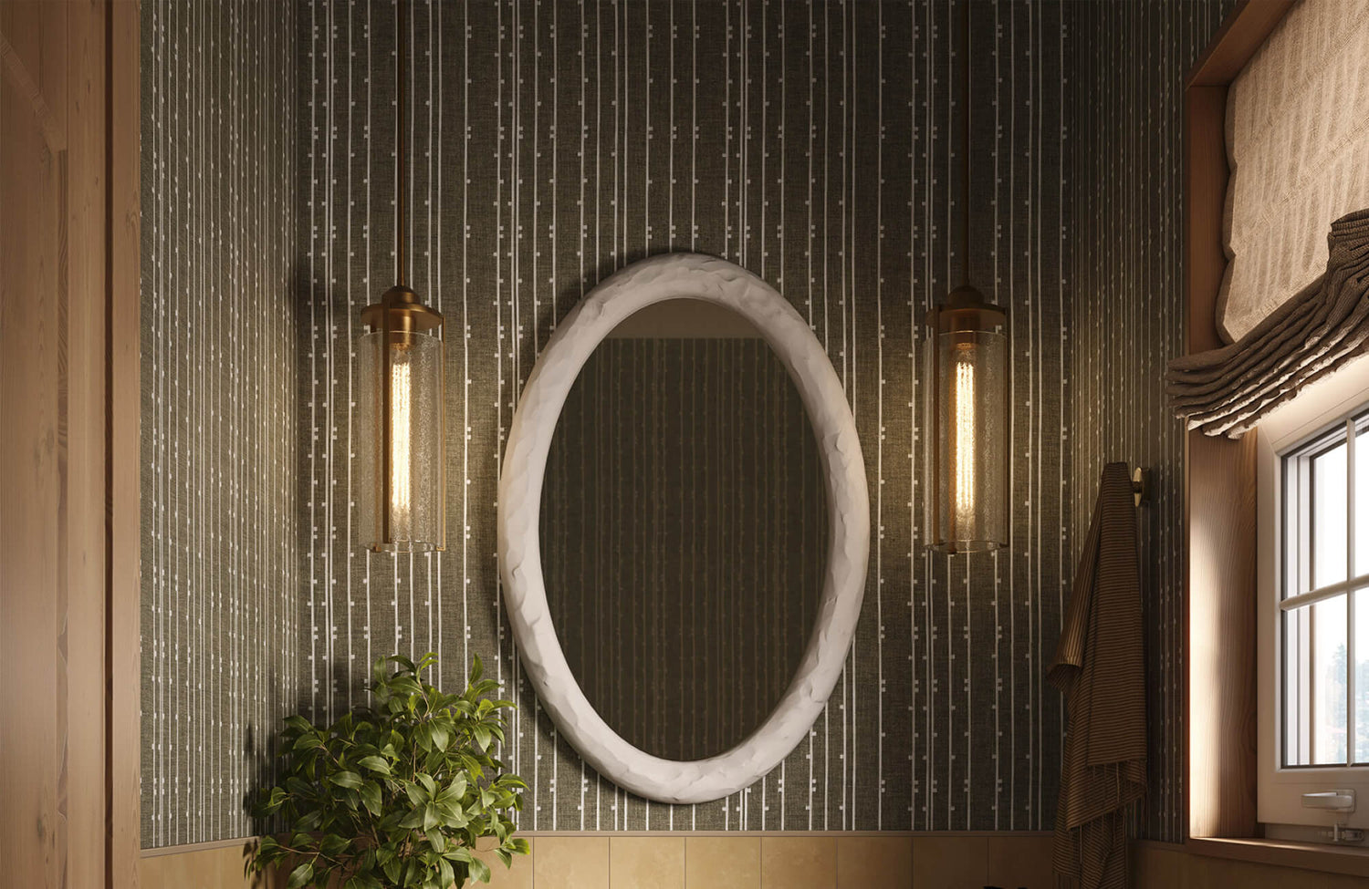
A more refined take on this concept can be seen with the Strafford Wallpaper in Olive Night II, 52" x 132". Digitally printed on DreamScape Terralon, a PVC-free, eco-friendly wallcovering material known for its durability and low-emission composition, it introduces a richly layered pattern in deep olive green tones. Rather than relying on bold contrast, its subtle, nature-inspired texture creates dimension through tonal variation, allowing the walls to feel both grounded and visually engaging. This makes it especially effective in quieter spaces like bathrooms, as seen above, or dressing areas, where a calm yet sophisticated atmosphere is desired. Paired with warm lighting and natural finishes, this type of wallpaper enhances the sense of depth while maintaining a cohesive, organic look that aligns beautifully with eco-conscious design principles.

Pattern Styles to Match Interior Design Themes
Wallpaper should enhance the overall style of your space rather than compete with it. When the pattern aligns with the character of your room, everything feels more cohesive and intentional.
Biophilic Design for a Natural Connection - H3
Nature-inspired patterns bring an immediate sense of calm and balance into your space. When you introduce botanical prints, leafy motifs, or organic textures, the room begins to feel softer and more grounded. This connection to nature can be especially refreshing in interiors that rely heavily on clean lines and modern materials.
In more minimal spaces, these patterns act as a counterbalance to sharp edges and smooth surfaces. The addition of natural elements introduces warmth without overwhelming the design, allowing the room to feel both refined and inviting. As your eyes move across these organic shapes, the space naturally feels more relaxed and less rigid. This subtle connection to nature can also change how you experience your space. The room becomes a place where you can unwind more easily, making it particularly effective in areas where you spend long periods, such as living rooms or bedrooms.
Edward Martin’s Bower Wallpaper in Taupe I, 52" x 132", is a beautiful expression of this idea, which features an elegant botanical pattern in warm taupe and off-white tones. Its flowing design brings a gentle sense of movement to the space while maintaining a refined and understated look. In a bathroom setting like above, the organic motif softens the clean lines of the vanity and architectural details, creating a harmonious balance between structure and nature. The muted color palette also allows the wallpaper to feel calming and versatile, making it an ideal choice for spaces where comfort and visual cohesion are equally important.
Period Appropriate Patterns for Character
When your space has a distinct architectural style, choosing wallpaper that reflects that character helps create a more unified look. Patterns inspired by specific time periods can reinforce the identity of the space, making it feel more authentic and thoughtfully designed.
For instance, intricate and detailed patterns often complement traditional or older interiors, adding depth and historical charm. In contrast, bold, abstract, or geometric designs tend to work better in modern spaces, where simplicity and clean lines define the overall aesthetic. When the wallpaper echoes the architectural language of the room, the result feels balanced rather than forced.
By aligning your wallpaper choice with the existing style of your space, you also create a sense of continuity that ties everything together. This thoughtful approach ensures that the design feels timeless, allowing your space to evolve gracefully without appearing mismatched or trend-driven.

Testing Samples Before Making a Final Decision
Seeing wallpaper online can give you an idea, but it rarely tells the full story. Testing samples in your own space allows you to experience how the design truly looks and feels in real conditions.
Full Day Light Evaluation
Lighting changes constantly throughout the day, and each shift can alter how a wallpaper appears. In the morning, natural light may highlight subtle undertones, while midday brightness can intensify colors. By evening, artificial lighting often softens or deepens the overall look. Because of these variations, a wallpaper that seems perfect at one moment may feel completely different a few hours later.
When you place a sample directly on your wall, you begin to see how it responds to these changes in real time. As your eyes adjust to the evolving light, you gain a clearer understanding of whether the color remains balanced or becomes too dull, too bright, or too heavy. This process helps you avoid unexpected results after installation, when changes are far more difficult to correct.
.
Verifying Texture and Material Compatibility
Beyond color, texture plays a crucial role in how wallpaper interacts with the rest of your space. A design may look appealing on its own, but if it clashes with your existing materials, the room can feel disconnected. This is why it is important to evaluate how the wallpaper works alongside your furniture, flooring, and fabrics.
When you compare a sample against these elements, you start to notice how surfaces relate to one another. A richly textured wallpaper, for instance, may enhance soft furnishings and layered textiles, while a smooth or matte finish might better suit a clean, minimal setting. These subtle interactions influence whether the space feels cohesive or visually fragmented. Taking the time to assess texture in context also allows you to refine your decision. As everything begins to align, the room feels more unified, and the wallpaper becomes a natural extension of the overall design rather than a separate feature.

Planning Installation and Long-Term Flexibility
Choosing wallpaper is not just about how it looks today, but also how it will function over time. By thinking ahead about installation and future changes, you can select an option that fits both your lifestyle and your long-term plans.
Choosing Between Peel and Stick and Traditional Wallpaper
Different types of wallpaper offer varying levels of commitment, and your choice should reflect how permanent you want the design to be. Peel-and-stick wallpaper is often appealing because it is easy to install and remove, which makes it ideal if you like to refresh your space regularly or prefer a low-risk option. As you apply it, you can reposition it easily, allowing for quick adjustments without the stress of making a mistake.
In contrast, traditional wallpaper tends to deliver a more refined and long-lasting finish. Although the installation process requires more effort and precision, the result often appears smoother and more seamless. This durability can make a noticeable difference, especially in spaces where you want a consistent and polished look.
Pattern Matching and Extra Material
Wallpaper installation often involves more planning than it initially seems, particularly when patterns need to align perfectly. As you work across a wall, repeating designs must match from strip to strip, which can lead to excess material being trimmed away. Without proper planning, this can result in running short before the project is complete.
To avoid this issue, it is important to account for additional material from the beginning. Ordering extra wallpaper allows you to maintain consistency throughout the installation, especially since slight variations can occur between different production batches. This small precaution also helps prevent visible differences that could disrupt the overall look. With the right preparation, the installation process becomes much smoother and less stressful. More importantly, you achieve a clean, cohesive finish where the pattern flows seamlessly across the walls, reinforcing the overall design of your space.
Bringing Your Wallpaper Vision to Life
Finding the perfect wallpaper comes down to making thoughtful choices that align with your space, your lifestyle, and your personal style. When you consider the room’s scale, lighting conditions, material durability, and overall design direction, the decision becomes much clearer and more intentional. As a result, the wallpaper you choose does more than decorate your walls; it enhances the atmosphere, supports how you use the space, and brings everything together in a way that feels both natural and complete.
To bring those ideas into reality, having the right support can make all the difference. Whether you need guidance on selecting the most suitable materials, help visualizing how a design will work in your space, or assistance with placing an order, connecting with a knowledgeable team ensures a smoother process from start to finish. Reaching out also allows you to get personalized recommendations and expert insight tailored to your project, helping you move forward with confidence and achieve a result that truly reflects your vision.

