


Subway tile may be simple in shape, but the color you choose can completely shift the character of a kitchen. A crisp white backsplash can make the space feel brighter and more open, while deeper shades like navy, black, or charcoal add contrast and depth. Softer tones such as beige, sage, or light grey create a calmer backdrop that works beautifully with natural materials and warm lighting. Because the backsplash often sits at eye level, its color quietly influences the entire room. In this blog, we’ll walk through subway tile colors that work best for different kitchen styles and how to choose one that truly fits your space.

Choosing Subway Tile Colors That Match Your Kitchen Style
Before settling on a subway tile color, it helps to take a step back and look at the overall character of your kitchen. Every kitchen style carries its own visual rhythm, and the right tile color should support that atmosphere rather than compete with it. Once the tile palette aligns with the cabinetry, finishes, and overall design direction, the space starts to feel cohesive and thoughtfully composed.
Traditional Kitchens
Traditional kitchens often feel warm, layered, and welcoming. Rich materials, detailed cabinetry, and classic finishes create a setting where subway tiles can quietly reinforce that timeless character. The right color choice should blend naturally with those elements while still adding subtle depth to the backsplash.
Brown Subway Tiles
Brown subway tiles bring a sense of warmth that fits beautifully within traditional kitchens. Their earthy tones complement carved wood cabinetry, natural stone countertops, and other classic materials often found in these spaces. Instead of drawing a sharp contrast, they tend to deepen the color palette and create a layered look that feels grounded. Edward Martin’s Mara 2x10 Glossy Ceramic Tile in Cinnamon, for example, carries a soft reflective sheen that adds quiet elegance without overwhelming the surrounding finishes. When paired with warm lighting and natural textures, brown subway tiles help the entire kitchen feel richer and more inviting.
Soft Blue Subway Tiles
Soft blue subway tiles introduce a gentle contrast that can brighten traditional kitchens without disrupting their warmth. The cool tone naturally balances darker wood cabinetry, preventing the space from feeling too heavy or enclosed. Because the color remains muted, it works well alongside brass fixtures, glass-front cabinets, and decorative shelving. A backsplash in this shade often acts as a calm visual layer behind the rest of the kitchen’s details. The overall effect feels airy and balanced while still respecting the classic style of the space.
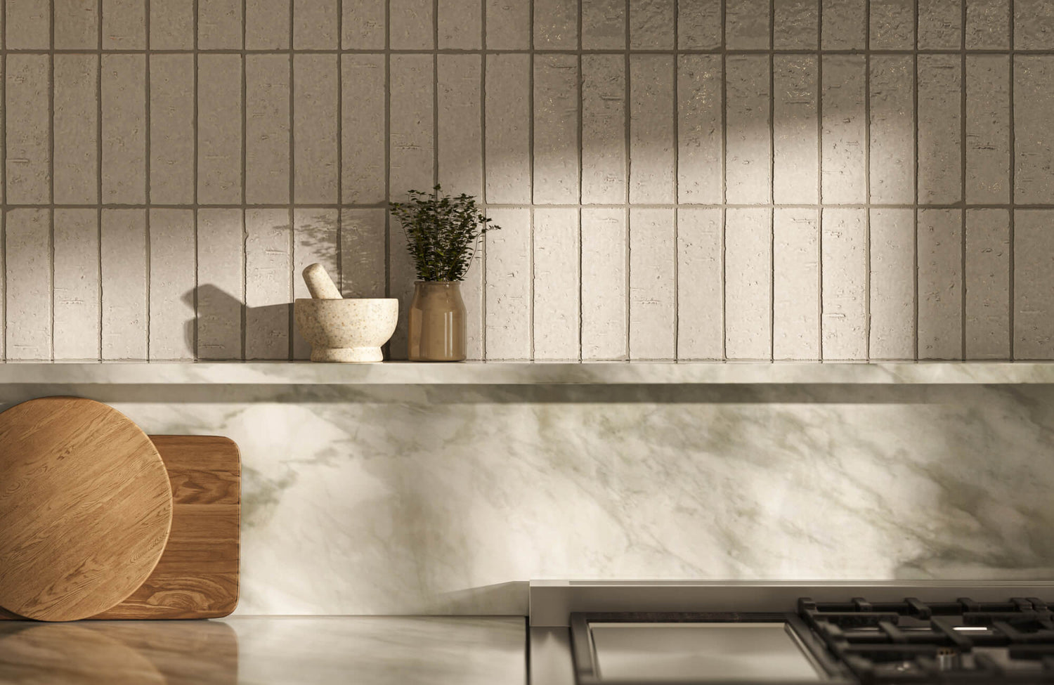
Beige Subway Tiles
Beige subway tiles offer a neutral bridge between different textures in a traditional kitchen. Their warm undertone pairs comfortably with materials like granite countertops, wood cabinetry, and natural stone flooring. Rather than standing out dramatically, they quietly unify these elements into a cohesive palette. Pattern choices such as herringbone or stacked layouts can add subtle visual movement without making the backsplash feel busy. This approach keeps the design grounded while still adding enough texture to maintain visual interest.
Cream Subway Tiles
Cream subway tiles, such as our Graham 3x6 Glossy Ceramic Tile in Bone above, brighten a traditional kitchen while preserving its soft, welcoming character. The color sits comfortably between white and beige, which allows it to lighten the space without feeling stark. It works particularly well with lighter wood tones such as maple or oak, where it highlights the natural grain of the cabinetry. Cream tiles can also frame decorative features like beveled edges or backsplash niches, allowing those details to stand out. The result is a backsplash that feels refined while still maintaining the warmth traditional kitchens are known for.
Modern Kitchens
Modern kitchens tend to lean toward cleaner lines, sharper contrasts, and bold material combinations. Subway tiles can still play a role here, but color choices often become more dramatic or graphic. When selected carefully, these shades introduce personality while still supporting the streamlined character of a modern kitchen.
Black Subway Tiles
Black subway tiles immediately add contrast and visual depth to a modern kitchen. Their dark surface creates a striking backdrop for lighter countertops, metallic fixtures, or minimalist cabinetry. In glossy finishes, they also reflect light in subtle ways that prevent the space from feeling too heavy. When paired with white or marble surfaces, the contrast can feel especially crisp and architectural. Even within a simple layout, black subway tiles help establish a strong visual anchor.
Dark Grey Subway Tiles
Dark grey subway tiles provide a sophisticated alternative for homeowners who want depth without the intensity of black. The tone feels contemporary but slightly softer, which allows it to blend easily with materials like concrete, brushed metal, or natural wood. Because grey sits comfortably between warm and cool palettes, it offers more flexibility when coordinating finishes. A dark grey backsplash can ground the design while still maintaining a calm visual balance. This makes it a reliable option for kitchens that mix modern textures and tones.
Orange Subway Tiles
Orange subway tiles introduce warmth and energy, making them a bold choice for modern kitchens that embrace personality. Muted versions such as terracotta often feel especially natural, pairing well with neutral cabinetry or stainless steel appliances. Instead of overwhelming the space, these tones bring a subtle vibrancy that keeps the kitchen feeling lively. In open-concept homes, an orange-toned backsplash can also help define the cooking area without adding physical barriers. The color becomes both a focal point and a warm design accent.
Minimalist Kitchens
Minimalist kitchens prioritize calm, clarity, and visual breathing room. Instead of bold contrast, the design often leans on soft colors and clean surfaces to maintain a quiet atmosphere. Subway tiles work beautifully in this setting when the palette stays restrained, and the layout remains simple.
White Subway Tiles
White subway tiles remain one of the most recognizable choices for minimalist kitchens. Their clean surface reflects light, which helps smaller kitchens feel more open and spacious. A matte finish can soften the look, while layouts such as vertical stacking or offset patterns add subtle variation. Because the color stays neutral, it allows cabinetry, fixtures, and countertops to take center stage. White subway tiles often act as a quiet backdrop that keeps the entire kitchen feeling fresh and uncluttered.
Light Grey Subway Tiles
Light grey subway tiles introduce a gentle contrast without disturbing the calm tone of a minimalist kitchen. The shade softens the brightness of pure white while still maintaining a clean, modern appearance. Paired with brushed metal fixtures or natural wood accents, the color feels balanced and understated. It works especially well behind open shelving, where it provides just enough depth to frame displayed objects. The backsplash stays visually interesting while still preserving the simplicity of the space.
Green Subway Tiles
Muted greens such as sage or olive bring a subtle organic touch to minimalist kitchens. These tones connect naturally with materials like wood, stone, and linen, which often appear in minimalist interiors. Rather than acting as a bold accent, green tiles tend to introduce calm depth and a sense of softness. A backsplash in this palette can also help bridge indoor and outdoor elements, especially in kitchens with natural light or garden views. The color quietly enriches the space while maintaining its serene atmosphere.

Color Psychology in Kitchen Design
Color does more than decorate a kitchen. It quietly shapes how the space feels when you walk into it, how light moves through it, and even how comfortable it feels to spend time there. The right subway tile color can make a kitchen feel brighter, calmer, warmer, or more energetic, depending on how it interacts with cabinetry, lighting, and surrounding materials. When color choices are made with intention, the backsplash becomes part of the atmosphere that defines the room.
How Colors Influence Mood and Energy
Different colors naturally create different emotional responses, which is why they can influence how a kitchen feels throughout the day. Warm tones such as red, terracotta, or soft orange tend to introduce energy and warmth, making them appealing for kitchens that function as lively gathering spaces. Cooler tones like blue or green move in the opposite direction, often creating a calmer and more relaxed atmosphere that feels refreshing in busy households. Neutral colors such as white, beige, and grey offer balance, allowing other design elements to stand out while keeping the space visually open. Darker shades like black can add sophistication and visual depth when used thoughtfully. For instance, our Jaden 2.5x16 Glossy Ceramic Tile in Ink above demonstrates how a dark subway tile can bring dimension and elegance while still feeling polished and modern.
Using Color to Shape the Perception of Space
Subway tile color can also influence how large or compact a kitchen feels. Lighter tones such as white, cream, or soft grey tend to reflect more light, which helps smaller kitchens feel brighter and more spacious. In contrast, deeper shades like navy, charcoal, or forest green can add depth and make larger kitchens feel more grounded and intimate. Accent colors can also help guide the eye toward important areas of the room, such as the backsplash behind the range or the surface of a kitchen island. When used thoughtfully, these color choices create visual structure without making the space feel crowded. The goal is to balance brightness, contrast, and warmth so the kitchen feels comfortable and visually cohesive.
Balancing Personal Preference With Practical Needs
While color theory offers helpful guidance, personal preference often plays the biggest role in the final decision. A shade that feels calming to one homeowner may feel too subdued to someone else, which is why it helps to see tile colors in your own environment before committing. Testing samples on the wall allows you to observe how the color shifts throughout the day as natural and artificial lighting change. Practical factors matter as well, especially in kitchens that see frequent cooking and daily activity. Darker tones can help conceal small splashes or marks, while lighter shades highlight cleanliness and openness. When both personal taste and practical needs are considered together, the chosen subway tile color tends to feel much more satisfying over time.

Creating a Focal Point
A focal point helps give a kitchen visual structure, guiding the eye to a feature that feels intentional and well-designed. Subway tiles make this easy because their color, finish, and layout can highlight specific areas without overwhelming the space. When used thoughtfully, they can turn a wall, backsplash, or island into a natural centerpiece.
Accent Walls as a Bold Statement
An accent wall is one of the most effective ways to introduce a focal point in the kitchen. Instead of blending into the background, a bold subway tile color or distinctive layout immediately draws attention. Deeper shades like navy, emerald, or charcoal can create contrast against lighter cabinetry, helping the wall stand out while still feeling balanced. Softer tones work just as well when paired with interesting layouts or finishes that add movement to the surface. Even subtle variations in texture or sheen can bring depth to the wall without making the design feel busy.
The image above features our Julianna 4x12 Polished Ceramic Tile in Carrara, used behind brass shelving to create a refined focal point. Its white base and gentle gray veining bring a marble-inspired look while keeping the space bright and elegant. The glossy surface reflects light across the wall, helping the kitchen feel open and polished. Paired with warm metallic accents, the tile quietly supports the overall design without overwhelming it.
Backsplashes for Big Impact in Small Spaces
In smaller kitchens, the backsplash often becomes the most visible surface, making it a perfect place to introduce a focal point. A subway tile layout, such as herringbone or vertical stacking, can add movement while still keeping the design clean. Bold colors like navy or emerald create contrast against light countertops, helping the backsplash stand out without overwhelming the room. For a softer approach, marble-look or textured white tiles add depth while maintaining brightness. Grout color can also influence the final look, with darker grout highlighting the tile pattern and lighter grout keeping the wall more seamless. When balanced well, the backsplash can give a small kitchen a strong sense of design without making the space feel crowded.
Kitchen Islands as a Standalone Statement
Kitchen islands naturally draw attention, which makes them an ideal place to introduce subway tile in a more creative way. Tiling the island base adds visual weight and helps anchor the overall kitchen layout. Deep blue or charcoal tiles can create a striking contrast when paired with lighter countertops. Warmer tones such as terracotta bring a more relaxed and inviting character, especially alongside wood cabinetry and brass accents. Mixing two complementary tones can also add subtle depth without making the island feel overly decorative. When treated thoughtfully, the island becomes more than a functional surface and starts to feel like the centerpiece of the kitchen.

Keeping Subway Tiles Looking Their Best
Subway tiles are known for their durability, but a little routine care goes a long way in keeping them looking clean and polished over time. With the right materials and simple maintenance habits, your kitchen backsplash can stay fresh and functional for years.
Choosing Durable Materials for Busy Kitchens
Ceramic and porcelain subway tiles are especially well-suited for kitchens because they resist moisture, stains, and everyday wear. Their non-porous surfaces make them easier to maintain compared to more absorbent materials. Porcelain tiles, in particular, are known for their density and strength, which helps reduce the risk of chips or surface damage. Many glazed options also include protective finishes that help guard against scratches and minor spills. Because of this durability, subway tiles remain a practical and reliable choice for busy cooking spaces.
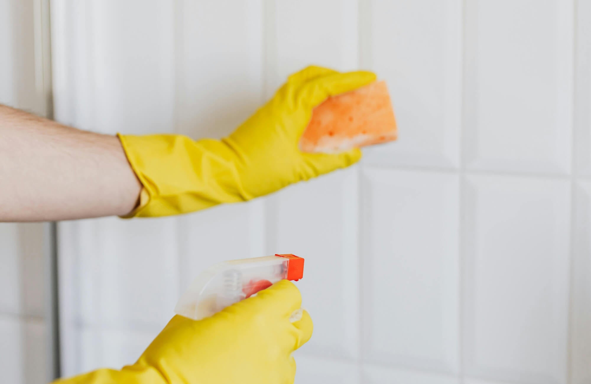
Simple Cleaning for Everyday Care
Regular cleaning helps subway tiles maintain their clean, polished appearance. In most kitchens, warm water and mild dish soap paired with a soft cloth or sponge are enough to remove grease or residue. This gentle approach keeps the surface looking fresh without risking scratches or dulling the finish. It also helps to wipe the backsplash occasionally after cooking to prevent buildup from oils or food splashes. Avoiding harsh chemicals or abrasive scrubbers is important, since they can weaken grout or damage the tile’s surface over time.
Maintaining Grout for a Fresh Finish
Grout plays a big role in how clean and defined a subway tile backsplash appears. Over time, grout lines may collect residue or discolor slightly, especially in cooking areas. Using a specialized grout cleaner can help restore its original brightness and keep the tile pattern looking crisp. Applying a high-quality penetrating sealer also adds protection by reducing how easily stains or moisture can settle into the grout. With occasional upkeep, grout lines remain neat and help the entire backsplash maintain a polished look.
Subway Tile Colors that Reflect Your Style
Finding the right subway tile color often comes down to how you want your kitchen to feel day to day. Lighter shades such as white or cream can keep the space bright and open, while deeper tones like navy or black introduce contrast and visual depth. Softer neutrals such as grey create a balanced backdrop, and natural colors like green can bring a calm, grounded character to the room. When the tile color works in harmony with cabinetry, lighting, and countertops, the kitchen begins to feel more cohesive and thoughtfully designed.
If you’re still deciding which direction fits your space best, getting a second perspective can make the process much easier. Our personalized design consultation offers guidance tailored to your kitchen layout, style preferences, and overall design goals. With expert insight, you can explore color options more confidently and create a subway tile look that feels intentional, balanced, and perfectly suited to your home.