


When you ask about the best color for a light fixture, you are really asking how your space should feel and function. The right choice can tie a room together, highlight its best features, and make everyday living more comfortable and visually balanced. Since light fixtures are both decorative and functional, their color has a lasting effect on how a space looks and performs. In this article, we’ll help you weigh style, mood, and day-to-day use so you can choose a finish that looks right and works well for your space.

The Role of Color in Lighting Fixtures
Fixture color sets the tone of a room and shapes how you and your guests perceive its height, furnishings, and overall lighting. It also influences mood, defines whether a space feels open or grounded, and affects how light reflects throughout the room, helping you make a confident and informed choice.
Color and Mood
Color is the first cue that sets the tone of a room, even before the light is turned on. Warm metallics can create a sense of welcome and encourage conversation, while a crisp matte black feels focused and contemporary. For a calmer backdrop, especially in spaces meant for reading or working, cooler silvers can keep the eye at ease. To put this into practice, start by defining the mood you want the room to convey, then test two finishes side by side under your own lighting, once in the evening and again in the morning, to see which one consistently supports that atmosphere.
Perception of Space
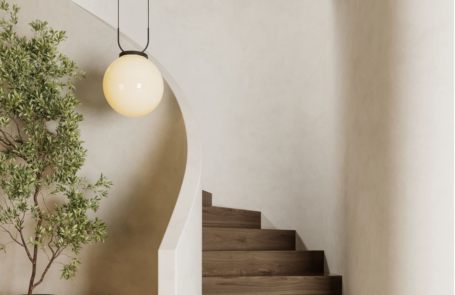
Fixture color does more than add style; it can further influence how spacious or intimate a room feels. Lighter finishes reflect ambient light, making ceilings appear higher and giving compact rooms or areas with low soffits a more open feel. In contrast, darker finishes ground a space, drawing the eye inward and adding structure, which works especially well in large or open layouts. Rooms with ceilings under eight feet may benefit from lighter or mid-tone fixtures, while taller ceilings often look more balanced and proportional with deeper tones that can also add a stronger sense of presence.
Fixture Color and Light Reflection
The finish of a fixture plays a direct role in how light interacts with the room. Polished metals reflect light outward to brighten a space, while matte or satin finishes absorb more light and create a softer effect that helps reduce glare. When a room calls for extra brightness, a reflective finish paired with a white or light shade interior can also help amplify the glow. On the other hand, if you want a calmer, more diffused pool of light, a matte finish with a neutral or parchment interior can spread illumination evenly across the space.

Coordinating with Room Design Elements
After mood and light, the next step is selecting a color that complements the room’s existing features. It should complement nearby finishes and create balance across walls, ceilings, floors, and hardware without simply matching them.
Matching Hardware and Fixtures
A good place to start is by looking at the metal accents already present in the room. Cabinet pulls, faucets, door levers, and even appliance trims provide clear direction for your choice. For a clean, unified look, you might echo one dominant metal in the fixture itself. If your space includes mixed metals, repeating each tone at least twice creates balance, while allowing the fixture to bridge them with a complementary finish and ensuring the design feels cohesive and intentional.
A great example is Edward Martin’s Lainey Wall Sconce in Burnt Brass, as displayed in the photo above, which reflects the same warm tones found in the faucets, mirror frames, and cabinet hardware, creating a cohesive and intentional design.
Complementing Wall and Ceiling Colors
A fixture should sit comfortably against the surfaces that frame it. Light walls can benefit from a fixture with mid-tone or dark contrast so the silhouette reads clearly. Dark walls often look best with a lighter or warmer metal that catches light and prevents the fixture from disappearing. If you have a colored ceiling, treat the fixture like jewelry against a fabric. Aim for contrast that still respects undertones, for example, pairing a cool nickel with a cool white ceiling, or a warm brass with a cream ceiling, to keep the look harmonious.
Balancing Flooring and Furniture
Floors and large furniture anchor a room, so fixture color should work in harmony with these elements. When wood tones dominate, choosing a finish that echoes a shade in the grain creates a natural connection; walnut often pairs well with aged brass, while pale oak feels balanced with soft nickel. If a rug or upholstery introduces strong colors, a neutral metal like black, bronze, or chrome can also steady the composition. To be sure, test a sample card or small piece near the main seating area and step back to see if the fixture color supports the room’s largest features rather than competing with them.

Considering Room Function and Purpose
While design sets the tone, function determines what works each day. Every room has different needs, whether it’s tasks, humidity, or upkeep, so choosing a fixture color that suits the purpose ensures it serves you well.
Kitchens and Dining Areas
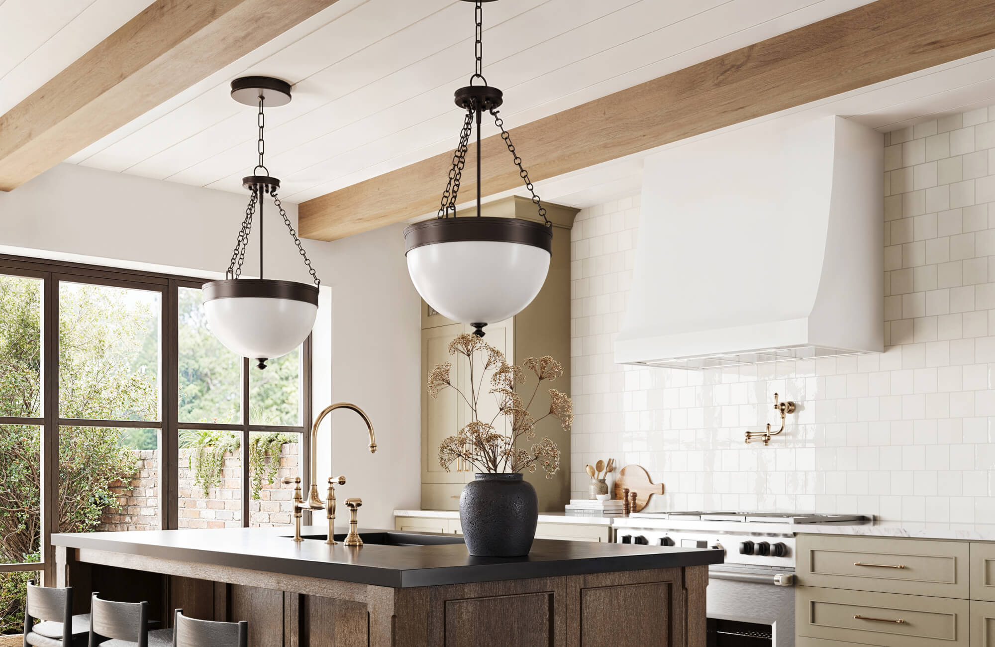
Kitchens and dining spaces benefit from finishes that offer both clarity and practicality. Chrome and polished stainless steel are excellent choices for prep zones because they can brighten the workspace and clean with ease. For dining areas, brushed brass introduces warmth without producing glare, creating a more inviting atmosphere. Over an island, opting for a darker metal can also help define pendant shapes while minimizing reflection on glossy countertops. In addition, if your backsplash includes warm veining, a muted brass finish ties the elements together, keeping the space visually unified from cooking to cleanup.
A great example is Edward Martin’s Carly 22" Pendant in Vintage Brass, as shown in the photo above, which demonstrates how fixture color can enhance both function and atmosphere in a kitchen by adding warmth over the island while coordinating with the wood cabinetry and backsplash tones.
Living Rooms and Bedrooms
When it comes to living rooms and bedrooms, comfort is the guiding principle. Finishes like brushed nickel, soft bronze, or muted gold work well here, as they can frame seating areas or headboards with a calm and balanced presence. These tones feel refined in both natural daylight and softer evening light, blending into the background rather than overwhelming the room. For those who prefer a stronger statement, a deep black fixture can also create a striking outline above a coffee table, yet still recede gracefully once lamps and sconces take over in the evening.
Bathrooms and Utility Spaces
In bathrooms and utility areas, humidity, mirrors, and limited space all play a role in choosing the right finish. Lighter, reflective metals are especially effective, as they can bounce light around the mirror and reduce shadows when grooming or applying makeup. In laundry rooms and mudrooms, powder-coated finishes in lighter tones are another practical choice since they can resist fingerprints and make upkeep easier. For tile and stone, polished chrome suits cool tones with a clean look, while soft brass further complements warm stone without adding a yellow tint.

Fixture Color Trends and Timeless Choices
Trends can inspire fresh ideas, while timeless finishes ensure your choices remain relevant for years to come. Understanding the difference helps you decide where it makes sense to embrace a bold, current look and where to rely on finishes that stand the test of time.
Current Popular Finishes
Today, matte black is a favorite for its ability to create crisp contrast against lighter surfaces while highlighting architectural details. Another growing trend is the use of mixed metals within the same fixture, which helps tie together different accents in a single, cohesive way. Natural textures such as hand-rubbed bronze or patinated brass also bring depth and richness, especially when paired with organic materials like linen, clay, or light wood tones. For those who want to experiment without overcommitting, a fashionable finish also works best on secondary fixtures, while keeping primary pieces in timeless options ensures long-term appeal.
Timeless Metallics
Some finishes remain popular because they adapt effortlessly to changing styles. Polished chrome, for instance, stays clear and neutral, making it as fitting in a classic bathroom as in a minimal kitchen. Aged brass develops a mellow character over time, blending well with both traditional trim and modern cabinetry. Oil-rubbed bronze, on the other hand, offers subtle warmth that pairs beautifully with earth-toned interiors. When you want a finish that can transition smoothly through future paint or furniture updates, these metals can also provide a dependable and versatile choice.
A great example is Edward Martin’s Jodie Wall Sconce in Antique Brass Iron, as shown in the photo above, demonstrating how a timeless brass finish complements dark cabinetry, light walls, and natural stone with ease.
Balancing Trend with Longevity
A thoughtful approach blends both trend and tradition. Timeless finishes work best for fixtures that are difficult to replace, like a statement chandelier or recessed trims, while on-trend colors can be reserved for pendants or lamps that are easier to update. By reassessing the room after a year, you can decide whether to reinforce the trend with new accents or shift back toward a neutral metal. This balance further keeps the space feeling current while preserving the investment in pieces that require more effort to change.

Impact of Fixture Color on Lighting and Ambiance
Color is noticeable even when a fixture is off, but once the light shines, the finish greatly shapes the atmosphere of a room. Fixture color further affects reflection, contrast, and the perceived warmth or coolness of light, allowing you to achieve a space that feels intentional and balanced at any time of day.
Reflectivity and Glow
Shiny metals act like small mirrors, bouncing light across the room and boosting overall brightness in spaces such as hallways, kitchens, and work areas. In contrast, satin and matte finishes diffuse light into a softer, more focused band, which works well over a dining table or beside a nightstand. When glare or hotspots become distracting, shifting to a less reflective finish paired with a white shade interior can also smooth the glow while still providing plenty of illumination.
Shadows and Contrast
Dark fixtures provide sharp outlines that highlight beams, arches, and cabinetry, adding definition where it’s needed most. This contrast is especially effective when walls and ceilings are tone in tone, as it helps the fixture stand out as a focal point. In spaces filled with reflective surfaces, a darker finish also reduces visual clutter by absorbing excess highlights. When a room feels flat or lacking in depth, introducing a deeper fixture color can further reestablish separation and bring the design back into balance.
A great example is Edward Martin’s Garner Wall Sconce in Soft Black, as shown in the photo above, which frames the mirror with clean lines and creates a striking contrast against the lighter wall, enhancing both depth and focus in the room.
Warmth vs Coolness
Although bulb temperature establishes the foundation, fixture color subtly shapes how that light is perceived. Warm metals can make a 3000 K lamp feel even cozier, while cool silvers help 4000 K lamps maintain a crisp and precise quality. For a more neutral effect, pairing understated metals with bulbs in the 2700 K to 3000 K range also works well, especially when avoiding colored shade interiors that could alter the tone. To ensure the right atmosphere, test the combination at night and confirm it creates the mood you need once natural daylight fades.

Practical Considerations Before Choosing a Fixture Color
A fixture’s color should be as practical as it is attractive. Before making a final decision, consider how easy it will be to maintain, how durable the finish is, and whether it fits your budget so it continues to look good and function well over time.
Cleaning and Upkeep
Different finishes reveal wear in other ways, which makes maintenance an equally important factor to consider. Glossy surfaces tend to show fingerprints and water spots quickly, something that may be acceptable in a powder room but less practical over a cooktop. Brushed and satin textures, on the other hand, conceal smudges and maintain a consistent appearance between cleanings. For fixtures that are frequently handled, satin or powder-coated finishes can also be the smarter choice, as they wipe clean easily with just a soft cloth.
A great example is Edward Martin’s Geraldine Wall Sconce in Old Bronze, as shown in the photo above, where the matte finish not only resists smudges but also provides an elegant, low-maintenance option for any bathroom setting.
Durability of Finishes
The way a finish is crafted plays a major role in how well it holds up over time. Solid brass with a living finish will naturally develop a patina, adding character as it ages, while high-quality plating over brass or zinc maintains a consistent tone for years. Powder-coated colors also provide better resistance to chipping than standard painted finishes, making them a smart choice for busy areas like entryways or children’s rooms. To make an informed decision, ask about the finish process and warranty so you know exactly how it will perform in your home.
Budget and Value
Fixture color can further affect the cost, as certain finishes involve more complex production. To get the best value, it often makes sense to invest more in permanent fixtures finished in classic metals, while saving on pieces that are easier to swap out in trendy colors. Before committing to a full set, check return policies and whether samples are available, then start with a single piece to see how it looks under your own lighting. Taking this step-by-step approach minimizes risk and also ensures your budget is spent wisely.
Making the Right Choice That Fits Your Space
Choosing the best color for a light fixture is about more than appearance; it’s also about how it supports the way you live. The right finish should set the mood, coordinate with surrounding materials, and serve the function of each room while being practical to care for over time. By testing options under your own lighting and considering how each finish suits your lifestyle, you can confidently make a decision. In the end, the best color is the one that not only elevates your design but also makes your space feel balanced and complete every day.
If you’re ready to explore the perfect fixture color for your home, contact us today. Our design team is here to guide you through the process and help you find a finish that fits your style and needs.