


When designing with large bathroom tiles, grout color plays a much bigger role than most people expect. Because these tiles cover more surface area with fewer lines, the grout becomes more visible and more influential in how the space feels overall. Whether you want a seamless spa-like look or bold contrast, the right grout can bring clarity, balance, or even drama to your design.
In this guide, we’ll explore how to choose a grout color that pairs beautifully with large bathroom tiles. From subtle tone-on-tone pairings to eye-catching contrasts, you'll find tips to help you match your grout to your style, space, and maintenance goals.

The Role of Grout in Large Tile Layouts
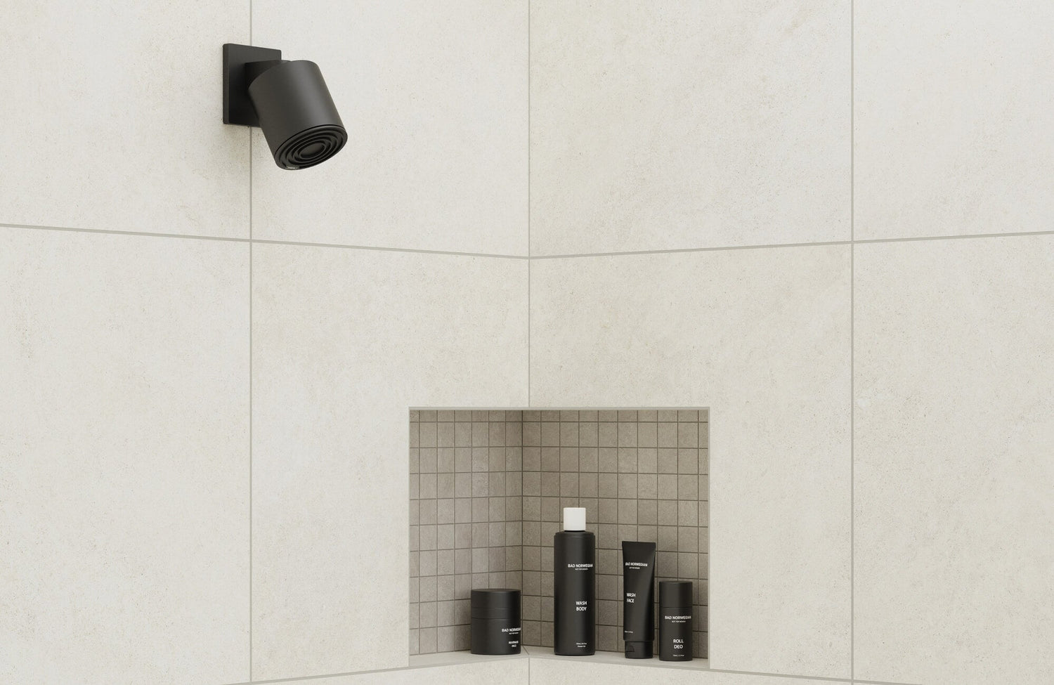
Grout might seem like a background detail, but with large-format bathroom tiles, such as our Pierce 12x24 Matte Porcelain Tile in Dune above, it plays a much bigger visual role. Because these tiles cover more surface area, there are fewer grout lines, so whatever color you choose becomes more pronounced in the overall design. Even a subtle shade shift can affect how seamless or structured the surface feels, especially in open or light-filled bathrooms.
This is also why grout becomes a key design tool rather than just a technical necessity. For instance, if your tiles are soft grey or stone-look, a mismatched grout color can unintentionally break up the space, while the right tone can tie everything together. Whether you’re aiming for continuity or contrast, your grout decision will shape how clean, bold, or balanced the final result looks.

Neutral Grout Shades for Seamless Designs
Neutral grout tones offer a timeless solution when you want your bathroom tiles to feel uninterrupted and refined. These shades blend closely with the tile color, helping large-format tiles look cohesive, expansive, and calm, perfect for minimalist or spa-style designs.
White on White
Pairing white grout with white tiles creates a clean, continuous surface that feels bright and airy. It works especially well in bathrooms where natural light plays a key role, amplifying that fresh and open feel. This combo is a staple for modern and Scandinavian-inspired spaces, where subtlety matters more than visual contrast. It's also a safe choice if you want the tile texture or finish to shine without the grout stealing attention.
However, white grout does require more maintenance to keep it looking crisp. It's prone to discoloration over time, especially in areas prone to moisture or frequent use. Sealing your grout and choosing a stain-resistant formula can help, but it’s worth considering how much upkeep you're comfortable with. If you love the white-on-white look but want a touch more forgiveness, try an off-white or light ivory grout as a softer alternative.
Grey on Grey
Grey grout with grey tiles gives off a sleek, unified look that works beautifully in contemporary or industrial bathrooms. It creates subtle shadow lines that define the tile edges without feeling too bold, especially with large-format matte or stone-look tiles. As seen above with our Dawson 12x24 Matte Porcelain Tile in Dune, this pairing enhances the soft veining and texture while keeping the space feeling grounded and cohesive. It’s also more forgiving than white grout when it comes to stains or everyday wear.
There are different tones of grey to consider, from cool silver to warm greige, so matching the undertone of your tile is key. For example, a mid-tone grout can bring out the depth in veined or marbled surfaces without calling too much attention to the grout lines. It’s a practical and versatile choice if you want a balance between low maintenance and polished design. When chosen well, grey-on-grey blends in without feeling flat.

Contrasting Grout for Visual Interest
If your goal is to add definition, rhythm, or drama to your bathroom tiles, contrasting grout can make a strong impact. Especially with large-format tiles, a darker or lighter grout helps frame each tile, turning your layout into a deliberate design element.
Light Tile with Dark Grout
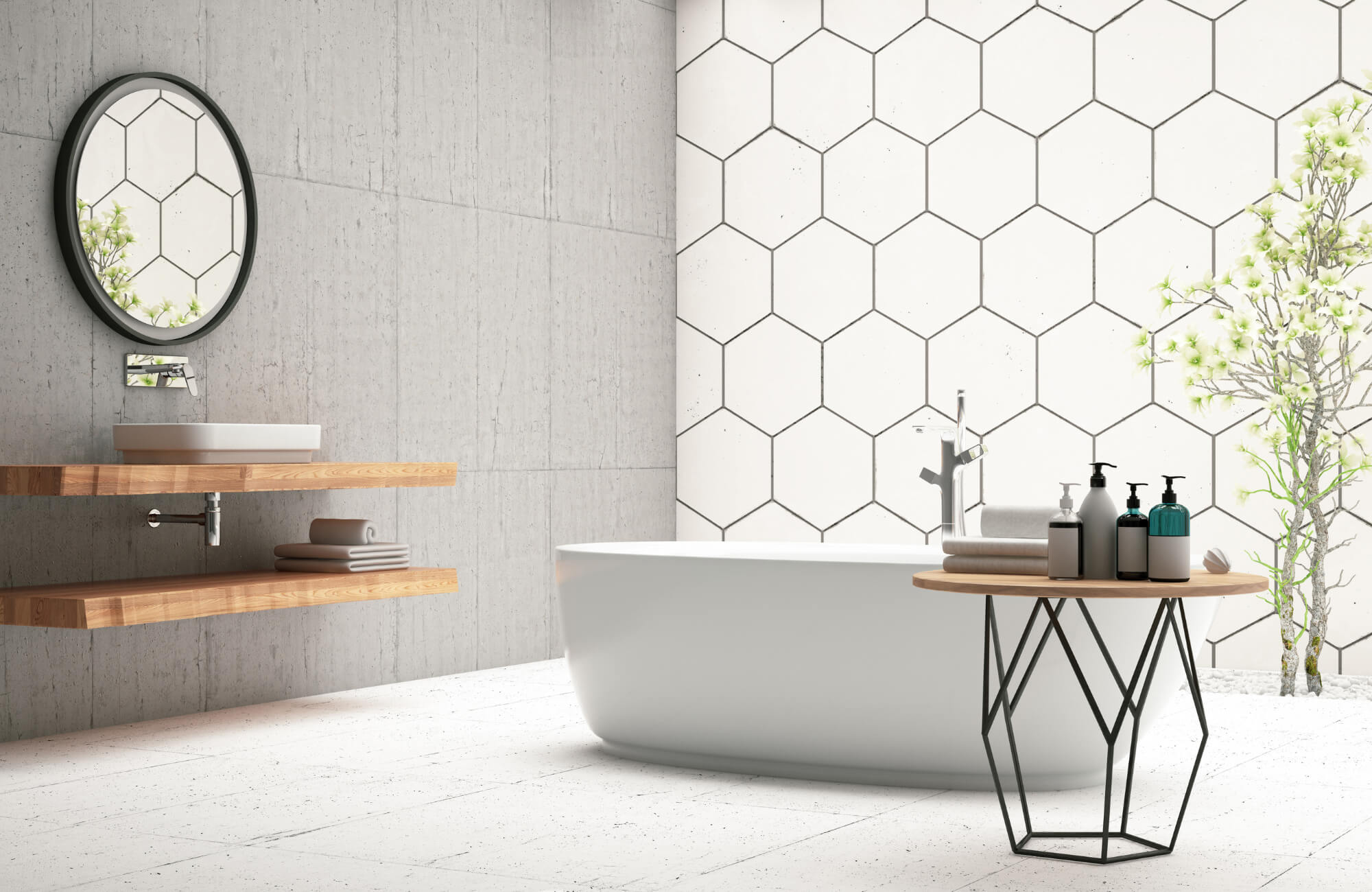
Using a dark grout with white or light tiles introduces boldness and structure to your space. It draws attention to the layout pattern, making the tile itself feel more graphic and defined. This combination is ideal for contemporary bathrooms with a bit of edge or architectural detail, like long linear tiles or staggered arrangements. It can also help ground larger walls and add visual texture without needing additional color.
That said, dark grout can sometimes fade or develop haze over time, especially if it’s not properly sealed. To maintain its sharp appearance, opt for a color-fast grout and wipe down regularly to prevent residue buildup. This pairing works especially well when balanced with matte black fixtures, warm wood accents, or geometric mirrors that echo the contrast theme. If you're after a bathroom that feels sharp and modern, this approach delivers that bold yet balanced look.
Dark Tile with Light Grout
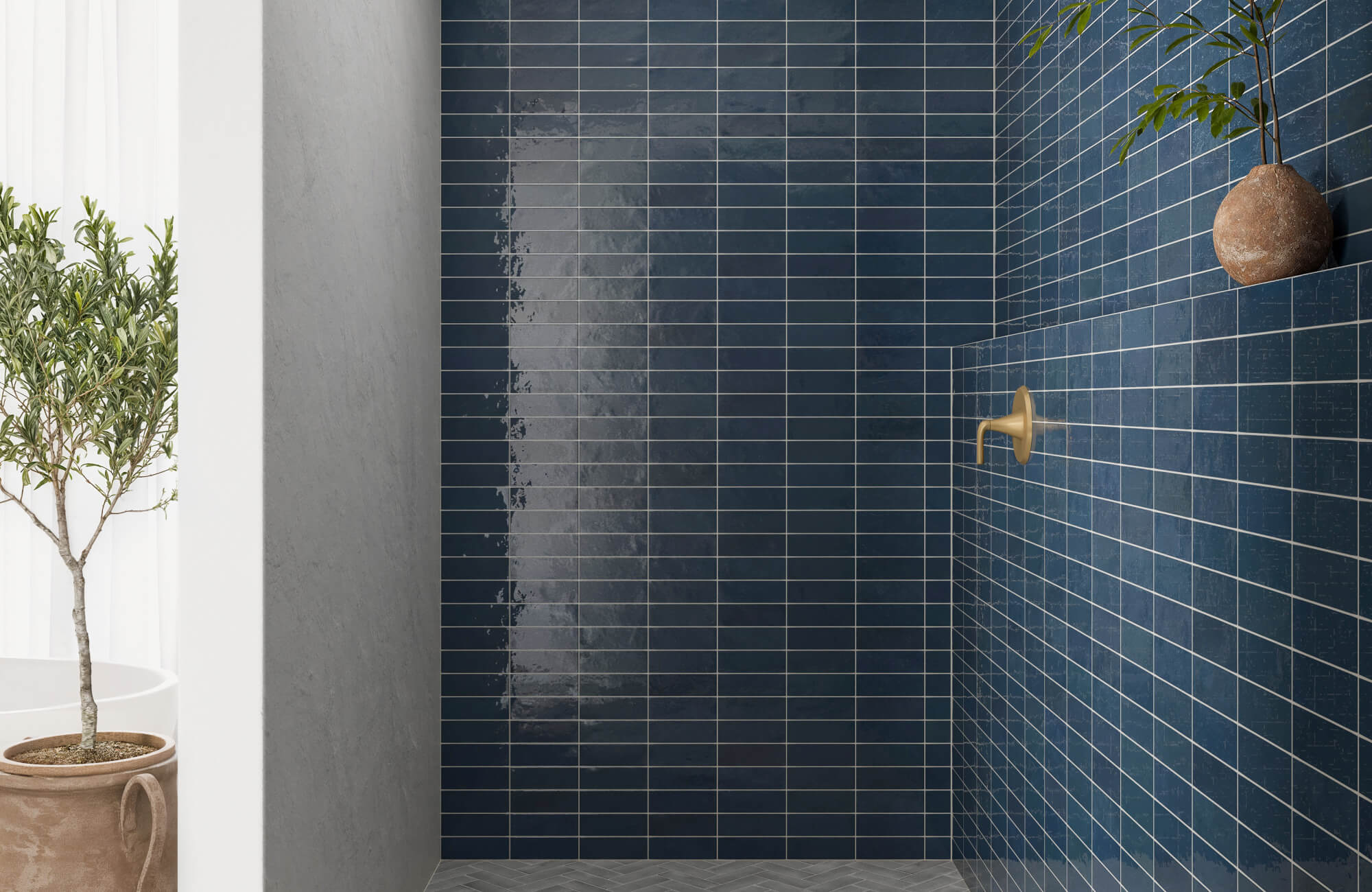
Inverting the contrast, light grout with dark tiles produces a similar sense of drama but with a slightly different energy. The grout lines pop against the tile surface, turning them into part of the design rather than blending away. As shown above with our Wren 24x48 Matte Porcelain Tile in Charcoal, this approach highlights the tile’s scale and texture while keeping the overall palette minimal and striking. It’s a strong visual tool if you want to emphasize structure and symmetry across your bathroom floor or feature wall.
This high-contrast pairing is popular in black-and-white bathroom schemes or bold blue tile setups where the goal is to make a statement. However, light grout can still require upkeep, particularly in areas that get a lot of water exposure. Choose a stain-resistant grout or consider sealing it to reduce visible buildup. When done right, this approach adds eye-catching depth to your tilework while still keeping the space cohesive and stylish.

Color Considerations Based on Tile Tone
When choosing grout for large bathroom tiles, your tile’s color is just as important as the layout. The right grout shade can either blend softly with the tile or provide just enough contrast to highlight its tone and texture. Below, we’ve outlined easy, go-to pairings that work well with common large tile colors.
White or Off-White Tiles
With white or off-white tiles, pairing them with soft grey or beige grout offers a clean, modern look without being too stark. These slightly warmer or cooler neutrals soften the transition between tiles, especially in larger layouts. This approach is ideal if you want to avoid the maintenance demands of pure white grout while still keeping things light. It also helps the tiles feel warm and inviting, particularly in spa-inspired or minimalist bathrooms.
Grey Tiles
Grey tiles are versatile, and your grout choice can subtly shift the room’s tone. A charcoal grout gives depth and contrast, making the tile layout more pronounced, while a light grey maintains a seamless, calming flow. This flexibility makes grey-on-grey combos great for modern and transitional spaces. Just match the undertones, cool with cool, warm with warm, for the most natural result.
Beige or Brown Tiles
With beige or brown tiles, grout colors like taupe, mocha, or soft sand bring out their warmth without overwhelming the palette. These combinations are perfect for bathrooms that lean earthy or rustic, offering a soft visual flow that feels grounded and natural. Matching grout tones also helps reduce visual noise, especially with large-format tiles. If you want a cozy, inviting space that still feels clean, this pairing is a safe bet.
Blue Tiles
Blue tiles pair beautifully with cool-toned greys or crisp whites, depending on the effect you want. A pale grey adds softness while keeping things cohesive, especially in ocean-inspired or coastal bathrooms. For a sharper contrast, white grout adds a pop that outlines the tile layout without overpowering the space. These pairings are especially effective in showers or feature walls where blue tile takes center stage.

Grout Color and Maintenance Impacts
Grout color doesn’t just influence style, it also plays a big role in how your bathroom looks over time. Light-colored grout, such as white or pale beige, can create a clean, seamless effect when paired with large tiles. But it also tends to show stains, soap residue, and mildew more easily, especially in moisture-prone areas like showers or near tubs. While it can make a space feel fresh, it requires more attention to keep it that way.
On the other hand, darker grout, like charcoal or mocha, can help mask everyday buildup and is often favored in busy bathrooms for that reason. However, these deeper hues can sometimes fade or develop a white haze over time due to hard water, harsh cleaners, or efflorescence. It's important to remember that while darker grout hides stains better, it may still require occasional touch-ups to maintain its depth of color. Choosing a mid-tone grout can sometimes strike a balance between visibility and upkeep.
Ultimately, the maintenance demands of your grout should align with how you use your space and how much upkeep you’re comfortable with. If your bathroom gets frequent use or lacks strong ventilation, it’s worth considering how visible stains or fading will affect the overall look. Setting realistic expectations from the start, based on grout tone, helps you keep your space looking polished without surprises. The right grout color isn’t just about aesthetics; it’s also about how it ages with your home.

Using Sample Boards and Lighting Tests
Grout color can appear very different depending on your lighting, especially in bathrooms where natural light, task lighting, and shadows all play a role. That’s why testing grout samples in your actual space is essential, not just relying on how it looked in a showroom. A warm beige might seem soft under store lights but could turn yellowish under your vanity lighting, while a cool grey may feel too stark once installed across a large wall.
To avoid these surprises, create a small sample board using your chosen tile and a few grout test patches. Place it in multiple spots around your bathroom, near the mirror, under the window, and beside your shower, to see how the combination shifts throughout the day. This hands-on method gives you the clearest view of how grout color interacts with your tile’s tone and finish.
You can also take advantage of our free 4" x 4" samples to test grout pairings more accurately, or use our augmented reality (AR) tool to digitally visualize tile combinations right on your bathroom wall. Both options help bridge the gap between idea and reality, making it easier to feel confident in your final decision. When you see your space come to life before committing, it’s much easier to choose the grout that truly works for you.

Making the Right Grout Choice for Your Bathroom
Grout color may seem like a small detail, but with large bathroom tiles, it plays a defining role in both style and upkeep. The right choice can either blend quietly into the background for a seamless effect or make each tile pop with clean, architectural contrast. From spa-like neutrals to bold, statement-making pairings, grout brings clarity and character to even the simplest design.
But just as important as the look is how that color performs over time. Think about how much maintenance you’re willing to take on and how grout visibility affects your day-to-day. With the right balance between tone, finish, and long-term care, you’ll not only enhance your tilework; you’ll enjoy a space that stays fresh, polished, and uniquely yours.