


When you bring a red Persian rug into a space, you are doing more than adding a floor covering. You are introducing history, pattern, and a strong sense of presence. Red can feel intimidating at first, but once you understand how color relationships work, a red Persian rug becomes far more adaptable than many expect. Rather than dominating a room, it can quietly anchor the space, allowing surrounding colors to support it and create balance.
The aim is not to match every element to the rug, but to build a palette that feels deliberate and cohesive. When approaching color choices with that perspective, the process feels clearer, more intuitive, and ultimately more rewarding.

The Role of Undertones in Red Persian Rugs
Before choosing surrounding colors, it helps to look closely at the red itself. Persian rugs rarely feature a single, uniform red, as their richness comes from layered undertones that shape how the rug responds to light and interacts with the rest of the room.
Identifying Warm vs. Cool Reds
Some red Persian rugs lean warmer, with gentle hints of brown or orange woven throughout the red tones. These tones feel grounded and natural, and they tend to pair effortlessly with warm wood finishes and soft cream or beige walls. Others read cooler, with deeper red shades that carry a touch of blue or purple. When you take the time to notice which direction your rug leans, selecting surrounding colors feels far more intuitive and results in a more cohesive overall palette.
Lighting also plays an important role in how red is perceived within a space. Natural daylight often highlights warmer notes, while evening light can deepen cooler tones. Taking time to observe the rug at different times of day helps ensure that paint and upholstery choices remain consistent and balanced in changing light.
Reading Secondary Colors in the Pattern
Persian rugs rarely rely on red alone. Woven into the design, you will often find accents of navy, soft blue, ivory, camel, or muted green. These secondary tones offer subtle guidance, helping surrounding color choices feel intentional rather than incidental. Even light repetition through artwork or soft furnishings can reinforce cohesion and bring the room together naturally.
Matching Undertones to Room Finishes
Undertones play an important role in finishes, not just in color selection. Warm red rugs tend to pair well with honey or walnut wood tones, aged brass, and natural stone surfaces, creating a sense of warmth and continuity. This relationship is clearly illustrated in the photo featured above, where Edward Martin’s Hutchinson Rug in Burgundy / Denim works seamlessly with warm wood furniture and softly reflective brass lighting. Cooler reds, by contrast, often feel more balanced alongside darker woods, brushed nickel, or blackened metal accents. When finishes align with the rug’s undertones, the space feels cohesive and visually calm rather than unsettled.

Neutral Colors That Balance a Red Persian Rug
Once the rug’s undertones are clear, neutrals become the most effective supporting elements in the room. Rather than competing with red, they influence whether the space feels calm and grounded or more bold and expressive overall.
Warm Neutrals That Soften Red
Warm neutrals such as ivory, cream, and soft taupe help red feel welcoming rather than intense. These tones work particularly well on walls and larger upholstered pieces, where they reflect light gently and give the eye a place to rest. They can also create a smooth transition between the rug and other natural materials in the room. You can see this balance in the photo featured above, where Edward Martin’s Pascal Rug in Natural / Spice complements light walls, soft upholstery, and warm wood accents. Surrounded by warm neutrals, a red Persian rug feels settled, inviting, and comfortable within the space.
Cool Neutrals for Contrast
Cool neutrals such as light gray or stone can work well when used with intention. They can create contrast that allows the rug’s pattern to stand out without overwhelming the space. These shades are especially effective in rooms with ample natural light, where they help keep the overall palette feeling open. The key is to avoid tones that feel stark, as grays with subtle warmth or texture tend to feel more balanced than those that read flat or overly industrial.
Layering Neutrals Through Texture
Texture prevents a neutral palette from feeling flat or monotonous. Layering elements such as linen curtains, wool upholstery, or subtly textured wall finishes adds depth without introducing additional colors. These tactile contrasts create visual interest even when the color range is restrained. This approach allows the rug to remain the focal point while the rest of the space feels thoughtfully layered and cohesive.

Complementary Colors That Enhance Red Without Overpowering
Aside from neutrals, select colors can enhance red when used with restraint. The goal is to support the rug’s presence, allowing complementary tones to add depth and interest without competing for attention.
Blues That Ground Red
Blue is one of the most reliable companions for a red Persian rug. Deep navy or muted indigo tones help ground the warmth of red and add visual stability to the space. This pairing works particularly well in seating, accent chairs, or built-in cabinetry. When used thoughtfully, blue allows red to feel timeless and composed rather than overly dramatic.
Greens Inspired by Nature
Muted greens such as olive or sage help soften the intensity of red while introducing a calming influence. These tones naturally connect the rug to elements of nature and work especially well in spaces designed for a relaxed atmosphere. They also pair comfortably with wood and other organic materials already present in many interiors. Green does not need to appear frequently, as even a small amount can noticeably shift the mood of the room.
Muted Golds and Ochres
Soft gold and ochre tones echo the warmth found in many Persian rugs. When used sparingly, they can add warmth and a sense of continuity without drawing focus away from the rug itself. These hues also reflect light gently, which can make a space feel more inviting. Introducing them through lighting, frames, or small decorative objects works better than using them across large surfaces.

Room by Room Color Strategies
Color choices are most effective when they respond to how a room is used. A red Persian rug can feel very different depending on where it’s placed, making the surrounding context an important part of the decision process.
Living Rooms With Red Persian Rugs
In living rooms, balance matters most. Keeping larger elements such as sofas and walls visually quiet allows the rug to introduce pattern and energy without competing for attention. This approach also makes it easier to layer in accent pieces over time without disrupting the overall harmony. That balance comes through in the photo featured above, where Edward Martin’s Hutchinson Rug in Fog / Crimson anchors the room alongside neutral upholstery, light walls, and warm wood finishes. When surrounding colors stay calm, the rug naturally anchors the room without overwhelming it.
Bedrooms That Feel Calm, Not Busy
Bedrooms tend to feel most comfortable when the color palette is kept restrained. A red Persian rug can introduce warmth underfoot, while the surrounding palette should support a restful atmosphere. This often means favoring muted tones and simple finishes over strong contrasts. Soft wall colors and low contrast bedding allow the rug to add character without disrupting the sense of calm.
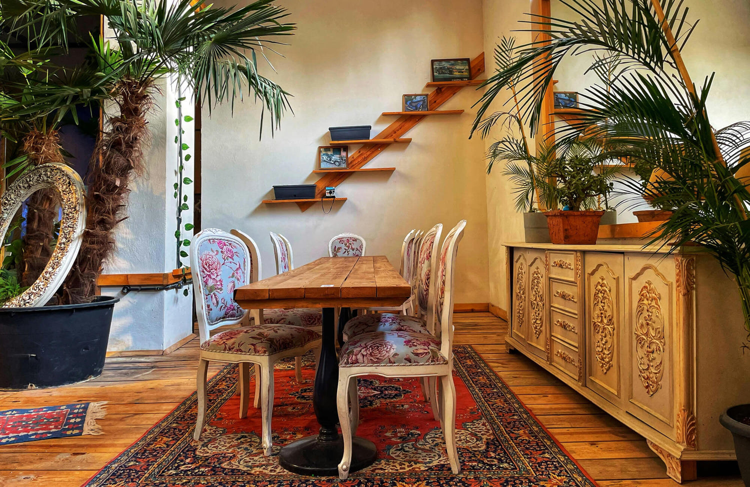
Dining Rooms and Studies
Dining rooms and studies can comfortably support deeper, more saturated tones. In these spaces, a red Persian rug pairs well with richer wall colors or darker wood finishes. This setting allows the rug to feel intentional rather than dominant. Because these rooms are often more intimate, the rug helps reinforce a sense of depth and focus.

Using Accent Colors Without Visual Clutter
Accent colors work best when they feel deliberate rather than scattered. Used with care, they help tie the room together and reinforce a cohesive overall design.
Pulling Accent Colors From the Rug
The easiest way to choose accent colors is to look directly at the rug. Small details within the pattern often suggest tones that already belong in the space. This approach reduces guesswork and helps the room feel more cohesive from the start. Repeating these colors in a limited and intentional way creates a sense of continuity that feels effortless.
Limiting the Accent Palette
Limiting accent colors to no more than two beyond neutrals helps prevent the room from feeling visually busy. This restraint creates a clearer visual hierarchy and allows each color to serve a defined role. The approach comes to life in the photo featured above, where Edward Martin’s Pascal Rug in Smoke / Multi adds subtle pattern and warmth, while the Juliet 7x8 Hexagon Matte Porcelain Tile in Rust echoes those same earthy tones at a larger scale.
By repeating these accents across the floor and rug while keeping walls and fixtures neutral, the space maintains a calm, cohesive feel. This balance also makes future changes or additions easier to integrate without disrupting the overall design, resulting in a room that feels thoughtfully composed rather than casually assembled.
Scaling Color Through Decor
Scale plays an important role in how color is perceived within a space. Larger furniture pieces are best kept neutral, while smaller items such as cushions, artwork, or decorative objects can introduce color. This approach prevents bold tones from overwhelming the room. It also allows color to be adjusted over time without major changes. The balance keeps the room grounded while still allowing personality to show through.

Common Color Mistakes to Avoid With Red Persian Rugs
Even thoughtful choices can leave a room feeling unsettled if certain common mistakes are overlooked. Being aware of these issues early on helps create a more balanced and cohesive result.
Overusing Competing Reds
Mixing multiple reds often creates tension rather than harmony. This is especially noticeable when different shades of red sit close together within the same sightline. The eye tends to compare these tones directly, making the differences feel more pronounced. Even subtle differences in tone can clash, which is why it is usually best to let the rug own the red and keep other elements within the same color family minimal.
High Contrast Without Balance
Very stark whites or deep blacks can feel harsh alongside a red Persian rug when they lack softer textures or intermediate tones. Without a transition between light and dark, the contrast can feel abrupt rather than intentional. Introducing softer neutrals or layered materials helps ease the visual shift. Balance is what allows contrast to feel deliberate and composed instead of jarring.
Ignoring Lighting Conditions
Lighting changes how colors are perceived within a space. A shade that looks balanced in a showroom may feel entirely different once it is placed at home. Natural and artificial light can shift undertones, saturation, and overall warmth throughout the day. Taking time to test colors in your own space helps avoid surprises and leads to more confident, well-informed decisions.
Choosing the Right Colors for a Red Persian Rug
Choosing colors for a red Persian rug is more about understanding color relationships than adhering to strict rules. When you pay attention to undertones, rely on well-chosen neutrals, and introduce complementary colors with restraint, the rug becomes a natural foundation instead of a challenge. With patience and observation, you can create a space that feels cohesive, personal, and timeless, allowing each element to support the overall design without competing for attention.
If you find yourself unsure how to apply these principles to your own space, reaching out for guidance can be helpful. Speaking with a design professional or contacting a design service allows you to explore color options with confidence and tailor them to your specific room, lighting, and lifestyle.
