A bathroom’s wall tile color shapes the entire feel of the space, influencing brightness, mood, and perceived size. When you choose the right shade, you can create a room that feels cohesive, calming, and visually balanced, even if the bathroom is small or the layout is challenging. The right color also brings fixtures, finishes, and lighting together so the space feels considered rather than pieced together. As we explore options, understanding how each hue behaves in a bathroom setting makes it easier to select a palette that supports both function and style.

The Role of Light in Choosing Tile Color
Light plays a significant role in how wall tile colors appear throughout the day. Because bathrooms often rely on a blend of natural and artificial lighting, recognizing how each one influences color helps you choose shades that remain steady and comfortable in every setting.
Natural Light Levels
Natural light sets the foundation for how any tile color is perceived. In north-facing bathrooms, the light tends to be cooler, which can make cool-toned tiles appear sharper or slightly subdued. In these spaces, soft whites, warm neutrals, or muted earthy tones often create a more balanced look.
South-facing bathrooms receive warmer sunlight throughout the day, which can deepen yellow or beige undertones. To keep the space visually comfortable, gentle whites or cooler-leaning shades are often more suitable. East- and west-facing rooms shift noticeably as the sun moves, so placing tile samples directly on the wall helps you see these changes in real time.
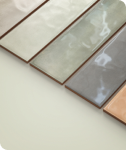
In the photo displayed above, Edward Martin’s Juliet 2.5x10 Matte Porcelain Tile in Olive shows how natural light can bring out its subtle shifts in tone, reinforcing the value of observing tiles under changing daylight conditions. By paying attention to the natural light patterns in your bathroom, you can choose colors that stay steady and harmonious from morning to evening.
Artificial Lighting Hue
Many bathrooms depend heavily on artificial lighting, especially when natural light is limited. The temperature of LED bulbs can noticeably shift how a tile's color appears on the wall. Warm lighting enriches beiges and soft neutrals, while cool lighting sharpens grays, whites, and delicate pastels.
To see how a wall tile will truly look day to day, it helps to preview options under the lighting you currently use or plan to install. An AR tool allows you to visualize tiles directly in your bathroom, making it easier to observe how each area of the room—whether the shower, vanity, or mirror wall—affects the color. With this added clarity, you can choose a shade that feels consistent once the room is fully finished.
Reflectivity and Finish
A bathroom’s wall tile finish plays an important role in how its color appears once installed. For example, glossy tiles reflect more light, which helps brighten dim bathrooms and gives the space a lighter, more open feel. In situations where your room has only a small window or limited ambient lighting, a glossy finish can add the lift the space needs.
On the other hand, matte finishes absorb light and reduce glare, creating a softer and more grounded look. This approach works especially well in bathrooms with abundant natural light, where too much reflection might feel distracting. Ultimately, because the finish influences how you perceive both color and brightness, pairing the right sheen with the right hue helps you create the overall effect you’re aiming for.

Designing for Space Perception and Room Dimensions
Tile color has the power to shift how large or compact a bathroom feels. By choosing colors thoughtfully and observing how they interact with your layout, you can make a small room feel more open or give a large room greater dimension.
Colors That Expand Space
Lighter colors tend to visually push the bathroom walls outward, helping the room feel larger and more open. Shades such as light beige, pale blue, and soft green ease the transition between surfaces, allowing the eye to move naturally across the space. A piece like Edward Martin’s Miley 4.5x9.1 Glossy Porcelain Tile in Bone, as displayed in the photo above, shows how a soft, light wall tile can brighten the shower and make the entire room feel more spacious. When your walls and tiles share similar tones, the bathroom appears more seamless and expansive.
In addition, using low-contrast palettes enhances this effect. Wall tiles that blend gently with the vanity, flooring, or surrounding finishes create a unified look that reduces visual heaviness. In smaller rooms, especially, these approaches minimize clutter and help the space feel calm, bright, and effortless.
Colors That Add Depth
Darker tile colors can bring a sense of depth when used thoughtfully. Shades like dark gray, navy blue, or deep green can create a more intimate atmosphere and help anchor the room. These tones also work well when you want a touch of drama or when the bathroom receives enough natural light to keep the space from feeling closed in.
To maintain balance, pairing darker wall tiles with lighter floors or ceilings helps prevent the room from feeling heavy. The contrast between light and dark surfaces further adds interest and gives the eye clear points of reference, resulting in a space that feels intentional and well-proportioned.
Strategic Color Placement
Where you place certain colors has a strong impact on how the room feels. Using a darker shade on one wall, for example, can draw the eye forward and make the room appear longer. Vertical tile patterns or color changes that move upward can also create the impression of added height, which is helpful in bathrooms with lower ceilings.
In contrast, horizontal bands or lighter wall tiles along the edges of the room can widen the space visually, giving narrow bathrooms a more balanced look. By using color placement as a design tool, you can subtly adjust the room’s proportions without changing its actual layout.

Creating the Right Mood Through Color Psychology
The color you choose for your bathroom tiles shapes not only how the space looks but also how it feels. Because bathrooms often function as personal retreats, selecting a color that aligns with the mood you want helps the room feel more inviting and comfortable.
Calming Neutrals and Soft Pastels
Warm beige, cream, and soft blush create a relaxed and welcoming atmosphere. These colors can bring a gentle softness to the room, making them ideal for bathrooms meant to feel soothing. Pairing them with natural textures like light wood or smooth stone further enhances the sense of calm and helps the space feel like a quiet retreat. A great example of this mood-setting approach is shown in the photo above, where Edward Martin’s Ellie 2.5x8 Matte Ceramic Tile in Blush creates a warm, calming backdrop that instantly softens the room and encourages a more peaceful state of mind.
Soft pastels offer similar comfort with a touch more personality. Light blue or pale lavender adds subtle color without overwhelming the room. The aim is to keep the space tranquil and balanced by avoiding strong contrasts that could break the calming mood.
Energizing Bright Tones
Some homeowners prefer bathrooms that feel lively and uplifting. Colors like bright blue-green, soft orange, or pale yellow can bring cheerful energy into the space. To keep these stronger tones from overpowering the room, it helps to use them on select surfaces or pair them with neutral floors and countertops for a more balanced look.
Incorporating brighter colors in small areas such as niches, feature walls, or accent sections allows you to enjoy a playful burst of personality without overwhelming the design. These touches can also create a refreshing mood that can make morning routines feel more vibrant and enjoyable.
Sophisticated Dark Palettes
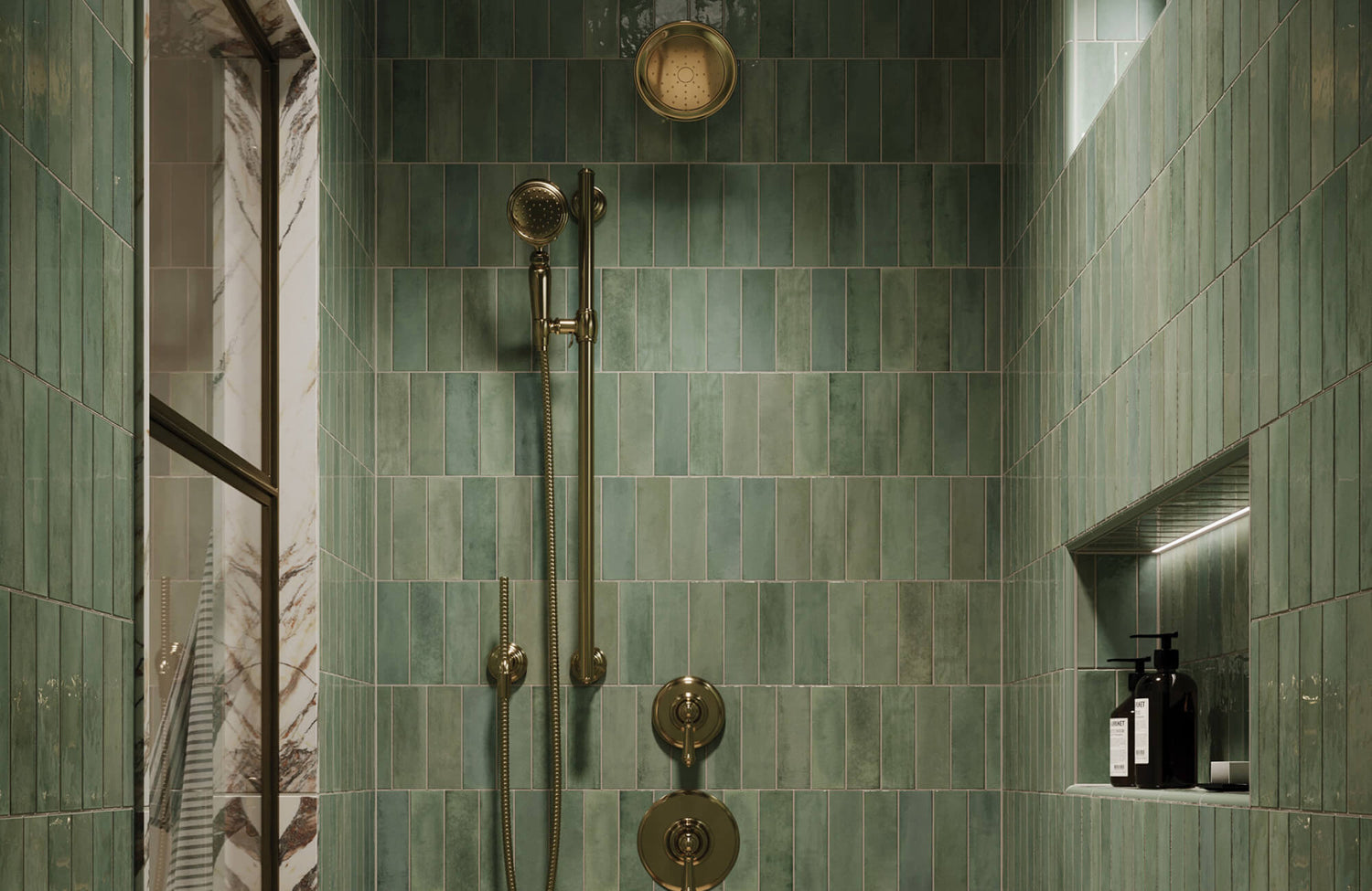
Bathrooms that use deeper colors such as dark green, dark gray, or rich brown often feel more refined and intimate. These shades add depth and character, especially when the room has enough lighting to keep the space comfortable rather than dim. When used thoughtfully, darker palettes also create a grounded and elegant atmosphere.
Additionally, pairing deep tile colors with lighter elements like pale countertops or clear mirrors helps maintain balance. This contrast allows the darker hues to stand out while the lighter features keep the room open and inviting.

Coordinating Tile Color With Fixed Bathroom Elements
Tile color choices rarely stand on their own. Because bathrooms include vanities, countertops, and hardware with their own tones and textures, coordinating your wall tile color with these fixed elements helps create a unified and visually consistent design.
Working With Vanity Finishes
Vanities often feature wood tones, painted surfaces, or floating designs that introduce their own color cues. Because of this, paying attention to the undertones of your vanity helps ensure the room feels balanced. A warm oak vanity pairs naturally with creamy beige or soft warm white tiles, while cool-toned painted vanities often work well with gentle gray or muted blue.
A subtle example of this coordination can be seen in the photo displayed above, where Edward Martin’s Natasha 2x6 Glossy Porcelain Tile in Ice pairs beautifully with the Bridgette 60" Double Vanity in Bright White with a 3 cm White Zeus Quartz Top. It’s cool, soft blue tone complements the bright white vanity without competing with it, creating a clean and cohesive palette. When the wall tile and vanity share compatible undertones like this, the bathroom feels unified and intentional rather than visually divided.
Matching Countertops and Tile
Countertops often feature subtle details such as veining, marbling, or small flecks of color. Choosing wall tiles that complement these features helps bring the bathroom design together. For example, a countertop with soft gray veining pairs well with pale gray or off-white tiles that echo those tones.
Concrete-style counters also work nicely with earthy neutrals, creating a grounded and modern feel. When you pick up a color or pattern from the countertop and repeat it subtly in the wall tile, the room gains a sense of continuity that makes the entire space feel more cohesive.
Fixture and Hardware Alignment
Hardware finishes can influence how tile colors appear throughout the room. For example, brushed nickel works well with cooler neutrals, bringing extra clarity to gray or soft white. Meanwhile, brass pairs naturally with warm tones like beige or tan, adding depth without overwhelming the space.
In contrast, matte black fixtures create a strong visual statement, so pairing them with lighter tile colors helps keep the room balanced. Chrome adds brightness and can enhance the clean look of white tiles or light pastels. When you take these interactions into account, your wall tile and fixtures work together to create a bathroom that feels cohesive and well considered.
Exploring Style-Specific Color Directions
Every bathroom style benefits from color palettes that naturally support its overall character. When you choose tile colors that align with your preferred aesthetic, the space feels more cohesive, intentional, and visually expressive.
Modern Minimalist
Modern minimalist bathrooms focus on simplicity and clarity. Crisp white, soft gray, and other subtle monochromatic colors can create an open, uncluttered look that feels calm and intentional. Rather than introducing several different colors, emphasizing tonal variation within the same palette adds interest while preserving the minimalist feel. These shades work particularly well in spaces with clean lines and streamlined fixtures. The result is a bathroom that feels serene, spacious, and visually organized.
Classic Traditional
Traditional bathrooms often rely on timeless color families that create a sense of familiarity and comfort. Warm cream, soft blue, and gentle neutral tones pair well with shaker-style cabinetry, classic fixtures, and surfaces that feature subtle variation rather than strong contrast. The aim is to choose a palette that feels lasting rather than trend-driven. This approach helps the bathroom maintain an elegant and welcoming character year after year.
Contemporary Organic
Many homeowners today prefer bathrooms that take inspiration from natural environments. Earthy colors such as tan, light brown, soft green, and sand bring warmth and a sense of authenticity to the space. These shades pair well with natural wood, simple textures, and understated accessories.
Choosing colors that reflect natural materials also helps create a room that feels calm and grounded. A contemporary organic palette offers a comfortable balance of modern style and natural ease, making the bathroom feel both relaxed and updated.

Considering Maintenance, Longevity, and Practicality
Aside from appearance, the color of your wall tile plays a role in how well your bathroom holds up over time. Some shades conceal watermarks more easily, while others remain appealing even as design trends evolve.
Colors That Hide Water Spots
Mid-tone neutrals such as beige, gray, or light brown tend to hide water spots more effectively than very light or very dark wall tiles. Because these shades offer gentle variation, they help mask small changes in surface moisture and keep the bathroom looking clean between wipe-downs.
In bathrooms that experience frequent use or more humidity, these practical tones offer convenience without compromising style. A great example can be seen in the photo displayed above, where Edward Martin’s Cleo 2x6 Glossy Ceramic Tile in Bone features a soft mid-tone shade that naturally disguises minor splashes and keeps the space looking polished throughout the day. Ultimately, the goal is to choose a color that stays appealing while reducing the need for constant maintenance.
Grout and Color Interaction
Grout color plays a significant role in how the wall tile looks once installed. A contrasting grout draws attention to the tile’s shape and adds clear definition, which can shift the overall impact of the wall. A matching grout, on the other hand, creates a more seamless look and allows the tile color to take the lead.
Choosing a grout shade that ages well is also important. Mid-tone grout often performs best because it avoids the discoloration issues that stark white or very dark options can develop over time. By pairing grout and tile thoughtfully, you can create a look that remains consistent and appealing for years.
Long-Term Appeal and Resale
Neutral tile colors with soft undertones tend to offer the most lasting appeal. Shades like white, light green, and light gray adapt easily to changing decor and remain attractive to future homeowners. While bold or trendy colors can be enjoyable, using them in small accents rather than on main wall surfaces helps prevent the bathroom from feeling dated too soon.
Because a bathroom is a long-term investment, choosing a color that will remain relevant supports the overall value of your design. This approach ensures the space stays welcoming, adaptable, and appealing for years to come.
Finding the Right Wall Tile Color for Your Bathroom
Choosing the best wall tile color for your bathroom means considering how light, space, style, and long-term needs work together. When we take the time to understand how these elements interact, the room becomes more intentional, balanced, and uplifting. By previewing colors, noticing how they shift throughout the day, and coordinating them with the fixtures and finishes you already have, you can select a palette that feels confident, functional, and reflective of your personal style. If you ever want guidance in narrowing down your options or visualizing different combinations, our design team is here to help you create a bathroom that feels tailored to your vision.


