


Subway tiles may be simple in shape, but the spacing between them can make a major difference in how the finished installation looks and performs. Each grout joint influences the overall pattern, the visibility of the grout lines, and how the subway tiles look and feel in a kitchen, bathroom, shower, or backsplash design. Because subway tiles are often arranged in clean, repetitive layouts, spacing needs to be chosen carefully. A small adjustment can shift the design from sleek and minimal to more defined, traditional, or handcrafted. The right spacing also helps support alignment, accommodate tile variations, and create a more durable finished surface.
In this article, we’ll explore the most common subway tile spacing options, how each one affects the final look, and what to consider when choosing grout, tile type, and installation methods.

Why Tile Spacing Matters for Subway Tiles
Tile spacing refers to the intentional gaps left between subway tiles during installation. These gaps allow room for grout, help maintain consistent alignment, and contribute to the overall durability and visual balance of the finished surface. Minimal spacing creates a sleek, seamless look that works well in modern spaces, while wider spacing emphasizes the grout lines and adds more definition. Wider joints can also be helpful when working with handmade or slightly irregular tiles, where minor size variations are more common.
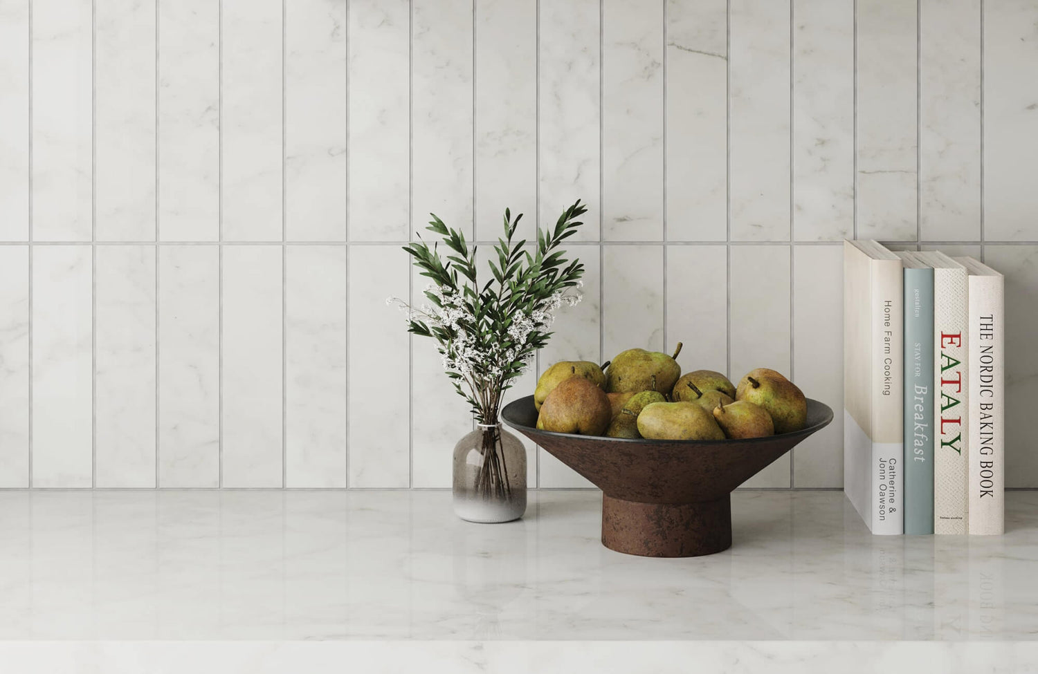
This relationship between spacing, grout visibility, and visual balance is easy to see with Edward Martin’s Jaden 2.5 x 16 Glossy Ceramic Tile in Tender Gray, as shown in the photo featured above. Its elongated subway format creates a clean horizontal flow across the backsplash. The visible grout joints define each tile and support a well-aligned look without overwhelming the kitchen design.
Ultimately, choosing the right tile spacing affects both the appearance and performance of your subway tile installation. It sets the tone for the design while helping create a stable, polished, and long-lasting finish.

The Pros and Cons of Different Subway Tile Spacing Options
Choosing the right subway tile spacing can significantly affect both the aesthetic and functionality of your design. Each spacing option has its own advantages, limitations, and ideal applications.
1/32 Inch Spacing
1/32 inch spacing offers an ultra-seamless look, making it ideal for clean, precise designs that prioritize modern minimalism. This narrow grout line creates a polished, almost grout-free appearance that works especially well with high-quality, uniform materials such as rectified porcelain subway tiles. However, this option requires expert installation and very consistent tile sizing. Even the smallest irregularities can disrupt the alignment and make imperfections more noticeable. For this reason, 1/32 inch spacing is best suited for experienced installers and premium tile materials.
1/16 Inch Spacing
1/16 inch spacing provides a sleek, contemporary look with subtle grout lines that add definition without overwhelming the design. It is an excellent choice for modern interiors where clean lines and precision are key. This spacing still requires careful placement and a smooth, even surface. With narrow joints, uneven tiles, walls, or floors can become more visible. When installed properly, however, 1/16 inch spacing creates a refined, balanced finish that feels both polished and understated.
1/8 Inch Spacing
1/8 inch spacing strikes a strong balance between style and practicality, making it one of the most popular options for subway tile installations. It accommodates slight tile variations better than narrower joints, making installation more forgiving while preserving a clean, classic look. The grout lines are more visible, which can add subtle definition to the layout. This spacing works well in kitchens, bathrooms, backsplashes, and shower walls. Regular cleaning is still important to keep the grout looking fresh, especially in moisture-prone or high-use areas.
1/4 Inch Spacing
1/4 inch spacing is a good option for rustic, handmade, or irregular subway tiles, where slight size differences are part of the design. The wider grout lines allow for more adjustment during installation and create a more relaxed, textured appearance. This spacing works especially well in farmhouse, vintage, or industrial-inspired spaces. However, because the grout lines are more prominent, they can become a major part of the design. If you prefer a sleek or highly polished look, this spacing may feel too casual or visually heavy.

Recommended Subway Tile Spacing by Tile Type
The best spacing often depends on the type of subway tile you choose. Rectified porcelain subway tiles can usually support narrower grout joints because they tend to have more consistent edges and sizing. Handmade or artisan-style tiles often look better with wider grout joints because the spacing helps accommodate natural variations.
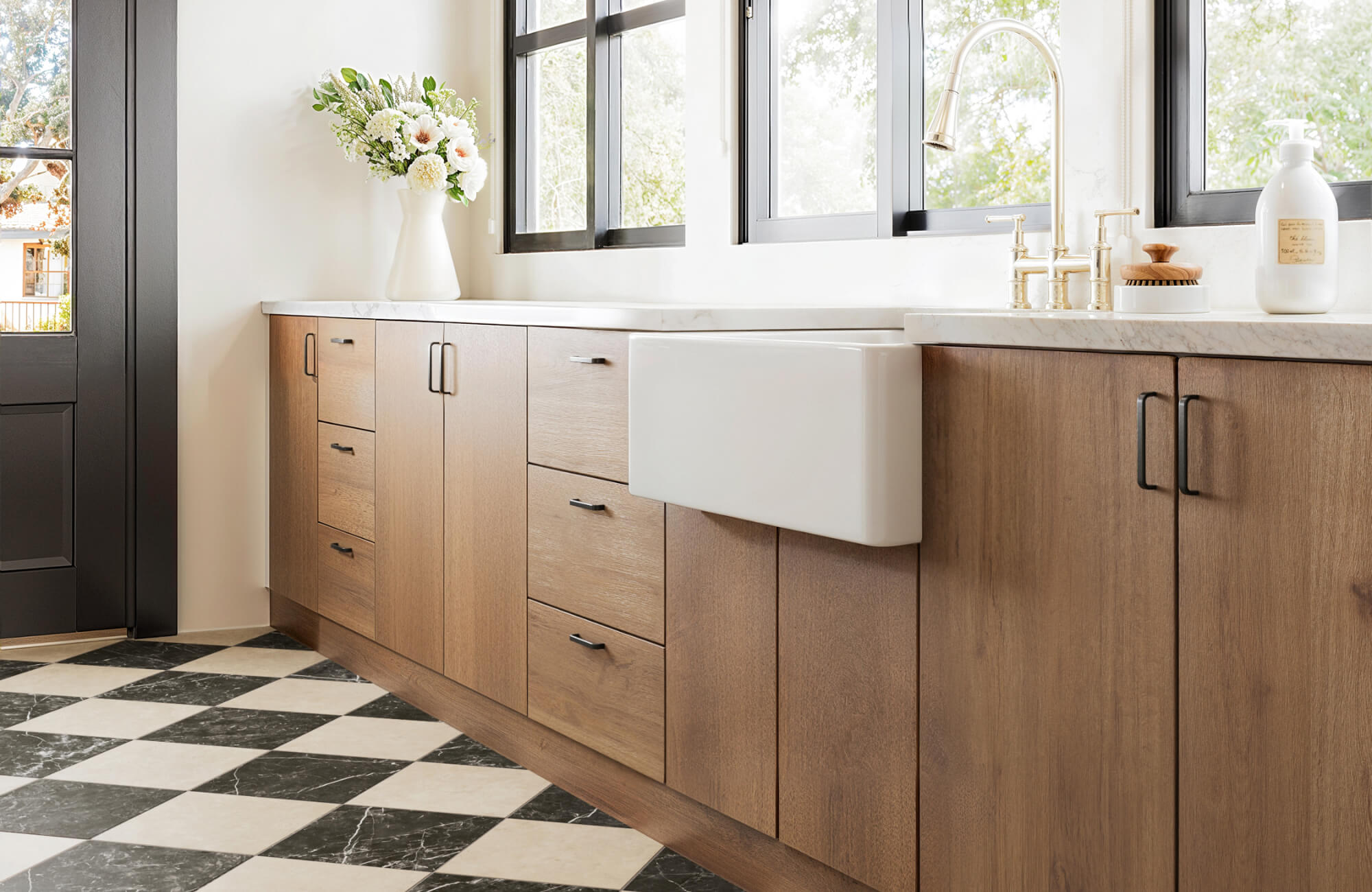
For standard ceramic subway tiles, 1/8 inch spacing is often a practical and versatile choice. It offers enough flexibility for minor size differences while still maintaining the familiar, timeless look associated with subway tile installations. This balance can be seen in Edward Martin’s Graham 3 x 6 Glossy Ceramic Tile in Off White, as shown in the photo featured above. Its classic ceramic format works well with visible grout joints, allowing the backsplash to feel clean and structured while still highlighting the traditional subway tile layout.

Choosing the Right Grout for Subway Tile Spacing
Grout is directly tied to subway tile spacing because the width of the gap determines how visible the grout lines will be and what type of grout may work best. The right grout choice can either soften the appearance of the spacing or make each tile stand out more clearly.
Grout Color for Narrow Spacing
For narrow spacing, such as 1/32 inch or 1/16 inch, a matching grout color can help create a sleek, seamless look. This is ideal for contemporary spaces where the goal is to keep the tile surface clean, minimal, and uninterrupted. Narrow grout joints also require careful application, since any inconsistency can be more noticeable. Choosing a grout color close to the tile shade helps reduce visual interruptions and supports a more refined finish.
Grout Color for Wider Spacing
For wider spacing, such as 1/8 inch or 1/4 inch, grout becomes a stronger part of the design. A matching grout color can keep the look subtle and balanced, while a contrasting grout color can highlight the subway tile pattern and add bold visual definition. This approach works especially well for classic, farmhouse, vintage, or industrial-inspired interiors, where more visible grout lines can enhance the overall character of the installation.
This effect is clearly illustrated by Edward Martin’s Ellie 2.5 x 8 Matte Ceramic Tile in Moss, as shown in the photo featured above. Its artisanal green color contrasts with the lighter grout, defining each subway tile and emphasizing the stacked layout while keeping the bathroom design calm, cohesive, and refined.
Grout Type by Joint Width
Grout type is also important when choosing subway tile spacing. Narrow joints are often best paired with unsanded or fine-grain grout, while wider joints may require sanded grout depending on the tile material and manufacturer’s recommendations. Selecting the right grout type helps the joints fill properly and supports a smoother, more durable finish. It also reduces the risk of cracking, uneven texture, or poor grout performance over time.
Grout Maintenance and Durability
In moisture-prone areas like kitchens, bathrooms, and showers, mold-resistant and stain-resistant grout can help prevent discoloration and make cleaning easier over time. This is especially important for wider grout lines, which are more visible and may require more regular upkeep. Ultimately, grout should be chosen alongside your tile spacing, not after it. The spacing, grout color, and grout type all work together to shape the final look, maintenance level, and long-term performance of your subway tile installation.

Mistakes to Avoid with Subway Tile Spacing
Proper tile spacing is critical for achieving a professional-looking result, but common mistakes can easily affect the finished design. Inconsistent gaps, for example, can make subway tiles look uneven and distract from their clean, linear appearance.
Skipping tile spacers is another common error. Without spacers, tiles can shift during installation, leading to misaligned rows and uneven grout joints. This is especially noticeable in high-visibility areas such as backsplashes, shower walls, corners, and edges.
Uneven surfaces can also create spacing problems. If the wall or floor is not properly prepared, tiles may sit unevenly or require awkward adjustments. Leveling the surface beforehand and checking alignment throughout the installation can help prevent costly mistakes.
It is also important not to choose spacing based on appearance alone. Tile type, edge style, surface condition, and grout selection should all factor into the final decision.
Choosing the Right Subway Tile Spacing
The right subway tile spacing depends on your tile material, design style, installation surface, and maintenance preferences. For a sleek, modern look, 1/32 inch or 1/16 inch spacing can create a refined finish, especially when paired with uniform tiles. For a classic and versatile installation, 1/8 inch spacing is often the most practical choice. For rustic, handmade, or textured designs, 1/4 inch spacing can add character and flexibility.
Once you have a spacing option in mind, it helps to see how it will look in your actual space. Try our augmented reality tool to preview different subway tile layouts, grout lines, and spacing options before making a final decision. For personalized guidance, contact our team to find the right tile spacing and grout combination for your project.