


Decorative pillows can completely shift how your furniture looks, even when nothing else in the room changes. You might add a few, and suddenly your sofa feels more defined, or swap them out and notice the space becomes calmer and more connected. The question is whether they should stand out or blend in, since each approach shapes the mood in a different way. In this blog, we’ll walk through when contrast works, when blending makes more sense, and how to combine both so your space feels intentional instead of trial and error.

The Difference Between Contrast and Blending
When you’re choosing decorative pillows, you’re really deciding whether you want them to stand out or quietly support your furniture. Both approaches can work beautifully, but they create very different effects in a space.
What “Contrasting Pillows” Actually Look Like in a Space
When you go with contrasting pillows, you’re choosing pieces that clearly stand apart from your sofa or chair instead of blending into it. This could mean placing deep navy pillows on a light beige couch or adding warm rust tones against a cool gray base. The idea is not always to go bold, but to create enough difference that the pillows feel intentional and noticeable. Even small shifts in color or pattern can make a big impact when everything else feels uniform. You’ll often notice that contrast brings more depth into the seating area without requiring a full redesign. It’s a simple way to make your furniture feel more stylish.
At the same time, you don’t need to overdo it for contrast at work. In most cases, one or two contrasting tones are enough to change the look without making the space feel busy. You can also tie those colors back to something else in the room, like a rug or artwork, so everything still feels connected. This keeps the contrast from looking random or out of place. If you’ve ever felt like your living room looks a bit flat, this approach usually helps bring it to life. The key is adding just enough variation to catch the eye without overwhelming the space.
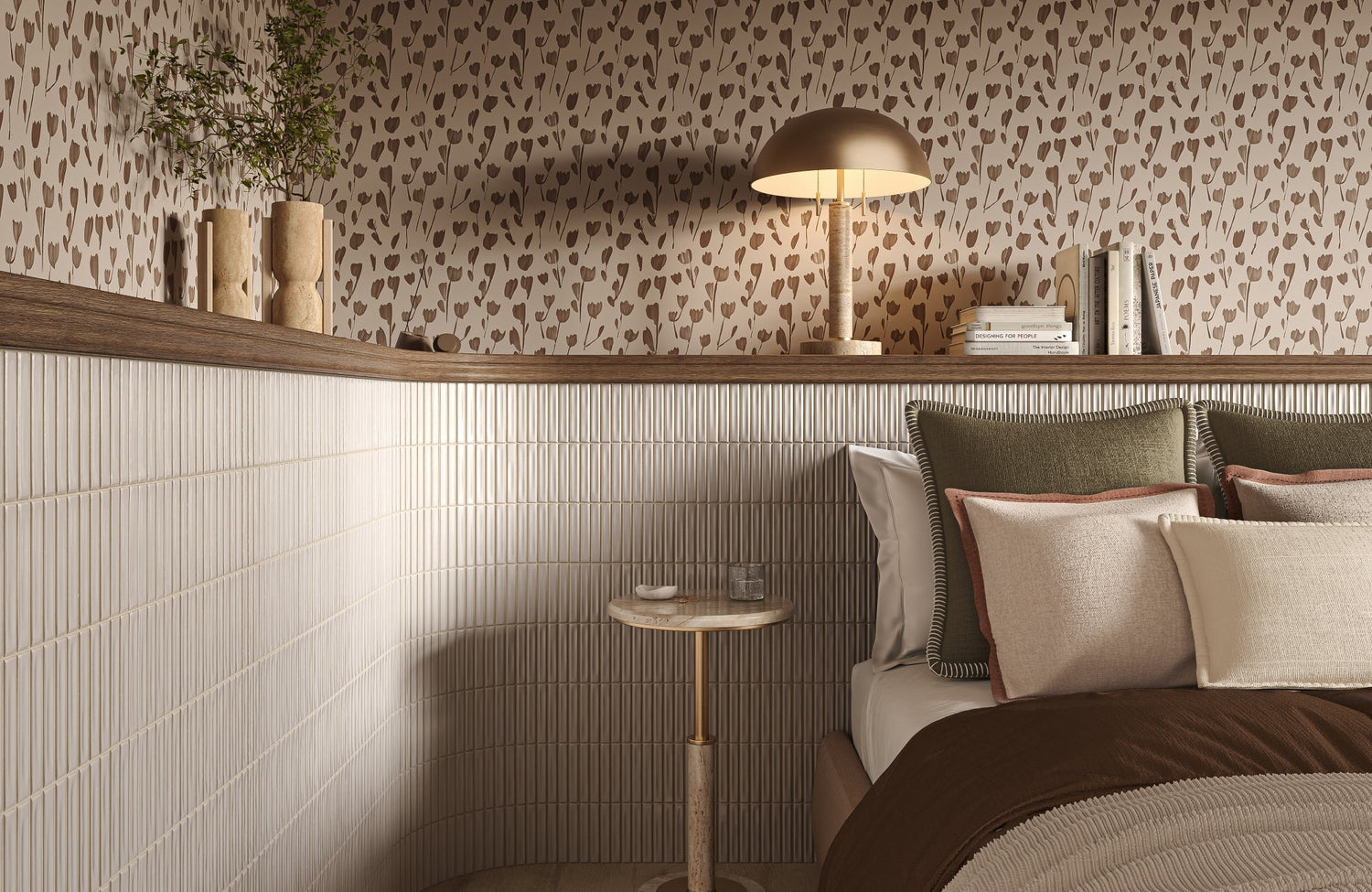
Contrast feels most natural when it builds on an already balanced palette rather than competing with it. In the space above, warm rust and mustard tones are layered over soft neutral seating, creating a subtle focal point without overpowering the corner. Our Brielle 18” x 18” Down Pillow in Natural / Mustard reflects this approach, with its beige linen base framed by a yellow cotton flange and hand-stitched detailing that adds quiet definition. That shift in tone draws the eye while still blending into the overall warmth of the room. It shows how contrast can feel refined, grounded, and easy to live with.
What “Blending Pillows” Means in Real Design
If you prefer a calmer and more cohesive look, blending pillows might feel more natural in your space. This approach keeps your pillows within the same color family as your furniture, so everything flows together without sharp contrasts. For example, if you have a light gray sofa, you might choose pillows in slightly darker or lighter shades of gray. The difference is subtle, but it creates a layered look that feels soft and intentional. Instead of drawing attention to each pillow, the whole seating area feels unified. This is often what gives a room that polished, pulled-together feel.
Even though blending is more subtle, it does not mean your space will look flat or boring. You can still add interest by mixing textures, like pairing smooth fabrics with woven or slightly raised materials. These small details keep the look engaging without breaking the color flow. This approach works especially well if your furniture already has a strong presence or if you want the room to feel more relaxed. It creates a space that feels easy on the eyes and comfortable to spend time in. In many homes, this is what makes a room feel complete without trying too hard.
How Each Approach Changes the Mood of a Room
The choice between contrast and blending really comes down to how you want your space to feel when you walk into it. If you go with contrast, your seating area will naturally stand out more and feel a bit more energetic. Your eyes are drawn to the pillows, which help define the space and give it more personality. This can be helpful if your room feels too plain or if you want to highlight a specific area. It adds a sense of movement and keeps the space from feeling one-dimensional. In many cases, it makes the room feel more styled and intentional without needing major changes.
Blending creates a different kind of atmosphere, one that feels more relaxed and continuous. When your pillows stay close to your furniture’s color, everything feels more connected and easier to look at. This can make your space feel more open and less visually busy, which is great for areas where you want to unwind. Instead of focusing on individual pieces, your attention shifts to the room as a whole. This approach works well if you prefer a softer, more understated look. It’s less about making a statement and more about creating a space that feels calm and balanced.

When Contrast Works Best for Decorative Pillows
There are certain situations where adding contrast feels like the natural choice, especially when your space needs a bit more depth or definition. Below, we’ll walk through real scenarios where contrast tends to work well so you can decide if it fits your setup.
Neutral Furniture That Needs a Visual Lift
If your sofa leans toward beige, gray, or white, it can sometimes feel like it fades into the background more than you’d like. In this case, adding contrasting pillows is one of the easiest ways to bring it back to life without replacing the furniture itself. A few deeper or richer tones can introduce dimension and make the seating area feel more intentional. You don’t need a dramatic shift either; even a slightly darker shade or a warm accent color can make a noticeable difference. This works especially well when the rest of the room already feels balanced but just needs a bit more presence in the seating area. It gives your sofa a stronger role in the overall design. Most importantly, it lets you refresh the look without committing to bigger changes.
Spaces That Feel Too Flat or Monotone
When everything in a room sits within the same color range, the space can start to feel a bit one-dimensional. Even if the palette is well chosen, the lack of variation can make it feel like something is missing. This is where contrast helps break that uniform look and introduces more depth. Adding pillows in a different tone or subtle pattern can shift the space without disrupting the overall style. It gives your eye somewhere to land, which naturally makes the room feel more complete. You’ll often notice that even small changes here can make the space feel more layered. It’s a simple adjustment that adds life without making the room feel busy.
Using Contrast to Highlight a Focal Point
Contrast works well when you want to draw attention to a specific part of the room, especially your main seating area. If your sofa is meant to be a focal point, adding pillows that stand out can help define it more clearly. This becomes even more effective when those pillow colors connect to other elements like a rug, wall art, or decorative accents. That connection helps everything feel tied together rather than random. It creates a visual path across the room, guiding your eye naturally from one element to another. This approach works well in open spaces where defining areas can sometimes feel tricky. With the right balance, your seating area becomes more grounded and visually clear.
Seasonal or Temporary Styling Changes
If you like updating your space throughout the year, contrast gives you an easy way to do it without much effort. Swapping out pillow covers in different colors or tones can shift the mood of a room almost instantly. Lighter shades can make the space feel more relaxed during warmer months, while deeper tones can bring in a cozier feel when the season changes. Since pillows are easy to store and switch, this approach stays flexible without creating extra work. It allows you to refresh your space regularly without making permanent changes. Over time, you can build a small rotation that fits different moods or occasions. It’s a practical way to keep your home feeling updated without starting from scratch each time.

When Blending Pillows Creates a Better Look
In some spaces, a softer and more cohesive look simply feels right, especially when you want everything to flow without sharp visual breaks. Here, we’ll look at situations where blending pillows into your furniture creates a more balanced and refined result.
Creating a Calm and Relaxed Atmosphere
If your goal is to create a space that feels calm and easy to unwind in, blending pillows is often the better direction. Keeping your pillows within the same color family as your furniture allows the entire seating area to feel more connected. Instead of drawing attention to individual pieces, the room feels smoother and more settled. This works especially well in bedrooms or quieter living areas where too much contrast can feel distracting. The transitions between elements become softer, which makes the space more comfortable to look at. It creates a kind of visual quiet that supports relaxation. Over time, this approach helps the room feel more restful without needing constant adjustments.
Working With Bold or Patterned Furniture
When your furniture already has a strong presence, whether through color, pattern, or texture, blending pillows helps keep everything from feeling overwhelming. Adding more contrast in this case can compete with what is already there, making the space feel too busy. By choosing pillows that stay within the same palette, you allow the furniture to remain the main feature. This keeps the design focused and easier to take in. It also helps avoid visual clutter, especially in smaller rooms where too many elements can feel crowded. The result is a more balanced look where nothing feels like it is fighting for attention. This approach supports what you already have instead of trying to outdo it.
Layering Textures Instead of Colors
Blending does not mean you have to rely on color alone to create interest. In fact, texture becomes even more important when you stay within a consistent palette. Mixing materials like linen, velvet, or woven fabrics can add depth without changing the overall color scheme. These subtle differences catch the light differently and give the pillows more presence up close. It creates a layered look that feels intentional rather than flat. You still get variation, just in a quieter and more refined way. This works well if you want detail without introducing strong color contrast. It is a simple shift that keeps the space visually engaging.
This approach works especially well in spaces where warmth and softness are already part of the design. In the setting above, the pillows stay close in tone to the bench and surrounding finishes, yet the difference in fabric texture keeps them from blending too completely. Our Merelle 22” x 22” Down Pillow in Ivory reflects this idea, with its richly woven surface and whipstitched flange adding subtle structure within a neutral palette. That level of detail draws attention up close without interrupting the overall flow. It shows how texture alone can carry the design while keeping everything visually connected.
Design Styles That Favor Blending
Certain design styles naturally lean toward blending because they focus on simplicity and cohesion. Minimalist, modern, and soft contemporary spaces often benefit from keeping colors closely related rather than sharply contrasted. This helps maintain a clean and uncluttered look that feels intentional. In these styles, too much contrast can disrupt the overall balance and make the space feel less refined. Blending supports the idea of everything working together as a whole. It allows the materials, shapes, and layout to stand out without relying on bold color shifts. This makes the space feel more polished while still staying comfortable and inviting.

How to Balance Contrast and Blending in One Space
You don’t have to choose between contrast and blending, since most well-designed spaces use a mix of both. The key is finding a balance that adds interest without making the room feel busy or disconnected. In here, we’ll look at simple ways to combine both approaches so your pillows feel intentional and cohesive.
Mixing One or Two Contrasting Pillows With Neutral Ones
A balanced setup often starts with a neutral base and just a few pillows that stand out slightly. Instead of filling your sofa with bold colors, keeping most pillows within your furniture’s palette helps maintain a clean foundation. Then, adding one or two contrasting pieces introduces just enough variation to catch the eye. This approach keeps the look controlled while still adding depth. It also allows your seating area to feel styled without overwhelming the rest of the room. You’ll notice that even a small amount of contrast can make a big difference when everything else stays grounded.
A helpful tip is to treat contrast as an accent rather than the main focus. Start with neutral pillows first, then layer in a contrasting one and step back to see how it feels. If it already adds enough interest, there’s no need to keep adding more. You can also repeat that accent color elsewhere in the room, such as in a throw or small decor piece, to keep everything connected. This keeps the contrast from feeling isolated. A little restraint here usually leads to a more polished result.
Using Color Families for Softer Contrast
If a strong contrast feels too bold, working within the same color family is a good way to ease into it. Instead of choosing completely different colors, you can mix lighter and darker shades of the same tone. This creates variation while still keeping everything connected. The look feels more layered rather than sharply divided. It also helps the pillows blend naturally with your furniture while still adding dimension. This approach works well in spaces where you want interest without strong visual breaks. It keeps the room feeling calm but not flat.
One useful way to approach this is by choosing a base color and building around it with two or three related shades. For example, if your sofa is a warm gray, you can introduce deeper charcoal and softer taupe pillows to create variation. Keeping everything within that range helps avoid clashing tones. You can also bring in subtle patterns that use the same colors to add more depth. This keeps the overall palette consistent while still giving the space more character. It’s a simple way to balance variety and cohesion.
Balancing Patterns With Solid Colors
Patterns can add personality to your pillows, but they need to be balanced carefully to avoid making the space feel too busy. Pairing patterned pillows with solid ones helps keep the look grounded and easier to manage. If everything has a pattern, it can feel overwhelming and harder for the eye to settle. Solid pillows act as a visual break, allowing the patterns to stand out without competing with each other. This creates a more intentional and organized look. It also makes it easier to introduce variety without losing control of the overall design.
A practical tip is to start with one main pattern and build around it with simpler pieces. Choose a pattern that includes colors already present in your room, then pull one or two of those tones into solid pillows. This helps everything feel connected instead of random. You can also vary the scale of patterns if you decide to use more than one, keeping one bold and the other more subtle. This prevents visual overload while still adding interest. Keeping patterns intentional makes a noticeable difference in how balanced the space feels.
Connecting Pillows With Other Elements in the Room
Pillows feel more intentional when they relate to other elements in the room instead of standing on their own. Pulling colors or textures from nearby items like rugs, curtains, or wall art helps tie everything together. This creates a sense of continuity that makes the space feel more cohesive. Even if you’re using contrast, this connection keeps it from feeling out of place. It allows the pillows to complement the room rather than compete with it. When everything relates back to something else, the design feels more complete.
A helpful approach is to look around your space and pick one or two elements to echo in your pillows. For example, you might match a tone from your rug or pick up a color from a piece of wall art. You don’t need an exact match, just something close enough to feel intentional. Repeating those colors in small ways across the room helps create a consistent design story. It also makes future updates easier since you already have a palette to work with. This small step can make the entire space feel more put-together.

Common Mistakes When Choosing Decorative Pillows
Even small choices with decorative pillows can affect how your entire space looks and feels. Here, we’ll go through common mistakes people make and how to avoid them so your setup feels more intentional and balanced.
Choosing Pillows That Are Too Matchy or Too Random
One common mistake is going too far in either direction, where pillows either match everything exactly or feel completely unrelated to the space. When everything is perfectly matched, the result can feel flat and lacking in personality because there is no variation to catch the eye. On the other hand, choosing random colors or patterns without any connection to the room can make the setup feel unbalanced. Instead of looking styled, it starts to feel scattered and unintentional. What works better is finding a middle ground where there is some variation, but still a clear link to the rest of the space. Even small connections in tone or pattern can bring everything together. This way, your pillows feel like part of a thoughtful design rather than an afterthought.
Ignoring Texture and Material
Color often gets the most attention, but texture plays just as important a role in how your pillows look and feel. When all pillows use the same fabric or finish, the arrangement can appear flat, even if the colors are well chosen. Adding variation through materials like linen, velvet, or woven fabrics introduces depth without needing to change the palette. These subtle differences help the pillows stand out in a more refined way. It also makes the seating area feel more layered and comfortable. Texture gives the eye something to engage with beyond color alone. In many cases, it is what turns a simple setup into something that feels complete.
Overcrowding the Sofa
It is easy to assume that more pillows will make a sofa look better, but too many can quickly have the opposite effect. When the seating area is filled with pillows, it becomes less functional and harder to use comfortably. This can make the space feel cluttered instead of inviting. Keeping a balanced number allows the sofa to remain practical while still looking stylish. It also gives each pillow enough space to stand out on its own. A more restrained approach often looks cleaner and more intentional. In the end, comfort and usability should always guide your choices.
Forgetting the Room’s Overall Color Story
Pillows should feel like they belong in the room, not like they were added without considering the bigger picture. When they do not connect to any other element, they can feel out of place even if they look good on their own. Tying pillow colors to existing features like rugs, artwork, or curtains helps create a more cohesive look. This does not mean everything needs to match exactly, but there should be a clear relationship. Repeating colors in small ways across the space makes the design feel more intentional. It also helps guide future styling decisions. Keeping the overall color story in mind makes everything feel more connected.

Choosing the Right Approach for Your Space
At the end of the day, choosing between contrast and blending comes down to what feels right for your space and how you want it to function. Instead of overthinking it, focusing on a few practical cues can help you make a decision that feels natural and easy to live with.
Reading Your Existing Furniture and Color Palette
A good starting point is to look at what you already have in your space before adding anything new. Your sofa color, surrounding decor, and even small accents can guide your pillow choices more than you might expect. If your furniture feels a bit understated, adding slight contrast can help bring it forward. On the other hand, if there is already a lot going on, blending tends to keep everything more balanced. Paying attention to these cues helps you avoid guessing and makes the process feel more intentional. It also keeps your choices grounded in what already works. Letting the room guide you often leads to a more cohesive result.
Deciding Based on Mood and Function
Think about how you want the space to feel when you use it, not just how it looks. If the room is meant for relaxing, softer blending choices usually help create that calm and comfortable atmosphere. If it is a more social or active space, a bit of contrast can add energy and make the seating area feel more engaging. The function of the room plays a big role in what feels appropriate. For example, a living room used for entertaining may benefit from more visual interest, while a bedroom often leans toward a quieter setup. Matching your pillow choices to how you actually use the space makes the design feel more natural. It also helps the room feel consistent with your daily routine.
Starting Simple and Adjusting Over Time
You do not need to get everything perfect on the first try, especially when it comes to styling details like pillows. Starting with a simple setup gives you room to adjust without feeling locked into one direction. You might begin with a few neutral pieces and then introduce a contrasting pillow to see how it changes the look. From there, it becomes easier to decide whether to add more or keep things minimal. This approach takes the pressure off and lets you experiment at your own pace. It also helps you see what works in your actual space rather than relying on guesswork. Small changes over time often lead to better results than trying to do everything at once.
Why There’s No One “Correct” Choice
There is no single right answer when it comes to choosing between contrast and blending, and that is what makes the process more flexible. What works in one home may not feel right in another, even with similar furniture or layouts. Personal style, comfort, and how you use your space all play a role in shaping the final look. This means you have the freedom to adjust and refine your choices without worrying about strict rules. In many cases, the best approach is the one that feels most natural to you over time. As your space evolves, your styling choices can evolve with it. That flexibility is what keeps your home feeling personal and well put together.
Bring Your Pillow Styling Together With a Plan That Fits Your Space
Choosing between contrast and blending is less about following a rule and more about shaping how your space feels day to day. The right balance depends on your furniture, lighting, and how you actually use the room, not just what looks good in isolation. Once everything starts working together, your pillows stop feeling like small details and begin to define the space more clearly. Even subtle adjustments in color, texture, or placement can shift the entire look. What matters most is creating a setup that feels intentional from every angle.
If you want a clearer direction, our personalized design consultation can help you map out combinations that suit your furniture and overall layout. We look at your existing pieces, color palette, and how the room is used to recommend pillow pairings that feel cohesive without overcomplicating things. This makes it easier to avoid trial-and-error decisions and build a setup that feels complete from the start. Whether you prefer a softer blended look or a more defined contrast, having a plan brings everything together. It’s a simple way to style with confidence and keep your space looking polished over time.