
)
)
)
)
)
)
)
)
Should All Light Fixtures In A House Be The Same Color?
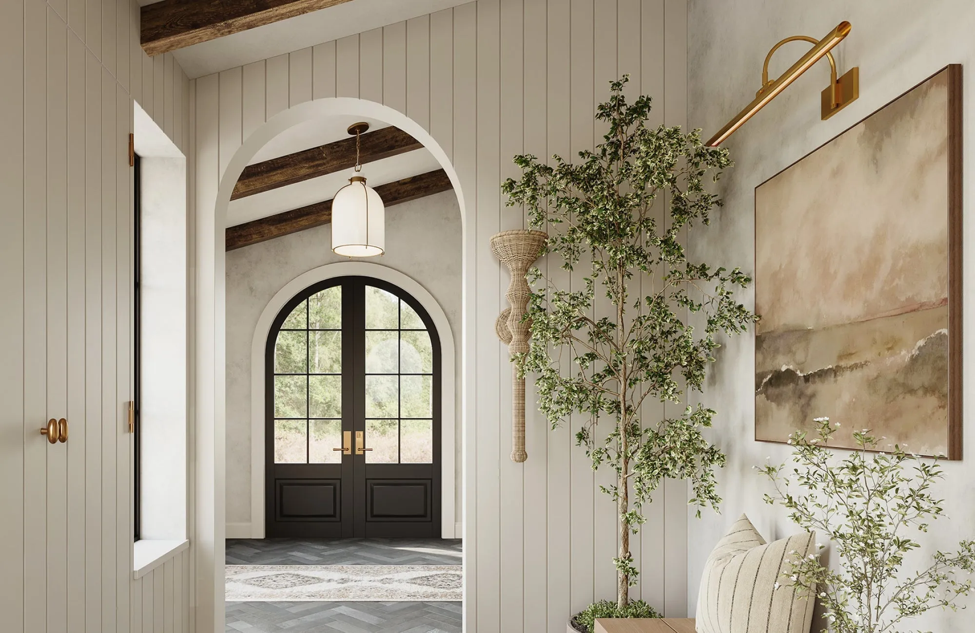
Lighting is one of the most powerful design tools you have in your home. It does more than illuminate your spaces; it also sets the mood, defines style, and even affects how you feel as you move from room to room. One of the most common design questions is whether all the light fixtures in a home should share the same color or if mixing finishes creates a stronger effect. We’ll walk through both perspectives so you can make an informed decision that feels intentional and suited to your space.
The Role of Fixture Color in Home Design
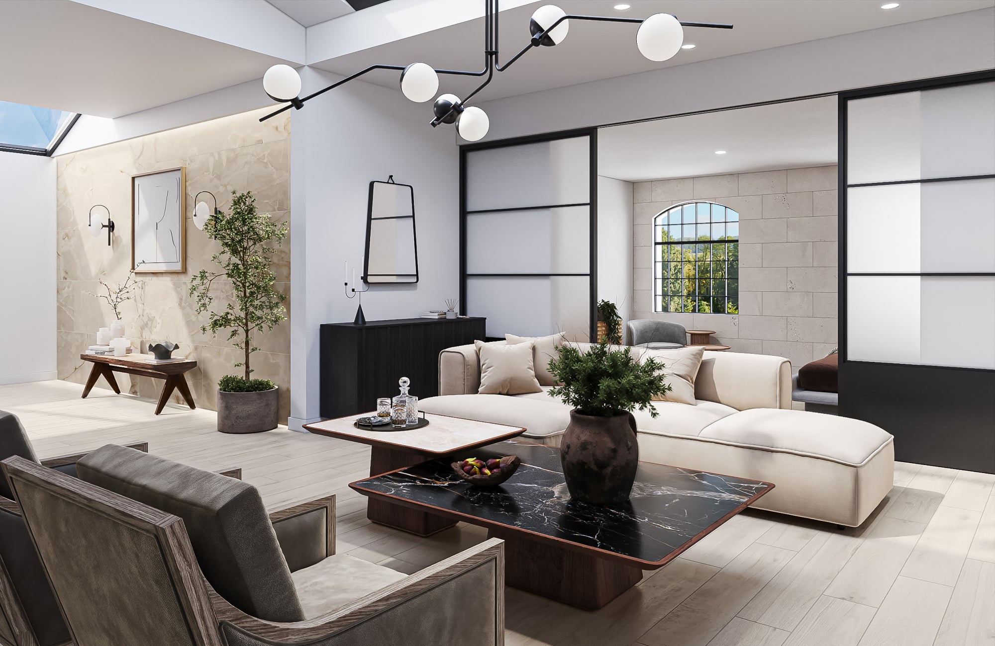
Before choosing whether to match or mix your fixtures, it’s equally important to recognize the influence color has on your home. Fixture color is more than a finishing detail; it further shapes balance, guides perception, and defines how each room connects with the next.
Creating Visual Harmony
When all fixtures share the same color, they naturally tie a space together. This creates a sense of flow that feels calm and intentional, making transitions from one room to the next smoother and more cohesive. Consistency in color allows the fixtures to act as a backdrop, supporting the overall design rather than competing with it. The result is a home that feels unified and thoughtfully connected.
On the other hand, introducing a contrasting finish can be just as effective when used with purpose. A bold choice might highlight a vaulted ceiling, frame exposed beams, or call attention to a feature you want guests to notice. By controlling where the eye is drawn, you can further influence the atmosphere of the room and the way the architecture is experienced. Ultimately, harmony is about balance; deciding when to let fixtures blend quietly into the design and when to let them define a focal point.
Relationship with Room Finishes
Light fixtures never exist in isolation; they’re always part of a larger composition. Their color interacts with surrounding details such as cabinet hardware, faucets, doorknobs, flooring, and even the paint on your walls. A brushed nickel pendant might read as sleek and modern when paired with cool gray cabinetry, yet feel softer and more understated when placed against rich, dark wood. These shifts also show how strongly finishes influence one another and how fixture color can either blend in or stand out depending on its context.
Thinking of fixtures as part of the overall design further helps you avoid a mismatched look and ensures that every detail works together. When finishes complement each other, they can create a balance and make the room feel intentional rather than accidental. This is where fixture color further becomes a tool, not just a decorative choice; it guides the eye, reinforces the design direction, and supports the atmosphere you want the space to convey.
Matching Fixtures Throughout the Home
Many people prefer to keep fixture colors consistent throughout the home, and for good reason. A uniform approach offers peace of mind and eliminates the guesswork of coordinating different finishes.
Benefits of Consistency
Selecting one finish across all fixtures takes the stress out of decision-making. Instead of juggling combinations, you know every piece will fit, and adding new fixtures later becomes simple. This approach appeals to those who want a polished result without the trial-and-error of mixing finishes.
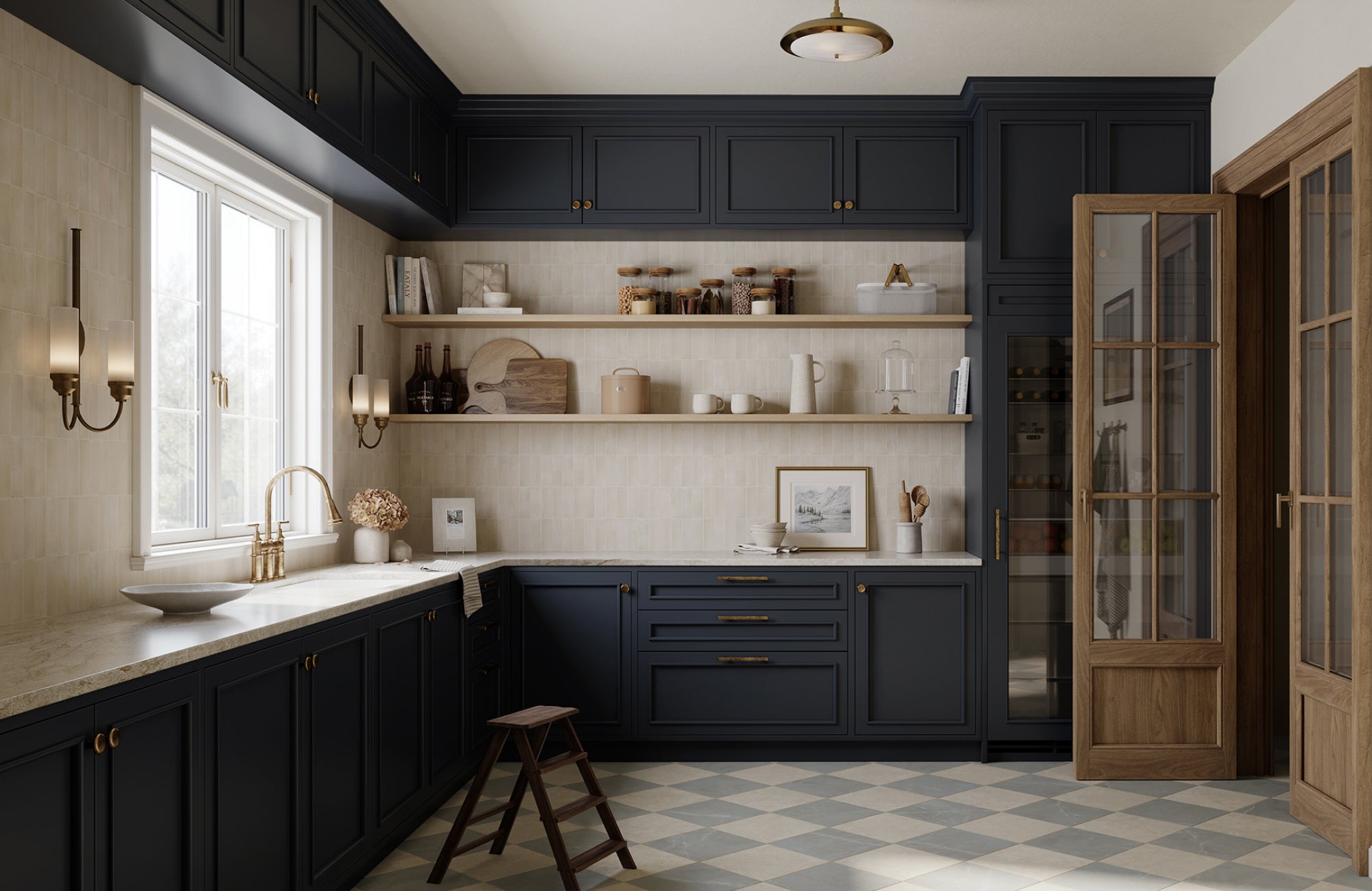
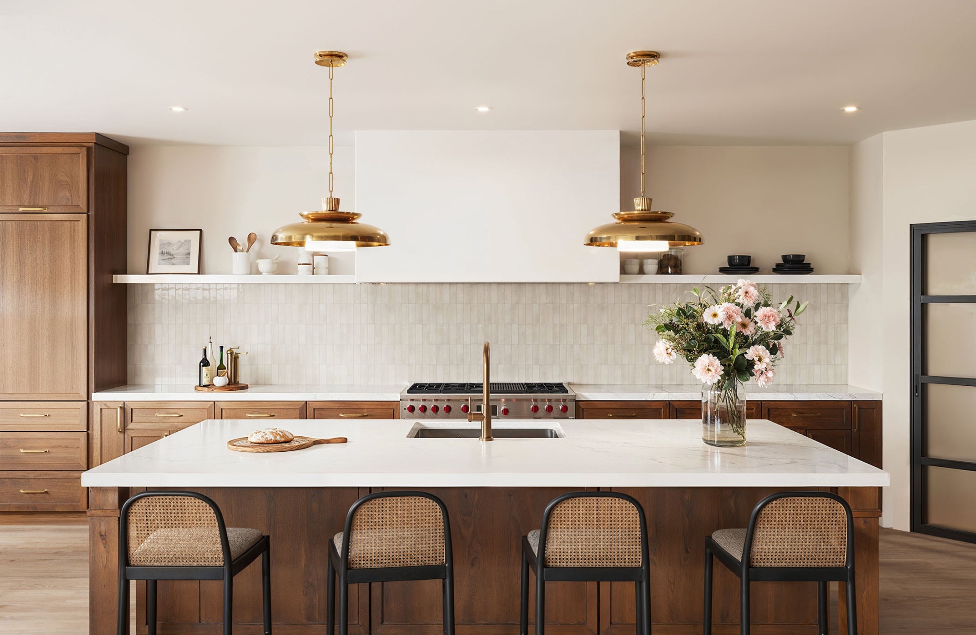
The kitchen above highlights this advantage with Edward Martin’s Sebastian Pendant in Aged Brass Iron paired with the Jodie Wall Sconce in Antique Brass Iron. Together, these fixtures establish a unified look that connects the lighting with the cabinetry hardware, giving the room a polished and intentional feel. This level of consistency not only enhances the design but also makes upkeep simpler while ensuring lasting appeal.
Where It Works Best
Matching finishes shine in minimalist and transitional spaces where restraint and simplicity are part of the design story. By repeating the same finish, you can create a clean backdrop that lets furniture, materials, and architecture take center stage. This streamlined look also resonates with buyers, who often view cohesive finishes as move-in ready and thoughtfully planned.
The approach is equally effective in homes with dramatic or complex features. Vaulted ceilings, tall foyers, and varying ceiling heights can already command attention, and consistent fixture colors can also prevent visual competition. Instead of pulling focus in multiple directions, uniform finishes highlight proportion and structure, allowing the architecture itself to stand out.
Mixing Fixture Colors with Intention
Keeping all fixtures the same isn’t your only choice. When done with care, mixing finishes can also add depth and character to your home. The key is to strike a balance, creating variety while still maintaining a sense of harmony.
Balancing Two or Three Finishes
The most effective way to mix fixture colors is to choose one finish as the primary tone, then add one or two accents for contrast. For instance, matte black might serve as the dominant color, with brushed brass introduced in key areas and chrome used sparingly in a secondary space. This approach creates variety without feeling disjointed. Think of it as accessorizing; your main look remains consistent, while carefully chosen details can also elevate the overall design.
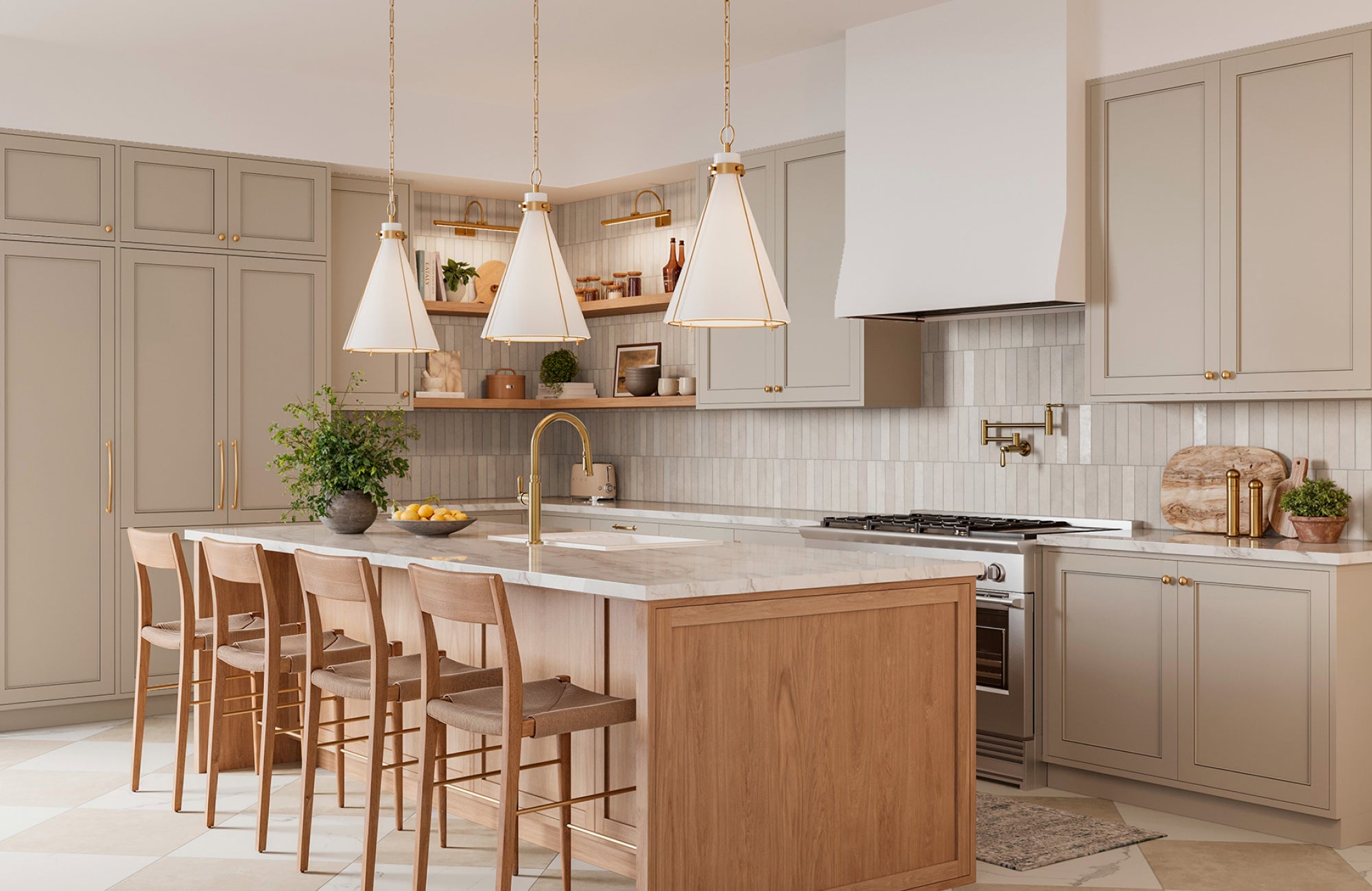
In the kitchen above, Edward Martin’s Rosa Triangular Pendant in Aged Brass shows how a bold finish can anchor a layered design. The pendants echo the brass faucet while standing out against the neutral cabinetry and warm wood island, creating a balanced look that feels both cohesive and dynamic. It’s a clear example of how mixing two or three finishes can add depth and character without disrupting harmony.
Creating Focal Points
There are times when a fixture should stand out rather than blend in. Using a contrasting finish is an effective way to create a focal point, such as a bold chandelier above a dining table that becomes the room’s visual anchor. Supporting fixtures in more neutral finishes can keep the look balanced, allowing the feature piece to take center stage. This approach also works well in entryways, kitchens, and other prominent spaces where a single statement fixture can shape the room’s character.
How Architecture and Layout Influence Fixture Choices
The design of your home plays a major role in whether consistent or varied fixture finishes will look best. Sightlines, room divisions, and the overall flow of spaces all affect how fixture colors are perceived.
Open Concept Homes
In open-concept layouts, architecture and sightlines play a major role in how fixture finishes are perceived. Because the kitchen, dining, and living spaces often flow together without walls, several fixtures are visible at once. Using a consistent finish in these areas reinforces the architecture, allowing the entire layout to feel like one cohesive environment rather than a collection of separate rooms. Matching pendants, chandeliers, and sconces also helps unify the space and highlight the openness that defines this type of design.
When finishes vary too much across connected areas, the eye is pulled in different directions, breaking up the natural flow of the layout. Instead of emphasizing the spaciousness of the architecture, the result can feel fragmented. By keeping finishes consistent, you also allow the structure to shine and create a smooth visual transition from one area to the next.
Defined Rooms
In homes with more traditional layouts, the architecture naturally separates spaces, which gives you greater flexibility in your fixture choices. Each room can take on its own identity, supported by a finish that complements its purpose and style. For instance, a home office might feel more sophisticated with oil-rubbed bronze, while a bathroom could feel brighter and cleaner with polished chrome. Because the walls create clear boundaries, these differences can also enhance the individuality of each space without disrupting the overall flow of the home.
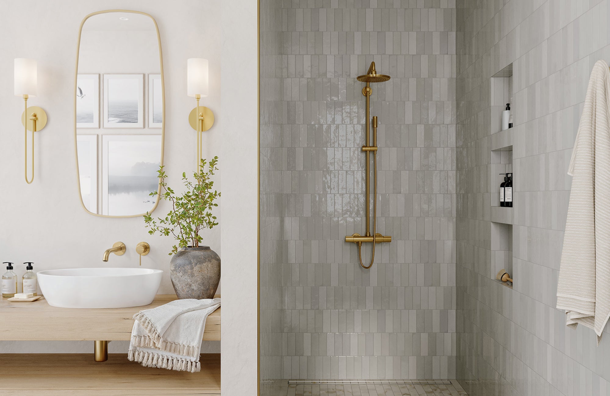
This idea comes to life in the bathroom above, where Edward Martin’s Foley Wall Sconce in Aged Brass frames the mirror with warmth and elegance. Paired with matching brass accents on the shower fixtures and faucet, the sconces establish a cohesive look that defines the room’s character. It’s a clear example of how a single space can embrace its own finish while still contributing to the home’s overall sense of thoughtful design.
Practical Considerations Beyond Aesthetics
Selecting fixture colors goes beyond appearance. It’s also about how well they hold up over time, the level of care they require, and how each finish interacts with light. These practical factors often determine whether your fixtures remain a lasting favorite or become a source of frustration later on.
Durability and Wear
Different finishes age in different ways. Polished brass, for example, can tarnish without regular care, while matte black or brushed nickel typically shows less wear over time. In busy spaces like kitchens and bathrooms, choosing finishes that withstand frequent cleaning will save you both effort and upkeep. The goal is to select a finish that looks just as appealing years from now as it does the day you install it.
Compatibility with Bulb Temperature
The appearance of a fixture finish depends greatly on the type of light it reflects. Warm bulbs can bring out the richness of brass, bronze, and gold, creating a soft glow that feels inviting in spaces like living rooms and bedrooms. Cooler bulbs, with their crisp white tone, can enhance finishes such as chrome or nickel, giving them a sharper, more modern edge that also works well in kitchens, bathrooms, and work areas.
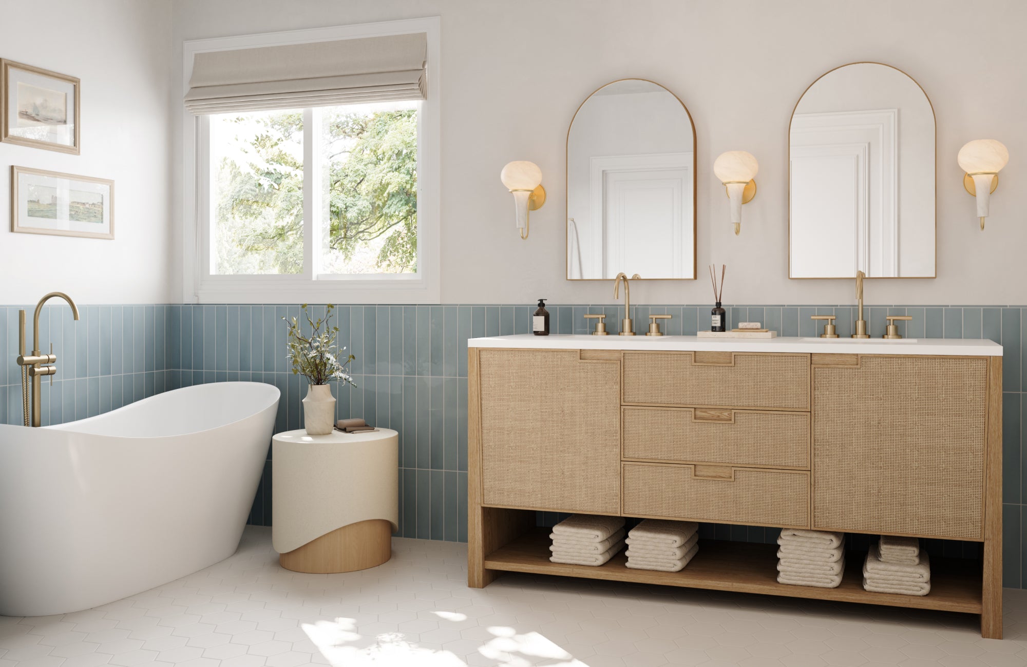
This effect is demonstrated in the bathroom above, where Edward Martin’s Wilma Wall Sconce in Aged Brass takes on a warm, inviting tone under soft light. The glow highlights the brass finish, reinforcing the point that bulb temperature can either enhance or diminish the beauty of a fixture. By pairing the right light source with the right finish, you can ensure that the atmosphere remains cohesive and the design intentional throughout the day.
Personal Style and Lifestyle Factors
Ultimately, your choice of fixture colors should reflect the way you live and what makes your home feel comfortable. Good design isn’t only about appearances; it’s also about creating an environment that supports your routines and showcases your personality.
Reflecting Your Aesthetic
Your lighting choices should echo the overall style that resonates with you. If you lean toward traditional design, a consistent bronze or gold finish can bring a sense of warmth and timelessness. For those who prefer clean lines and a pared-down look, matte black or brushed steel often provides the sleek, understated presence that modern spaces demand.
For more eclectic tastes, mixing finishes can also be an opportunity to showcase creativity and individuality. Pairing contrasting tones intentionally allows fixtures to stand out as part of the design story rather than blend into the background. The most important step is making sure your selections feel authentic to your vision, creating a home that reflects your personality rather than simply following passing trends.
Supporting Everyday Use
The way you use each room should guide how you choose fixture colors. Social spaces like kitchens, dining rooms, or living areas often benefit from bolder contrasts that add energy and create visual interest for gatherings. In these settings, a striking finish on a chandelier or pendant can become a conversation piece while other fixtures also provide balance.
Private spaces, on the other hand, usually call for a calmer approach. Bedrooms and bathrooms tend to feel more restful with cohesive finishes that don’t compete for attention. By aligning fixture choices with the function of each room, you can create an environment that not only looks polished but also supports the comfort and rhythm of daily life.
Finding the Right Approach for Your Home
There isn’t a single rule that dictates whether every light fixture should be the same color. Some homes feel more cohesive with consistent finishes, while others gain depth and character from a carefully mixed palette. The best choice depends on your layout, design style, upkeep preferences, and the way you use each space. By weighing these factors, you can design a lighting plan that feels balanced, personal, and enduring.
If you’re unsure where to begin, we’re here to help. Contact us today to explore our design services, and let’s create a lighting plan that’s tailored to your home and lifestyle!
Follow us on Instagram
@EDWARD.MARTIN
)
)
)
)
)
)
)
)
)
)
)
)
)
)
)
)