


Well-chosen artwork can anchor a room, but the right picture light elevates it, literally and visually. A picture light doesn’t just illuminate a painting; it shapes how the colors read, how the texture shows, and how the piece is perceived in space. That’s why one of the most common questions homeowners ask is also one of the most important:
Should a picture light be wider or narrower than the art?
Below, we break down the definitive answer, the design rule professionals use every day, and the exceptions that help you adapt the guideline to any art, any space, and any style. This guide will also walk you through installation, lighting quality, finishes, and technical choices to ensure the final look feels high-end and intentional.

The Definitive Answer and The Golden Rule of Width
Before choosing finishes or installation details, the first step is understanding the right width for your picture light. This section breaks down the simple rule designers rely on, and why narrower fixtures almost always look better above artwork.
The Light Is Almost Always Narrower
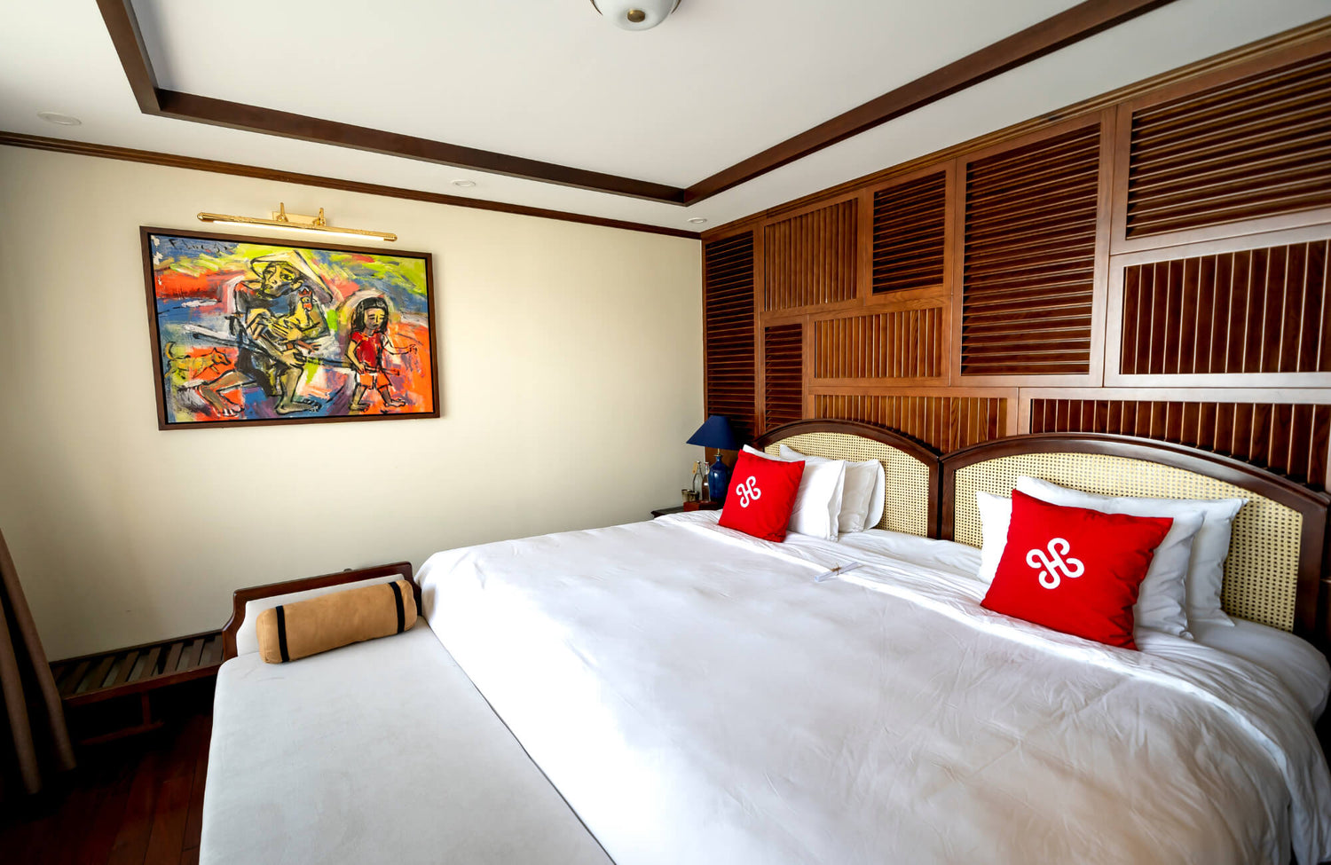
In nearly every design scenario, a picture light should be narrower than the artwork it illuminates. In the image above, Edward Martin’s McAvoy 24" Picture Light in Aged Brass demonstrates how a properly scaled fixture supports the artwork without overwhelming it.
A light that stretches beyond the frame tends to pull the viewer’s eye toward the fixture rather than the art; instead of enhancing the piece, an oversized light disrupts the visual proportions and looks awkward from across the room. A properly sized picture light should feel like a companion to the art, not a competitor.
The Designer’s Golden Rule
Professional interior designers rely on a simple sizing standard: choose a picture light that measures between one-half and two-thirds the width of the artwork. This ratio works beautifully whether you’re illuminating a vintage oil painting or a sleek contemporary print because it allows the fixture to sit comfortably above the frame while providing balanced, even illumination.
A light within this range feels proportionate from every viewing angle and enhances the artwork without drawing attention away from it. For example, a 36-inch-wide piece typically looks best with a light between 18 and 24 inches wide, while a 24-inch piece pairs well with a fixture around 12 to 16 inches.
The ratio also adapts well to different aesthetics. Traditional brass picture lights often look better on the slightly narrower end, while minimalist or modern designs can stretch closer to the two-thirds mark, similar to how oversized pendants can still feel balanced in the right space, without overwhelming the composition.
The Science of Light “Throw”
Beyond aesthetics, the half-to-two-thirds guideline works because of how a picture light distributes illumination.
A picture light is designed to direct light downward in a gentle, even “wash.” The beam spreads as it descends, meaning a narrower fixture can effectively illuminate a wider area, often the entire width of the artwork, without needing to match it in size.
If the light is too wide, the beam spreads past the frame edges. Not only does this dilute focus, but it can also wash the wall with light in a way that looks unpolished or too commercial.
In short: a slightly narrower light provides targeted illumination, enhances contrast, and highlights the subject matter in the most flattering way.

How to Adapt the Rules for Different Art and Frames
Now that you know the golden rule of width, the next step is learning when to bend it. Different art orientations, frame styles, and contemporary pieces can shift what “ideal” looks like, and this section shows you exactly how to tailor the guideline to real-world scenarios.
Sizing for Tall Vertical (Portrait) Art
Portrait-oriented pieces, especially those much taller than they are wide, require a slightly different approach because the main challenge is not width but reach. As shown in the image above, Edward Martin’s Ernest Picture Light In Aged Brass/Distressed Bronze demonstrates how a deeper projection can illuminate taller artwork evenly and gracefully.
Tall artwork needs a fixture that casts light far enough downward to avoid a bright “hot spot” near the top while still illuminating the lower portion evenly. For these vertical pieces, you can still rely on the one-half to two-thirds width rule, but it becomes equally important to choose a picture light with a longer arm projection so the beam clears the frame and spreads uniformly across the height.
Selecting a fixture with an adjustable shade or rotating arm also helps fine-tune the angle, ensuring every part of the artwork receives consistent, flattering illumination.
What About Frameless Canvas or Modern Art?
Frameless canvases, acrylic pieces, metal prints, and other contemporary artworks change how the eye perceives width because there’s no frame to establish a visual boundary. Without that anchor, it can be tempting to select a picture light that feels slightly wider, but going too large often overpowers the simplicity that defines modern art.
Designers generally recommend staying within the same half-to-two-thirds width ratio while choosing a clean, streamlined fixture that complements the minimal design. Avoiding ornate or heavy picture lights keeps the focus where it belongs, on the artwork itself.
With frameless pieces, it becomes especially important to pay attention to color temperature and CRI, since modern materials can reflect and interact with light differently than traditional canvas or paper.
The Exception for Extremely Wide Art
Panoramic pieces, oversized landscapes, and other unusually wide artworks can push the standard rule to its limits. When a piece spans four feet or more, a narrow light may leave the center bright while the edges fall into shadow.
In these cases, designers often recommend either using two picture lights spaced evenly across the top of the artwork or selecting a single, extra-wide fixture that remains slightly narrower than the frame but scaled proportionately to the piece. When opting for one light, it's important to look for features like a broad beam spread, higher lumen output, adjustable optics or diffusers, and a projection arm long enough to clear deep or substantial framing.
With very wide art, the priority shifts from strict adherence to the sizing ratio to achieving balanced, even illumination that allows the artwork to breathe and be fully appreciated.

Beyond Width: Other Essential Picture Light Choices
Once you’ve dialed in the right proportions, it’s time to look at the other decisions that shape the final result. From power options to color temperature and CRI, this section helps you choose lighting that elevates your artwork instead of compromising it.
Hardwired vs. Plug-In vs. Battery-Operated
Each power option offers its own advantages depending on your home’s layout, renovation plans, and how permanent you want the installation to be.
Hardwired picture lights provide the cleanest, most professional look because they connect directly into the wall and can be controlled through standard switches or smart home systems. They’re ideal for homeowners who are renovating or building, and they deliver consistent, flicker-free illumination, though the tradeoff is the need to hire an electrician, a worthwhile investment for the elevated aesthetic and long-term value.
Plug-in picture lights are the easiest solution when you want to avoid opening walls. They’re great for renters or anyone looking for a quick, stylish update, and many come with cord covers to create a cleaner appearance. While the cords are more visible than with hardwired models, plug-ins have improved significantly in both form and function, making them a reliable mid-range choice.
Battery-operated picture lights are useful in spots where outlets aren’t accessible or when you want a completely wireless look without installation. They work well for temporary displays and often include convenient features like remote controls and dimmers.
However, their performance varies widely, some require frequent recharging, and not all models offer the brightness or color accuracy needed for high-quality art lighting.
Why You Must Use LED and the Right Color Temperature
LED lighting quality has a major influence on how artwork reads, and the model featured above, Edward Martin’s Ernest Picture Light In Aged Brass, shows how a well-engineered LED source can enhance subtle tones without overpowering them.
Although halogen lights were once favored for gallery-level illumination, they run hot and can damage artwork over time, which is why modern LED picture lights have become the superior choice.
LEDs offer significant benefits, including zero UV emission, excellent energy efficiency, adjustable brightness, stable color temperature, and an impressively long lifespan. For artwork, the ideal color temperature usually falls between 2700K and 3000K. A 2700K light brings warmth to traditional art and oil paintings, while 3000K offers a slightly crisper tone that complements modern pieces, mixed media, and neutral decor.
Both temperatures mimic museum lighting without washing out color. It’s best to avoid LEDs above 3500K unless you’re lighting extremely contemporary metal or industrial-style art, as cooler lights can create unnatural blue casts that distort color.
Demanding a High CRI for True Color Accuracy
CRI, or Color Rendering Index, indicates how accurately a light source reveals colors when compared to natural daylight, and for picture lighting, a high CRI is non-negotiable. A CRI of 90 or higher ensures that colors appear vivid and true, with museums aiming even higher, typically 95 or above, to capture subtle variations that would otherwise be lost.
High-CRI LEDs reveal nuanced hues, preserve textured surfaces like brushwork and canvas grain, and prevent artwork from looking flat, muted, or distorted. Many inexpensive picture lights cut costs by using lower-quality LEDs with poor color rendering, so it’s always worth verifying CRI specs before making a purchase to ensure your artwork is displayed exactly as the artist intended.

How to Install Your Light for a Professional Look
With the right fixture selected, your last step is installing it with care so everything looks intentional and polished. This section walks through height, angle, projection, and finish tips that tie together all the choices you’ve made so far.
Getting the Perfect Height and Angle
When installing a picture light, placement is just as important as choosing the right fixture. Positioning the light centered over the artwork and about two to three inches above the top of the frame helps minimize glare on glass-covered pieces, ensures even illumination from top to bottom, and creates a clean visual connection between the light and the artwork.
And while these guidelines are helpful, it’s always best to hire a professional for installation to ensure the fixture is mounted safely and correctly.
After setting the height, aim the beam so it falls on the center of the piece at a downward angle of roughly 30 to 45 degrees. Most high-quality picture lights include tilting shades or adjustable arms to help you find that ideal angle.
You’ll know the aim is correct when there’s no distracting reflection, the bottom of the artwork receives just as much attention as the top, and the upper edge doesn’t appear overly bright or washed out.
Choosing the Right “Arm Projection”
Arm projection, the distance the fixture extends from the wall, is essential for achieving even, flattering lighting. A short projection can trap too much light near the top of the artwork, creating a harsh hot spot, while an overly long projection pushes the beam too far forward, causing unnecessary wall wash and uneven lighting.
The ideal projection should allow the light to clear the frame and distribute illumination evenly across the artwork’s surface. Shallow frames typically pair well with shorter projections, standard frames benefit from a medium reach, and deep gallery-style frames often require a longer arm to maintain balance.
Ultimately, you want a projection length that feels natural while ensuring the entire piece receives a smooth, consistent wash of light.
How to Match the Finish to the Frame and Room
Finish selection is central to how seamlessly a picture light integrates into the room, and in the image above, Edward Martin’s Irwin Picture Light in Aged Brass provides a strong example of a fixture that complements both frame and décor without competing visually.
Because picture lights come in a wide range of finishes, antique brass, brushed nickel, polished brass, matte black, bronze, and more, the finish you select has a significant impact on how well the fixture integrates into the room. Designers often suggest echoing the frame’s tone for a cohesive, classic look or matching the room’s hardware and lighting finishes for a more contemporary, unified aesthetic.
If you’re unsure which finish aligns best with your space, Edward Martin’s design consultation service can help you make confident style decisions with personalized guidance tailored to your project, whether you need recommendations for picture lights, help coordinating finishes, or even support with tile, rug, or furniture selections. You can also contact Edward Martin with product questions or for one-on-one assistance choosing the right look for your home.
Your Definitive Sizing Guide
Choosing whether a picture light should be wider or narrower than the artwork is at its core a question of balance, proportion, and light performance. And the answer, backed by both design principles and lighting science, is refreshingly clear:
A picture light should almost always be narrower than the art, ideally one-half to two-thirds its width.
This simple ratio works because picture lights cast a wide beam, allowing a smaller fixture to illuminate a larger surface elegantly and effectively. Whether you're highlighting a cherished family portrait, a vintage oil painting, or a modern statement piece, the right picture light transforms the art from something you see to something you experience.