


Floral wallpaper has become an increasingly popular feature in contemporary interior design because it introduces texture, depth, and organic movement into a space. Although botanical patterns can instantly make a room feel more elegant and visually engaging, overuse can create visual congestion and disrupt spatial harmony. Achieving the right balance requires a careful understanding of interior design principles, including pattern scale, visual weight, chromatic contrast, and architectural proportion.
Designers often use floral wallpaper strategically to create focal points that enhance a room without overpowering surrounding elements. When combined with thoughtful placement, cohesive materials, and balanced lighting conditions, floral wallpaper can transform interiors into sophisticated and inviting environments.

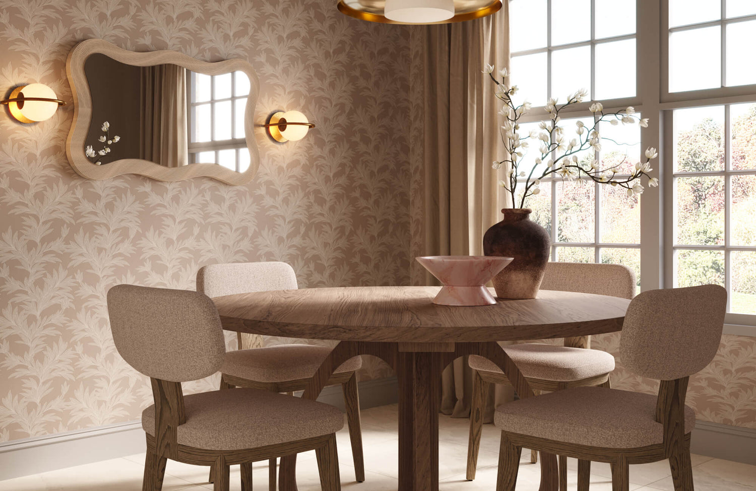
Our Genevieve Dining Chairs in Black pair a sleek, solid beech wood frame with a handwoven recycled paper rope seat for a warm, organic contrast, set against moody floral wallpaper
Understand Pattern Scale and Spatial Proportion
The scale of a floral wallpaper pattern has a direct impact on how spacious or confined a room appears. Because wallpaper occupies a significant portion of the visual field, selecting the correct motif size is essential for maintaining proportional balance and visual comfort.
Large-Scale Floral Motifs
Oversized botanical patterns naturally draw attention because they create strong visual movement and architectural emphasis across a wall surface. In larger rooms with higher ceilings, these expansive motifs can enhance spatial drama without making the environment feel overcrowded. Designers often use large-scale florals on a single feature wall so the pattern becomes a controlled focal point rather than a dominant visual distraction.
This approach also allows surrounding surfaces to provide negative space, which helps the room feel more breathable and visually organized. However, when oversized floral wallpaper is applied throughout a compact room, the continuous pattern repetition may reduce perceived openness and create a sense of spatial compression.
Small-Scale Repetitive Florals
Smaller floral patterns create a softer decorative effect because the motifs blend more subtly into the surrounding environment. As a result, these wallpapers are commonly used in cottage-inspired interiors, transitional spaces, and narrow hallways where visual delicacy is preferred over bold impact. The repetitive nature of micro-scale florals can also establish a sense of continuity and rhythm, especially when paired with understated furnishings and muted textiles.
To prevent visual clutter, designers often balance these detailed patterns with matte finishes and simplified decorative accessories that reduce sensory competition. This combination allows small-scale floral wallpaper to introduce texture and warmth while maintaining a calm and cohesive atmosphere.

Our Bower Wallpaper in Taupe II brings soft botanical movement and warm, earthy depth to this kitchen, finished with Palmer 12x12 Checkerboard Matte Porcelain Tile in Natural and Nero
Use Color Temperature and Contrast Strategically
Color selection significantly influences whether floral wallpaper feels balanced or visually overwhelming within a room. Since hue intensity and tonal contrast affect atmospheric perception, designers carefully coordinate wallpaper palettes with surrounding architectural and decorative elements.
Low-Contrast Botanical Color Palettes
Soft floral wallpapers featuring muted tones such as sage green, dusty rose, taupe, or greige create a more calming and refined visual composition. Because these colors contain lower saturation levels, they reduce visual intensity and support a relaxed interior atmosphere. Designers frequently use monochromatic or analogous botanical palettes in bedrooms and wellness-focused spaces where psychological comfort and tranquility are priorities.
A design such as Edward Martin’s Bower Wallpaper in Taupe II, 52" x 132," demonstrates this approach beautifully through its soft brown botanical pattern, which blends delicate foliage silhouettes with a warm neutral backdrop. In spaces like kitchens or utility rooms, the wallpaper’s low-contrast leaf motif adds organic texture and architectural softness while also harmonizing effortlessly with natural wood cabinetry, warm brass accents, and balanced lighting conditions.
High-Contrast Floral Wallpaper Applications
Bold floral wallpapers that combine dark backgrounds with vibrant botanical tones create dramatic visual energy and strong focalization. While these striking patterns can elevate a room aesthetically, they also increase visual weight and therefore require careful environmental balancing. Designers typically offset high-contrast wallpaper by incorporating neutral furniture, clean-lined silhouettes, and restrained decorative layering throughout the space. This contrast management helps prevent excessive visual competition while allowing the wallpaper to remain the dominant design feature. Without these balancing techniques, highly saturated floral patterns may overwhelm the room and diminish its sense of openness and harmony.

Our Botanique Wallpaper in Fall transforms this kitchen ceiling with delicate floral motifs in earthy tones, beautifully paired with Mara 2x10 Glossy Ceramic Tile in Nettle Green for a rich nature-inspired look
Control Visual Density Through Placement
Where floral wallpaper is installed can be just as important as the pattern itself because placement directly affects visual distribution and spatial flow. Strategic application techniques allow designers to introduce decorative impact while preventing excessive pattern saturation.
Accent Wall Installation Techniques
Using floral wallpaper on a single accent wall is one of the most effective ways to create emphasis without visually overpowering a room. By concentrating the pattern on one architectural surface, designers establish a focal point that naturally guides eye movement through the space. This method works particularly well behind beds, sofas, or dining areas because these locations already function as visual anchors within the room layout. In addition, limiting wallpaper coverage preserves larger sections of neutral wall space, which helps maintain openness and visual clarity. As a result, accent wall applications provide decorative impact while supporting a more balanced and breathable interior composition.
Partial Wall and Panel Applications
Instead of covering an entire room, many designers apply floral wallpaper within wall panels, recessed niches, or above wainscoting to create a more tailored visual effect. This technique introduces ornamental detail gradually, allowing the wallpaper to complement architectural elements rather than dominate them. Because panel applications divide the pattern into smaller visual sections, they reduce perceptual density and improve compositional structure. Designers also favor this method in transitional and modern interiors where subtle decorative layering is preferred over full-wall saturation.
Designers may also extend this restrained approach to unexpected architectural surfaces, including ceilings, to create decorative emphasis without overwhelming the room. A design such as the Botanique Wallpaper in Fall, 52" x 132", demonstrates this beautifully through its delicate botanical motif, which adds visual interest and decorative movement overhead while preserving openness across the surrounding wall surfaces. By drawing the eye upward, the ceiling application creates an elegant sense of dimension, while the deep green cabinetry and darker wall finishes below provide grounding contrast and balanced spatial hierarchy.

Our Petaline Wallpaper in Taupe I pairs abstract floral silhouettes in softly washed brown tones, finished with Celia 5x10 Glossy Ceramic Tile in Deep White, for a warm, minimalist look
Balance Floral Wallpaper With Material Texture
Texture plays an important role in softening the visual intensity of floral wallpaper because it adds tactile variation and environmental depth. When carefully coordinated, textured materials help distribute visual attention more evenly throughout the room.
Natural Material Pairings
Organic materials such as linen, oak, rattan, travertine, and woven jute complement floral wallpaper by reinforcing its natural aesthetic qualities. These textures introduce warmth and irregular surface variation, which helps soften the visual sharpness of intricate botanical patterns.
A wallpaper such as our Petaline Wallpaper in Taupe I, 52" x 132" pairs naturally with layered tactile materials through its softly washed floral motif and earthy brown palette. The wallpaper’s small-scale botanical pattern feels balanced against the fluted tile texture, warm wood finishes, woven textiles, and matte ceramic accents, allowing the space to feel visually warm without becoming overly decorative.
In bedroom settings, the wallpaper’s delicate motif adds decorative softness while surrounding tactile materials, including upholstered fabrics, fluted surfaces, and warm wood tones, create a grounded and calming visual composition. This balanced interaction between floral patterns and organic textures allows the room to feel sophisticated, comfortable, and visually harmonious without becoming overly decorative.
Matte and Low-Sheen Surface Coordination
Surface reflectivity significantly affects how wallpaper patterns are perceived because glossy finishes amplify color contrast and motif visibility. Matte and low-sheen materials absorb light more evenly, which helps floral wallpaper appear softer and less visually aggressive. For this reason, designers commonly pair botanical wallpaper with eggshell paint finishes, brushed metals, and low-luster textiles that support a calm and cohesive environment. Reduced glare also allows intricate floral details to integrate more naturally into the surrounding design composition. By minimizing excessive reflectivity, matte surfaces help maintain visual harmony while enhancing the room’s overall sense of refinement.

Our Botanique Wallpaper in Winter layers stylized floral motifs in muted earthy tones, beautifully complemented by the Esme 15" Wall Sconce in Polished Nickel for a refined botanical look
Adapt Floral Wallpaper to Room Function and Lighting
The success of floral wallpaper depends not only on aesthetics but also on how well it responds to the room’s function and lighting conditions. Since environmental context influences both comfort and perception, designers carefully evaluate how wallpaper interacts with daily use and illumination.
Lighting Temperature and Wallpaper Perception
Lighting dramatically affects the appearance of floral wallpaper because it changes how colors, shadows, and patterns are visually interpreted throughout the day. In north-facing rooms, cooler daylight can intensify darker floral tones and make a space feel more enclosed or visually dense. By contrast, warmer natural light in south-facing spaces softens botanical patterns and enhances chromatic warmth, creating a more inviting atmosphere. Designers also often test wallpaper samples under multiple lighting conditions to evaluate how pigment rendering and surface contrast shift over time. This process ensures that the wallpaper maintains visual balance and does not appear excessively harsh under changing illumination.
Psychological Impact Based on Room Usage
Different rooms require different levels of visual stimulation because occupants interact with each space in unique ways throughout the day. Bedrooms, home offices, and living areas generally benefit from softer floral patterns that promote relaxation and reduce sensory fatigue during prolonged occupancy. On the other hand, powder rooms and entryways can accommodate bolder botanical designs because they are experienced for shorter periods of time. Designers also consider environmental psychology when selecting wallpaper intensity, as overstimulating interiors may negatively affect comfort and concentration. By aligning floral wallpaper choices with the intended function of the room, it becomes easier to create spaces that feel visually balanced, comfortable, and emotionally welcoming.
Creating Balanced Botanical Interiors
Successfully incorporating floral wallpaper into a room requires a balance between decorative expression and spatial harmony. Elements such as pattern scale, color contrast, material texture, and lighting conditions all work together to determine how visually comfortable a space feels. When floral wallpaper is applied thoughtfully through strategic placement and cohesive material coordination, it enhances architectural depth without creating unnecessary visual congestion. Through careful planning and refined design choices, floral wallpaper can transform interiors into sophisticated spaces that feel inviting, timeless, and visually harmonious.
Edward Martin’s design services can help bring balanced botanical interiors to life with thoughtfully curated wallpaper, tile, and lighting selections tailored to your space. Contact us to create a cohesive look that feels layered, inviting, and distinctly your own!