


Choosing wall art is not only about color, style, or subject matter. Size is just as important because even beautiful artwork can look out of place when it does not suit the wall properly. If a piece feels lost, awkwardly positioned, or less noticeable than expected, the size is often the issue.
Many people assume small artwork can work in any space, but oversized walls and large furniture can make compact pieces feel undersized. Understanding how proportion, spacing, and placement influence a room makes it easier to recognize when artwork is too small and how to create a more balanced look.
In this article, you will learn how to spot common sizing mistakes, understand how furniture and wall dimensions affect artwork scale, and discover practical ways to make wall art feel more cohesive within your space.

Why Wall Proportion Changes Everything
The relationship between your artwork and wall size has a big impact on how the entire room feels. When wall art is proportionate to the surrounding space, the room naturally feels more balanced, cohesive, and visually complete instead of empty, disconnected, or unfinished.
Reading Empty Space
One of the easiest ways to tell if the artwork is too small is by looking at the empty wall space around it. When too much blank wall space surrounds a piece, the artwork can feel disconnected from the rest of the room rather than naturally integrated. Instead of drawing attention naturally, the artwork can fade into the background because the eye looks for proportion within the room.
You can usually notice this right away when walking into a room. If your attention goes to the wall first instead of the artwork itself, the piece may not have enough visual presence for that area. This often happens on long living room walls, tall staircases, or open-concept layouts where large surfaces make smaller artwork appear even more compact.
In many situations, the issue is not the artwork itself but how it interacts with the surrounding space. Smaller pieces often work better when grouped or placed on narrower wall sections where they feel more intentional. On large, uninterrupted walls, however, compact artwork can struggle to create enough impact on its own.
Matching Art To Wall Width
One of the simplest ways to judge whether an artwork is the right size is by comparing its width to the wall. In most spaces, wall art tends to look more balanced when it fills around two-thirds of the available wall width. This gives the piece enough visual presence without making the area feel overcrowded.
For instance, a large sofa paired with a narrow frame above it can feel visually uneven because the furniture appears much heavier than the artwork. A larger canvas or a wider arrangement usually creates a stronger connection and helps the entire setup feel more balanced.
It also helps to pay attention to the space around the artwork. Some breathing room keeps the wall from feeling cluttered, but too much blank space can make the piece seem disconnected from its surroundings. In the bathroom featured above, Edward Martin’s Shadow Orchard Wall Art works well within the narrower wall section beside the mirror because the proportions feel intentional rather than oversized for the space. The artwork adds visual interest without overwhelming the room, while the surrounding wall space still allows the arrangement to feel open and balanced. When the proportions feel right, the artwork looks naturally integrated into the room rather than looking like an afterthought.
Understanding Ceiling Height
Ceiling height can completely change how artwork looks within a room. In spaces with tall ceilings, smaller frames often appear even smaller because the extra vertical space emphasizes the difference in scale. A piece that looked appropriately sized in a store or showroom may suddenly feel undersized once it is placed on a taller wall.
Because of this, compact wall art usually works better in smaller or more intimate areas such as reading nooks, hallways, or cozy bedrooms. In larger rooms with higher ceilings, oversized artwork or vertically arranged pieces tend to create a stronger sense of balance and fill the space more naturally. The goal is not to cover every inch of the wall but to ensure the artwork has enough presence within the room. Since tall walls naturally draw your attention upward, artwork that is too small can easily get lost instead of standing out in the room.
Spotting Visual Disconnection
Artwork should feel naturally connected to the room rather than looking like it was added as an afterthought. When artwork feels detached from the furniture, lighting, or architectural details, the scale is often the reason. For example, a small frame centered on a large empty wall can feel incomplete because nothing around it helps support or ground the arrangement visually. Properly sized artwork helps the wall, furniture, and décor feel more unified within the space.
One of the simplest ways to tell is by looking at the wall from across the room. If the empty wall catches your attention before the artwork does, the piece is probably too small for the space. In some cases, a larger artwork creates better balance, while in others, grouping several pieces can make the arrangement feel more intentional and visually connected.

How Furniture Affects Artwork Scale
Wall art rarely exists on its own because the surrounding furniture affects how large or small it appears. When artwork is properly scaled to nearby furnishings, the entire room feels more balanced, connected, and visually cohesive.
Sizing Art Above Sofas
Artwork above a sofa should be wide enough to feel balanced with the seating area below it. If the piece is too narrow, the wall can appear fragmented because the sofa dominates the composition. A common mistake involves hanging a single small frame above a large sectional. Even though the placement may be centered correctly, the artwork lacks enough width to support the furniture beneath it. As a result, the arrangement feels incomplete.
Larger canvases, paired frames, or gallery layouts often work better in these situations because they distribute visual weight more evenly. The artwork should complement the scale of the sofa rather than compete against it.
Balancing Beds And Headboards
Bedrooms require a softer visual approach, yet proportion still matters. Artwork above a bed should feel proportionate to the headboard width so the overall arrangement looks balanced on both sides. Small art centered above a king-sized bed often creates a disconnected appearance because the surrounding wall space becomes too dominant. Wider artwork or grouped pieces usually create stronger symmetry.
Height also matters in bedrooms. Artwork hung too high can make the room feel disjointed, while properly positioned pieces create a calmer visual transition between the bed and the wall above it.
Working Around Dining Furniture
Dining rooms feel different because you usually experience the space while sitting down. Artwork that seems properly sized when you are standing may suddenly look too small once viewed from across the table at a seated level. Large walls around dining areas usually benefit from artwork with a stronger visual presence. That does not always mean choosing one oversized piece. Wider layouts or vertically layered arrangements can also help the wall feel more balanced and connected to the space.
This becomes especially noticeable in dining spaces like the one featured above, where Edward Martin’s Borrowed Dawn Wall Art helps create a stronger relationship between the long console and the surrounding wall. Although the artwork itself is not oversized, its proportions work naturally with the furniture and surrounding décor, helping the arrangement feel balanced and intentionally styled rather than too sparse.
Lighting also changes how artwork is perceived in dining rooms. Softer lighting can make smaller pieces fade into the background, while larger artworks tend to remain visually noticeable even in dimmer settings.
Coordinating With Console Tables
Entryways and hallway consoles often depend on wall art to help define the look and feel of the space. When the artwork is too small, the entire setup can feel incomplete or visually unbalanced. Since a console table creates a strong horizontal base, the artwork above it should feel large enough to relate naturally to that width. Smaller pieces can still work well when paired with lamps, mirrors, or decorative accents, as these elements help create a more connected arrangement. Without that added support, compact artwork can seem separated from the furniture below it. When the proportions work together, the entire area feels more polished and welcoming from the moment you walk into the room.

Signs Your Artwork Looks Undersized
Sometimes a room can feel incomplete or visually unbalanced without it being obvious why. Learning how to recognize the signs of undersized artwork can help you identify the issue more easily and understand what needs adjusting.
The Floating Frame Problem
Artwork can start to look like it is floating when it feels too small for the wall space. Instead of helping anchor the room, the piece can appear isolated against a large empty wall. This is especially noticeable on feature walls or above large furniture, where the surrounding space naturally calls for artwork with more presence. Even beautiful artwork can lose impact when too much blank wall space pulls attention away from it.
In many cases, you do not need to replace the artwork completely. Expanding the arrangement with nearby frames, larger matting, or a wider composition can help the artwork feel more grounded within the space.
Weak Room Focal Points
Every room benefits from a focal point that naturally draws the eye. When artwork is too small, it can struggle to create that sense of visual focus within the space. For example, a living room with large furniture, tall windows, and layered lighting can feel unfinished when the artwork is not large enough to stand out within the space. Instead of settling naturally on one area, your attention moves around the room without a clear focal point.
Properly sized wall art helps create structure by giving the room a clearer focal point. Without that anchor, even a thoughtfully decorated space can feel visually scattered.
Overpowered By Decor
Large furniture, tall plants, statement lighting, and bold architectural features can make artwork appear smaller than it actually is. In many cases, the problem is not just the wall size but how the artwork compares to everything surrounding it. For example, a small frame placed beside a tall floor lamp or oversized sectional can easily fade into the background because nearby pieces carry more visual weight. To stand out comfortably, the artwork needs enough scale to hold its own within the overall setup.
Rather than focusing on the wall, it is equally important to look at how the artwork fits within the entire room. The piece should feel balanced with the furniture, lighting, and décor around it rather than looking separate from the space.
Uneven Visual Weight
A room tends to feel more balanced when visual weight is spread evenly throughout the space. When artwork is too small for a large wall, it can throw off that balance and make certain areas of the room feel much heavier than others. For example, a large entertainment unit paired with a small piece of wall art can feel visually uneven because the furniture draws far more attention than the artwork. Choosing a larger piece or wider arrangement often helps create better proportion and a stronger sense of visual harmony.
This sense of balance plays a big role in how comfortable and cohesive a space feels. Properly scaled artwork helps tie the room together and creates a stronger sense of visual harmony.

Smart Ways To Make Small Art Work
Small wall art is not automatically the wrong choice for a space. When styled thoughtfully, smaller pieces can feel just as impactful and visually interesting as larger artworks. The key is creating enough presence so the arrangement feels balanced and intentional rather than too sparse or disconnected.
Creating A Gallery Arrangement
Gallery walls allow smaller pieces to work together as one larger visual arrangement. Instead of depending on a single frame to fill the space, multiple pieces combine to create more presence and make the wall feel fuller and more balanced.
The spacing between frames makes a big difference in how cohesive the arrangement looks. If pieces are placed too far apart, the wall can still feel disconnected, while closer spacing helps everything feel more unified. Keeping the layout aligned also gives the arrangement a more intentional and polished appearance.
A well-designed gallery wall usually mixes variety with consistency. Different frame sizes and artwork styles can add character, but the overall arrangement should still feel balanced across the wall so it looks connected rather than scattered.
Using Larger Frames And Mats
The right frame can completely change how a smaller artwork feels on a wall. A smaller piece placed inside a larger frame with wide matting often appears more substantial because the extra space gives the artwork greater visual presence. This approach works especially well for photography, sketches, and minimalist prints. The added border creates breathing room around the artwork while helping the overall piece take up more visual space on the wall.
Instead of looking too small, the artwork feels more intentional and visually grounded because the frame becomes part of the overall presentation. It also gives the arrangement a cleaner and more refined look without overwhelming the piece itself.
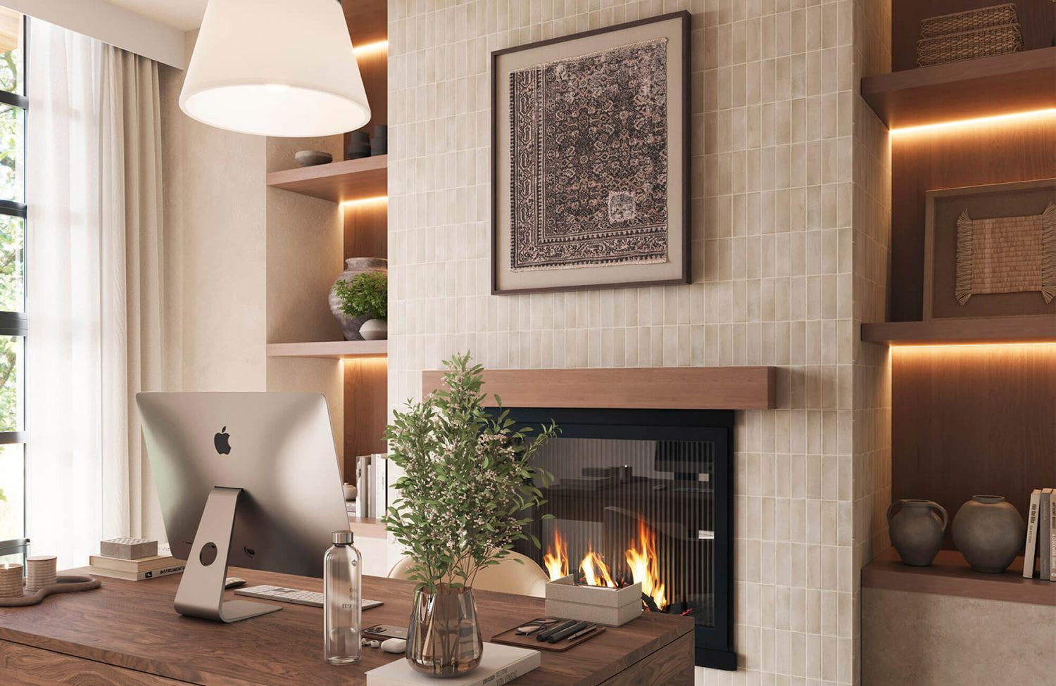
Layering With Decorative Elements
Layering helps smaller wall art feel more naturally connected to the surrounding space. Shelves, sconces, ceramics, and thoughtfully styled furniture can support compact artwork without taking attention away from it.
The photo featured above demonstrates this beautifully with Edward Martin’s Silent Orchard Wall Art, which feels more visually grounded within the built-in shelving arrangement. Surrounded by warm wood finishes, decorative accents, and soft textures, the smaller artwork becomes part of a cohesive display rather than appearing isolated. This styling approach works especially well in entryways, bedrooms, and reading corners where layered décor can add warmth, depth, and a stronger sense of balance to the space.
Pairing Art With Mirrors
Mirrors can help smaller artwork feel more balanced within a larger wall arrangement. Because mirrors reflect light and make a space feel more open, they help reduce the contrast between compact artwork and large empty walls. You can place artwork beside a mirror or combine both within a layered gallery wall. The mirror helps add scale and openness, while the artwork brings personality and visual interest to the arrangement. This combination works especially well in darker rooms where reflective surfaces help brighten the space while keeping the wall visually balanced.

Measuring Before You Hang Anything
Taking measurements before hanging artwork can help you avoid common placement mistakes and better understand how the piece will look within the space. Planning also makes the process much smoother because you are less likely to move or rehang the artwork multiple times later.
Testing With Paper Templates
Paper templates are one of the easiest ways to preview how artwork will look on your wall before hanging it permanently. By taping paper cutouts to the wall, you can get a better sense of the artwork’s size and placement from different areas of the room. This simple method helps you see whether the artwork feels balanced within the space. Sometimes a piece that seems large enough when measured can still look too small once it is actually positioned on the wall. Templates also make it easier to test different layouts and spacing arrangements. You can quickly move pieces around and adjust the composition without putting unnecessary holes in the wall or second-guessing the proportions later.
Calculating Ideal Hanging Height
Hanging height affects how large or small an artwork appears just as much as its width does. When artwork is placed too high on the wall, it can seem smaller because it no longer feels connected to the furniture or the natural line of sight within the room. In most spaces, wall art looks more balanced when the center of the piece sits close to eye level. However, certain areas, such as bedrooms, dining rooms, and staircases, may need slight adjustments depending on how the space is typically viewed. The right hanging height helps the artwork feel more naturally integrated into the room. Even a properly sized piece can look out of place if it is positioned too high or too low on the wall.
Measuring Around Architectural Features
Windows, fireplaces, molding, and built-in shelves all affect how artwork looks within a space. Even when the measurements seem correct, ignoring these architectural details can make the artwork feel too small or visually out of proportion. For example, a narrow piece placed beside large windows can feel compressed because the surrounding architectural elements naturally draw more attention. In these situations, wider artwork or larger arrangements often create a more balanced look.
It helps to think of the wall as part of the room’s overall structure rather than just an empty surface to decorate. Architectural features can strongly affect proportion and often change how an artwork looks within a space more than people expect.
Using Digital Room Mockups
Digital mockups make it much easier to see how artwork will look before you buy or hang it. Many people now use simple apps or edited room photos to test different artwork sizes directly within their space. This helps remove much of the guesswork as you can compare proportions more realistically. A piece that looks large online may end up feeling much smaller once you see it against your actual wall and furniture.

Choosing The Right Size From The Start
Choosing artwork in the right size from the beginning can make the entire decorating process feel much more seamless. Rather than trying to correct visual imbalance later, you can create a room that feels more cohesive and naturally put together from the start.
Shopping With Wall Dimensions
Measuring your wall before shopping for wall art can help you avoid choosing pieces based only on appearance. Artwork often appears much larger in a showroom or online than it does once you place it in a larger room. Having a general idea of the width and height you need makes it easier to narrow down your options. It also helps you compare artwork more realistically against the actual space available on your wall. Taking these measurements ahead of time creates a more thoughtful and intentional buying process instead of relying purely on guesswork.
Thinking Beyond Single Pieces
Some walls need more visual coverage than a single small frame can provide. In these cases, oversized artwork or multi-piece arrangements often create a stronger sense of balance within the room. The right choice usually depends on the overall style and feel of the space. Large statement pieces tend to work well in modern interiors, while layered arrangements can create a more collected and personal look.
This idea comes through clearly in the photo featured above, where Edward Martin’s Dusk Fold Wall Art has enough presence to balance the tall ceilings, large dining table, and statement lighting without getting lost within the surrounding architecture. The larger scale helps anchor the wall and contributes to the room’s overall sense of balance and cohesion.
Instead of focusing only on the size of one piece, it helps to consider how the entire arrangement will interact with the room as a whole.
Considering Viewing Distance
Viewing distance plays a big role in how an artwork is experienced within a room. Pieces that look detailed and visually interesting up close can lose their impact when viewed from farther away. Large living rooms and open-concept spaces often need bigger artwork because scale is perceived differently at a distance. Smaller pieces usually work better in more intimate areas where you naturally view them from a closer distance. As a general rule, artwork needs more presence as the viewing distance increases, so it can still stand out comfortably within the room.
Planning For Future Decor Changes
Furniture layouts can change over time, lighting may be updated, and your decorating style will likely evolve as the room develops. Choosing artwork with balanced proportions helps the space stay flexible and visually cohesive through those changes. Well-proportioned wall art usually remains naturally connected to the room even as the surrounding décor changes. Smaller pieces that already feel slightly undersized, however, can start to look even more disconnected as new furniture or larger design elements are added. Thinking long-term helps you create a space that continues to feel balanced and intentional rather than needing constant adjustments later on.
Creating Walls That Feel Balanced
Knowing whether artwork is too small for a wall usually comes down to proportion, placement, and how naturally the piece connects with the rest of the room. Wall art should feel like part of the overall space rather than something isolated on an empty wall. Once you understand how wall size, furniture scale, ceiling height, and viewing distance affect perception, it becomes much easier to choose artwork that feels balanced within the room.
Smaller artwork can still look beautiful when it is styled thoughtfully, grouped intentionally, or supported through framing and layered décor. In the end, the goal is not simply to fill wall space but to create an arrangement that feels cohesive, comfortable, and visually complete in your home.
If you are unsure what artwork size works best for your space, a professional design service can help you create a layout that feels balanced and intentional from the start. You can also contact us for personalized guidance on choosing wall art that complements your room dimensions, furniture, and overall style.
