Neutral rooms can feel calm and timeless, but without the right layers, they can also fall flat. Woven multicolored rugs offer a way to introduce depth, warmth, and visual interest while keeping the palette grounded and balanced. Because color is woven rather than printed, these rugs blend naturally into neutral spaces instead of competing with them. In this blog, we’ll explore how woven multicolored rugs work in neutral interiors, from choosing the right color mix to understanding texture, materials, sizing, and placement.

Why Woven Multicolored Rugs Work in Neutral Rooms
Neutral rooms often rely on texture and tone to feel complete, and woven multicolored rugs naturally support that balance. Instead of introducing a single bold color, these rugs layer softer hues together, which adds warmth and depth without overwhelming the space.
How Color Variation Adds Depth Without Visual Noise
Woven multicolored rugs bring in variation slowly, which helps neutral rooms feel layered without tipping into visual clutter. Because the colors are woven together rather than sharply divided, the eye reads the rug as one cohesive surface instead of a collection of competing shades. This creates a sense of richness while still allowing the space to feel calm and grounded. You notice the depth more as you move through the room, not all at once.
At the same time, this gentle color movement keeps neutral spaces from feeling flat or overly uniform. Instead of relying on strong contrast, interest comes from soft shifts between tones. For instance, quiet touches of muted blue, clay, or olive can sit comfortably alongside whites, beiges, or light grays. These colors add character without demanding attention. The overall effect feels natural and balanced rather than decorative or forced.
A good example of this approach is our Georgette Polyester Pile Rug in Spice / Indigo above, which uses a time-faded mix of brownish-red and muted blue to create depth without sharp contrast. The vintage-inspired floral clusters and softened vine border feel gently layered, so the color reads as aged and cohesive rather than bold. Because the tones are restrained and slightly washed, the rug adds warmth and character while still sitting comfortably within a neutral room. It’s the kind of piece that feels collected over time, not introduced all at once.
Why Woven Patterns Feel Softer Than Printed Designs
Woven patterns tend to feel more relaxed because the design is part of the rug’s structure rather than something applied to the surface. This naturally introduces slight irregularities that give the pattern a more organic, lived-in quality. Unlike printed designs, which often read as crisp or sharply defined, woven patterns soften edges and ease the transition between colors. That subtle softness allows the rug to settle into a neutral space instead of standing apart from it.
Because of this, woven rugs are usually easier to live with visually over time. They add interest and texture without constantly pulling focus. In neutral rooms, where comfort and cohesion matter more than bold contrast, that balance goes a long way. The pattern feels present and grounding, not decorative for the sake of decoration.
Using Subtle Color Movement to Prevent Flat Neutrals
Subtle color movement helps neutral rooms feel alive rather than still. In woven multicolored rugs, small shifts in tone flow across the surface, giving the eye something to move through without creating a bold focal point. This kind of movement brings quiet energy into the space, especially when walls, furniture, and finishes all stay within a narrow color range. It adds interest without asking for attention.
Instead of disrupting the neutral palette, these gentle variations often help tie it together. A rug with soft tonal changes can naturally connect warm wood, light upholstery, and neutral flooring, so the room feels more cohesive. For example, a mix of muted hues can bridge different materials without standing out on its own. That’s often what keeps a neutral space from feeling unfinished and helps it feel comfortably layered instead.

Picking a Color Mix That Still Feels Neutral
Not all multicolored rugs feel bold, and the difference usually comes down to how the colors are mixed. By paying attention to dominant tones, undertones, and contrast levels, it becomes much easier to choose a rug that adds interest while still blending naturally into a neutral room.
Reading the Dominant Color Before the Accent Colors
When looking at a multicolored rug, the first thing to identify is the dominant color rather than the smaller accent shades. This main tone is what your eye reads from a distance, and it should sit comfortably alongside your walls, floors, or large furniture pieces. If the dominant color feels neutral, the rug will generally read as neutral overall, even if it includes several secondary hues. Accent colors tend to show up more subtly and only become noticeable once you’re closer to the space. Starting with the dominant tone helps avoid rugs that feel unexpectedly busy once they’re in the room.
Warm vs Cool Multicolor Rugs in Neutral Spaces
Even in neutral rooms, multicolored rugs usually lean either warm or cool, and that underlying temperature plays a big role in how the space feels. Warm mixes often include beige, tan, clay, or soft gold tones, which tend to work naturally with wood finishes and creamy neutrals. Cooler blends rely more on gray, muted blue, or soft green undertones and pair well with stone surfaces, concrete details, or crisp whites. Paying attention to this balance helps the rug feel integrated rather than added as an afterthought. When the warmth or coolness aligns with the rest of the room, the colors settle in more easily. If it doesn’t, the space can feel slightly off even when everything looks neutral on its own.
Low-Contrast vs High-Contrast Weaves and Their Impact
Contrast level plays a big role in how noticeable a multicolored rug feels in a neutral space. Low-contrast weaves use colors that are close in value, which creates a softer, more blended look that supports calm interiors. High-contrast rugs, on the other hand, introduce clearer light and dark differences, making the pattern more visible even from across the room. In neutral spaces, lower contrast often feels more relaxed and easier to live with long-term. Understanding this difference helps you control whether the rug quietly supports the room or becomes a stronger visual element.
When a Rug Should Echo the Room Instead of Standing Out
In many neutral rooms, a multicolored rug works best when it echoes colors already present rather than introducing something new. Pulling tones from nearby finishes, such as upholstery, wood, or subtle wall undertones, helps the rug feel like part of the space rather than a separate layer. This approach keeps the room feeling balanced and intentional, especially when other elements are understated. A rug that blends in doesn’t disappear, but it also doesn’t compete for attention. Often, this is what makes a neutral room feel cohesive instead of styled.

Rug Construction and Texture in Neutral Interiors
In neutral interiors, rug construction plays a bigger role than many people realize in how color and pattern are perceived. The way a rug is woven, piled, or textured can either calm a multicolored design or make it feel visually busy. Below, we’ll look at how different constructions influence texture, clarity, and overall balance without getting into material durability or care just yet.
Flatwoven Rugs for Clean, Layered Neutral Rooms
Flat-woven rugs tend to feel visually lighter, which makes them a strong choice for neutral rooms that already rely on subtle layering. Because the weave sits close to the floor, multicolored patterns appear more controlled and less dominant. This helps color variation blend into the space rather than stand out sharply. Flatweaves also work well in rooms where clean lines matter, since their structure keeps patterns crisp without adding bulk. For instance, in a calm living room, a flat-woven rug can introduce color while still supporting an uncluttered look. As a result, the room feels intentional, not overstyled.
Handwoven and Loomed Rugs That Add Subtle Dimension
Handwoven and loomed rugs introduce dimension in a softer, more organic way. Slight variations in weave and yarn naturally break up color transitions, which helps multicolored designs feel relaxed rather than graphic. Because of this, the pattern often reads as layered instead of bold. In neutral interiors, that subtle irregularity adds warmth and depth without demanding attention. These rugs tend to feel lived-in from the start, which also makes them easier to pair with understated furniture. Overall, they support the room’s calm tone while quietly enriching it.
How Pile Height Changes the Way Color Reads
Pile height has a noticeable impact on how color and pattern show up in a neutral space. Lower piles usually make multicolored designs feel sharper and more defined, which works well when structure is important. Taller piles, on the other hand, soften color edges and blur transitions slightly. This can be especially appealing in relaxed spaces where contrast needs to stay gentle. Because light hits taller piles differently, colors also shift more throughout the day. That movement keeps neutral rooms from feeling flat or static.
When Texture Matters More Than Pattern
In some neutral interiors, texture ends up doing more of the visual work than pattern ever could. Rugs with varied yarn thickness, gentle ridging, or a tactile surface add interest even when the color range stays restrained. Because of that, multicolored rugs can feel grounded rather than decorative. For instance, a richly textured rug can support soft color shifts without pulling too much attention. When texture takes the lead, color becomes more flexible and easier to live with, which makes the room feel layered, not busy or overdesigned.

Materials That Make Multicolored Rugs Easier to Live With
Material choice plays a quiet but important role in how a multicolored rug looks and feels in a neutral space. Beyond comfort, materials influence how clearly colors show up, how much texture is visible, and how the rug holds up to everyday use. In here, we’ll walk through common rug materials and blends and how each one supports a balanced, livable neutral interior.
Wool Rugs for Depth, Warmth, and Natural Color Variation
Wool rugs tend to work especially well in neutral spaces because the way they hold color feels natural rather than precise. The fibers absorb dye unevenly, so multicolored weaves develop soft shifts and depth instead of crisp edges. That variation helps the colors blend together, which keeps the rug from feeling overly defined. Wool also adds warmth, both visually and underfoot, which pairs nicely with cooler neutrals like stone, gray, or white. As the fibers settle over time, the rug often feels even more relaxed and comfortable. Because of that, wool rugs usually read as grounded and enduring, not decorative or trend-driven.
Polypropylene Rugs for Busy Neutral Spaces
Polypropylene rugs are a practical choice for neutral rooms that see a lot of daily activity. The fibers hold color consistently, which keeps multicolored patterns looking clear and intentional. Because the material resists fading and moisture, the rug tends to look the same day to day without much effort. This reliability makes color feel more controlled, even in spaces with movement and wear. While polypropylene doesn’t have the same softness as wool, it still works well visually in neutral settings. It allows color to show up cleanly without becoming overwhelming.
Polyester and Blends That Brighten Multicolored Weaves
Polyester rugs naturally reflect more light than many natural fibers, which can help multicolored weaves feel brighter without pushing them into bold territory. Because of that, the colors tend to read a bit clearer, even when the palette stays neutral overall. This can be especially helpful in rooms that feel slightly muted or low-contrast to begin with. Polyester blends soften that brightness, too, so the rug still feels comfortable rather than glossy or sharp. The smoother fibers also help patterns appear more even across the surface. Together, those qualities make polyester-based rugs a solid choice when you want gentle lift and color clarity without added visual weight.
Cotton and Wool Blends for Lightweight, Casual Rooms
Cotton and wool blends sit comfortably between structure and softness, which makes them a natural fit for relaxed, neutral spaces. Cotton keeps the rug feeling lighter and more breathable, while wool brings in warmth and subtle depth of color. Together, they help multicolored designs feel easygoing rather than formal or overly polished. These blends also tend to settle naturally on the floor, so patterns look softer and less rigid. Over time, the fibers loosen and soften, which only adds to that lived-in feel. Because of this, cotton and wool blends work especially well in rooms meant for everyday comfort and low-key living.
A piece like our Marcela Cotton Blend Rug in Lake / Spice above fits seamlessly into this kind of relaxed setting. Its light beige and gray base reads neutral first, while soft green undertones and faint terracotta notes surface gradually through the weave. Because the pattern feels gently worn and textural rather than sharp, the color stays calm even as you notice more detail over time. The cotton blend keeps the rug feeling breathable and easy underfoot, which suits everyday rooms where comfort matters more than formality. It’s the kind of rug that adds character quietly, settling into the space instead of defining it outright.

Size and Placement That Keep Multicolor Rugs Feeling Calm
Even the most beautiful multicolored rug can feel off if the size or placement isn’t quite right. In neutral rooms, scale and positioning are what determine whether color feels relaxed and grounded or visually distracting.
Area Rugs That Anchor Neutral Living Spaces
In neutral rooms, area rugs work best when they clearly connect the furniture instead of sitting loosely beneath it. A properly sized rug gives multicolored weaving a sense of belonging, so the colors feel part of the room rather than scattered across it. When a rug is too small, the pattern can feel disconnected and slightly restless. By contrast, a rug that extends comfortably under key furniture pieces creates visual stability. This grounding effect allows the color variation to feel calmer and more cohesive. In many spaces, anchoring is what helps multicolor feel intentional rather than busy.
Runner Rugs That Add Color Without Dominating
Runner rugs introduce color in a controlled, directional way, which makes them especially useful in neutral interiors. Their narrow proportions naturally limit how much pattern is visible at once. Because of that, the color reads as movement rather than a focal point. Runners work well in hallways, kitchens, or entryways where you want warmth without visual weight. They guide the eye through the space instead of stopping it. This makes multicolor feel subtle and supportive rather than overwhelming.
Oversized Rugs That Let Multicolor Feel Intentional
Oversized rugs often make multicolored designs feel calmer rather than more noticeable. Because the rug stretches well beyond the main furniture pieces, the colors have space to blend instead of standing out individually. Over time, the eye starts to read the rug as one continuous surface rather than a mix of separate tones. This helps reduce visual breaks across the floor, which makes the room feel more grounded and settled. In neutral spaces, a larger rug tends to hold the color gently instead of calling attention to it.
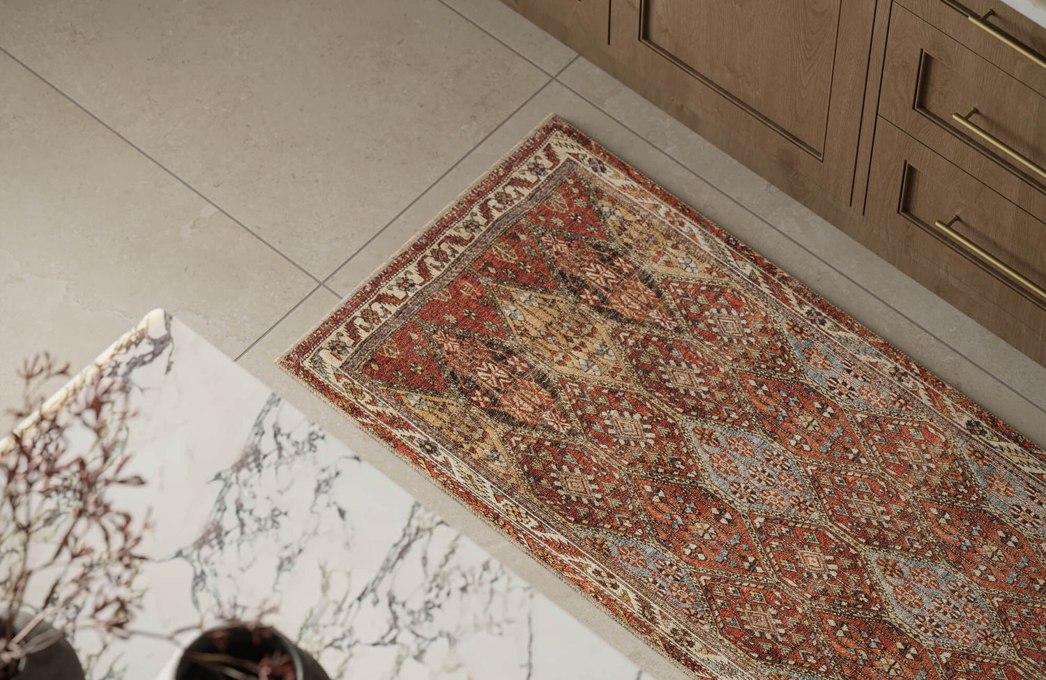
A rug like our Hutchinson Polyester Face Rug in Burgundy / Denim above shows how scale can completely change how multicolor reads in a neutral room. When used in a larger size, its deep red and denim blue tones soften into the background, allowing the warm beige and golden accents to blend rather than stand apart. The repeating medallion and vine motifs feel more unified across a wider surface, so the pattern reads as texture first, color second. Its gently distressed finish reinforces that settled, lived-in look, especially in calm interiors with light floors and simple furnishings. Instead of drawing the eye in fragments, the rug anchors the space as one cohesive foundation.
Common Placement Mistakes That Make Rugs Feel Busy
Multicolored rugs usually feel most chaotic when placement feels unplanned. Rugs pulled too far away from furniture can make the colors seem disconnected from the rest of the room. Using several small rugs instead of one well-sized piece can also break up the space and amplify contrast. Another issue is placing a patterned rug too close to other strong visual elements, like bold artwork or heavy textures. In neutral rooms, that kind of overlap can quickly feel overwhelming. Giving each element enough space to breathe helps the rug feel balanced instead of overstimulating.

When Other Rug Colors May Work Better Than Multicolor
Woven multicolored rugs are versatile, but they’re not always the best fit for every neutral space. Sometimes a simpler palette does a better job supporting the room’s mood, layout, or existing finishes. Below, we’ll look at situations where alternative rug colors may feel more natural and how each option shapes the overall atmosphere.
Black and White Rugs for Structured Neutral Rooms
Black and white rugs tend to work best in neutral rooms that already lean structured and graphic. Their contrast creates clarity, which can help anchor spaces with clean lines, strong geometry, or modern finishes. Instead of softening the room, these rugs bring order and definition. This can be especially helpful when furniture silhouettes are simple, and the architecture does most of the visual work. In these settings, multicolor might feel unnecessary, while black and white keeps everything crisp and intentional.
Earth-Toned Rugs That Keep Spaces Grounded
Earth-toned rugs work well when a neutral space needs warmth but not extra visual layers. Colors like sand, clay, rust, and warm brown connect easily with wood furniture and other natural finishes. Because these tones feel familiar, they tend to settle into a room instead of calling attention to themselves. In spaces with softer lighting or organic textures, earth tones often feel more cohesive than multicolored designs. They add depth and warmth while letting the rest of the room breathe.
Green and Muted Color Rugs in Calm, Natural Interiors
Muted greens and softened botanical tones tend to settle easily into neutral, nature-inspired spaces. They introduce color quietly, which helps the room feel relaxed rather than styled for effect. Because green sits between warm and cool palettes, it pairs naturally with materials like wood, stone, and light upholstery. In bedrooms, reading corners, or slower-paced living areas, these rugs often feel more soothing than busier multicolored designs. They add just enough visual interest while letting the rest of the room stay calm and grounded.
Solid Rugs in Rooms With Strong Architectural Features
In rooms where the architecture already makes a statement, simpler rugs often feel like the right choice. Features such as exposed beams, large windows, or dramatic ceiling lines naturally draw the eye, and a solid or near-solid rug lets those elements stay in focus. Introducing too much color or pattern can start to compete with what the room already does well. A quieter rug helps the space feel open and balanced instead of layered on. This approach tends to work especially well in older homes or spaces with strong architectural character.
Light Neutral Rugs for Small or Visually Busy Rooms
In smaller rooms or spaces with a lot of visual activity, lighter neutral rugs can quietly bring everything back into balance. Shades like soft beige, pale gray, or warm ivory reflect light and ease contrast at floor level, which helps the room feel more open. This subtle lift can make tight layouts feel less compressed and more breathable. In settings like these, multicolored rugs sometimes pull too much attention downward and highlight how compact the space is. A lighter rug keeps the focus moving rather than stopping abruptly. The result is a room that feels calmer and easier to live in.
Knowing When Multicolor Is Too Much for the Space
Multicolored rugs can start to feel overwhelming when a room already carries strong visual energy. Bold wallpaper, statement art, or heavily textured furniture can leave little room for additional pattern on the floor. When your eye struggles to settle, it’s often a sign that the rug is adding more than the space can comfortably handle. In those situations, dialing back the floor pattern can actually make everything else feel more intentional. Choosing restraint doesn’t mean the room loses character. More often, it creates a sense of clarity that makes the space feel finished and livable.
Making Multicolored Rugs Feel Intentional in Neutral Spaces
Styling neutral spaces with woven multicolored rugs is really about balance, not boldness. When color is introduced through weaving, texture, and subtle variation, it supports a room instead of competing with it. From construction and material to size and placement, each choice shapes how calm or layered the space ultimately feels. When those decisions are made with intention, multicolor becomes a grounding element rather than a distraction.
If you’re unsure which rug direction fits your space best, getting a second set of eyes can make the process much easier. Our design consultation helps you look at your room as a whole, from finishes and lighting to scale and flow, so the rug feels like a natural extension of the space. Instead of guessing, you can move forward with confidence knowing each choice supports the overall mood. That clarity is often what turns a good neutral room into one that truly feels complete.