


A statement countertop can instantly define the mood of a kitchen, but pairing it with the wrong backsplash can quickly throw the balance off. From bold veining to dramatic color shifts, these surfaces already do a lot of visual work, which makes ceramic tile selection more about restraint than decoration. In this blog, we’ll walk through how to pair ceramic tile backsplashes with statement countertops by focusing on visual hierarchy, color relationships, finish, layout, and the surrounding elements that bring everything together.

Statement Countertops as the Visual Foundation
Statement countertops naturally draw the eye in kitchens and baths, which is why they should guide the rest of the design decisions. Before bringing ceramic tile into the conversation, it helps to read the countertop as the visual anchor, because its scale, surface detail, and contrast already establish the mood of the space. Below, we’ll take a closer look at how elements like veining, movement, and visual weight shape the way the backsplash should respond.
How Veining and Movement Define the Countertop’s Visual Weight
Veining and movement are usually the first things people notice in a statement countertop, because they introduce motion across the surface. Bold, sweeping veins tend to feel more expressive and visually heavy, while finer or softer veining reads calmer and more controlled. This sense of movement affects how much visual space the countertop seems to occupy, even when the overall color stays fairly neutral. For instance, a slab with dramatic veining can still feel dominant without relying on dark tones or strong contrast. Paying attention to this early makes it easier to gauge how much visual restraint the backsplash will need later on.
Why Bold Countertops Should Lead the Design Conversation
Bold countertops often become the focal point without any extra effort, so letting them lead the design conversation keeps things feeling intentional. When the countertop sets the visual hierarchy, other elements can respond naturally instead of competing for attention. This also makes decisions easier, because you’re building around a clear starting point rather than guessing in isolation. For example, a countertop with a strong presence usually benefits from quieter supporting elements to keep the space balanced. Allowing the countertop to guide these choices helps the room feel cohesive and thoughtfully put together.
Identifying Dominant vs Secondary Colors in Stone Surfaces
Most stone countertops include more than one color, although not all of them carry the same visual weight. Typically, one tone reads as dominant, while others show up more quietly through veining, speckling, or subtle shifts across the surface. Spotting these secondary colors early is helpful because they often offer more flexibility as the design comes together. For instance, a countertop may appear white at first glance but include warm beige or soft gray undertones that shape the overall mood. Seeing these layers clearly keeps the color story from feeling oversimplified and makes later pairing decisions feel more intentional.
When a Countertop Reads as Dramatic vs Subtle
Not every statement countertop feels bold in the same way, and some come across more quietly than expected. Strong contrast, pronounced veining, or noticeable color variation tends to push a surface toward the dramatic end of the spectrum. On the other hand, consistent coloring paired with gentle movement often feels more restrained, even when the countertop is large. This distinction matters because more dramatic surfaces usually benefit from greater visual restraint around them. Understanding where a countertop falls along this spectrum makes it easier to judge how much support it will need from surrounding elements.
How Finish Changes the Countertop’s Overall Presence
Finish has a significant influence on how a countertop is perceived, sometimes even more than color itself. Polished surfaces reflect light and emphasize veining, which can make patterns feel sharper and more defined. In contrast, honed or matte finishes soften those details and lend a calmer, more grounded appearance. Because finish affects how light interacts with the surface throughout the day, it also shapes how bold or subdued the countertop feels over time. Considering finish early helps clarify the countertop’s presence before other materials enter the conversation.

Balancing Bold Countertops With Simpler Ceramic Tile
When a countertop brings a lot of visual energy into a space, ceramic tile works best when it knows when to step back. In these moments, simplicity becomes a design tool rather than a limitation, because it helps bold surfaces feel intentional instead of overpowering. In this section below, we’ll look at how clean tile choices help create balance while keeping the countertop firmly in focus.
Why Simpler Tile Shapes Work Best With Active Countertops
Simple tile shapes tend to work well alongside active countertops because they avoid adding extra visual noise. When a countertop features strong veining or movement, more complex tile forms can pull attention away rather than support the surface. Clean, familiar shapes give the eye a place to rest, which helps the countertop feel more deliberate. For example, a straightforward tile profile can quietly frame a bold slab without competing with it. This restraint allows each surface to play its role clearly. The space feels cohesive, not visually crowded.
Using Ceramic Tile to Create Visual Breathing Room
Ceramic tile often works like a pause between design statements, helping create breathing room around bold countertops. A calm backsplash gives the countertop space to stand out without feeling boxed in or overwhelmed. This doesn’t mean the tile feels plain or forgettable, but rather that it supports the overall composition. For instance, a simple backsplash can make a dramatic countertop feel lighter and easier to live with. That added sense of openness carries through the entire space. Kitchens and baths tend to feel more relaxed and visually balanced when this breathing room is built in.
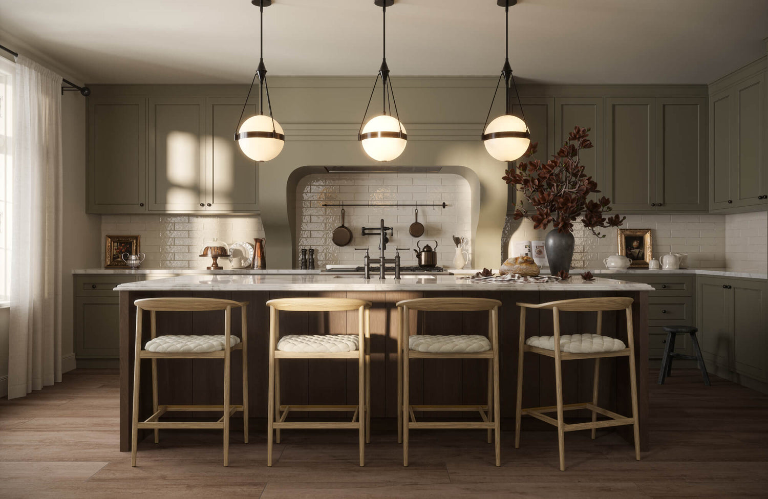
Our Mara 2x10 Glossy Ceramic Tile in Nettle Green, as shown above, is a great example of how ceramic tile can create visual breathing room around a bold countertop. Its elongated form keeps the backsplash feeling streamlined, while the unevenly layered glaze adds depth without introducing visual noise. The muted green tone, inspired by naturally derived pigments, brings an earthy softness that balances stronger surfaces nearby. Together, the subtle variation and lean profile allow the countertop to remain the focal point while the backsplash quietly supports the overall composition.
When Minimalism Makes the Countertop Feel More Intentional
Minimalism tends to work best when the countertop is meant to carry the visual weight of the space. By keeping the backsplash understated, the countertop reads as a deliberate design choice rather than just another surface layered into the room. This clarity helps each element feel purposeful because nothing is competing for attention. For example, a restrained backsplash can make a bold countertop feel curated and thoughtfully placed. With fewer details surrounding it, the countertop naturally stands out. In many cases, that sense of restraint makes the statement feel stronger, not smaller.
How Scale Helps Keep the Backsplash Visually Quiet
Scale quietly influences how calm or busy a backsplash feels next to a bold countertop. Smaller or more intricate tile formats can introduce extra visual activity, even when the tile itself is simple. Larger, more straightforward layouts tend to read calmer, which helps the countertop remain the focal point. For example, a visually broad backsplash surface allows the eye to move smoothly across the space without interruption. This sense of openness supports the countertop rather than competing with it. Paying attention to scale early makes the pairing feel intentional and comfortable to look at.

Using Color Relationships Instead of Exact Matches
When you’re pairing ceramic tile with a statement countertop, the most successful combinations usually come from subtle color relationships rather than perfect matches. Copying the countertop color can feel tempting, but it often flattens the space instead of adding depth. Below, we’ll walk through how working with undertones and quiet color connections helps the backsplash support the countertop while still feeling intentional and layered.
Pulling Secondary Tones From the Countertop
Most statement countertops carry more than one color, even when they look fairly simple at first glance. Once you slow down and really look at the surface, secondary tones often appear in the veining or background. These quieter colors can be especially helpful when choosing a backsplash, because they create a natural connection without feeling overly matched. For instance, a countertop that reads as white may still include soft beige or light gray notes worth echoing in ceramic tile. Picking up on those subtleties keeps the pairing from feeling forced. It also allows the countertop to remain the focal point while everything around it feels connected.
Why Near-Matches Often Feel Flat
Near-matching the backsplash to the countertop might seem like a safe choice, but it rarely creates the depth people expect. When two surfaces sit too close in color, they tend to blur together, which makes the backsplash feel less defined. Even though the backsplash covers a large portion of the wall, it can quietly disappear instead of contributing to the design. For example, a ceramic tile that’s just slightly lighter or darker than the countertop often reads as indistinct once installed. Introducing a bit of separation helps each surface stand on its own. In many cases, that small contrast is what gives the space its visual energy.
Warm vs Cool Color Echoes in Ceramic Tile
Understanding whether a countertop leans warm or cool can quietly shape how successful the pairing feels. When ceramic tile echoes that same temperature, the two surfaces tend to feel connected, even if the colors aren’t an exact match. For instance, warm stone usually pairs more comfortably with tiles that carry a hint of warmth, while cooler slabs feel more at ease alongside cooler supporting tones. This shared temperature creates a sense of continuity without making the pairing feel obvious or overplanned. It also helps the eye move smoothly from one surface to the next. In many cases, paying attention to warmth and coolness matters more than matching a specific shade.
Using Neutrals to Support Bold Stone Colors
Neutrals become especially helpful when a countertop brings strong color or dramatic movement into the space. Instead of competing for attention, a neutral ceramic tile gives the eye a place to pause while the stone remains the focal point. This doesn’t mean the backsplash fades away, but rather that it plays a steady, grounding role. For example, soft neutrals can make bold countertops feel more approachable and easier to live with over time. They help calm the overall composition without stripping it of character. Because of that balance, neutral pairings often hold up well as styles and preferences shift.
When Contrast Creates a More Balanced Pairing
Sometimes a statement countertop needs contrast to feel fully defined. Introducing a ceramic tile that clearly differs in tone helps draw a clean line between surfaces, so each one reads on its own. This approach works particularly well when the countertop feels visually dense or highly expressive. For instance, contrast can keep bold materials from visually blending into each other. When handled with intention, contrast adds clarity instead of tension. It often becomes the detail that makes the pairing feel resolved and thoughtfully composed.
When contrast is used thoughtfully, it helps define where the countertop ends and the backsplash begins, as shown above. Our Teagan 3x12 Glossy Ceramic Tile in Pearl is a great example of this approach, pairing crisp white tones with a high-gloss surface that stands apart from richly veined or visually dense stone. The subtle shade variation adds refinement without pulling focus away from the countertop, while the elongated subway form keeps the look structured and clean. This kind of contrast adds clarity to the space, allowing each surface to read distinctly while still feeling cohesive.

Finish and Texture as the Key to Visual Balance
Finish and texture often do just as much balancing as color, especially when ceramic tile is paired with a statement countertop. The way a surface reflects light, feels visually soft, or shows subtle variation can quietly shift the mood of the entire space. In here, we’ll look at how finish and texture help the backsplash support bold stone surfaces without competing for attention.
Glossy Ceramic Tile and Light Reflection Against Stone
Glossy ceramic tile reflects light in a way that can ease the visual weight of dramatic stone countertops. That reflection softens heavy veining and helps the space feel more open, rather than dense or closed in. As light moves across the room throughout the day, a glossy backsplash can lift darker or more expressive stone surfaces. For example, even a bold countertop can feel lighter when paired with a reflective tile that bounces light back into the space. This contrast adds brightness without introducing extra pattern or color. When used intentionally, gloss brings clarity and a sense of airiness to the pairing.
When light is allowed to bounce gently across the backsplash, it can noticeably soften the presence of a bold countertop, as shown above. Our Graham 3x6 Glossy Ceramic Tile in Bone is a great example of how a reflective surface adds lift without competing, using its warm limestone-inspired tone to complement rather than overpower stone. The glossy finish highlights subtle artisanal variation, helping the backsplash feel lively while still restrained. This balance allows the countertop to remain the focal point while the tile quietly enhances brightness and depth in the space.
Matte Finishes That Ground Polished Countertops
Matte ceramic tile tends to work best when the countertop already has a polished or reflective surface. The softer finish creates a visual pause, giving the eye a place to rest while the countertop remains the focal point. This contrast feels natural because not every surface is trying to shine at the same time. For instance, a matte backsplash can tone down the brightness of a polished slab while still feeling connected to it. The space often reads as calmer and more grounded with this balance in place. Matte finishes quietly anchor the design without making it feel heavy or subdued.
Crackle and Handmade Looks for Added Softness
Crackle glazes and handmade-inspired surfaces bring in softness through subtle variation rather than bold pattern. These finishes interact with light more gently, which helps ease the impact of strong stone movement nearby. Instead of reflecting light evenly, they scatter it in a way that feels warm and relaxed. For example, slight surface irregularities can take the edge off a bold countertop, making it feel less stark. This type of texture adds personality without asking for attention. It’s a natural way to introduce warmth while keeping the countertop in focus.
How Texture Changes the Perceived Weight of a Surface
Texture has a quiet influence on whether a surface feels visually light or heavy, even when the color stays exactly the same. Smooth, uniform tiles often read cleaner and more minimal, while textured surfaces introduce depth that feels more dimensional. This becomes especially important when working with dense stone countertops, because texture can help counterbalance that weight. For instance, gentle surface variation can soften the overall look without making the backsplash feel busy. Texture also makes the tile feel more tactile and intentional. Small shifts in surface detail often change how balanced the space feels.

Tile Shape and Layout in Relation to Countertop Movement
Tile shape and layout play a quiet but important role in how a statement countertop is experienced in a space. When countertops feature strong veining or noticeable movement, the structure of the backsplash can either bring a sense of order or introduce even more visual activity. In this section below, we’ll look at how rhythm, direction, and repetition help ceramic tile guide the eye and keep bold surfaces feeling intentional.
Straightforward Layouts for Highly Veined Countertops
When a countertop carries heavy veining or dramatic movement, straightforward tile layouts tend to feel the most comfortable. Simple, predictable patterns give the eye something steady to return to, which helps balance the countertop’s natural energy. This approach doesn’t make the backsplash feel dull, but instead gives it a calm, grounding presence. For instance, a clean layout can frame bold stone without pulling attention away from it. The countertop still leads the visual story, while the backsplash plays a supporting role. That sense of structure often helps the entire space feel more composed and easier to take in.
When Elongated Tiles Complement Linear Stone Patterns
Elongated tile shapes can be a strong choice when a countertop features linear veining or directional movement. When both surfaces share a similar sense of direction, the design tends to feel more cohesive and thoughtfully connected. This doesn’t mean the tile and stone need to mirror each other exactly, but their visual flow should feel related. For example, linear tiles can gently echo the direction of stone veining without copying it outright. That subtle alignment creates a rhythm that carries the eye naturally across the space. When handled with restraint, this pairing feels balanced and intentional rather than overly designed.
Elongated tile formats are especially effective when they quietly echo the directional movement of a statement countertop, as seen in the space above. Our Madilyn 3x12 Glossy Ceramic Tile in Dove is a strong example, using its extended silhouette to reinforce visual flow without competing with the stone. The soft gray-beige tone and gently rippled, handmade-inspired surface keep the backsplash calm and cohesive. This kind of alignment helps the eye travel smoothly across the room, letting the countertop lead while the tile provides structure and balance.
Why Simple Grid Patterns Often Work Best
Simple grid patterns tend to work well alongside bold countertops because they bring structure without asking for attention. The steady repetition of a clean grid gives expressive stone surfaces something to lean against visually. That consistency helps the eye feel anchored, which matters even more when the countertop carries a lot of movement. For instance, a straightforward grid can make a dramatic stone feel deliberate rather than chaotic. The backsplash stays present, but it doesn’t compete for focus. In many cases, that simplicity is exactly what allows the countertop to stand out.
Using Tile Orientation to Control Visual Flow
Tile orientation has a noticeable effect on how the eye moves through a space. Horizontal layouts often stretch the room visually, while vertical orientations draw the eye upward and introduce a sense of height. When tile orientation is chosen with countertop movement in mind, it can either reinforce that flow or gently counterbalance it. For example, orienting tile against strong stone movement can help slow the eye and calm the overall look. This kind of control makes the space feel more considered. Small layout choices like this often shape the balance more than expected.
Avoiding Overly Expressive Layouts With Dramatic Stone
When a countertop already makes a strong statement, highly expressive tile layouts can easily push the design too far. Pairing bold stone with complex patterns often introduces visual competition rather than clarity. Even when each element works on its own, the combination can feel unsettled. For instance, dramatic layouts may pull attention away from the countertop instead of reinforcing its presence. Keeping the backsplash more restrained allows the stone to stay in the lead. That restraint often makes bold materials feel more intentional and easier to live with over time.

Considering the Whole Kitchen Before Finalizing the Pairing
Once the countertop and backsplash start to feel right together, it helps to pause and look at the kitchen as a complete space. Elements like cabinetry, hardware, and lighting often shape how those surfaces are perceived, sometimes more than expected. Below, we’ll zoom out and look at how these surrounding details influence the pairing and help it feel cohesive rather than pieced together.
How Cabinet Color Frames the Backsplash and Countertop
Cabinet color acts like a visual frame, quietly influencing how both the backsplash and countertop are read. Lighter cabinetry can make bold surfaces feel more open and approachable, while darker cabinets tend to deepen contrast and add visual weight. This framing effect plays a role in whether the countertop comes across as dramatic or more restrained once everything is in place. For instance, the same backsplash can feel warmer or cooler depending on the cabinet tone around it. Because cabinets take up so much visual space, their color often sets the baseline for how other materials interact. Thinking about this relationship early helps keep the pairing feeling connected.
The Role of Lighting in How Materials Read Together
Lighting has a quiet influence on how tile and stone come across throughout the day. Natural and artificial light can soften contrast, emphasize edges, or reveal subtle surface variation that isn’t always noticeable at first. For example, a pairing that feels balanced in daylight may appear heavier or more muted under evening lighting. That shift doesn’t point to a problem, but it does show how much perception depends on light. Taking lighting into account helps the pairing feel comfortable and consistent over time. It’s often what separates a space that simply looks good from one that feels right.
Why Hardware Finishes Affect Overall Balance
Hardware finishes may feel like a small detail, but they quietly shape how the entire space comes together. Metals introduce their own tone and level of reflectivity, which can either support the materials around them or create subtle visual breaks. For instance, warmer hardware often softens cooler stone surfaces, while cooler finishes can sharpen contrast and add definition. Because hardware repeats across cabinets and drawers, its finish shows up again and again in the room. That repetition means it plays a bigger role in balance than most people expect. When hardware is considered alongside tile and stone, the space tends to feel more settled and complete.
Seeing the Backsplash as Part of a Larger Material Story
The backsplash works best when it’s viewed as part of a larger material story rather than a standalone feature. Sitting between cabinetry and countertops, it naturally acts as a transition point between those surfaces. When approached this way, the backsplash helps connect tones and textures instead of calling attention to itself. For example, it can quietly bridge differences in color or surface intensity without feeling decorative. This mindset helps avoid choices that feel isolated or out of place. Looking at the full material picture often leads to pairings that feel more natural and cohesive.
Final Checks Before Locking in the Pairing
Before locking in the pairing, it’s worth taking a moment to step back and look at everything together. Viewing the space as a whole makes it easier to notice if one element feels too dominant or if something feels slightly unresolved. For instance, checking how cabinetry, backsplash, and countertop interact can highlight small imbalances early on. This step isn’t about rethinking every decision, but about confirming the overall direction. Taking the time for this final review helps the pairing feel confident, cohesive, and thoughtfully finished.
Making Tile Work With a Statement Countertop
Pairing ceramic tile backsplashes with statement countertops works best when each decision builds on the last, rather than competing for attention. Starting with the countertop as the visual anchor helps clarify how much movement, contrast, and presence the space can comfortably hold. From there, choices around simplicity, color relationships, finish, and layout feel more intuitive and less forced. Each element has a role to play, but none of them needs to speak louder than the rest.
At the same time, stepping back to look at the kitchen as a whole helps bring everything into focus. Cabinetry, lighting, and hardware all influence how the backsplash and countertop read together, often in subtle but meaningful ways. If you’d like help pulling those decisions together, our design consultation offers guidance tailored to your space, materials, and style. It’s a simple way to move forward with confidence and create a pairing that feels cohesive, comfortable, and thoughtfully finished.
