


A well-balanced mix of tile patterns can transform a plain room into a visually rich and cohesive space. As we explore these ideas together, we’ll focus on the design principles that will help you blend different tile patterns with confidence. When each decision is grounded in clarity, the final result feels intentional, polished, and easy to enjoy. Mixing tile patterns is not about taking risks for the sake of boldness, but about understanding how each choice contributes to the room’s overall character. With the right approach, you can create combinations that feel creative, cohesive, and well-designed.

Color Strategy for Mixed Tile Patterns
Color is one of the most effective ways to unify different tile patterns. With the right palette, even contrasting styles can feel unified and intentional. By focusing on tone, accents, and neutrals, you can create harmony that supports your overall design.
Tone Harmony
Tone harmony refers to the balance between lightness, darkness, and underlying temperature. When tiles share similar undertones, they naturally relate to one another, even if their patterns vary. Warm browns usually blend well with other warm colors, while cool grays pair smoothly with darker grays or light black tones. Identifying these tonal connections early helps you avoid combinations that feel visually discordant.
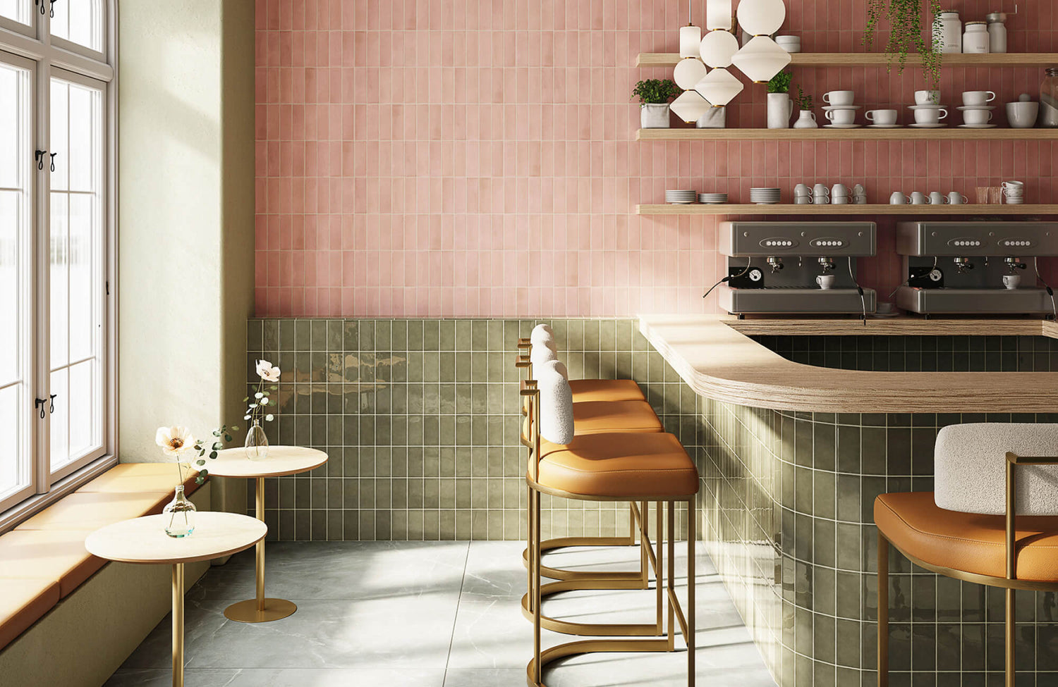
In the photo displayed above, the warm undertones in the Isabel 11x11 Matte Porcelain Tile in Star in Charcoal and Cross in Rosewood echo the gentle warmth of Edward Martin’s Olivia 4x16 Glossy Ceramic Tile in Pearl. Because both tiles share the same tonal family, the space feels cohesive even with patterns that differ in scale and style.
Accent Distribution
Accent distribution helps guide the eye while keeping a balanced design. Rather than placing accent colors at random, you can position them where they reinforce the overall rhythm of the space. When a color appears in more than one tile pattern, it forms a subtle link between surfaces, even if the designs differ in scale or detail. This shared accent becomes a visual bridge that connects the patterns.
You might carry a color from a patterned floor tile into the backsplash or a decorative border to strengthen the overall palette. This repetition builds a clearer color story and allows varied patterns to feel connected. The aim is not to match colors perfectly but to reference them in ways that support unity. When accents are used with intention, the room feels cohesive without relying on identical tiles.
Neutrals as Anchors
Neutrals act as grounding elements that support more expressive tile patterns. When a design starts to feel busy, introducing a neutral surface can create breathing room and bring the composition back into balance. Soft whites, light creams, gentle grays, and natural stone shades work well because they stay in the background. They give patterned tiles the space to stand out while maintaining a composed and comfortable overall look.
Choosing a neutral tile for a major surface, such as the floor or a primary wall, can help visually anchor the room. The patterned tiles then become accents rather than competing for dominance across every area. This approach is also useful when mixing several patterns, as neutrals create the structure needed for each one to stand out in an organized and approachable way.

Layering Texture and Finish to Enhance Pattern Mixing
Texture and finish influence how tiles catch and reflect light, which affects how their patterns are perceived from different angles. When these elements work well together, they can add depth and character without creating unnecessary visual clutter. By understanding how textures and finishes interact, you can bring clarity and dimension to mixed-pattern designs.
Matte with Gloss
Pairing matte and gloss finishes is a simple way to add dimension without introducing more patterns. Gloss tiles reflect light, while matte tiles absorb it, creating a contrast that helps define each surface. When placed side by side, these finishes make patterns easier to distinguish, especially in spaces where lighting shifts throughout the day.
A great example is shown in the photo above, where the matte veining of Edward Martin’s Aniston 24x48 Matte Porcelain Tile in Calacatta Viola grounds the room, while the Graham 3x6 Glossy Ceramic Tile in Moss adds a reflective lift that brightens the surrounding surfaces. This pairing demonstrates how matte and gloss finishes can work together effectively. Placing the gloss finish where light naturally falls and framing it with matte elements creates a comfortable balance between shine and softness. Together, these finishes enhance clarity and add subtle depth to the space.
Smooth with Textured
Combining smooth tiles with textured ones helps create clear visual separation between patterns. Textured surfaces interact with light in unique ways, giving them a tactile presence that smooth tiles lack. When used thoughtfully, the two finishes help keep patterns distinct and make them easier for the eye to read.
For example, a textured tile on a feature wall can pair well with a smooth patterned tile nearby. The smooth surface maintains the pattern sharp, while the textured surface adds depth and dimension. This contrast prevents the area from feeling flat and allows each pattern to retain its own character.
Reflectivity Balance
Reflectivity balance involves tile placement based on how much light each surface reflects. Highly reflective tiles can brighten certain areas, while more absorbent surfaces help soften the overall look. When these qualities are balanced, the room maintains a consistent visual comfort.
Lighting changes throughout the day, so a tile that appears bright in the morning may feel stronger at night under warm or focused lighting. By combining reflective and low-reflective surfaces, you can create a space that feels steady and pleasant in any lighting condition. This balance also keeps each pattern clear and readable without overwhelming the design.

Using Layout and Geometry to Combine Tile Patterns
The way tiles are arranged shapes how patterns interact within a space. Thoughtful layout and geometry help organize these patterns, making the design feel structured instead of scattered. By considering zoning, transitions, and symmetry, you can create a cohesive look even when multiple patterns are working together.
Pattern Zoning
Pattern zoning involves assigning specific patterns to defined areas within a room. This approach brings clarity and prevents visual blending between surfaces that are meant to stand apart. For instance, you might place one pattern on the backsplash and another on the floor, giving each its own space.
Zoning is particularly useful when incorporating two or three patterns in one room. Each pattern serves a purpose and occupies a designated location, making the layout feel deliberate and balanced. It also lets you highlight different parts of the room without overwhelming any single area.
Transition Techniques
Transitions mark the boundaries where one pattern meets another. Clear, intentional transitions keep patterns from competing and help the eye move through the space with ease. You can use edge trims, subtle grout color shifts, or slight changes in tile size to create a smooth and natural handoff between designs.
For example, a simple trim can act as a visual frame that separates two distinct styles. This added structure helps the patterns feel coordinated rather than abrupt. The aim is not to conceal the transition but to make it clear and controlled so the overall design remains cohesive.
Symmetry Control
Symmetry control helps bring stability to a space that features multiple patterns. Symmetry does not have to be exact, but thoughtful balancing creates a sense of order. Aligning tiles around focal points can add structure, especially when the patterns differ in scale or style.
If the patterns begin to feel scattered, adding touches of symmetry can restore clarity. Mirroring patterned tiles or centering them around architectural features helps unify the design. This approach also keeps the room feeling grounded, even when the patterns are varied.

Integrating Mixed Tile Patterns to Support Room Function
Patterns can do more than enhance appearance; they can help organize a room and make daily use more intuitive. When patterns are chosen with function in mind, the space becomes both visually appealing and practical. Tiles can define different areas, guide movement, and support long-term usability in thoughtful and effective ways.
Defining Activity Areas
Patterns are a practical way to mark different sections within a room. In a combined kitchen and dining area, for example, using one pattern in the cooking zone and another near the dining table creates clear visual separation. This distinction helps you understand the purpose of each space at a glance.
A clear definition is also helpful in open layouts where there are no walls to create boundaries. Patterns act as visual cues that organize the room without adding physical barriers. They can make the space easier to navigate and more intuitive to use.
Guiding Movement
Tile patterns can influence how you move through a space. Directional designs draw the eye in a specific way, helping create a natural sense of flow. A pattern with elongated shapes may guide you toward a feature wall or doorway, making the room feel more connected.
This guidance is subtle but effective. Rather than relying on furniture or structural elements, tile patterns can gently shape your path. When planned thoughtfully, the room feels intuitive and comfortable to move through.
Practical Durability Choices
Different patterns offer varying levels of visual forgiveness, which influences how surfaces appear over time. Patterns with small repeats or varied textures often hide everyday marks, while simpler designs may reveal them more easily. Choosing patterns that match the demands of each area helps maintain a clean look with less effort. A more varied pattern can be a good fit for spaces you use often, while simpler patterns may work best in quieter areas. Aligning pattern characteristics with the room’s needs allows the design to age gracefully.
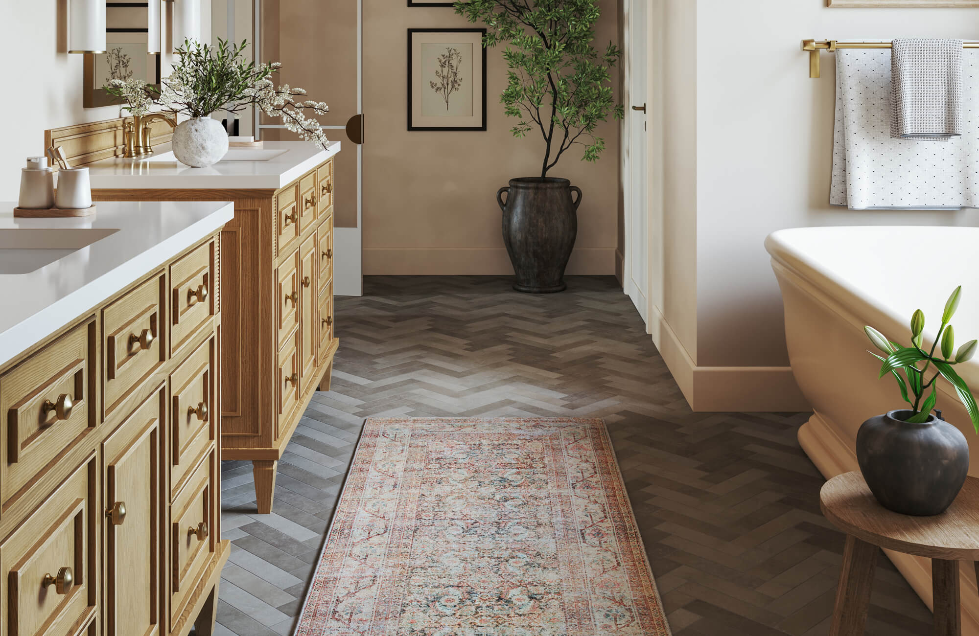
In the photo featured above, Edward Martin’s Aniston 2x2 Polished Porcelain Hexagon Mosaic Tile in Carrara Bianco is used on the bathroom floor, offering a practical and durable option for a high-use area. Its small-scale hexagon pattern naturally disguises minor scuffs and water spots, making the floor easier to maintain throughout daily routines. This choice illustrates how a subtle yet detailed pattern can deliver both visual appeal and long-term resilience in spaces that experience frequent use.

Planning and Testing Mixed Tile Patterns Before Installation
Preparation is essential when mixing tile patterns. Testing your combinations before installation gives you a clearer sense of how the tiles will work together. Mockups, scale previews, and staging methods can help you make informed and confident decisions.
Pattern Mockups
Pattern mockups help you see how different tiles interact in a real setting. You can lay samples on the floor, tape them to the wall, or create a sample board that brings the patterns together. This step reveals how the designs overlap, how the colors relate, and whether the patterns complement one another.
Seeing the tiles side by side makes it easier to notice if anything feels out of place. It also gives you an idea to refine your choices before installation begins. Mockups offer a low-risk way to explore your options and approach the design with greater confidence.
Scale Visualization
Scale visualization helps you see how a tile pattern will look once it covers a full surface. A tile that seems subtle in your hand can appear much bolder when installed, so getting an accurate preview is important. Our AR tool makes this easier by letting you project different tile sizes and patterns directly onto your walls or floors, giving you a realistic sense of scale before you commit.
As you explore options in AR, you can step back, view the patterns from different angles, and adjust choices instantly. This helps you decide whether a pattern feels balanced or overwhelming long before installation begins.
Sample Staging
Sample staging helps you see tiles in context by pairing them with nearby materials such as cabinets, paint colors, countertops, and lighting. This approach shows how the patterns interact with the entire room, not just with one another. Because tiles can appear different depending on their surroundings, staging helps you notice those shifts early.
Taking photos of your staged samples can also offer a fresh perspective. Sometimes a design appears different on camera, revealing contrasts or connections you might not notice at first. Staging ensures your pattern mix works with the full environment, resulting in a cohesive and well-balanced design.
Achieving Balance in Mixed Tile Designs
Mixing tile patterns becomes easier when you understand how scale, color, texture, layout, and function work together. Each element plays a distinct role, and when combined thoughtfully, they create a room that feels layered, expressive, and comfortable. As you explore your options, take time to plan, test, and visualize your choices. With a clear approach, you can confidently combine multiple patterns and create a space that feels cohesive and uniquely yours. If you’d like guidance or help refining your design, feel free to contact us for personalized support.
