


Choosing the right backsplash color might seem simple, but it can have a lasting impact on how your kitchen, bathroom, or even outdoor space feels over time. Some shades look fresh for a moment, only to fade with the trends, while others continue to feel relevant and balanced through years of updates. That’s why timeless color decisions matter; not just for style, but for long-term satisfaction.
In this article, we’ll explore what makes certain ceramic backsplash colors more enduring than others. From layout and lighting to coordinating surfaces, you’ll find practical guidance to help you choose a color you won’t regret later.

Why Color Choice Matters for a Lasting Look
A ceramic backsplash might seem like a small detail, but its color can shape how your kitchen or bathroom feels for years to come. Choosing a shade that holds up over time, not just in quality but also in style, helps you avoid frequent updates or mismatched changes down the line. A timeless color choice can make your space feel balanced even as trends shift around it.
The Role of Trends vs. Classics
Trendy ceramic backsplash colors can feel exciting at first, especially when they reflect the latest styles seen online or in showrooms. But those colors often come and go quickly, leaving your kitchen or bathroom looking outdated sooner than expected. What feels fresh today might lose its appeal in just a few years, making future updates more likely and sometimes more costly.
Classic colors tend to hold up better over time. They also pair more easily with evolving design choices, such as updated countertops or cabinet finishes. Choosing a timeless base gives you more freedom down the road without feeling boxed in by earlier color decisions. It’s a smart way to balance personality and long-term appeal.
How Backsplash Color Affects Room Feel
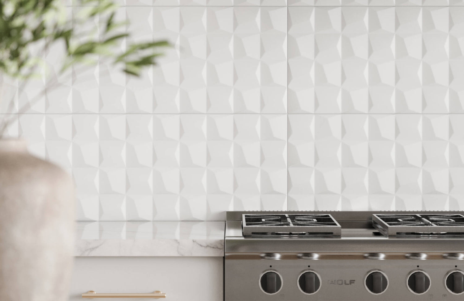
The color of your ceramic backsplash can shape how large, bright, or welcoming a room feels. For instance, lighter shades, such as our Aniston 3x12 Polished Porcelain Tile in Calacatta Quarzite above, reflect more light and can make tight spaces appear more open. They’re especially helpful in small kitchens or areas with limited natural light, where a brighter tone can subtly lift the atmosphere.
Darker hues, on the other hand, bring richness and warmth, which can work well in larger rooms or more modern interiors. They create contrast and mood, especially when paired with lighter countertops or cabinets. Also, your backsplash can influence the emotional tone, calm, cozy, or energetic, depending on the color you choose. That makes it more than just a background element in your design.

Factors to Consider Before Choosing a Color
The right ceramic backsplash color isn’t just about personal taste; it also depends on how it works with the rest of your space. Light, layout, and surrounding materials all play a part in how a color will look and feel once it’s in place.
Room Size and Natural Lighting
Room size and lighting can completely shift how a backsplash color appears. For instance, in smaller kitchens or areas with limited natural light, specific tones can help create a sense of airiness and openness. They reflect more light and can make a tight space feel less closed in.
In contrast, spacious kitchens and open layouts can handle darker hues more comfortably. These deeper tones can add warmth and balance, especially if the space gets a lot of daylight. It’s also easier to incorporate bold color choices without overwhelming the room. The key is making sure the color works with the size of the room, not against it.
Matching With Countertops and Cabinets
Backsplash color doesn’t stand alone; it’s part of a bigger visual equation. The undertones in your countertops and cabinets matter just as much as the primary color. For example, warm beige counters might clash with cool gray tiles unless you’re careful about balance. Looking at samples side by side can help you spot these subtle shifts.
Also, contrast can be just as effective as matching. A light ceramic backsplash against dark cabinets can bring depth and visual interest, while similar tones across surfaces create a more seamless, calm appearance. It really depends on whether you want your backsplash to stand out or blend in quietly. Both can work beautifully when the tones are coordinated with intention.
Consider the Floor and Appliances Too
It’s easy to overlook, but your flooring and appliances influence ceramic backsplash color more than you might expect. Stainless steel, black, or white appliances create different backdrops that can change how bold or muted a color feels. For instance, a cool-toned backsplash might feel crisper against stainless finishes, while a warmer tile might look more balanced next to wood or matte black details.
Your flooring plays a role as well, especially if it has strong undertones or patterns. Matching too closely with the floor can make the space feel flat, while too much contrast can feel disjointed. The goal is to create a cohesive look across surfaces without everything blending into one tone. That balance makes the entire space feel more intentional and pulled together.

Timeless Color Palettes That Work
Some colors hold up beautifully, no matter how many design trends come and go. Choosing from these time-tested palettes gives your ceramic backsplash the kind of longevity that still feels fresh years later. Below, we’ll look at color groups that continue to work across styles, materials, and evolving tastes.
Warm Neutrals and Soft Whites
Warm neutrals like off-white, cream, and light beige easily blend into different design approaches without feeling flat or sterile. They create a clean, calm atmosphere that softens the space and invites a more relaxed tone. These shades also pair seamlessly with a range of finishes, from wood and stone to brushed metal, which gives you more flexibility as trends shift. If your goal is to create a look that feels pulled together but never forced, warm neutrals are a natural fit.
They’re also great at letting other features shine. For instance, statement lighting or detailed cabinetry stands out more against a soft, quiet backdrop. These colors never overpower the space but still bring their own subtle character. Whether your space leans traditional, transitional, or modern, warm neutrals continue to feel relevant. It’s this quiet adaptability that makes them so dependable.
Earthy Tones Like Taupe, Sage, and Terracotta
Nature-inspired colors like taupe, sage, and terracotta bring a sense of calm and comfort that never feels overdone. Their organic roots help them stay grounded, even when other elements in the space change. These hues don’t try to dominate the room—instead, they offer warmth, familiarity, and just the right amount of character. Over time, they tend to age better than bolder, less natural tones, which can lose their charm as trends pass.
These earthy shades also layer beautifully with textured materials like wood grains, ceramic finishes, or matte metals. For example, sage pairs nicely with natural oak or creamy countertops, while terracotta adds depth without looking too bold. They offer just enough personality to stand out without overwhelming the design. This makes them ideal for homeowners who want subtle distinction and long-term style. They’re flexible, but never boring.
Black, Greige, and Subtle Greys
Deeper neutrals like charcoal and greige bring contrast and sophistication while still staying grounded. Greige, the blend of grey and beige, has become a go-to for designers because it plays well with both warm and cool tones. These shades offer more interest than plain white without locking you into a heavy or moody look. They’re especially effective when you want to add depth to a room without making it feel smaller.
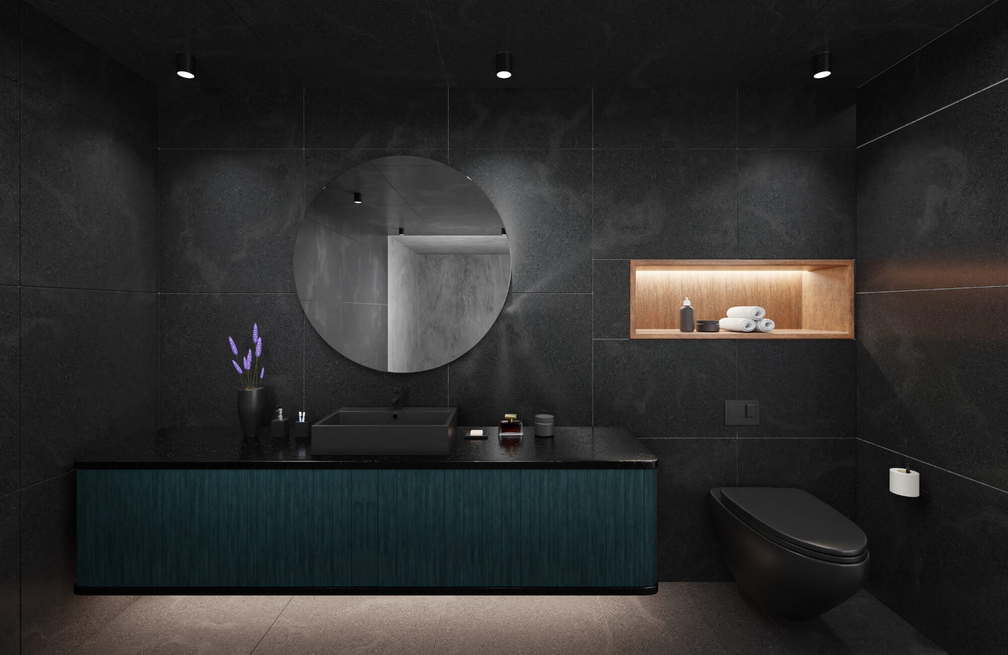
Greys also have practical benefits; they hide smudges, splashes, and wear better than lighter tones. Deep black looks especially sharp against white cabinets, as seen above with our Jaden 2.5x16 Glossy Ceramic Tile in Ink, which offers a similar bold richness with a cooler, high-gloss finish. These colors strike a rare balance: modern, classic, and low-maintenance all at once. Their ability to adapt across styles is why they continue to be a safe and timeless choice for ceramic backsplashes.

What to Avoid When Selecting a Timeless Color
Even with good intentions, it’s easy to pick a color that feels fresh now but quickly loses its charm. Below, we’ll walk through a few common mistakes that can make a ceramic backsplash age faster than expected.
Overly Saturated or Neon Hues
Bright, saturated colors might grab attention at first, but they tend to lose appeal quickly. These intense shades can feel overwhelming in a space you use every day, especially when paired with other bold elements. Also, they often limit your ability to update other parts of the room without clashing. Once the trend fades, these hues can feel out of place fast.
More muted versions of the same color can still add personality while being easier to live with long-term. For example, a soft blue or dusty coral keeps the spirit of the color without locking you into a loud design. You’ll have more flexibility to switch up hardware, paint, or decor without needing a full remodel. A toned-down palette is a safer bet if you’re aiming for longevity.
Relying Too Heavily on Current Trends
Colors that dominate social media or showroom displays can be tempting, but trend-driven choices can age quickly. What looks stylish now may feel outdated once the next wave of trends arrives. If your ceramic backsplash color is too tied to a current look, it may not blend well when you refresh other parts of the space. Also, bold trends often have shorter design lifespans than expected.
This doesn’t mean you have to avoid all trends, just use them carefully. It’s usually better to apply trendy colors in accessories or accents rather than permanent surfaces. That way, you can update your space without redoing your backsplash. A timeless color base gives you more freedom to evolve your style down the road.

What If Your Style Changes Later On?
It’s completely normal for your taste to shift over time; what you love today might not be your favorite down the road. That’s why it’s worth choosing a ceramic backsplash color that gives you room to grow. Below, we’ll explore how to plan for future updates without locking yourself into one look.
Choosing Colors That Work With Multiple Palettes
Some colors just work across the board, even when everything else in the room changes. Shades like soft grey, warm beige, or muted olive can pair well with both bold and subtle palettes, giving you more freedom over time. They’re neutral enough to support different design directions without clashing or feeling out of place. Whether you swap out your cabinet hardware, wall paint, or lighting, these colors continue to feel cohesive. That kind of flexibility makes them a safe and stylish long-term choice.
Why Midtone Shades Offer Flexibility
Midtone colors land in that sweet spot between light and dark, making them incredibly versatile. They bring just enough depth to stand out, but not so much that they overpower the room. For example, a soft greige or muted sage can easily work in both modern and traditional spaces. They also adapt well to changes in decor, whether you bring in warmer tones or cooler accents later on. With a midtone backdrop, you’re less likely to feel boxed in by one specific style.
Accent Decor vs. Permanent Fixtures
Your decor will probably change over time, but your backsplash is built to last, so it helps to plan with that in mind. Choosing a timeless tile color means you can refresh the room with new rugs, artwork, or small touches without needing to retile. A more neutral or versatile base lets your accents do the talking, while everything still feels pulled together. For instance, switching from brass to matte black fixtures won’t be a problem if your ceramic backsplash color plays well with both. It’s a smart way to keep things fresh without the cost or hassle of a major update.

Tips for Long-Term Satisfaction With Your Choice
It’s easy to get caught up in the excitement of choosing a ceramic backsplash color, especially when something immediately catches your eye. But long-term satisfaction usually comes from balancing what you love now with what will still feel right a few years down the line. A thoughtful approach can help you avoid second-guessing later and feel more confident in your decision.
Start by testing a few tile samples in your space and checking how they look throughout the day. Natural light, artificial lighting, and even shadows can shift how a color appears. For instance, a grey that feels clean and soft in the morning might look cold under warm evening lights. Observing it in real conditions helps reveal subtle undertones and gives you a clearer sense of how it fits the room. It’s a small but smart step that can save you from regret later on.
It also helps to think beyond what feels trendy or exciting right now and focus on colors that support your overall design goals. A bold choice might feel fresh today, but will it still work if you change your decor or update your cabinets in a few years? Colors with longevity tend to blend in rather than compete; they let the rest of the space evolve without clashing. Choosing something timeless doesn’t mean playing it safe; it just means planning with flexibility in mind. That way, you’ll love the result for much longer.
Choosing The Right Ceramic Backsplash Color
Finding a timeless ceramic backsplash color isn’t just about avoiding trends; it’s about choosing something that fits your space, your lifestyle, and the small changes that may come with time. Whether you’re working with a compact kitchen, an airy bathroom, or an outdoor grilling area, your backsplash color helps shape the mood and function of the room. By thinking through elements like light, layout, and nearby finishes, you’ll land on a shade that feels right today and still fits seamlessly years from now.
To make that choice even easier, we recommend ordering a high-quality 4x4 sample so you can see the color in your own space and lighting. And if you're unsure about where to start, our team offers personalized design consultation to help you choose the right tone for your layout, finishes, and long-term plans. A little planning now goes a long way toward a backsplash that continues to work beautifully over time.