


Choosing the right rug color can significantly affect the perceived size of a room. Whether you opt for a dark or light rug, the impact on spatial perception depends on an intricate blend of color psychology, lighting conditions, layout, and functional design. Interior designers often leverage rug tones to either open up a space or ground it, depending on the specific needs of the environment.
By examining this topic through the lenses of color theory, lighting interaction, spatial arrangement, room functionality, and flooring coordination, we uncover how each variable contributes to the illusion of size. These design principles do not operate in isolation; instead, they converge in subtle yet powerful ways that shape how a room is experienced. This detailed exploration offers insights that bridge aesthetic preferences with practical design strategy, empowering you to create spaces that are both visually appealing and purposefully planned.

Color Theory and Spatial Perception in Interior Design
Color has long been a fundamental element in altering how we perceive space, and rugs offer one of the most effective ways to apply these principles at floor level. Their tone and saturation influence depth, dimension, and the psychological atmosphere of a room.
Reflectivity and Visual Expansion
Light-colored rugs can reflect a greater amount of ambient light, resulting in a more luminous and visually spacious room. This reflection reduces shadow formation across the floor, subtly pushing visual boundaries outward. Especially when paired with cooler undertones, like soft greys, blues, or ivory, light rugs can evoke a calm, open-air aesthetic.
These soft hues prevent visual clutter and create continuity between the floor and walls, making the environment feel less constrained. Low-saturation, pale colors work particularly well in minimalist settings, where simplicity and clarity are essential to visual comfort. Altogether, the interaction between color reflectivity and light distribution contributes to a space that feels wider and more breathable.
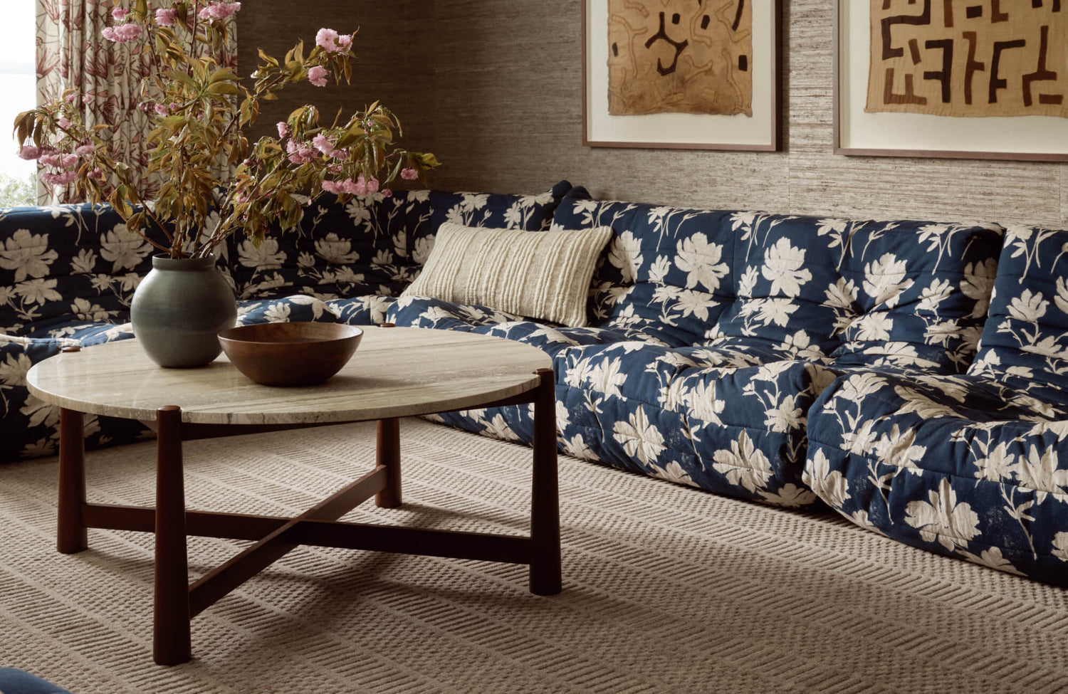
A perfect example is Edward Martin’s Lafferty Wool Blend Rug in Dove, as displayed in the photo above. This rug features a delicate diamond weave and neutral palette that enhances light reflectivity and contributes to a more expansive, balanced interior.
Absorption and Depth Compression
In contrast, rugs in deeper hues such as dark gray, dark brown, or dark blue tend to absorb more light, which intensifies shadow zones and can visually contract a room. This can be effective for creating intimacy, but in small or dim spaces, it risks making the environment feel tighter. Because the eye is naturally drawn to areas of strong contrast and heavier shadow, these darker rugs also often anchor the gaze downward, subtly reinforcing a more grounded and enclosed feel.
However, when used in larger or high-ceilinged spaces, these darker tones can establish a grounded, anchored effect that adds sophistication and structural clarity. Their rich visual weight helps stabilize open layouts or offset overly bright surroundings. When balanced properly, darker rugs can also provide cohesion and visual drama without overwhelming the space.
Chromatic Harmony and Spatial Balance
Creating a seamless color relationship between the rug and the surrounding décor can significantly enhance the sense of spatial fluidity in a room. When the rug’s hue complements or subtly echoes dominant tones, whether from walls, upholstery, or window treatments, it helps to soften transitions and maintain a unified visual rhythm. This harmony allows the eye to move effortlessly across the space, reducing the perception of boundaries and contributing to an overall feeling of openness.
While neutral color palettes, such as whites, taupes, and beiges, are particularly effective in achieving this effect, more vibrant or contrasting schemes can also work well when thoughtfully coordinated. By aligning tones across key elements, a space feels more cohesive and less visually segmented. In the end, it’s this chromatic consistency that reinforces spaciousness, eliminating abrupt breaks and encouraging a continuous visual flow.

Lighting Conditions and Their Interaction with Rug Colors
Light affects not only how rug colors appear but also how they behave within a spatial context. Whether sourced naturally or artificially, lighting modulates how rug tones influence the perception of room size and atmosphere.
Natural Light and Color Synergy
In spaces with generous daylight, the interplay between light-colored rugs and natural illumination produces a bright, open visual narrative. These rugs tend to reflect sunlight throughout the room, creating a consistent light distribution that prevents visual compartmentalization. The effect is particularly pronounced in rooms with large windows or skylights, where pale rugs help extend the field of vision beyond furniture lines. Paired with translucent curtains and reflective surfaces, this setup maximizes the spatial benefits of daylight. It also creates a serene, airy mood that enhances both the aesthetic and functional performance of a room. This synergy between rug and sunlight fosters a sense of visual freedom and balance.
Artificial Lighting and Tone Balance
In interior settings where natural light is limited, artificial lighting plays a central role in determining how rug colors affect perceived scale. Light rugs under cool LED or daylight-balanced bulbs maintain their expanding effect, but under warmer incandescent lighting, their warmth can deepen and slightly diminish this effect.
Dark rugs, meanwhile, tend to absorb artificial light more readily, increasing visual weight and shadow depth. However, layering light sources, using a combination of overhead fixtures, sconces, and floor lamps, can counteract this and reintroduce dimensional fluidity. Matte and low-sheen rug finishes also help diffuse light evenly across surfaces, preventing harsh light spots. The balance between rug tone and lighting type becomes a fine-tuned variable in spatial optimization.
Directional Lighting and Shadow Play
The placement and angle of lighting fixtures influence how shadows interact with rug surfaces, subtly altering spatial cues. For example, track lighting or pendant lights positioned to one side of a room can highlight texture variations in the rug, especially in high-pile options. These shadows, depending on intensity, may either deepen perceived texture or visually compress the area. Lighter rugs with smoother weaves tend to handle directional lighting more uniformly, helping preserve spatial integrity. Meanwhile, darker rugs under oblique lighting may produce more defined contrast zones that draw the eye downward. Managing light angles ensures that the rug supports the room’s scale rather than inadvertently fragmenting it.

Rug Size, Placement, and Pattern Considerations
Beyond color, a rug’s physical proportions and surface design play a powerful role in shaping how space is visually organized. Strategic decisions around size, position, and pattern can either amplify or diminish the perception of openness.
Proportional Sizing and Visual Continuity
A rug that fits the furniture layout proportionally, extending under major elements like sofas and chairs, creates a unified visual framework. This continuity prevents fragmentation, encouraging the eye to perceive the room as one cohesive whole. Light-colored, generously sized rugs particularly excel here, blending the floor space into the broader architectural context. When appropriately scaled, the rug acts as a visual anchor that binds separate furnishings without enclosing them. In contrast, undersized rugs can isolate pieces of furniture, inadvertently drawing attention to the lack of floor coverage and making the space feel disjointed. Proportional placement is therefore critical to maintaining flow and maximizing spatial potential.
Pattern Density and Spatial Rhythm
Pattern design adds another layer of visual influence, with density and scale guiding how the eye navigates across a room. Sparse, large-scale patterns on light rugs tend to encourage smoother visual movement, creating the illusion of a broader, more open space. Dense or intricate motifs, especially in darker palettes, may increase visual stimulation and shorten perceived distances between surfaces. Horizontal stripes can elongate a room's width, while vertical patterns may emphasize height, making them useful tools for correcting proportion. Geometric or linear motifs often introduce directional energy that can subtly restructure spatial orientation. Achieving the right pattern rhythm is essential to complementing the room’s overall design intent.
Edge Definition and Boundary Perception
The visual edge of a rug can influence whether it appears to expand or compartmentalize a space. Rugs with clear, high-contrast borders tend to emphasize their perimeter, segmenting the floor into visually distinct areas. Conversely, rugs with blurred edges, gradient fades, or no defined border blend more seamlessly with surrounding flooring. This creates a sense of uninterrupted space and softens room transitions. Curved or asymmetrical rug shapes can also disrupt rigid grid layouts, infusing flexibility into tighter floor plans. When edge definition is considered alongside color and size, it becomes an effective instrument for spatial manipulation.

Functional Purpose and Psychological Impact of Rug Color
The emotional tone and functional purpose of a room are closely linked to its material palette, including rug color. These choices influence not only visual outcomes but also how the space feels and behaves in everyday use.
Practicality and Durability in Busy Zones
In areas that see frequent activity, like entrances, hallways, and dining rooms, rug durability and maintenance often take priority. Darker rugs, with their lower propensity to show stains or dirt, offer a practical solution without compromising visual sophistication. These tones also wear evenly over time, maintaining a cleaner appearance between maintenance cycles. Materials such as wool blends, nylon, or solution-dyed synthetics add resilience to daily wear. When paired with furniture in contrasting or metallic finishes, dark rugs can retain elegance while withstanding daily wear. Thus, practicality and aesthetics align most effectively when rug tone is matched with function-specific needs.
Psychological Comfort and Ambient Design
The psychological impact of color is especially evident in spaces designed for rest and relaxation. Lighter rugs contribute to feelings of openness and calm, helping to diffuse stress and promote mental clarity. These effects are amplified in bedrooms or reading nooks, where minimal distractions and soft visuals are desired. On the other hand, darker rugs can create a cocooning effect—inviting, grounded, and secure—when combined with ambient lighting and plush textiles. Such environments foster introspection and comfort, making dark rugs suitable for dens, libraries, or meditation spaces.
A perfect example is our Micah Wool Blend Rug in Natural / Graphite, as shown in the photo above. It exemplifies this balance beautifully, with its rich contrast and warm wool texture that adds both visual depth and emotional warmth, perfect for cultivating a space that feels both grounded and restorative. Selecting rug color with emotional context in mind enhances the room’s livability and sensory appeal.
Acoustic Performance and Sensory Environment
Rug color and texture also influence the way sound behaves in a room, contributing to the overall sensory environment. Thicker, darker rugs absorb more noise and can improve acoustics by reducing echo, which is beneficial in media rooms or bedrooms. Lighter rugs, depending on material and pile height, tend to reflect more sound and may contribute to a brighter, livelier atmosphere. This auditory feedback can affect how full or empty a room feels, adding another layer to spatial perception. Matching rug acoustics to room function ensures a comfortable sound profile aligned with daily use. In this way, color indirectly supports a room’s acoustic balance through its material characteristics.

Color Coordination Strategy and Flooring Contrast
The visual relationship between the rug and the existing floor material contributes significantly to how the space is read. Whether through contrast or tonal harmony, this interaction affects the room’s visual architecture.
Tone-on-Tone for Seamless Expansion
Rugs that closely match the tone of the floor beneath them support a more continuous and expansive visual narrative. Pale rugs on light hardwood or bleached tile minimize visual breaks and enhance the sense of openness. This technique is especially effective in minimalist or Scandinavian interiors, where uniformity contributes to a clean, airy look.
Subtle variations in texture, rather than color, maintain interest without disturbing the illusion of flow. The rug essentially dissolves into the background, allowing other elements, like furniture and art, to take visual precedence. A prime example is the Pascal Polyester Face Rug in Smoke / Multi, as displayed in the picture above. Its low-contrast palette of earthy neutrals and vintage detailing harmonizes with the surrounding floor tones, quietly extending the space while adding nuanced character.
High Contrast for Visual Delineation
Dark rugs laid over light-colored flooring, such as white oak, ceramic tile, or concrete, create immediate focal points that define zones within larger rooms. This contrast offers clarity in open-concept layouts, delineating living, dining, or office areas without physical dividers. The visual tension between the floor and the rug adds structure and can serve as an anchor point for the rest of the design scheme. However, excessive contrast must be managed carefully to avoid spatial fragmentation. Accents such as matching trim, accessories, or lighting fixtures can help smooth transitions between high-contrast surfaces. When balanced correctly, contrast becomes a precise instrument for spatial hierarchy.
Material Texture Interplay and Depth Perception
The interaction between the rug’s texture and the underlying flooring introduces another dimension to how depth and layering are perceived. For instance, a smooth wool rug over coarse tile creates a contrast that adds tactile richness and visual complexity. On the other hand, pairing soft rugs with equally soft carpeting can blur these layers, flattening the room’s spatial cues. Texture also becomes especially crucial when rug and floor colors are similar, allowing material variance to define surfaces instead of hue. Glossy finishes reflect light differently than matte ones, subtly influencing how light and shadow define the room. When thoughtfully coordinated, texture and tone together form a dynamic visual field that enhances spatial character.
Rug Color as a Strategic Design Tool
Whether a dark or light rug makes a room look bigger depends on a nuanced combination of factors, each shaping spatial perception in different ways. Light rugs generally contribute to openness and brightness, while darker options bring depth and grounded sophistication. The most effective design choices emerge from a deep understanding of how color interacts with you can manipulate visual scale to suit both aesthetic goals and practical requirements. In the end, the right rug does more than fill a floor—it defines space, mood, and the sensory identity of the entire room.
At Edward Martin, we turn design theory into tailored, livable spaces that reflect your vision with precision and purpose. Contact us today to discover how our expert team can help you make your space feel bigger, brighter, and beautifully balanced!
