


Blue ceramic tiles evoke a sense of calm, sophistication, and versatility. From the tranquil depth of navy to the vibrant energy of turquoise, blue offers a broad range of design possibilities. Yet, the true art lies in selecting complementary colors that enhance the space without overwhelming it. This guide explores harmonious color palettes, strategic design techniques, and creative applications to help you elevate your blue ceramic tile installations with confidence and style.

Understanding the Psychology and Versatility of Blue
Before selecting color companions, it is important to understand blue's core attributes and how they influence interior design. Recognizing its psychological associations and diverse spectrum of shades provides a strong foundation for making informed decisions that are both beautiful and intentional.
The Calming Canvas
Blue, often associated with the sky and ocean, inherently brings a sense of peace, serenity, and trust. This makes it a popular choice for spaces intended for relaxation, designed for relaxation and renewal, including bathrooms, bedrooms, and spas. At the same time, blue’s steady presence adds structure and elegance, making it equally fitting for kitchens or living areas where a sense of clarity and balance is desired
Exploring Blue’s Diverse Shades
The versatility of blue is evident in its wide range of hues, each offering distinct moods and pairing potential. Lighter blues like periwinkle or sky blue reflect more light, creating an open, airy ambiance. Deeper blues, such as navy or indigo, add a sense of grounded sophistication. Undertones also matter: green-leaning blues like teal and turquoise evoke a natural, aquatic feel, while purplish blues like cobalt convey richness and depth. This broad spectrum provides a dynamic base for exploring complementary colors.

The Classic Companions
With an understanding of blue’s emotional and aesthetic impact, we now turn to color combinations that have stood the test of time. These classic companions create enduring harmony and provide a safe yet stylish foundation for blue ceramic tile designs.
Whites and Creams
Pairing blue ceramic tiles with whites and creams delivers a clean and classic aesthetic that never goes out of style. Crisp white surfaces create a strong contrast, enhancing the vibrancy of blue tiles and making rooms feel brighter and more expansive. For a contemporary twist, navy or cobalt blue tiles with stark white grout provide a bold, graphic edge. Alternatively, soft ivory walls next to lighter blue tones introduce a more relaxed and welcoming vibe.
In bathrooms, this pairing evokes spa-like serenity or classic nautical charm. Cream tones also add warmth, preventing the space from feeling overly cool. A perfect example is the Jaden 2.5x16 Glossy Ceramic Tile in Navy from Edward Martin—its deep blue tone and sleek finish look striking against white or cream walls, offering a timeless yet fresh combination that elevates both traditional and modern spaces.
Grays and Silvers
For a sleek and refined look, combining blue ceramic tiles with grays and silvers creates a sophisticated and balanced palette. Light gray walls or countertops provide a soft, neutral backdrop that allows blue tones to shine, while darker grays, like charcoal or slate, add contrast and a subtle industrial edge. This interplay works especially well when lighter blues are featured in backsplashes or accent walls.
A great example is the Jojo 2x6.3 Glossy Ceramic Tile in Denim, which pairs effortlessly with soft gray flooring and muted surroundings. Its deep hue and glossy finish strike a balance between modern richness and subtle elegance. Brass fixtures and natural wood accents add warmth, while silver or brushed nickel hardware introduces a clean, minimalist detail. This combination thrives in open, light-filled spaces, where the contrast and texture of each element are fully appreciated.
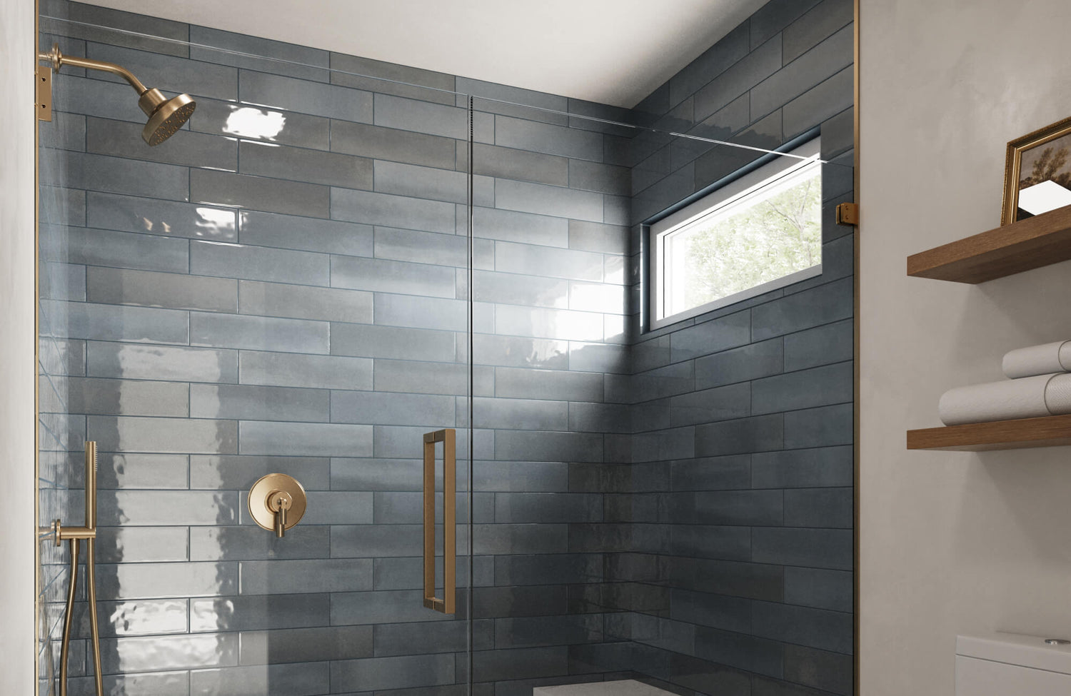
Natural Woods and Earth Tones
Incorporating natural wood tones and earthy hues alongside blue ceramic tiles brings a grounded, nature-inspired warmth to interiors. From pale oak to deep walnut, wood softens the coolness of blue and creates inviting, well-balanced environments. Picture a navy tile backsplash with open walnut shelving in a kitchen, or sky-blue ceramic tiles set against a honey-toned wood vanity in a bathroom.
A beautiful illustration of this pairing is the Maisie 2.5x16 Glossy Ceramic Tile in Ocean, shown in the photo above. Its elongated shape and glossy surface introduce coastal elegance, while warm wood surroundings help anchor the space. Earth tones like beige, taupe, and terracotta can also be layered through paint or accessories, adding texture and a soothing, biophilic touch that makes the space feel lived-in and natural.

Bold and Playful Color Combinations
While classic palettes provide structure, adventurous combinations can add personality and creative flair. The following color pairings showcase how blue ceramic tiles can thrive in vibrant, expressive environments.
Golden Hues and Brass Accents
Blue ceramic tiles paired with brass or gold accents create a luxurious and balanced aesthetic. The cool tones of blue contrast beautifully with the warmth of metallic finishes, producing a refined yet inviting atmosphere. Deep indigo or denim-hued ceramic tiles, like the Ellie 2.5x8 Matte Ceramic Tile in Denim, featured above, provide a rich backdrop that makes antique brass fixtures or a gilded mirror stand out with sophistication. The tile’s matte finish adds a soft, contemporary texture that works especially well in spaces aiming for understated elegance. This pairing suits both modern and traditional designs, delivering a polished look without overwhelming the room.
Vibrant Greens and Teals
For a fresh, nature-inspired palette, blue ceramic tiles blend seamlessly with green and teal tones. These analogous colors evoke the tranquility of natural landscapes, perfect for calming bathroom retreats or energetic kitchen zones. Try combining ocean-toned backsplash tiles with sage cabinetry or emerald green walls. Layering greenery, like hanging plants or rattan accessories, can further tie the palette together and introduce a biophilic touch.
Soft Pinks and Corals
Surprisingly harmonious, the pairing of soft pinks or corals with blue ceramic tiles delivers a balance of cool and warm tones. This palette is ideal for playful powder rooms, creative kitchens, or even gender-neutral spaces. A light blue backsplash paired with coral accessories or blush-toned textiles softens the mood, while deeper pinks alongside navy tiles offer an elegant, modern twist. This unexpected combination brings warmth and charm without sacrificing sophistication.
Deep Purples and Berries Royal
For a bold and opulent ambiance, blend blue ceramic tiles with deep purples or rich berry hues. These jewel tones, such as aubergine, plum, or raspberry, intensify the drama and create a luxurious setting. An indigo tile feature, for example, looks stunning next to a velvet berry accent chair or plum-painted wall. This combination is especially effective in intimate spaces like dining rooms, reading nooks, or statement bathrooms, where moody, layered color enhances depth and character. It’s a palette for those who embrace bold elegance and want their space to feel distinctly curated.

Applying and Personalizing Your Color Strategy
Successfully coordinating blue ceramic tiles with other colors involves more than selecting hues; it’s about how they’re applied throughout a space. This section provides practical frameworks and techniques for integrating your palette cohesively and creatively.
The 60-30-10 Rule
A cornerstone of interior design, the 60-30-10 rule provides a reliable formula for balancing colors in your blue-tiled space. The dominant color—comprising 60% of the design—might include your blue ceramic tiles and a complementary wall color that sets the room’s tone. The secondary color (30%) introduces contrast and interest, such as a neutral gray, a warm wood tone, or even a muted green. The final 10% is reserved for an accent color that brings personality and energy, like vibrant pinks, gleaming golds, or deep berry hues.
For instance, with light blue ceramic tiles as the feature, 60% could include the tile and soft white wall paint. The 30% might come from gray cabinetry or wood furnishings, while the 10% could be delivered through brass fixtures or cheerful yellow towels. This method prevents any one color from dominating and ensures a visually balanced space.
Texture and Pattern
A well-designed space is not just about color—it’s also about how those colors interact through texture and pattern. Introducing varied textures creates depth and visual interest, particularly when working with blue ceramic tiles. For example, combining glossy subway tiles with matte penny rounds can subtly shift the light and add complexity to a backsplash. Layer in contrast through soft furnishings and textiles, such as patterned rugs, geometric throw pillows, or sheer curtains. These patterns prevent visual monotony, especially in monochromatic or minimalist settings.
Additionally, contrast materials enhance the tactile quality of your space. The smooth finish of ceramic tiles can be beautifully offset by the natural grain of reclaimed wood, the plush texture of a wool rug, or the sheen of polished metal. These combinations not only elevate the sensory experience but also create an inviting, curated atmosphere.
Lighting Considerations
Lighting plays a pivotal role in shaping how your colors are perceived. Natural light changes throughout the day, revealing the full depth of your palette, while artificial lighting offers more controlled options to set a desired ambiance. Warm-toned lighting adds a golden glow, softening blues and emphasizing warmth in accent colors like brass or terracotta. Cooler lighting, on the other hand, sharpens the blue and enhances the crispness of white or silver elements. A well-rounded lighting scheme that combines ambient, task, and accent lighting ensures that each layer of your color strategy is highlighted appropriately, whether it’s illuminating a textured wall tile or casting a soft glow over a vibrant accessory.
Flooring and Furniture Pairings
Flooring and furniture choices significantly impact how your color strategy comes together. For flooring, consider both tone and material. Pale wood, off-white tile, or light gray concrete can brighten a room and expand the sense of space, especially effective with lighter blues. In contrast, darker flooring options like charcoal tile, rich walnut, or bold checkerboard patterns create a focal point and a sense of grounding.
Furniture selections should echo the color palette while complementing the scale and tone of your tiles. A neutral sofa can let blue ceramic tiles take center stage, while a statement chair in your accent color introduces visual interest. Consider the materials and shapes of your furniture as well—rounded forms can soften a space filled with sharp tile lines, and textured finishes can balance sleek ceramic surfaces. The result is a room that feels harmonious, comfortable, and curated, where each element complements and reinforces the overall design.
Accessorizing with Intent
Finally, accessories complete the story and allow you to express your individuality within the design. These elements offer flexibility, allowing you to evolve your space over time without major renovations.
Use decorative accents to reinforce your 10% color selection—think mustard-yellow vases, blush-pink bath linens, or green ceramic planters. Consider layering in metallics like silver or brass for added shine and structure. Items such as picture frames, towel hooks, and pendant lights are subtle yet effective ways to echo your palette.
Don’t forget practical accessories. Shower curtains, dish towels, rugs, and even art can serve as seasonal or interchangeable touches that refresh your space while maintaining cohesion.

Personalizing Your Blue Tile Space
Interior design is ultimately about creating a space that reflects your style, values, and lifestyle. Here are strategies to tailor your blue tile environment into a distinctive and welcoming setting.
Defining Your Aesthetic
The first step toward creating a personalized space is to define your design identity. Every interior style—whether minimalist, bohemian, traditional, or industrial—has its own visual language of color, shape, and material. Identifying which of these styles resonates with you will help guide how blue ceramic tiles and complementary hues should be used. A minimalist design may pair pale blues with crisp whites and soft grays for a calm, understated look. Bohemian interiors might embrace vibrant turquoise or indigo tiles, enriched with earthy greens, terracotta, or coral. For a timeless traditional space, navy tiles combined with cream tones and brass accents create lasting elegance.
To better visualize how these color palettes and tile styles align with your aesthetic, our Augmented Reality (AR) Tool lets you preview tile selections in your own space before making final decisions. This added layer of personalization ensures that the tiles you choose not only match your vision but also harmonize beautifully with your overall design goals.
Small Spaces, Big Impact
Once you’ve defined your aesthetic, it’s important to consider how your design choices scale within the available space. In smaller rooms such as powder rooms, compact bathrooms, or galley kitchens, blue ceramic tiles can be particularly powerful when used thoughtfully. Lighter shades of blue help expand the perception of space by reflecting light and reducing visual weight, while the use of larger tiles can minimize grout lines and contribute to a cleaner, more open look. Mirrors strategically placed across from or near tiled surfaces can amplify both natural and artificial light, enhancing the airy atmosphere. When working in compact spaces, restraint is key—limiting your palette to one dominant neutral and a single accent color ensures the design remains balanced and uncluttered. Even in tight quarters, a small burst of color, thoughtfully placed, can make a memorable impact without overwhelming the room.
Budget-Friendly Transformations
Personalized design doesn’t require an extravagant budget. With blue ceramic tiles providing a strong visual foundation, even modest updates can deliver striking results. Focus on accessible, high-impact elements that enhance your color scheme without major renovation. Swapping out textiles, such as towels, throw pillows, or rugs, in your chosen accent color can refresh the feel of a space almost instantly. A simple DIY paint refresh on walls or cabinetry, coordinated with your palette, can add cohesion and style at a fraction of the cost of new fixtures. Additionally, sourcing affordable decor from local markets, discount shops, or secondhand stores allows you to discover unique pieces that add character and align with your design vision. These small, intentional updates demonstrate that successful design is less about price tags and more about creativity and attention to detail.
Dynamic Design
Your design preferences, like the seasons, can also evolve. Blue ceramic tiles offer a timeless and stable backdrop that easily accommodates changing styles and seasonal preferences. With each new season or shift in mood, you can update your space using removable accents, such as curtains, throws, or decor, that introduce fresh colors while maintaining the core blue palette. Warmer tones like rust or burgundy might create a cozy winter atmosphere, while vibrant greens or soft yellows can bring a springtime refresh. Incorporating seasonal elements like foliage, flowers, or textural accessories lets your room reflect both the time of year and your evolving aesthetic.
Harmonizing Your Blue Hues: Final Reflections
Designing with blue ceramic tiles is a creative journey rooted in both knowledge and self-expression. When thoughtfully paired with complementary colors and brought to life through strategic use of texture, light, and accessories, blue tiles become more than a visual feature—they become the soul of the space. Whether your vision leans toward subtle elegance or bold experimentation, the flexibility and depth of blue allow you to build a space that is not only beautiful but genuinely yours. With a clear design approach and a touch of creativity, your blue-tiled space can evolve into a personalized sanctuary that feels timeless, expressive, and entirely unique.