


Wall art has a measurable relationship to the room around it. A canvas that feels commanding in a showroom can look undersized above a long sofa, while an oversized framed piece can crowd a mantel, interrupt sightlines, or make a seating area feel visually top-heavy. Choosing the right size is less about instinct than proportion, placement, and the way artwork interacts with furniture, ceiling height, frame depth, and surrounding negative space.
For living rooms in particular, scale carries both aesthetic and practical weight. Art often sits above the largest furniture pieces in the room, anchors open walls, or completes a fireplace composition, which means its dimensions need to respond to architecture as much as style. The most successful selections begin with clear measurements, then refine those numbers through material presence, frame profile, visual density, and the structural realities of the wall itself.

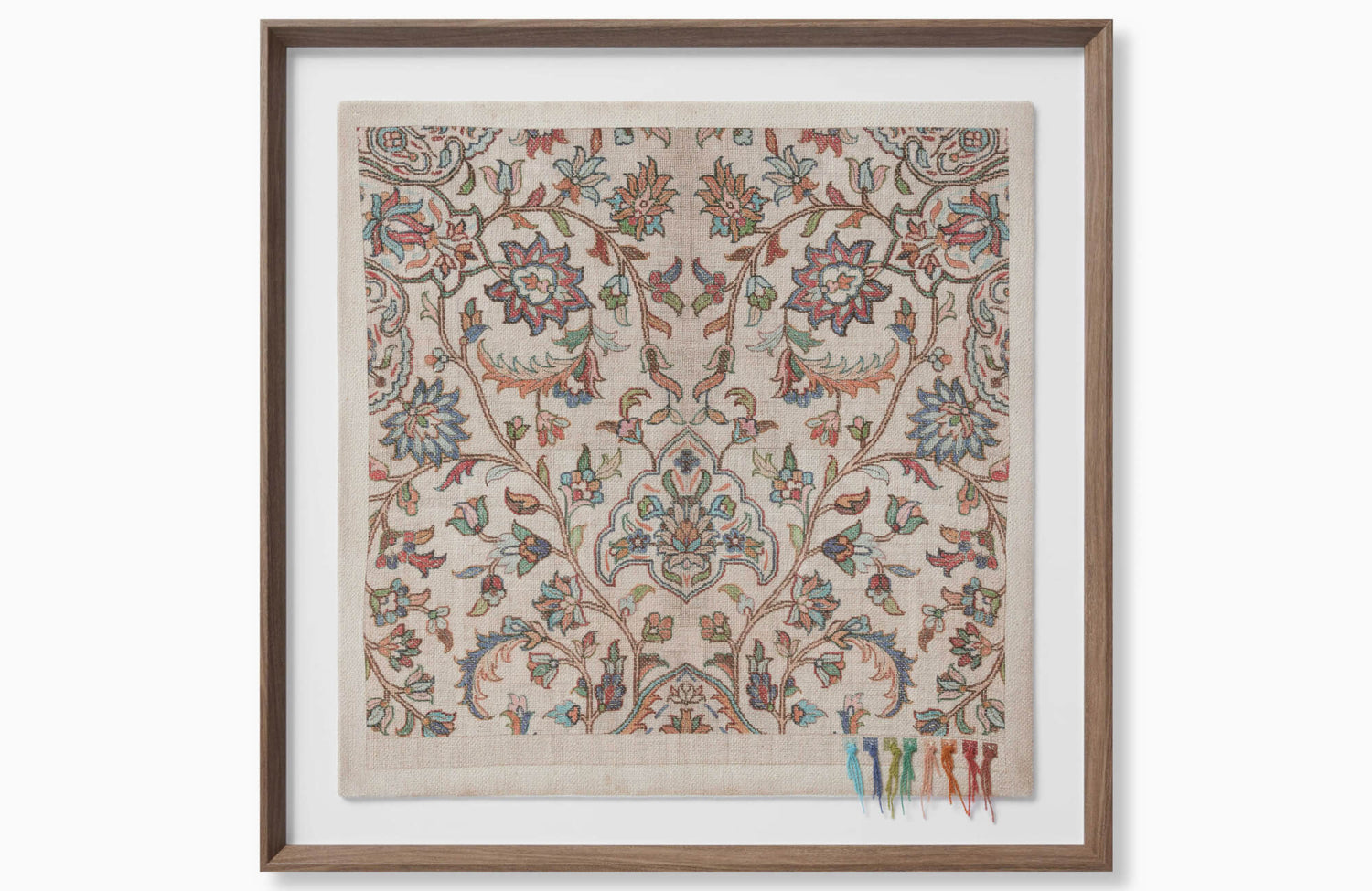
Quiet Study Wall Art sits within a warm living room vignette, complemented by the Clement Chandelier In Polished Nickel and the soft stone look of Leona 24x48 Polished Porcelain Tile in Marfil.
The Core Mathematical Rules for Living Room Wall Art Scaling
The most reliable way to size living room art is to treat it as part of a larger visual system. Sofa width, ceiling height, wall span, frame thickness, and viewing distance all influence whether a piece feels intentional or misplaced. While personal preference still matters, mathematical guidelines give the room a stable starting point before color, subject matter, and material finish enter the decision.
Understanding the Two Thirds Rule for Furniture Relative Scaling
When artwork is placed above a sofa, console, credenza, fireplace bench, or sectional, its width should generally measure between 60% and 75% of the furniture width beneath it. This range is often referred to as the two-thirds rule because it keeps the art visually connected to the furniture without matching its full span.
For a 72-inch sofa, suitable artwork usually falls between 43 and 54 inches wide. An 84-inch sofa pairs well with art measuring roughly 50 to 63 inches wide, while a 96-inch sofa can support a piece between 58 and 72 inches wide. These dimensions apply to the full visible composition, including the frame, not only the printed image or canvas surface.
The artwork should typically remain narrower than the furniture below it. When a frame extends beyond the sofa arms, the upper wall can feel heavier than the seating zone, creating an inverted proportion that pulls attention upward in an unbalanced way. A slightly narrower composition keeps the sofa grounded while giving the artwork enough scale to read as a deliberate focal point.
Applying the Fifty Seven Inch Eye Level Rule to Living Room Walls
The 57-inch rule places the center of the artwork approximately 57 inches from the floor, aligning the composition with average human eye level. This measurement refers to the center point of the artwork, not the top of the frame. For example, a 36-inch-tall framed piece would have its center at 57 inches, placing the top around 75 inches and the bottom around 39 inches from the floor. In the featured living room, Edward Martin’s Quiet Study Wall Art demonstrates how a large framed textile can hold visual presence above the fireplace while still reading as part of the surrounding architecture rather than floating independently from it.
Living rooms often require some adjustment because artwork is frequently installed above furniture. When hanging art over a sofa, maintain a 6-to-8-inch gap between the bottom of the frame and the top of the sofa backrest. This spacing creates a clear relationship between the two elements without making the art appear to rest on the furniture.
Ceiling height also affects placement. In a room with standard 8-foot ceilings, keeping the artwork closer to the 57-inch centerline helps preserve comfortable proportions. In spaces with 10-foot ceilings or taller architectural volumes, the center point may shift slightly upward, especially when the art is large or vertically oriented. The adjustment should still feel connected to the seating area rather than drifting toward the ceiling.

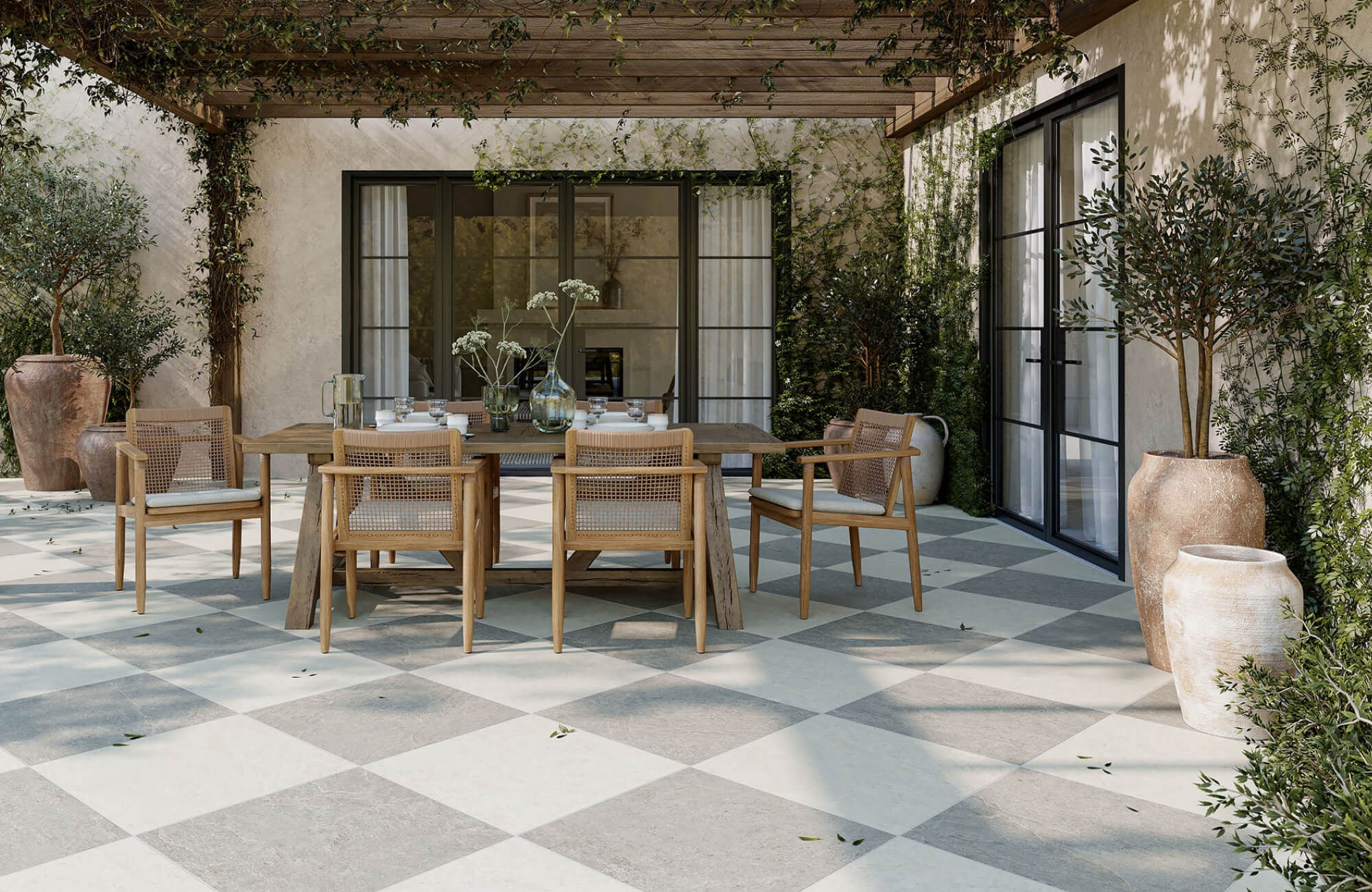
The Haverford Rug in Platinum / Bronze grounds the seating area with muted pattern and texture, while Everett 2x10 Matte Ceramic Tile in Almond adds warmth and rhythm to the fireplace wall.
Living Room Sofa and Wall Art Size Comparison Chart
A comparison chart makes it easier to translate proportion rules into practical measurements. The following guide uses the 60% to 75% range and assumes the artwork is centered above the sofa, with the full frame included in the final width.
|
Sofa Width |
Ideal Single Artwork Width |
Diptych Configuration |
Gallery Wall Footprint |
|
60 inches |
36 to 45 inches |
Two 17 to 21 inch frames with a 2 to 3 inch gap |
36 to 45 inches total width |
|
72 inches |
43 to 54 inches |
Two 20 to 25 inch frames with a 2 to 3 inch gap |
43 to 54 inches total width |
|
84 inches |
50 to 63 inches |
Two 24 to 30 inch frames with a 2 to 3 inch gap |
50 to 63 inches total width |
|
96 inches |
58 to 72 inches |
Two 28 to 34 inch frames with a 2 to 3 inch gap |
58 to 72 inches total width |
|
108 inches |
65 to 81 inches |
Three 20 to 25 inch frames with 2 to 3 inch gaps |
65 to 81 inches total width |
|
120 inches |
72 to 90 inches |
Three 22 to 28 inch frames with 2 to 3 inch gaps |
72 to 90 inches total width |
The chart should be read as a sizing framework rather than a rigid prescription. A dark abstract composition with a heavy wood frame may feel larger than a pale landscape in a slim metal profile, even if both share the same dimensions. Wide matting can also increase the artwork’s overall footprint while giving the image more internal negative space, so the final framed size should always guide measurement rather than the print size alone.
Sofa height and upholstery volume can also shift the balance. A low-profile sofa may allow taller artwork, while a high back, layered pillows, or a deep sectional can make the same piece feel more compressed. For the most accurate read, compare the artwork’s full width, height, frame thickness, and visual density against the furniture below it. The featured seating arrangement shows how Edward Martin’s Haverford Rug in Platinum / Bronze grounds the furniture grouping, while Edward Martin’s Vicente Picture Light in Aged Old Bronze adds a horizontal accent above the shelving niche, reinforcing how art scale is influenced by the broader composition of textiles, lighting, and architectural details.

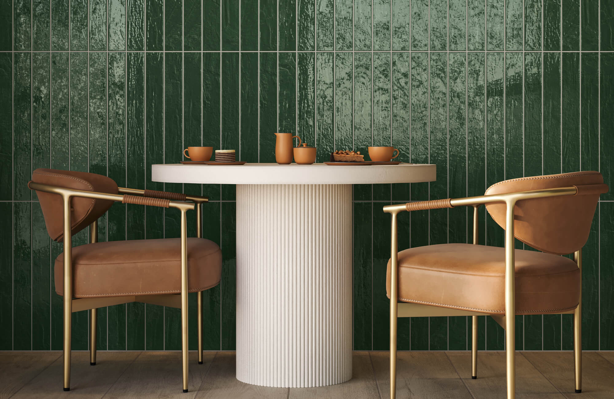
Brody 2x2 Matte Porcelain Mosaic Tile in Smoke brings subtle texture to the fireplace surround, balanced by the arched silhouette of the Esmeralda Wide Mirror in Iron Matte Black.
How to Scale Art for Blank Accent Walls and High Ceilings
Blank accent walls require a different approach because there may be no furniture below the artwork to define its width. In these situations, the wall itself becomes the reference point. The goal is to give the artwork enough presence to hold the open surface without making the room feel crowded or visually compressed. The larger the wall plane, the more important it becomes to calculate the intended visual footprint before choosing a single canvas, diptych, or gallery composition.
Calculating the Perfect Negative Space Ratios for Open Walls
For an open living room wall, artwork should typically occupy about 50% to 60% of the usable wall width. Usable width means the clear portion of wall not interrupted by windows, sconces, doorways, floor lamps, tall plants, or circulation paths. Measuring only the uninterrupted surface gives a more accurate sense of what the artwork needs to fill.
A helpful way to think about negative space is the 3/7 empty space rule. In practical terms, the art should command the center portion of the wall while leaving enough breathing room around it for the architecture to remain visible. If a wall is 140 inches wide and the usable central area is 100 inches, a composition measuring roughly 50 to 60 inches wide may feel balanced. If the wall is especially tall or minimally furnished, the composition may need more vertical height to avoid appearing isolated.
Negative space should look intentional, not accidental. Equal margins are not always required, especially in rooms with asymmetrical furniture layouts, but the art should feel anchored to the room’s main sightline. Viewing the wall from the primary seating area, adjacent doorway, and room entry helps reveal whether the piece has sufficient presence from multiple angles. The fireplace vignette featuring Edward Martin’s Brody 2x2 Matte Porcelain Mosaic Tile in Smoke also shows how surface rhythm affects open-wall perception, as the compact mosaic field adds texture below the mantel while leaving enough surrounding wall area for artwork, mirrors, and decor to breathe.
Managing Vertical Scale in High Ceiling and Loft Spaces
High ceilings change the proportions of a living room by expanding the vertical field. In vaulted, double-height, or loft-style spaces, a horizontal canvas sized only to the sofa may not be enough to address the room’s height. Portrait-oriented artwork, stacked panels, or vertically arranged diptychs can draw the eye upward while still keeping the lower portion connected to the furniture arrangement.
Frame scale becomes more important in these rooms. A thin profile may disappear against tall walls, while a thicker wood, metal, or shadow-box frame can give the art enough architectural weight to stand up to grand molding, exposed beams, tall windows, or stone fireplace surrounds. The frame should not compete with the architecture, but it should have enough substance to register from a distance.
Subject matter can also affect perceived scale in tall rooms. High-contrast photography, dense abstract compositions, and dark color fields often carry more visual weight than tonal sketches or softly rendered landscapes of the same size. When a wall has significant vertical volume, both the physical measurements and the artwork’s visual density should be considered together.
In rooms with pronounced vertical features, artwork can also align with existing architectural lines. A tall canvas may echo window height, a stacked pair may correspond to a fireplace column, or a gallery wall may follow the rhythm of built-in shelving. This kind of alignment creates continuity between art and architecture rather than treating the wall as an empty backdrop.

Open Province Wall Art highlights a quiet woven surface with pale tonal stitching, giving the framed textile a soft, understated presence.
The Painters Tape Mockup Strategy for Risk Free Spatial Planning
Before purchasing large artwork, a physical mockup can prevent proportion mistakes that are difficult to judge from product photography alone. Painter’s tape is one of the simplest tools for testing scale because it allows the outer dimensions of a frame or canvas to be mapped directly onto the wall.
Use low-tack blue painter’s tape to outline the full exterior dimensions of the artwork, including the frame. If the piece includes a wide mat, account for the total framed size rather than the image opening. For multi-piece arrangements, tape each frame separately and include the intended spacing between panels. With softly detailed pieces such as Edward Martin’s Open Province Wall Art, the featured close-up makes this especially clear: the pale wood frame, woven surface, and subtle stitched accents all contribute to the final visual footprint, even when the palette itself remains quiet.
Once the outline is in place, evaluate it from the primary sofa, side chairs, room entrance, and adjacent hallway. A size that feels balanced from straight on may appear too small from a diagonal view. Natural light should also be considered, since shadows from windows, floor lamps, or nearby architectural details can change the perceived weight of the taped area throughout the day.
For best results, leave the tape in place for at least a few hours and observe it during different lighting conditions. The goal is not only to confirm width and height, but to understand whether the artwork supports the room’s focal point. This step is particularly useful when selecting high-value framed pieces, oversized canvases, or custom art where returns may be limited.
A tape mockup confirms visual scale, but it does not replace proper installation planning. Heavy framed artwork, glass glazing, masonry walls, plaster surfaces, mantels, and placements above seating require hardware suited to the artwork’s weight and wall type. For oversized or heavy pieces, professional installation is recommended, with stud integrity, anchor capacity, fireplace conditions, and applicable local requirements verified before hanging.

Chantel 24x48 Matte Porcelain Tile in Dolomite creates a calm wall surface behind the seating area, while Preston 8x48 Matte Porcelain Tile in Chestnut adds warmth underfoot.
Multi Piece Art Configurations and Multi Frame Layout Scaling
A single oversized canvas is not the only way to create visual scale. Diptychs, triptychs, split canvases, and gallery walls can collectively occupy the same footprint as one large artwork while allowing more flexibility in subject matter, spacing, and installation. The key is to treat the arrangement as one complete composition. Whether the layout is symmetrical or organic, the total footprint should follow the same proportional rules used for single artworks above sofas or open walls.
Spacing Math for Diptychs Triptychs and Split Canvases
For diptychs and triptychs, the space between frames must be included in the total width calculation. A pair of 24-inch-wide frames with a 3-inch gap creates a 51-inch-wide composition. Three 20-inch panels with two 3-inch gaps create a 66-inch arrangement.
Standard spacing between panels usually falls between 2 and 3 inches. Smaller gaps can make the pieces feel visually connected, especially when the image continues across panels. Wider gaps may be appropriate for large rooms or thick frames, but excessive spacing can weaken the relationship between the pieces.
When placing a multi-panel composition above a sofa, calculate the full arrangement as though it were one artwork. If the sofa is 84 inches wide, the total diptych or triptych footprint should generally remain between 50 and 63 inches wide. This prevents the group from becoming too narrow or spreading beyond the furniture in a way that feels unstable.
Calculating the Collective Footprint of a Balanced Gallery Wall
A gallery wall should begin with a defined bounding box. Rather than hanging individual pieces one by one, determine the total width and height the arrangement should occupy, then build the composition within that invisible rectangle. This approach keeps even an organic layout from becoming visually scattered.
A strong gallery wall often depends on a central horizon line. This does not mean every frame must align perfectly, but the arrangement should have a visual center that stabilizes the group. Larger or darker pieces can sit near the middle, while smaller works extend outward to soften the edges. In the featured living room with Edward Martin’s Chantel 24x48 Matte Porcelain Tile in Dolomite, the paired abstract artworks above the sofa show how a clean rectangular arrangement can echo the room’s broader linear elements, from the large-format wall surface to the black-framed mirror and console.
Frame variety should be controlled. Mixing wood, metal, painted finishes, and mat widths can add depth, but the group still needs shared visual logic. A balanced gallery wall may repeat one frame color, maintain consistent spacing, or use a limited palette of mats to keep diverse artworks from feeling disconnected. Cleaning and upkeep should follow the artwork or frame manufacturer’s guidelines, especially for glazed pieces, natural wood profiles, metal frames, archival mats, canvas surfaces, and specialty finishes.
Bringing Living Room Wall Art Scale Into Balance
Choosing the right wall art size for a living room comes down to proportion, sightline, perceived weight, and architectural context. The strongest layouts begin with measurable guidelines, including the 60% to 75% furniture-width range, the 57-inch centerline rule, and a 6-to-8-inch gap above seating, then refine those numbers through ceiling height, frame depth, visual density, and surrounding negative space. Multi-piece arrangements should be treated as one complete visual block, with every frame and gap included in the final footprint.
Painter’s tape remains a valuable way to test scale before committing, especially when lighting, room circulation, fireplace placement, or unusual wall conditions make dimensions difficult to judge from a product page alone. For spaces with historic masonry, irregular alcoves, oversized fireplaces, or complex furniture layouts, Edward Martin’s complimentary design services can help translate these principles into a more precise placement plan, while the contact page offers a practical path for project-specific questions. The goal is not simply to fill a wall, but to create a balanced relationship between artwork, furniture, and architecture.