


Wood-look tiles have become a defining feature in modern interiors, combining the warmth and texture of natural hardwood with the durability and moisture resistance of porcelain or ceramic. From contemporary lofts to rustic retreats, they offer remarkable design flexibility. Yet one detail often determines whether the final result feels seamless or segmented: grout color.
The right grout can quietly blend into the background, allowing the wood pattern to flow uninterrupted, or it can frame each tile plank with subtle definition. Choosing wisely ensures your installation feels intentional, cohesive, and suited to your space’s lighting, scale, and lifestyle.

The Role of Grout in Tile Design
Before selecting a color, it’s important to understand how grout influences both the performance and overall appearance of your wood-look tile installation. Grout fills the joints between tiles, locking them in place and preventing moisture or debris from penetrating beneath the surface. Typically composed of cement-based or epoxy materials, it contributes directly to the structural integrity and longevity of a tile installation.
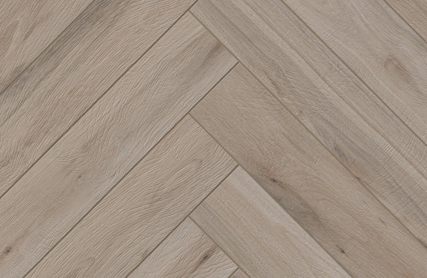
Beyond its functional role, grout is also a powerful design element. Its color influences how wood-look tiles are perceived, either reinforcing the illusion of continuous planks or emphasizing the pattern and layout. This is especially evident in Edward Martin’s Preston 8x48 Matte Porcelain Tile in Pine, where the warm mid-tone wood variation, as shown in the image above, can either blend seamlessly with a coordinating grout or gain subtle definition through a slightly deeper joint color.
Darker grout tends to conceal dirt and everyday wear, while lighter shades reflect more light and create a brighter appearance. The key is understanding how these visual and practical qualities align with your space.

Key Factors for Choosing the Right Grout Color
Once you understand grout’s impact on design, the next step is evaluating the practical and visual factors that should guide your color selection.
Tile Color and Style
Start with the tone and character of your wood-look tiles. If your goal is a cohesive, uninterrupted appearance, choose a grout color that closely matches the dominant tone of the tile, warm beige for honey oak finishes or soft taupe for walnut-inspired hues. This approach minimizes visible joint lines and enhances the illusion of natural wood planks.
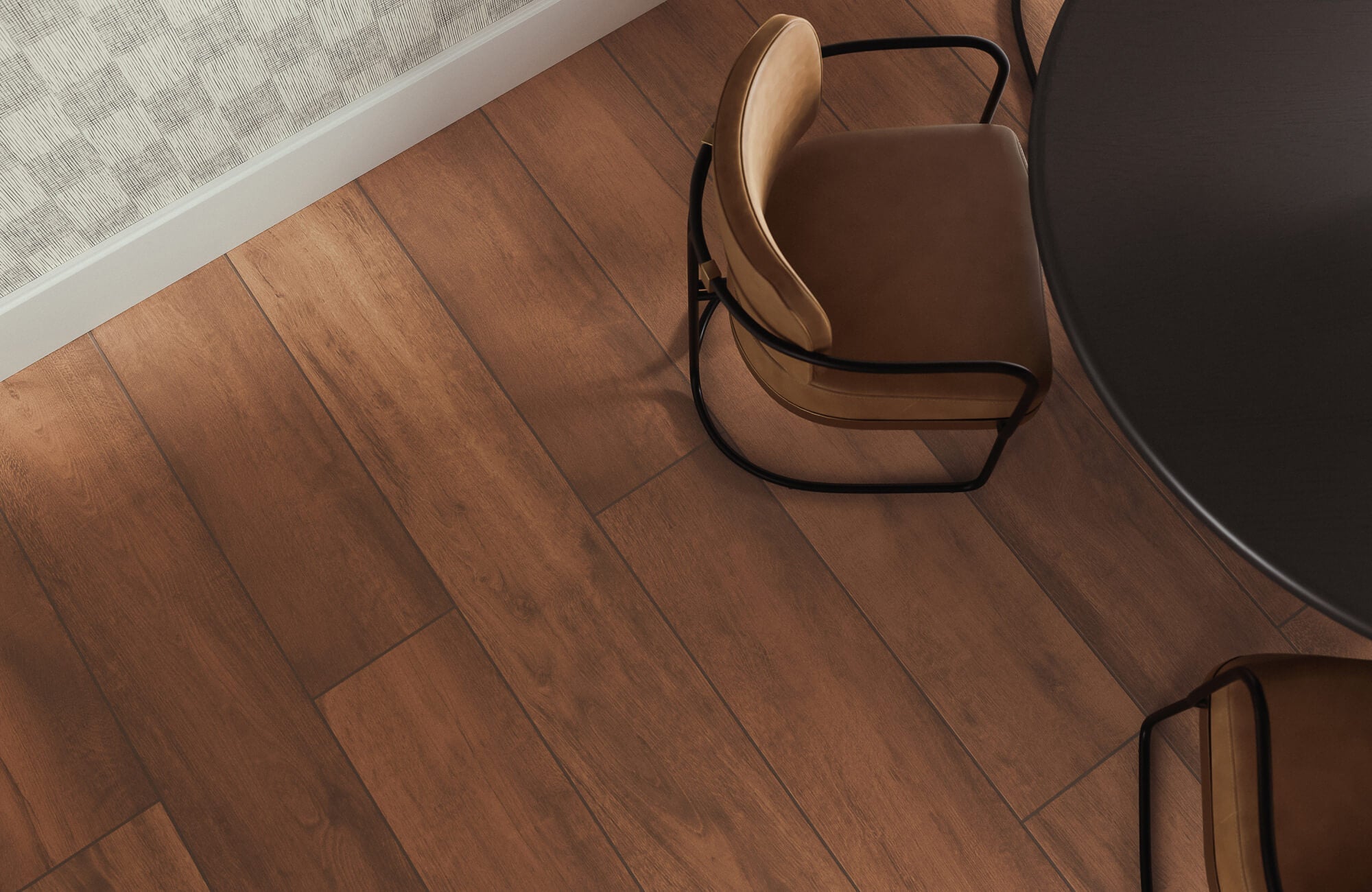
With Edward Martin’s Jameson 8x48 Matte Porcelain Tile in Camel, the soft golden undertones and gentle grain movement, visible in the image above, pair beautifully with a warm, tone-on-tone grout to preserve the fluidity of the plank layout. For a more defined installation, a slightly contrasting grout can outline each tile and introduce subtle depth. However, stronger contrast increases visual emphasis on spacing, making precise installation especially important for a polished result.
Room Size, Lighting, and Overall Design
Grout color also affects how a space feels. In smaller or dimly lit rooms, lighter grout reflects light and can help maintain an open, airy impression. In expansive spaces, medium or darker tones can create grounding definition and visual cohesion.
To achieve harmony, align grout tones with the room’s broader palette. Warm undertones pair well with rustic or farmhouse-inspired interiors, while cooler greys and charcoals complement contemporary and minimalist settings.
Maintenance and Long-Term Appearance
Daily wear should also influence your choice. Darker grout naturally disguises minor stains and foot fall, making it a practical option for kitchens, hallways, and entryways. Lighter grout delivers a crisp aesthetic but may require more frequent cleaning to maintain its brightness. Considering how the space is used ensures your grout color supports both design and durability over time.

Popular Grout Colors for Wood-Look Tiles
With these considerations in mind, exploring common grout color categories can help clarify which direction best suits your design goals.
Neutral Grout Colors
Beige, taupe, and soft greys remain timeless options. These tones complement the organic character of wood-look tiles without competing for attention. For light oak or maple-inspired tiles, beige grout preserves warmth and continuity. For cooler ash or driftwood finishes, light grey maintains a modern, understated feel. Neutral grout is ideal for those who want the wood pattern to remain the primary focal point.
Contrasting Grout Colors
Charcoal, deep brown, or even crisp white grout can define each plank more distinctly. Dark grout against lighter wood-look tiles introduces structure and visual separation, while lighter grout paired with darker tiles creates crisp contrast.
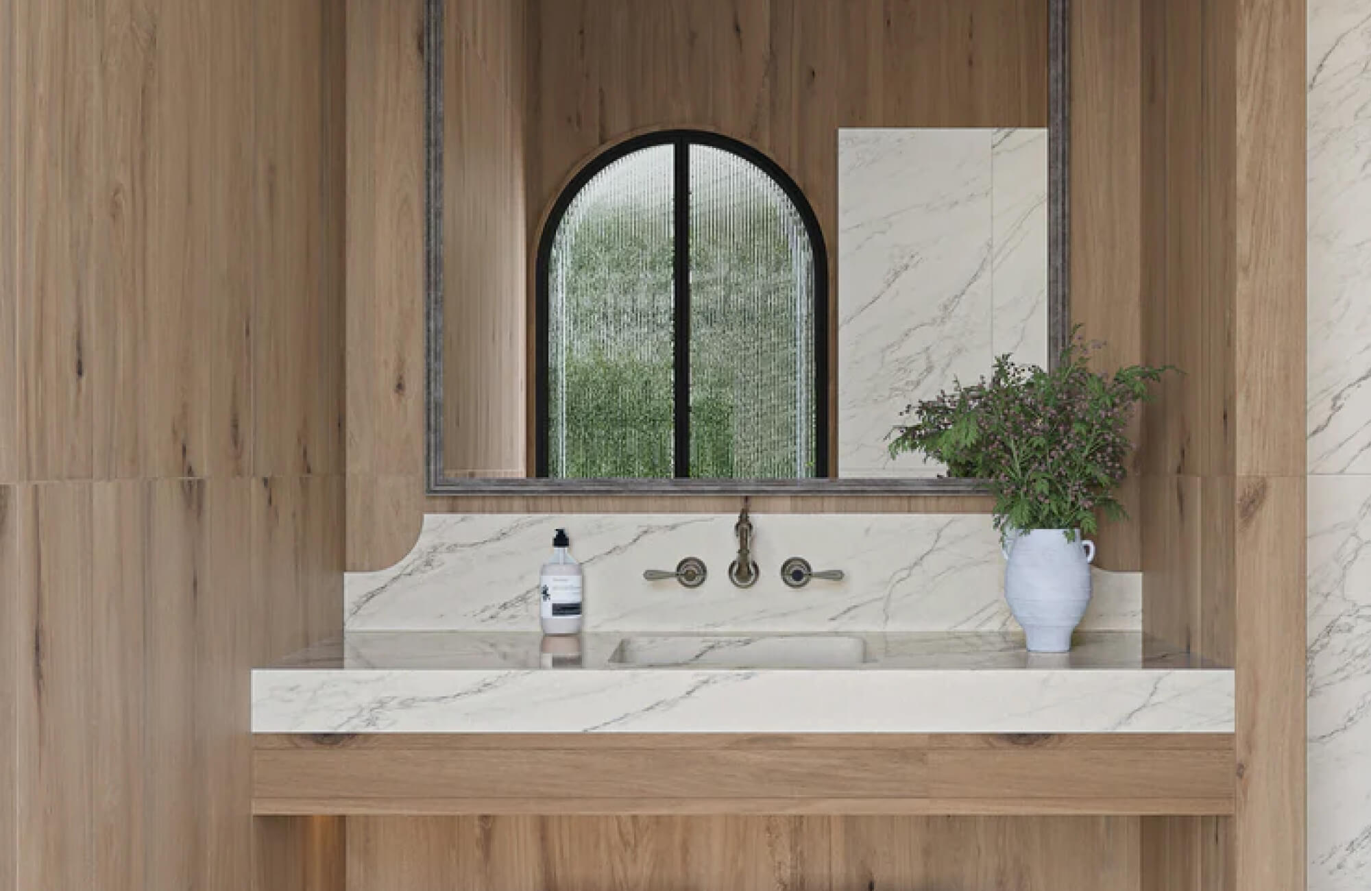
In contemporary settings, Edward Martin’s Preston 8x48 Matte Porcelain Tile in White Oak demonstrates how a pale, neutral wood tone can take on a more architectural presence when paired with a slightly deeper grout, as seen in the image above. This approach works well in spaces where clean lines and layout definition are part of the overall design language. However, because contrast highlights alignment, careful installation is essential.
Custom and Accent Tones
For more expressive interiors, slightly tinted greys or muted earthy shades can add personality without overwhelming the space. While bold grout colors are less common with wood-look tiles, subtle variations can tie the tile installation into surrounding finishes such as cabinetry, wall paint, or furnishings. The goal is thoughtful coordination rather than distraction.

Practical Steps to Confidently Choose Your Grout
After narrowing down your preferred color range, a few practical steps can ensure your final decision translates seamlessly into your space.
Test with Tile Samples
Seeing grout and tile together in your own space is one of the most effective ways to make a confident decision. Both natural daylight and artificial lighting can subtly shift how tones are perceived, sometimes causing grout to appear darker, lighter, warmer, or cooler once installed.
To refine your selection, Edward Martin’s Augmented Reality (AR) Visualization Tool offers a practical starting point, allowing you to digitally place wood-look tiles within your interior and explore how different tones interact with your lighting and furnishings. From there, ordering tile samples provides a hands-on step, giving you the opportunity to compare grout colors directly against the tile surface in real conditions. This layered approach, visualizing first, then testing physically, helps ensure your final choice feels cohesive and intentional.
Consider Sealing and Protection
Over time, grout is exposed to moisture, spills, and daily foot traffic, which makes protection essential, especially in kitchens and bathrooms. Applying the appropriate sealer helps guard against staining and discoloration, supporting a cleaner, more consistent appearance regardless of whether you choose a light or dark shade. To ensure lasting results, follow the manufacturer’s recommended sealing and maintenance guidelines for your specific grout type, as proper care is key to preserving both its look and performance.
Seek Professional Insight
If you’re unsure how grout color will interact with your specific tile selection or layout pattern, consulting a tile professional can provide clarity. Designers and installers can recommend grout types, finishes, and application techniques suited to your space, especially for larger installations or intricate layouts.

Ensuring a Clean and Lasting Grout Finish
Finally, proper installation and finishing techniques are essential to preserving both the appearance and durability of your chosen grout color.
Preparation
Before grouting, confirm that tiles are firmly set and joints are clean and dry. Selecting the appropriate grout type, sanded for wider joints or unsanded for narrower ones, ensures compatibility with your tile spacing.
Application
Grout should be pressed firmly into joints using a grout float, working in manageable sections to maintain consistency. Excess grout should be removed carefully to avoid haze, preserving the clarity of both tile and joint lines.
Finishing and Maintenance
After curing, sealing the grout helps protect against moisture and discoloration. Routine cleaning with non-abrasive products will maintain the integrity of the grout lines and preserve the overall aesthetic of your wood-look tile installation.
Creating a Cohesive Wood-Look Tile Installation
Choosing the best grout color for wood-look tiles is about more than filling joints, it’s about shaping how the entire surface is perceived. A well-matched grout can create the illusion of continuous hardwood planks, while subtle contrast can add rhythm and structure to the layout.
By considering tile tone, lighting, maintenance needs, and installation precision, you can select a grout color that enhances both style and performance. Testing combinations in your own space and seeking expert guidance when needed ensures your final installation feels intentional, balanced, and built to last.