


A cohesive bathroom design is about more than choosing attractive finishes. It is about creating a space where every element feels connected, purposeful, and calm the moment you walk in. When materials, lighting, proportions, and details work together, the bathroom stops feeling like a collection of parts and starts feeling like a complete experience.
As you move from tiles and lighting to vanities, mirrors, and soft accents, each decision builds on the last. With the right approach, cohesion becomes less about rigid rules and more about thoughtful alignment, allowing your bathroom to feel both visually balanced and effortlessly functional.

Tiles As The Visual Foundation Of The Bathroom
In a bathroom, where nearly every surface is defined by material, tile becomes the visual framework that holds the entire design together. When you treat tile as a foundational element rather than a decorative afterthought and take advantage of tools like our augmented reality (AR) to preview tile selections in your own space, every design decision feels more intentional, confident, and connected.
Wall Tiles
Wall tiles play a defining role in how you experience the bathroom the moment you step inside. The direction in which they are installed subtly reshapes the room, allowing you to manipulate proportions without changing the footprint. Vertical layouts draw the eye upward and can make ceilings feel taller, while horizontal arrangements stretch the space visually, easing the confinement of narrower bathrooms. As you consider orientation, the finish becomes just as influential, shaping how light moves across the room and how the space feels throughout the day.
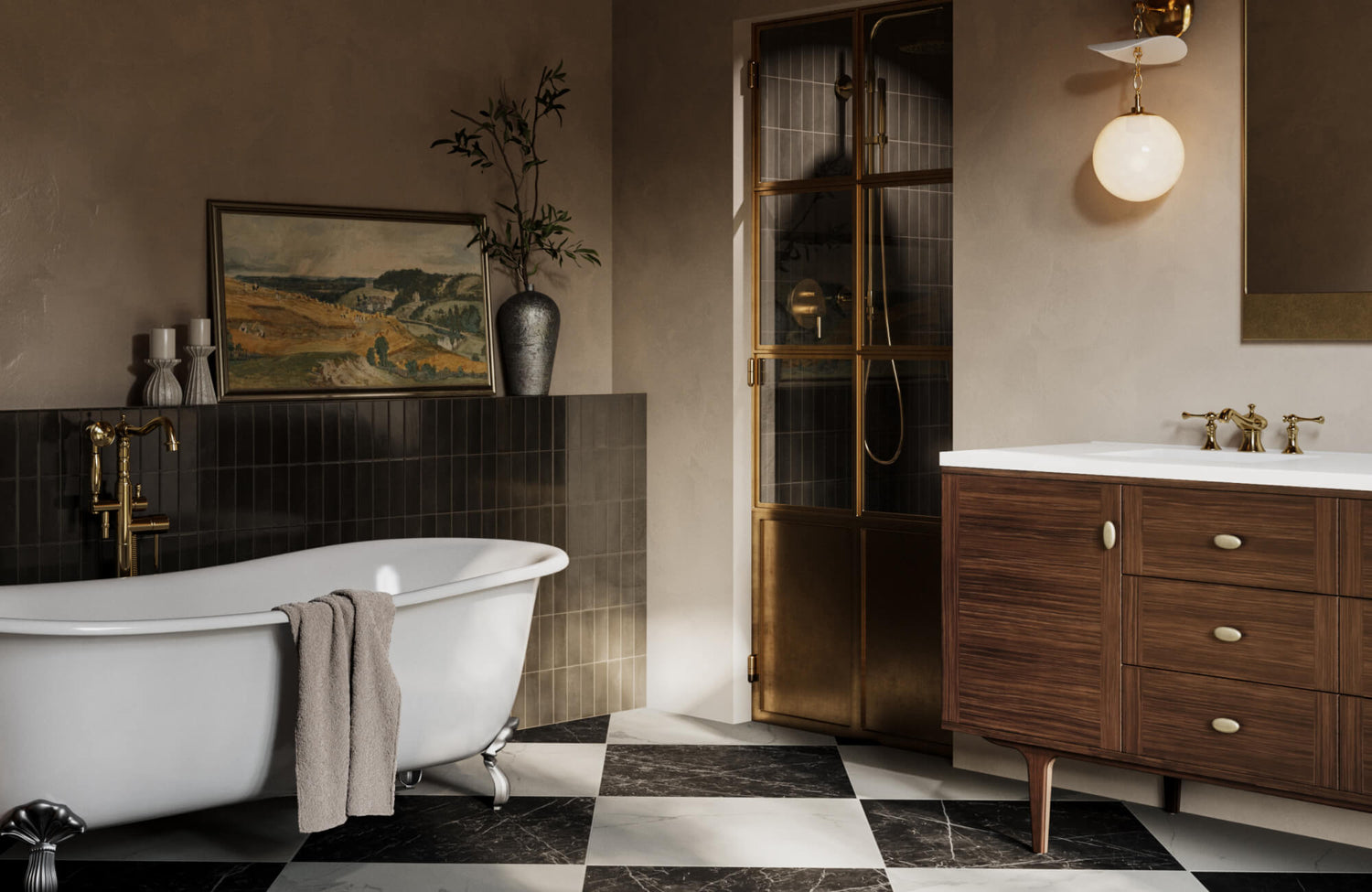
Glossy wall tiles naturally bounce light around the bathroom, which can make smaller or windowless spaces feel brighter and more open. This reflective quality also sharpens edges and highlights clean lines, lending itself well to contemporary or minimalist designs. In a space like the one shown above, where natural light and warm metallic fixtures work together, a vertically stacked glossy ceramic tile such as our Olivia 4x16 Glossy Ceramic Tile in Pearl enhances that effect. Its off-white surface helps amplify brightness while maintaining a refined, timeless backdrop behind vanities or within shower enclosures.
To maintain cohesion, restraint is essential. When you limit wall tiles to a primary field tile and one complementary accent, the room gains clarity and rhythm. Too many competing textures or finishes can fracture the visual flow, making the space feel busy rather than balanced. By allowing one tile to lead and another to support, you create a backdrop that enhances the bathroom’s design instead of overpowering it.
Floor Tiles
If wall tiles set the mood, floor tiles provide the anchor that grounds everything in place. The floor is often the first surface you should commit to, because its undertones naturally influence the rest of the palette. Warm-toned tiles can soften the room and pair seamlessly with wood or brass finishes, while cooler hues establish a crisp, modern foundation that works well with polished metals and clean-lined fixtures. In the same space above, a patterned porcelain tile such as our Isabel 11x11 Matte Porcelain Tile with Star in Charcoal and Cross in Rosewood adds visual weight and character underfoot, blending dark gray and beige accents that echo the room’s mix of light and dark elements. Extending this same tile behind the freestanding tub reinforces continuity, allowing the floor pattern to transition seamlessly into a striking feature wall that visually anchors the bathing area.
Beyond aesthetics, floor tiles must perform reliably in a wet environment, which makes texture and finish especially important. Slip resistance becomes a functional necessity rather than a technical detail, and selecting tiles with appropriate traction ensures safety without compromising style. Subtle surface texture can also add depth and character while still feeling cohesive with smoother wall finishes, creating a balanced interplay between practicality and design.
Grout choice further reinforces this sense of unity. When the grout closely matches the tile color, visual interruptions fade, allowing the floor to read as a continuous plane. This approach is especially effective in curbless showers, where uninterrupted flooring enhances both flow and spaciousness. As the floor extends seamlessly from dry to wet areas, the bathroom feels calmer, larger, and more thoughtfully composed, reinforcing the role of tile as the true foundation of cohesive design.

Lighting That Unifies Function And Atmosphere
Lighting determines how you perceive every color, texture, and finish in the bathroom, making it a powerful tool for cohesion. When thoughtfully planned, it balances practical visibility with atmosphere, allowing the space to feel consistent and intentional from morning to night.
Layered Lighting For Visual Consistency
A cohesive bathroom relies on multiple layers of light working together rather than a single dominant source. Ambient lighting, often delivered through recessed ceiling fixtures, establishes the overall brightness of the room. When these lights are evenly spaced and aligned with the layout, they prevent dark corners and visual imbalance, creating a clean and orderly foundation that supports the rest of the design.
Task lighting then builds on this base by addressing specific functional needs, particularly around the vanity. Sconces placed at eye level on either side of the mirror help eliminate harsh shadows, making daily routines feel easier and more comfortable. As seen in the photo above, wall-mounted fixtures such as our Posey Wall Sconce in Aged Brass provide focused illumination while introducing a warm brass tone that complements the vanity hardware and mirror trim. Because this light interacts directly with your reflection, its placement and finish play a key role in how refined and usable the space feels.
Accent lighting completes the layering by adding depth and subtle emphasis. A decorative overhead fixture, such as our Aida Pendant in Aged Brass, shown in the same picture above, draws the eye upward and helps visually define areas like the bathing zone without overpowering the room.
Matching Light Temperature Across Fixtures
Even the most carefully layered lighting can feel disjointed if color temperatures are inconsistent. When one fixture emits a warm glow while another casts a cooler light, the contrast creates visual tension and disrupts the unity of the space. This inconsistency also alters how tiles, wall colors, and finishes appear, making carefully chosen materials look mismatched under different light sources.
Maintaining a consistent Kelvin temperature across all fixtures helps preserve visual harmony. Warm white light in the 2700K to 3000K range encourages relaxation and pairs naturally with wood tones, stone surfaces, and softer color palettes. Neutral white light between 3500K and 4000K strikes a balance between comfort and clarity, making it a strong choice for bathrooms that blend modern style with everyday functionality.
Cooler temperatures can also work when applied deliberately. Light in the 4000K to 5000K range enhances crisp lines and minimal aesthetics, but it requires careful selection. Using bulbs with a high Color Rendering Index ensures that skin tones remain natural and surface colors stay true, allowing cooler light to feel intentional rather than clinical. When all fixtures share the same temperature, the bathroom reads as one cohesive environment rather than a collection of separate zones.

Vanity As The Design Anchor
The vanity often commands the most visual weight in the bathroom, making it the element that everything else naturally revolves around. When you choose it with intention, it becomes a unifying force that connects materials, proportions, and finishes into a cohesive whole.
Material And Finish Harmony
The material and finish of the vanity play a critical role in balancing the bathroom’s overall texture. In spaces dominated by cool stone or sleek tile, a wood vanity introduces warmth that softens the environment and prevents it from feeling overly clinical. In the bathroom image above, a piece like our Paxton 72" Double Vanity in Pebble Oak with 3 cm White Zeus Quartz Top brings that warmth through its light oak-toned wood grain, which contrasts beautifully against the deep blue wall tile while still feeling refined and modern.
In bathrooms where patterns, veining, or bold tile already create visual energy, a painted vanity can provide much-needed calm. Matte or satin finishes in neutral tones reduce visual noise and allow other elements to breathe. The vanity then acts as a stabilizing presence, grounding the space rather than competing for attention. This balance ensures the design feels intentional rather than overwhelming.
Hardware further reinforces cohesion when it echoes the tone or sheen of nearby fixtures. Even without exact matches, maintaining consistency in warmth or finish keeps the look unified. A vanity top that subtly reflects the color or veining of the floor tile strengthens this connection, making the vanity feel integrated into the architecture rather than placed on top of it.
Proportion And Storage Balance
A cohesive bathroom depends heavily on proportion, and the vanity sets the standard. When its size aligns with the room, the space feels comfortable and visually stable. An oversized vanity in a compact bathroom can crowd circulation and dominate the view, while a vanity that’s too small may feel disconnected and underwhelming. Matching scale to square footage ensures the vanity supports the room instead of distorting it.
Floating vanities offer a lighter visual presence by exposing more of the floor, which helps smaller bathrooms feel open and airy. In contrast, freestanding vanities bring weight and structure that suit larger spaces, where a stronger architectural presence feels appropriate. Choosing between the two is less about trend and more about how you want the space to feel when you move through it.
Inside the vanity, thoughtful storage design plays a quiet but essential role in cohesion. Built-in organization, such as drawer dividers or concealed power access, reduces clutter and keeps daily essentials out of sight. When drawer fronts align cleanly, and handles are placed with intention, the vanity maintains a composed, symmetrical appearance that reinforces the bathroom’s overall sense of order.

Mirrors That Reflect Design Intent
Mirrors shape how the bathroom reads as a whole, influencing light, balance, and visual flow. When chosen with intention, they reinforce the logic of the space by echoing its forms, materials, and overall mood rather than competing for attention.
Shape As A Design Echo
The shape of a mirror should feel like a natural extension of the room’s architecture. Rectangular mirrors emphasize clean lines and structure, making them especially effective in bathrooms with strong geometry, linear tile layouts, or modern vanities. Their defined edges also reinforce order and clarity, helping the space feel composed and deliberate.
Rounded and arched mirrors, on the other hand, introduce softness that can counterbalance hard surfaces like stone or porcelain tile. An arched mirror, such as our Esmeralda Wide Mirror in Polished Brass, echoes the curved doorways and architectural niches, as seen in the bathroom photo above, creating a gentle visual rhythm that feels cohesive rather than decorative. These curved silhouettes also make the bathroom feel more inviting while subtly breaking up rigid lines.
In double-vanity layouts, mirror configuration further influences how the space functions and feels. A single, wide mirror enhances openness and amplifies light, visually unifying the vanity wall. Two separate mirrors, by contrast, create symmetry and subtly define individual zones, which can add structure while maintaining balance.
Frame And Finish Coordination
A mirror’s frame acts as a visual connector between different finishes in the bathroom. When the frame matches or complements nearby metal tones, it reinforces material continuity and strengthens the overall palette. A brass-framed mirror, for example, echoes warm hardware and fixtures, adding depth without introducing a new finish that might feel out of place.
Frameless mirrors offer a quieter approach, allowing surrounding materials to take center stage. By minimizing visual boundaries, they blend seamlessly into tiled or stone-clad walls, making the mirror feel integrated rather than ornamental. This approach works especially well when the wall material itself is a key design feature.
The choice between framed and frameless should also support the broader design direction. A simple frame can add subtle character to transitional spaces, while minimal profiles align with modern or understated aesthetics. When the mirror’s finish and form align with the rest of the bathroom, it reinforces cohesion through restraint rather than decoration.

Rugs As Soft Visual Connectors
Bathrooms are typically defined by tile, stone, and other hard surfaces, which can make the space feel visually rigid if left unbalanced. A well-chosen rug introduces softness and warmth while quietly linking different areas of the room into a cohesive whole.
Color And Pattern Alignment
The color and pattern of a rug should feel like a continuation of the bathroom’s existing palette. When you pull tones from grout lines, stone veining, or metal finishes, the rug naturally blends into the design rather than standing apart from it. A piece such as our Charlise Rug in Natural / River echoes the soft beige, sand, and stone hues found in the surrounding tile and marble surfaces, as shown in the photo above, allowing it to feel grounded within the overall composition.
In bathrooms with bold tile patterns or strong visual movement, restraint becomes especially important. A solid-colored rug with a tactile weave or plush texture can calm the composition, allowing the eye to rest without sacrificing interest. The texture also provides depth, while the simplicity of the color prevents visual competition with surrounding surfaces.
In more minimal bathrooms, a rug can take on a slightly more expressive role. Soft patterns or muted contrasts introduce visual depth without disrupting the overall calm. When patterns remain understated, and color choices stay within the established palette, the rug enhances the space rather than pulling focus away from it.
Size And Placement Strategy
Proper sizing and placement are essential for maintaining visual balance. A rug that spans most of the length of a double vanity helps unify the grooming area, creating a clean horizontal line that visually anchors the space. When the rug feels proportionate to the vanity, it supports the layout instead of fragmenting it.
Placement can also be used to soften specific architectural moments. Positioning a rounded rug in front of a freestanding tub offsets sharp angles and draws attention to the fixture’s form, adding a sense of intention to the layout. This contrast between soft and hard shapes enhances the room’s overall rhythm.
In narrower bathrooms, placement becomes even more deliberate. Centering a runner while leaving a slim border of tile visible on each side preserves symmetry and allows the flooring to remain part of the visual story. This careful balance ensures the rug complements the tile rather than concealing the design choices that define the space.

Color Palette And Material Repetition
A cohesive bathroom relies on a clear and disciplined approach to color and material selection. When tones and textures are repeated with intention, the space feels calm, organized, and visually connected from one surface to the next.
Limiting The Color Range
Restraint is what gives a bathroom color palette its strength. When you limit the scheme to a small, deliberate range, each color has room to make an impact without competing for attention. A dominant base tone establishes the overall mood, while a secondary tone introduces contrast and depth, preventing the space from feeling flat or monotonous.
The third color works best when used sparingly, acting as an accent rather than a focal point. This controlled approach allows fixtures, finishes, and textures to complement one another naturally. When every element supports the same palette, the bathroom feels cohesive rather than fragmented.
Expanding beyond this range often weakens the design. Too many colors dilute the visual hierarchy, making it harder for the eye to settle. By simplifying your palette, you allow the materials themselves to stand out, reinforcing clarity and intention throughout the space.
Repeating Materials With Purpose
Cohesion emerges when materials are echoed thoughtfully across multiple surfaces rather than introduced as isolated features. As shown in the picture above, the interplay between our Leona 12x12 Checkerboard Matte Porcelain Tile in Calacatta and Amani Grey on the floor and the vertically stacked Cleo 2x6 Glossy Ceramic Tile in Sage on the walls establishes a balanced rhythm of pattern and color. That foundation is softened by our Pascal Rug in Chalk / Ash, which bridges light and dark tones while adding comfort underfoot. Warmth and structure come from our Demi 60" Single Vanity in Mid-Century Walnut with 3 cm White Zeus Quartz Top, whose wood finish and quartz surface echo both the cabinetry and stone elements throughout the room. Above, our Tristan Square Mirror in Polished Brass and Sable Pendant in Aged Brass with Ceramic Moss Crackle repeat warm metal tones, visually tying lighting, fixtures, and reflective surfaces together. This thoughtful repetition allows each material to reappear just enough to feel intentional, creating a bathroom that feels layered, cohesive, and complete rather than assembled piece by piece.
Wood tones also benefit from thoughtful repetition. When cabinetry finishes reappear in mirror frames or small furnishings, they create continuity without overwhelming the room. These repeated elements act as quiet anchors, helping different areas of the bathroom relate to one another.
Metals, too, play a key role in reinforcing unity. When finishes remain consistent across faucets, hardware, and accessories, the bathroom feels composed and intentional. This repetition doesn’t read as monotony; instead, it establishes rhythm and harmony, allowing the overall design to feel balanced and complete.
Bringing It All Together With Intentional Choices
Achieving a cohesive bathroom design comes down to clarity and consistency across every decision you make. When tiles establish a strong foundation, lighting enhances both function and mood, and elements like vanities, mirrors, rugs, and finishes repeat tones and materials with purpose, the space naturally comes together. Rather than relying on perfect matches, cohesion is created through balance, restraint, and thoughtful transitions, resulting in a bathroom that feels calm, unified, and enduring long after the design is complete.
To support this level of clarity and coordination, professional guidance can help translate your ideas into a cohesive plan from start to finish. Through our design services, you can refine material selections, confirm proportions, and ensure each choice aligns with the overall vision, making it easier to achieve a bathroom that feels intentional, balanced, and thoughtfully designed.